visual communication
Typography 1
.................................................................
Professor: Andrea Herstowski
Office: 317 Marvin Hall
Office
hours: by appointment
email: herstow@ku.edu
Professor: Alex Anderson
Office: 353 Marvin Hall
Office
hours: by appointment
email: alexandersoncreative@gmail.com
................................................................
Documents relating to project
:- InDesign doc (zip file)
:- PDF Saving: | pdf |
::::::::::::::::::::::::::::::::::::::::::::
:: Links : start following...
:- Thinking with Type
:- Typotheque
:- Visual Thesaurus
:- dailydropcap.com
:- designobserver.com
:- formfiftyfive.com
:- friendsoftype.com
:- ministryoftype.co.uk
:- thevisualdictionary.net
:- typographica.org
:- welovetypography.com
:::::::::::::::::::::::::::::::::::::::::::
:: Short films :: Audio
:- films by Hillman Curtis
:- Type Radio
:- Type Cultur
:::::::::::::::::::::::::::::::::::::::::::
::Fonts (pick one for the project)
_ Helveitca
_ Gotham
_ Univers
...............
:::::::::::::::::::::::::::::::::::::::::::::::::::::::::::::::::::::::::::::::::::::::::::::::::::::::::::::::::::::::::::::::::::::::::::::::::::::::::::::::::::::::::::::::::::::::::::::::::::::::::::::
Project Two:
MODULAR GRID + HIERARCHY
In this project you will learn so see typography in two ways: 1) as visual elements in a two- dimensional composition 2) as information which represents hierarchical organization. Emphasis will be on establishing a clear visual hierarchy and exploring compositions that closely adhere to a given modular grid.
Analyze the given text. You will be asked to classify it into three levels of informational importance; dominate, sub-dominate, subordinate. Your compositions will simplify and clarify the information, encouraging the viewer to read the information in a logical and per-determined order.
You will be creating a series of typographic compositions that closely adhere to a traditional grid form (a straightforward composition that stresses organization and legibility). Use a clear vertical/horizontal structure in the organization of the information. Do not orientate type at an angle, running vertical, or into any shape or form.
D A T E S
It is your responsibility to have everything asked of you ready before class begins. Process is 50% of your grade you can't pass the project or the course if you don't come prepared for every class. Also, if you have prints in the print lab when class begins you will be counted LATE (3 lates = 1 absence). Remember there are over 40 of you and you can't all print at the same time, coming in 15 minutes before class to print will get you into trouble.
:::::::::::::::::::::::::::::::::::::::::::::::::::::::::::::::::::::::::::::::::::::::::::::::::::::::::::::::::::::::::::::::::::::::::::::::::::::::::::::::::::::::::::::::::::::::::::::::::::::::::::::
Wed. Sept 13
_ Project 1 due, discuss
_ Tips on Behance
_ Check out BrandNew (underconsideration)
_ Introduction of project 2: working in class
_ Ellen Lupton
_ Thinking with Type: Grids
_ InDesign refresher *use the document that was sent to you!
understanding the master page,
layers (2 layers type and grid),
type: text box, change font, change size, change leading, change tracking
lock type to corner left corner of the grid,
add another page from master page or duplicate page, save, print.
_ Lost in InDesign? there are plenty of on-line tutorials. Start with this Lynda.com video. Free if you have a Lawrence Public Libarary Card so go downtown and get one. Need your ID and proof of Lawrence address.
TECHNICAL RESTRICTIONS
Grid: 4 column. All type must lock-up into the upper left corner
Font: pick one font: Gotham Reg and Gotham Bold, or Univers Light and Bold or Helvetica light and Bold
Text: must remain horizontal, no vertical text, no shapes
USE ALL OF THE FOLLOWING TEXT (once per layout)
A Designer's Art
Paul Rand
Princeton Architectural Press
Ask yourself...
How does where you put text on the page affect what we see first? How does bold type affect what we read first? How does size affect what we read first? what about tracking?
Explore...
Tension: how the page is used, how the edges are used, activate the page
Grouping: how things are grouped together, use triangulation as a guide.
Alignments: vertical, horizontal (type must stay horizontal)
Coding: type that is the same size and style will be read together
WATCH
Ellen Lupton (doesn't work), you could try this one: download the Grid. Take notes.
ROUND ONE:
_ Use the InDesign Doc it has instructions in it. Was emailed to you so find it.
_ Explore 14 different compositions with clear hierarchy: 1st, 2nd, 3rd
_ Strive for all 14 compositions to look different from each other. EXPLORE variations.
_ Print all b/w with the grid and page layer visible
ROUND ONE +
_ Choose your favorite 6 designs (all solutions should be different from each other)
_ Explore case changing some text to all caps or all lowercase
_ Explore that happens to hierarchy when you use
tracking
_ Print all b/w with the grid and page layer visible
RESEARCH:
Who is Paul Rand? Why is he important and capture at least 6 examples of his work.
Who is Jan Tschichold? Why is he important and capture at least 6 examples of his work.
Who is Josef Müller-Brockman? Why is he important and capture at least 6 examples of his work.
Who is Wolfgang Wiengart?.
Why is he important and capture at least 6 examples of his work.
- - - - - - - - - - - - - - - - - - - - - - - - - - - - - - - - - - - - - - - - - - - - - - - - - - - - - - - - - - - - - -
HOMEWORK
_ Finish 20 layouts (follow the directions)
_
Print B/W with the grid and page outline on
_ Design and print a title page: Your Name, Round One
_ Clip all together
_ Strive for all compositions to be different from each other.
_ They should not look like they are a set or a theme.
_ Research the four men listed.
_ Read Meet your Type: chapter 3 and Thinking with Type: Grids
:::::::::::::::::::::::::::::::::::::::::::::::::::::::::::::::::::::::::::::::::::::::::::::::::::::::::::::::::::::::::::::::::::::::::::::::::::::::::::::::::::::::::::::::::::::::::::::::::::::::::::::
Monday September 18
_ Review: Meet your Type: chapter 3 and Thinking with Type: Grids
_ Review homework
- - - - - - - - - - - - - - - - - - - - - - - - - - - - - - - - - - - - - - - - - - - - - - - - - - - - - - - - - - - - - -
HOMEWORK
you are completing round 2 and round 3 as homework. work in class to get started on BOTH rounds so if you have questions we can help you.
ROUND TWO: ADD RULES + COLOR
How can you visually show us the information so we can read it quickly.
How does color, typographic rules help with hierarchy?
MAKE 10 layouts using up to 3 sizes, 2 weights but now add color and/or rules.
You want to have 10 different successful layouts exploring typographic rules (lines) and/or color.
If you didn't have great layouts this is your opportunity to make great ones
_
Create new layouts/refine old ones add color and/or rules (need 10 different solutions of color and /or rules)
_ Remember you can add color to the background.
_
If your background color is in the mid-range then you could have colored type, black or white text
_
Explore not having all the type 1 color)
_ Strive for all 10 to be different from each other.
_ Type has to lock to the Upper left of the module
_ USE only 3 sizes of type only (48pt, 24pt, 12pt) (not every layout has to use all three. These are your choices.
_
2 weights only (light and bold)
_ typographic color (type style, tracking, leading...)
_ add typographic rules (tip: keep rules going the same direction and with purpose)
_ add color no more than 2 colors + tints
_ Make/Print a title page Your Name and Round 2
AVOID decoration! You are only using these elements to HELP with hierarchy. Avoid checker boards, diagonal structures, think horizontal pull, vertical pull
- - - - - - - - - - - - - - - - - - - - - - - - - - - - - - - - - - - - - - - - - - - - - - - - - - - - - - - - - - - - - - -
ROUND THREE: GO BIG
_ Explore SCALE. Extreme Scale. 20 new layouts using SCALE (and rules and/or color)
_ Do not use any layouts you have made in Round 1 or Round 2
_ Do not repeat the text on a layout
_ Letters/Words can bleed off the page
Create 20 new layouts that use SCALE BIG TYPE. Do not use more than 4 sizes of type on one layout. You can also use color, rules.
Type should lock up to any corner on the grid .
_
Explore 20 NEW compositions
_ Use the grid as a guide large text should relate to the grid somehow
_ Smaller text can lock to the top or bottom of the modular
_ Strive for all 20 to be different from each other.
_ ANY 3 sizes of type only, No more than 3 sizes on a layout
_
(you can go small 5pt you can go HUGE explore a range).
_
2 weights only (any 2 wieights explore different choices on different layouts)
_ typographic color (type style, tracking, leading...)
_ add typographic rules (tip: keep rules going the same direction and with purpose)
_ add color no more than 2 colors + tints
_ Make/Print a title page Your Name and Round 3
Ask yourself...
How does where you put text on the page affect what we see first? How does bold type affect what we read first? How does size affect what we read first? what about tracking?
Explore...
Tension: how the page is used, how the edges are used, activate the page
Grouping: how things are grouped together, use triangulation as a guide.
Alignments: vertical, horizontal (type must stay horizontal)
Coding: type that is the same size and style will be read together
:::::::::::::::::::::::::::::::::::::::::::::::::::::::::::::::::::::::::::::::::::::::::::::::::::::::::::::::::::::::::::::::::::::::::::::::::::::::::::::::::::::::::::::::::::::::::::::::::::::::::::::
Wed. September 20
_ Review homework
_ Working with paragraphs
- - - - - - - - - - - - - - - - - - - - - - - - - - - - - - - - - - - - - - - - - - - - - - - - - - - - - - - - - - - - - -
HOMEWORK
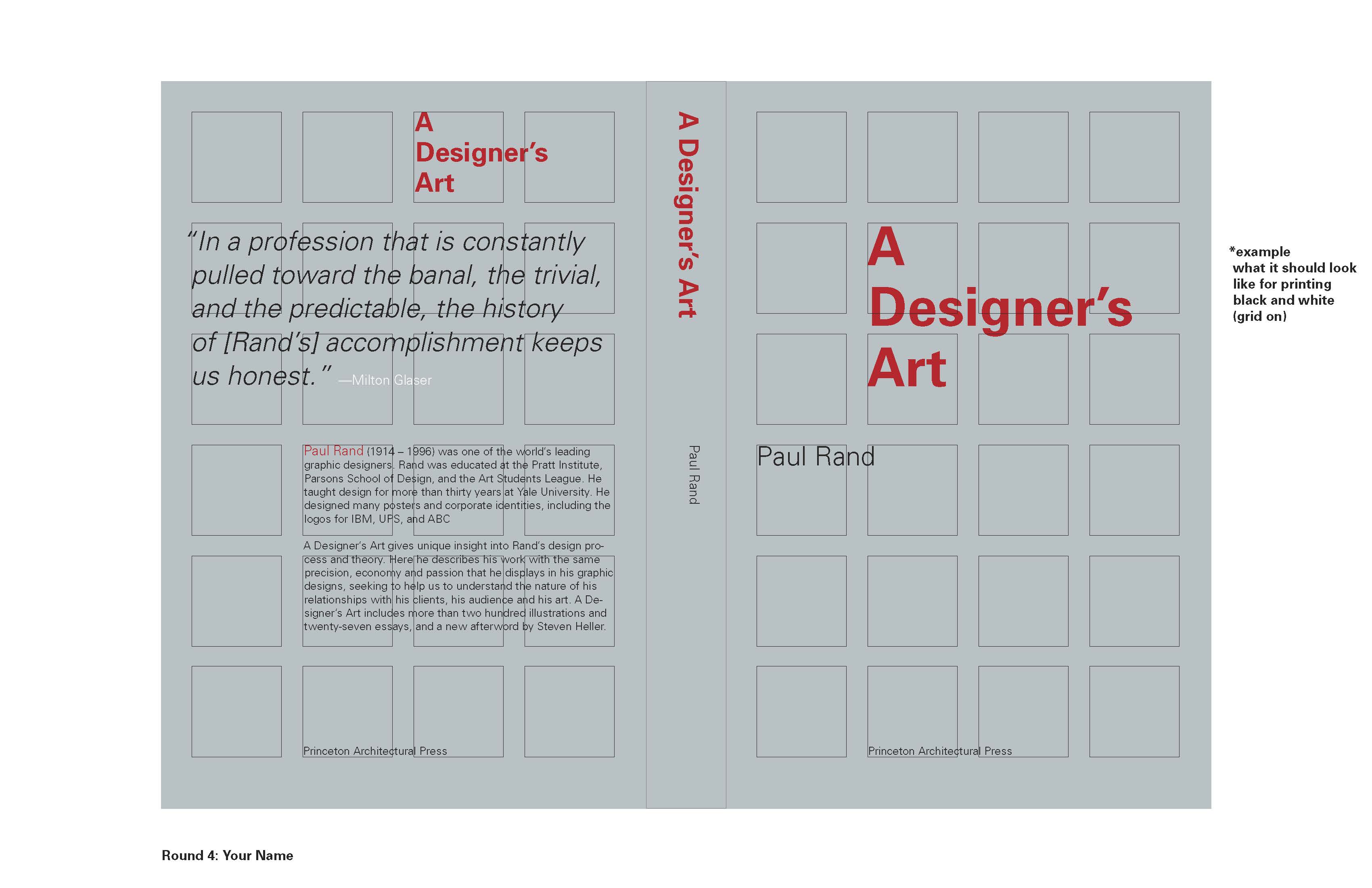
ROUND 4: Exploring the back cover and spine
_ Explore 20 great refined or new compositions of the front/spine/back (you can use your fronts
_ You can pick from your great front designs (range of b/w, color, scale use all)
_ If you need to make new designs you can.
_ You are adding a spine and back cover.
_ Spine text reads down: A Designers' Art Paul Rand or Paul Rand A Designers' Art
_ Use horizontal alignment from front, to spine to back
_ Strive for all 20 to be different from each other.
_ 3 - 5 sizes of type only (you can go small 5pt you can go HUGE explore a range).
_
3 weights only (any 2)
_
*make sure you use some of the same sizes and weights on the front, spine, back
_ typographic color (type style, tracking, leading...)
_ add typographic rules (tip: keep rules going the same direction and with purpose)
_ add color no more than 2 colors + tints
_ Make/Print a title page Your Name and Round 4
- - - - - - - - - - -
Below is the copy for the back of the book. Design it! The content has to be on the back but not in this order.
A Designer’s Art
Princeton Architectural Press
Paul Rand (1914 – 1996) was one of the world's leading graphic designers. Rand was educated at the Pratt Institute, Parsons School of Design, and the Art Students League. He taught design for more than thirty years at Yale University. He designed many posters and corporate identities, including the logos for IBM, UPS, and ABC
A Designer's Art gives unique insight into Rand's design process and theory. Here he describes his work with the same precision, economy and passion that he displays in his graphic designs, seeking to help us to understand the nature of his relationships with his clients, his audience and his art. A Designer’s Art includes more than two hundred illustrations and twenty-seven essays, and a new afterworld by Steven Heller.
“In a profession that is constantly pulled toward the banal, the trivial, and the predictable, the history of [Rand’s] accomplishment keeps us honest.” —Milton Glaser
- - - - - - - - - - -
Print in color you will have 20 11 x 17 pages with the grid turned on.
AVOID decoration! You are only using these elements to HELP with hierarchy. Avoid checker boards, diagonal structures, think horizontal pull, vertical pull.
Explore...
Tension: how the page is used, how the edges are used, activate the page
Grouping: how things are grouped together, use triangulation as a guide.
Alignments: vertical, horizontal (type must stay horizontal)
Coding: type that is the same size and style will be read together
DO NOT wait to print to just before class (think of how many of you and how many you need to print). If you are waiting for prints when class starts you will be marked LATE. (3 lates = 1 absence)
Make a title page Your Name and ROUND 4
:::::::::::::::::::::::::::::::::::::::::::::::::::::::::::::::::::::::::::::::::::::::::::::::::::::::::::::::::::::::::::::::::::::::::::::::::::::::::::::::::::::::::::::::::::::::::::::::::::::::::::::
Monday Sept 25
_ Crit round 4
_ refine paragraphs/ how can you make the type more engaging to read?
_ color, weight, tracking, leading...
_ rag or justification
_ kern any other bad letterspacing
_ working in class
: bring all prints from round 2, 3, 4 with you.
HOMEWORK
Redo/Refine/Remake Round 4
8 new and or improved layouts
print 11 x 17 in color, turn off the grid when printing this time
:::::::::::::::::::::::::::::::::::::::::::::::::::::::::::::::::::::::::::::::::::::::::::::::::::::::::::::::::::::::::::::::::::::::::::::::::::::::::::::::::::::::::::::::::::::::::::::::::::::::::::::
Wed. Sept 27
_ Crit refined layouts
_ work on Final layouts
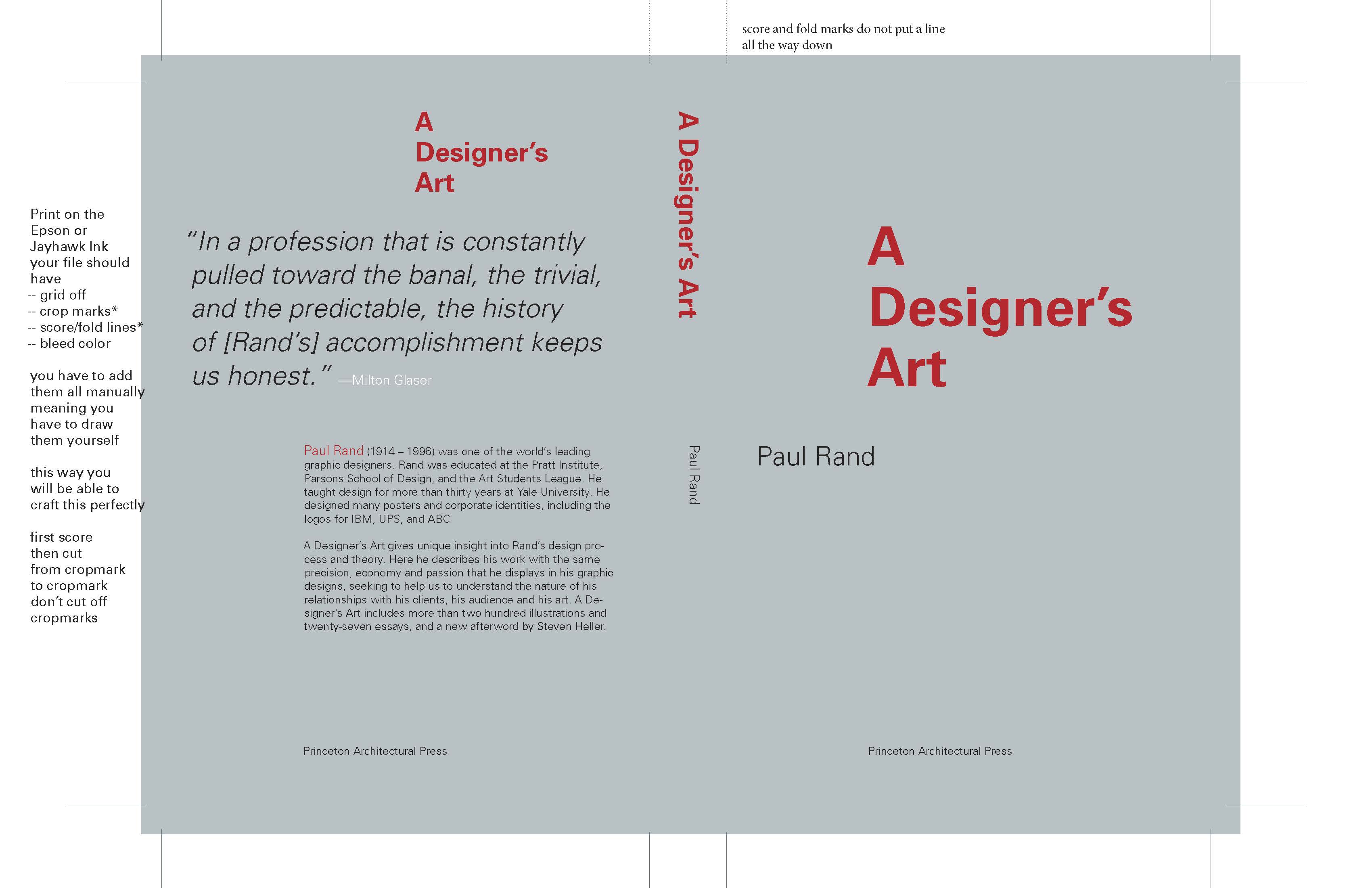
_ setting up file to print with crop marks and score lines
- - - - - - - - - - - - - - - - - - - - - - - - - - - - - - - - - - - - - - - - - - - - - - - - - - - - - - - - - - - - - -
HOMEWORK
FINISHING UP PROJECT 2
DUE MONDAY OCT 2
All 12 have to be different layouts not variations of the same layout.
ALL DIFFERENT DESIGNS.
That is your responsibility to check that each design is different.
You need to have all of what is listed below ready when class start on Monday!
________________________________________________________
Refine/Redo/Remake :: 4 layouts from Round 2
Print in color on the color laser printer or at jayhawk ink with the grid off.
Print in b/w with the grid on.
* Read over Round 2 to make sure you have everything correct! You have to follow the directions!
* Leave 2 layouts per page. Do not trim out
* Make sure your name is at the bottom of each page
Directions for Round 2
_ Grid: Type has to lock to the Upper left of the module
_ Size: only 1 – 3 sizes of type (only choices are 48pt, 24pt, 12pt)
_ Type styles: 2 weights only (light and bold)
_ Typographic color: consider type style, tracking, leading..
_ Typographic rules: consider how rules or block of color can enhance hierarchy
_ Color palette: 2 colors + tints (plus black or white)
_ Tip *remember you can add color to the background.
_ Tip *background color is in the mid-range then you could have colored type, black or white text
*All 4 of these layout have to be completely different from each other and different from
your next rounds. They should be dynamic, have a clear hierarchy so if you have to make new, now is your chance.
________________________________________________________
Refine/Redo/Remake :: 4 layouts from Round 3
Print in color on the color laser printer or at jayhawk ink with the grid off.
Print in b/w with the grid on.
* Read over Round 3 to make sure you have everything correct! ( can make a handout
* Leave 2 layouts per page. Do not trim out
* Make sure your name is at the bottom of each page
Directions for Round 3
_ Grid: Type has to lock to the any part (top bottom left or right) of the module
* Large text or elements should use the grid as a guide, text can bleed off the page
_ Size: only 1 – 3 sizes of type (any 3! big and small)
_ Type styles: 2 weights only (any 2 weights or type styles in the family)
_ Typographic color: consider type style, tracking, leading..
_ Typographic rules: consider how rules or block of color can enhance hierarchy
_ Color palette: 2 colors + tints (plus black or white)
_ Tip *remember you can add color to the background.
_ Tip *background color is in the mid-range then you could have colored type, black or white text
_ Tip *SCALE go big, do not use the same sizes in any of your 4 layouts make sure you are exploring all the possibilities
*All 4 of these layout have to be completely different from each other and different from
your previous and next round. They should be dynamic, have a clear hierarchy so if you have to make new, now is your chance.
________________________________________________________
Refine/Redo/Remake :: 4 layouts from Round 3
Print in each cover on the sheet Epson or at Jayhawk Ink (on the heavy paper) with the grid off.
* Read over Round 4 to make sure you have everything correct! You have to follow the directions
* Color prints you should add crop marks, fold tick and bleeds.
* Turn OFF the rules around the page do not print with rules but with crop marks only.
* Trim and fold all 4 book covers. (no mounting)
**
Print in b/w each cover with the grid on, no trimming, name at the bottom of the page
Directions for Round 4
_ Grid: Type has to lock to the any part (top bottom left or right) of the module
* Large text or elements should use the grid as a guide, text can bleed off the page
_ Size: only 1 – 5 sizes of type (any 5! big and small)
_ Type styles: 3 weights only (any 2 weights or type styles in the family)
_ Typographic color: consider type style, tracking, leading..
_ Typographic rules: consider how rules or block of color can enhance hierarchy
_ Color palette: 2 colors + tints (plus black or white)
_ Tip *remember you can add color to the background.
_ Tip *background color is in the mid-range then you could have colored type, black or white text
_ Tip *embrace scale
_ Tip *make sure you have size and style relationships from front to back
_ Tip *make sure you have alignment relationships from front to spine to back
*All 4 of these layout have to be completely different from each other and different from
your previous rounds. They should be dynamic, have a clear hierarchy so if you have to make new, now is your chance.
________________________________________________________
Your process book should be ready to be bound. If you followed the directions for every homework you already have title pages for each Round. You need to just organize everything. Make a title page for the process book, write a project description and project overview and spiral bind it all.
________________________________________________________
Post all final layouts on Behance without the grid. Remember to design your Behance page as 1400 pixels wide and as long as you need it. We can see 800px high at a time (when you are scrolling), you can use InDesign and export your file as a jpg or png to upload to Behance. RGB! make sure your file you upload to Behance is RGB it will not take a CMYK file. Design it so it looks great.
________________________________________________________
tips for printing