____________________________________________
Resources
Jonathan Hoefler’s Type Styles 101 (typophile.com)
The Elements of Typographic Style
Matthew Butterick's Practical Typography
Lynda.com
Mac is not a Typewritter
:::...
ALIGNMENTS
In unjustified text, the text block is set with normal letter and word spacing. Because of the even word spacing the text will have an even texture – no large spaces between words. The lines will naturally vary in length. a ragged text block can integrate with the layout and add visual interest to the page. The difficulty is making the ragged edge have a pleasing silhouette. The ragged edge needs to have a life, but a narrow column can be less active. Another advantage to ragged text is less hyphenation is needed. Therefore, names, dates or words which are normally read together can stay together.
If someone insists that fully justified text is better than left-aligned text, tell them they are wrong. If someone else tells you that left-aligned text is better than justified text, tell them they are wrong.
If they are both wrong, then what's right? Alignment is only a small piece of the puzzle. What works for one design might be totally inappropriate for another layout. As with all layouts, it depends on the purpose of the piece, the audience and its expectations, the fonts, the margins and white space, and other elements on the page.
The most appropriate choice is the alignment that works for that particular design.
download this file
________________________________________________________________________________________________
LEGIBILTY
Legibility is the concern of the typographer to select a typeface with appropriate clarity of design for the intended use at the intended size. The typeface chosen should be legible. That is, it should be read without effort. Sometimes legibility is simply a matter of type size; more often, however, it is a matter of typeface design. In general, typefaces that are true to the basic letterforms are more legible than typefaces that have been condensed, expanded, embellished, or abstracted.
Legibility is different from readability. Readability is the ease with which a reader can recognize words, sentences, and paragraphs. Legibility is a component readability. Other typographic factors that affect readability include font choice, point size, kerning, tracking, line length, leading, and justification. In typography, color can also describe the balance between black and white on the page of text. A typeface’s color is determined by stroke width, x-height, character width and serif styles. As a designer, if you are only asked to make the text readable on the page the following questions should be asked…
Who is to read it?
Someone that wants to read it? Someone that has to read it?
How will it be read?
Quickly. In passing. Focused. Near. Far.
.................................................................................................................................
Left Aligned, Ragged Right
Speaking just in terms of alignment, left aligned (Flush Left, Ragged Right) text is the most readable. Left aligned text uses the optimum word spacing and letter spacing that the designer built into the font, and the spacing is very consistent so you do not have to struggle through the words at all. And as you read, your key can quickly find the beginning of the next line.
Often considered more informal, friendlier than justified text. The ragged right edge adds an element of white space. May require extra attention to hyphenation to keep right margin from being too ragged. Generally type set left-aligned is easier to work with (i.e. requires less time, attention, and tweaking from the designer to make it look good).
If you bump (soft return) words down, be sure to do it as the last south in your final layout. Otherwise when you edit the text, change the type size or column width, alter the layout in any way, you will ed up with tab spaces, empty spaces or line breaks in the middle of your sentences. Fortunately, in flush left alignments you can easily make type corrections and adjust lines, often without effecting the rest of the text.
Because you can control where lines end you can try to avoid beginning consecutive lines with the same word. Avoid ending consecutive lines with the same word. And avoid ending lines with the words: the, of, at, a, by...
.................................................................................................................................
Center Aligned
There is nothing inherently wrong with centered text. As with ragged right or fully-justified text alignment, what works for one design might be totally inappropriate for another layout. There are simply fewer situations where centered text is appropriate. When in doubt, don't center it.
As with all layouts, alignment depends on the purpose of the piece, the audience and its expectations, the fonts, the margins and white space, and other elements on the page. The most appropriate choice is the alignment that works for that particular design.
No matter what alignment you use, remember to pay close attention to hyphenation and word/character spacing as well to insure that your text is as readable as possible.
There will undoubtedly be well-meaning friends, business associates, clients, and others who will question your choices. Be prepared to explain why you chose the alignment you did and be prepared to change it (and make necessary adjustments to keep it looking good) if the person with final approval still insists on something different.
.................................................................................................................................
Justified
Text When you justify text, the computer forces the lines to extend to a certain length by adding or deleting space between the words, and sometimes between the letters. Some programs let you specify the minimum and maximum amounts the spacing can adjust, but the computer will override your specifications if necessary.
The greatest problem with justified text, both in terms of readability and aesthetics, is the uneven word spacing and letter spacing: some lines have extra spacing, some less. This irregularity is visually disturbing and interrupts reading. The shorter the line length in relation to the size of the type, the worse this problem becomes because there are fewer words between which to add or delete space. * Please make an example of this in your workbook)
One simple rule for determining whiter a line length is "long enough" to justify is this: The line length in picas should be twice the point size of the type. If you are using 12 point type, the minimum line length you should try to justify is 24 picas (6 picas = 1 inch).
For many years, justified type reigned supreme as the way to set most text. But the trend over the past couple of decades has been to allow the natural spacing of flush left text to dominate, losing the structured look of the "block" of text and maximizing readability.
...................................
If you are thinking about justifying text you must take in all the following
Type Size/x-height/Type Color
Column Width
Leading
and then finally adjust the Hyphenation and Justificaiton Rules
_________________________________________________________________________________________________
COLUMN WIDTH
Having the right amount of characters on each line is key to the readability of your text. It shouldn’t merely be your design that dictates the width of your text, it should also be a matter of legibility.
The optimal line length for your body text is considered to be 50-60 characters per line, including spaces. Reading takes place in small leaps of 5–10 characters at a time. 55–60 characters per line could be considered an appropriate line length, allowing the eye 6–12 quick stops on each line. Narrower lines would cause the reader to have to switch from line to line unnecessarily often, and they also cause problems with the way justified columns appear.
If a line of text is too long the visitor’s eye will have a hard time focusing on the text. This is because the length makes it difficult to get an idea of where the line starts and ends. Furthermore it can be difficult to continue from the correct line in large blocks of text. If a line is too short the eye will have to travel back too often, breaking the reader’s rhythm. Too short lines also tend to stress people, making them begin on the next line before finishing the current one (hence skipping potentially important words).
Reminder:
A general guideline for determining if your line length is long enough to satisfactorily justify the text: the line length in picas should be about twice the point size of the type; that is, if the type you are using is 12 point, the line length should be at least 24 picas (24 picas is 4 inches-simply divide the number of picas by 6, as there are 6 picas per inch). Thus 9-point type should be on an 18-pica line (3 inches) before you try to justify it, and 18-point type should be on a 36-pica line (6 inches). The rulers in most programs can be changed to picas, if you like.
_________________________________________________________________________________________________
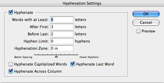
HYPHENATION RULES
Don’t rely on the software to judge where hyphens should be placed. At the end of lines, leave at least two characters behind and take at least three forward. For example, “ele-gantly” is acceptable, but “elegant-ly” is not because it takes too little of the word to the next line. Avoid leaving the stub end of a hyphenated word or any word shorter then four letters as the last line of a paragraph. Avoid more then 3 consecutive hyphenated lines. Avoid hyphenating or breaking proper names and titles. Creating a non-breaking space before and after the name will ensure that the name will not break. Avoid beginning three consecutive lines with the same word Since software programs deal with line breaks automatically based upon a number of variables, it is possible to have paragraphs with consecutive lines beginning with the same word. When this happens simply adjust the text to avoid/fix the problem.
Hyphenation rules pay attention to:
-- how the text is read avoid widows (one word on the last line of a paragraph)
-- avoid hyphenating or line brakes of names and proper nouns
-- leave a least 2 characters on the line and 3 following
-- avoid beginning consecutive lines with the same word
-- avoid ending consecutive lines with the same word
-- avoid ending lines with the words: the, of, at, a, by...
-- never hyphenate a words in a headline and avoid hyphenation in a callout
_________________________________________________________________________________________________
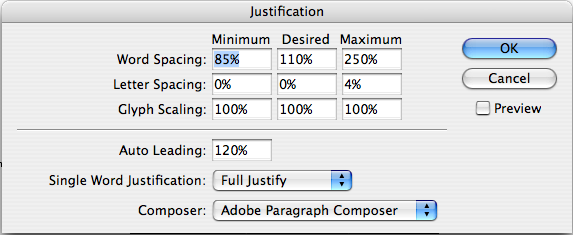
JUSTIFICATION
Justify text only if the line is long enough to prevent awkward and inconsistent word spacing. The only time you can safely justify text is if your type is small enough and your line is long enough, as in books where the text goes all the way across the page. If your line is shorter, as in newsletter, or if you don't have many words on the line, than as the type aligns to the margins the words space themselves to accommodate it. It usually looks awkward. You've seen newspaper columns where all text is justified, often with a word stretching all the way across the column, or a little word on either side of the column with a big gap in the middle. Gross. But that's what can happen with justified type. When you do it, the effect might not be as radical as the newspaper column, but if your lines are relatively short, you will inevitably end up with uncomfortable gaps in some lines, while other lines will be all squished together. When your work comes out of the printer, turn it upside down and squint at it. The rivers will be very easy to spot. Get rid of them. Try squinting at the example on the bottom of the previous page.
A general guideline for determining if your line length is long enough to satisfactorily justify the text: the line length in picas should be about twice the point size of the type; that is, if the type you are using is 12 point, the line length should be at least 24 picas (24 picas is 4 inches-simply divide the number of picas by 6, as there are 6 picas per inch). Thus 9-point type should be on an 18-pica line (3 inches) before you try to justify it, and 18-point type should be on a 36-pica line (6 inches). The rulers in most programs can be changed to picas, if you like.
Rivers
In typography, rivers, or rivers of white, are visually unattractive gaps appearing to run down a paragraph of text. They can occur with any spacing, though they are most noticeable with wide word spaces caused by either full text justification or monospaced fonts.
Widows and Orphans
Never leave widows and orphans bereft on the page. Avoid both of these situations. If you have editing privileges, rewrite the copy, or at least add or delete a word or two. Sometimes you can remove spacing from the letters, words, or lines, depending on which program you’re working in. Sometimes widening a margin just a hair will do it. But it must be done. Widows and orphans on a page are wrong.
Widow
When a paragraph ends and leaves fewer than seven characters (not words, characters) on the last line, that line is called a widow. Worse than leaving one word at the end of a line is leaving part of a word, the other part being paraphrased on the line above.
Orphan
When the last line of a paragraph, be it ever so long, won’t fit at the bottom of a column and must end itself at the top of the next column, that is an orphan. ALWAYS correct this.
Attention to Detail
To design professionals it will be apparent if you “know” type or if you don’t. When a professional designer looks at your type, they can immediately tell your understanding of typography. Ultimately getting and keeping the job you want, whether in traditional or digital design, requires that you know and master the typographic rules, terms and application. Take care, invest the time needed, and pay attention to every detail.
_________________________________________________________________________________________________
RULES CHECKSHEET
The following is a compendium of the rules established in this book. Check through the checksheet before when you are doing the final refinements of a project.
-- Use only one space between sentences.
-- Use real quotation marks.
-- Use real apostrophes.
-- Make sure the apostrophes are where they belong.
-- Hang the punctuation off the aligned edge.
-- Use en or em dashes, use consistently.
-- Kern all headlines where necessary.
-- Never use the spacebar to align text, always set tabs and use the tab key.
-- Leave no widows or orphans.
-- Avoid more than 3 hyphenations in a row.
-- Avoid too many hyphenations in any paragraph.
-- Avoid hyphenating or line brakes of names and proper nouns.
-- Leave a least 2 characters on the line and 3 following.
-- Avoid beginning consecutive lines with the same word.
-- Avoid ending consecutive lines with the same word.
-- Avoid ending lines with the words: the, of, at, a, by...
-- Never hyphenate a words in a headline and avoid hyphenation in a callout.
-- Never justify the text on a short line.
-- Keep the word spacing consistent.
-- Tighten up the leading in lines with all caps or with few ascenders and descenders.
-- Use a one-em first-line indent on all indented paragraphs.
-- Adjust the spacing between paragraphs.
-- Either indent the first line of paragraphs or add extra space between them – not both.
-- Use a decimal or right-aligned tab for the numbers in numbered paragraphs.
-- Never have one line in a paragraph in the column or following.
-- Never combine two serif fonts on one page.
-- Rarely combine two sans serif fonts on one page.
-- Rarely combine more than three typefaces on one page.
-- Use the special characters whenever necessary, including super- and subscript.
-- Spend the time to create nice fraction or chose a font that has fractions.
-- If a correctly spelled word needs an accent mark, use it.
_________________________________________________________________________________________________
TYPOGRAPHY RULES
1. Insert only a single space after all punctuation
Inserting two spaces after a period was common when using a typewriter. Monospace typefaces were designed to occupy the same amount of space no matter the width of the character. Therefore, two spaces were needed to identify the end of a sentence and the beginning of another sentence. With the introduction of the Mac and digital type, characters are designed proportionately, which allows for the correct practice of using one space after all punctuation.
2. Use proper ‘em’ dashes, ‘en’ dashes, and hyphens
An em is a unit of measure equal to the point size that you are using. An em dash is a type of punctuation used to offset clauses in a sentence or to indicate an abrupt change in thought. An en dash is equal to half the length of an em dash. En dashes are used to denote duration (time.)
3. Use proper quote and apostrophe marks
Use true quotation marks and apostrophes instead of using inch marks and feet marks. Place all punctuations inside the quotation marks.
4. Use True Small Caps
When setting text that contains acronyms, select a typeface with small caps as a family. Selecting small caps from the style menus is a poor choice because the compute reduces the overall size of the type by 80%. This changes the stroke weight and the feel of the font. Expert sets in the Adobe Type Library have small caps options.
5. Add letter spacing to capitalized text and small caps
Letterspacing is the amount of space between characters in a word. Some software programs caller letterspacing tracking. Use positive number values (to about 2 or 3) to open up letterspacing to capitalized text and small caps, except when periods are used between characters.
6. Use old style figures when appropriate
Old style figures, also known as non-lining figures do not line up on the baseline as regular or lining numerals do. They can be found in various fonts. If the body text has a significant amount of numbers, research a font family where they are included. If non-lining numerals are not available, use a slightly smaller point size for the lining numbers. Think of lining numbers as upper case numbers and non-lining numbers as lower case numbers.
7. Use caps properly
With options given to you by almost any type family (bold, point size, etc) you will seldom need to use all caps to draw attention to your text. Not all typefaces are legible when set in all caps; esp. true for script and decorative typefaces. Short headlines may be the once exception to this rule.
8. Use copyright, register, and trademark marks properly
The copyright, register, and trademark characters need to be reduced to work with body text. At times, depending on the typeface, you may need to reduce the mark between 50% and 70%. The goal is to match the x-height. The copyright mark should be approximately 70% of the surrounding text. Unlike the ™ symbol, the © should NOT be superscripted and should remain on the baseline. ™ is usually superscripted for the chosen font. ™ and ® are normally set higher then other marks. If you choose to superscript ®, reduce it to about 60% of the size.
9. Ellipsis Character
Use the ellipsis character and NOT three periods. You can access the ellipsis by typing Option + : (colon). Allow a small amount of space before and after. However if it is not crowding the text, leave no space at all. 10. Avoid underlined text This was useful back in the days of the typewriter to draw attention to the text. With digital type and their families, you should not need to use underlined text.
10. Increase line spacing to improve readability in body text
Line spacing (aka leading) refers to the space between lines of text. It is important for readability and appearance. Leading is measured from baseline to baseline. As a rule of thumb, allow leading that is 120% of the point size. For sans serif, you may need 130% or more. When setting headlines, solid leading (leading = point size, 12/12) or negative leading (leading =< point size, 12/10) may be appropriate.
11. Body copy size
Body text is set anywhere from 9-12 points. When you print text, it is usually larger than what it looked like on the screen. So, print out your text before finalizing your layout. Type studies will help you determine the proper size before you proceed with your layout.
12. Altering fonts
Don’t alter the original typeface by stretching or condensing the letters improperly. Certain type families provide you with a lot of flexibility, so you should not need to destroy/alter text.
13. Legibility of fonts
Sans serif typefaces work well for headlines and to set text that is aligned to vertical/horizontal lines. Certain sans serif typefaces which are not very geometrical work well for body copy (i.e. Frutiger, Meta, Scala Sans, etc.)
14. Decrease line length and increase margins
Line length is a measure of text on one line. Any measure between 45 and 75 characters is comfortable for single column widths. The ideal measure for body text length is 66 characters (counting both letters, punctuation, and spaces.) For multiple columns, a measure between 40 and 50 characters is ideal.
15. Avoid letterspacing lowercase body copy
Don’t letterspace body copy as it really hampers legibility. Use letterspacing when working with caps. small caps, numbers and display text where looser type spacing may increase legibility.
16. Word spacing should be fairly close
For text meant for extended reading, the amount of space between words in a paragraph should be fairly close–about the width of a lowercase “i.” If the word spacing is too close, it appears as one giant word and legibility is decreased. Keep the spaces between words fairly thin, consistent and even!
17. Ideal column width
For single-column pages, 4.25 inches is ideal. For two-column width, columns can be as narrow as 2 inches. Turning on the hyphenation feature can improve word spacing.
18. Justification of text
Justification can be appropriate in certain places. However, it can create certain problems such as rivers and word spacing. Adjusting size of margins, decreasing body copy size, turning on auto hyphenation and manually hyphenating the text are all examples of possible solutions.
19. Choose the alignment that fits
Make sure the alignment chosen for all areas of text are legible and consistent with the design and guidelines. Left-aligned text is easier to read and set. Justified text is harder to set w/o inevitable word spacing problems. Right-aligned and centered are generally not used for body copy.
20. Rules of hyphenation
Don’t rely on the software to judge where hyphens should be placed. At the end of lines, leave at least two characters behind and take at least three forward. For example, “ele-gantly” is acceptable, but “elegant-ly” is not because it takes too little of the word to the next line. Avoid leaving the stub end of a hyphenated word or any word shorter then four letters as the last line of a paragraph. Avoid more then 3 consecutive hyphenated lines. Avoid hyphenating or breaking proper names and titles. Creating a non-breaking space before and after the name will ensure that the name will not break.
21. Avoid beginning three consecutive lines with the same word
Since software programs deal with line breaks automatically based upon a number of variables, it is possible to have paragraphs with consecutive lines beginning with the same word. When this happens simply adjust the text to avoid/fix the problem.
22. Always spell check!
Once you are finished with your design, spell check the text using both of the following: a. Use spell=check option that comes with the software you are using for the project. b. Print the document and read it. The monitor and design of the document will make text look perfect when it may not be. Even if text is given to you by a client, check it. Never ever assume that it is correct. Keep a dictionary close as well.
23. Avoid widows and orphans
Widows are either single words alone on a line or single sentences alone on a new page. Orphans are single lines of copy alone at the end of a page.
24. Kerning in headlines
Adjust the space between two particular letters to allow for more consistent negative space.
25. Indents
In continuous text, mark all paragraphs after the first with an indent of at least one “em” (3 spaces). Do NOT use three spaces but rather use the tabs or indents option in your software.
26. Items in a series
Items in a series do not use a comma before the word “and.” (i.e., ‘peaches, apples and oranges.’)