visual communication
Typography 1
:: email: andrea herstowski :: email: tim hossler
.................................................................:: Airport Codes
.................................................................
:: Short films :: Audio
:- films by Hillman Curtis
:- sagmeister | vicore | scher
:- Type Radio
:- Type Culture Movies
.................................................................
..........
- - - - - - - - - - - - - - - - - - - - - - - - - - - - - - - - - - - - - - - - - - - - - - - - - - - - - - - - - - - - - - -
VISC 202
Project One: Airport Code
create a logotype using an existing airport code (MCI, JFK, MKE...)
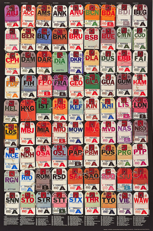
full list of International Air Transport Association airport codes
OBJECTIVES
_ understand the anatomy of letterforms
_ explore the potential of letterform combinations to create symbols
_ recognize and identify type classifications
_ understand primary and secondary font combinations
_ understand and create a clear hierarchy
_ becoming comfortable with Adobe Illustrator
the problem
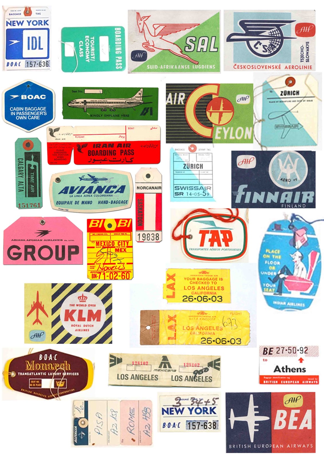
combine three letters—into one (memorable) typographic mark/logotype. the solution should rely exclusively on typography—so no additional shapes, containers, symbols, ornaments, illustrations or other. here's a growing set of comparables, vintage logos *be careful not to be overly inspired by any of the things you see on-line, in books, in the world...
for reference..what visual attributes could define those qualities? would a serious airport/city look light or heavy? would it look static or active or humanistic or geometric or else?
you will pick your airport code but you can't have the same code as someone else in the class. so when it is your turn to pick you need to have a few backup choices.
- - - - - - - - - - - - - - - - - - - - - - - - - - - - - - - - - - - - - - - - - - - - - - - - - - - - - - - - - - - - - - -
Monday, August 22
_ Class Syllabus
_ Set up blog on blogger or tumblr send me the link to your blog
HOMEWORK
_ Read: The Art of Travel
_ Read: Letter Fountain pages 40-41, 90-98 (take notes)
_ print out FontSheets_p1.pdf (yes all can be front to back, bring to every class.)
Tracing paper: you will need tracing paper for the next class. (yep buy it but you can share a pack with a person or purchase a roll. you will need at least 10 sheets.
Pencil, pens (black thick and thin), scissors, transparent tape...
- - - - - - - - - - - - - - - - - - - - - - - - - - - - - - - - - - - - - - - - - - - - - - - - - - - - - - - - - - - - - -
Wednesday, August 24
_ History of Typography by Ben Barrett-Forrest.
_ Discuss the Art of Travel
_ Lecture: Parts of the Letter (take notes)
_ Anatomy of Type.pdf
_ Start to fill out FontSheet info
_ Introduction to Project 1: Airport Code
_ pick airport code, research city
_ Figure Ground.pdf
_ Closure.pdf
_ Modular.pdf
_ Sign up for dropbox (basic free version)
_ Go to the lab an open up fonts in FontBook
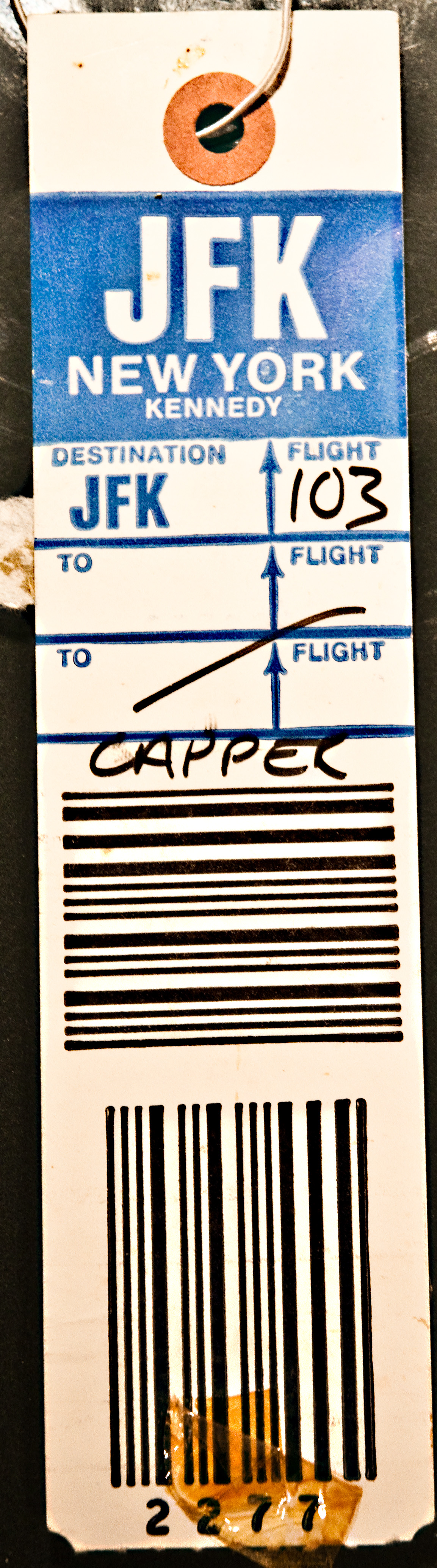
The airport code typographic marks are to be made by combining three letters into one logotype/ wordmark. The airport code must be recognizable and read in the correct order MCI must read M, C, I.
Using your printed out typefaces as inspiration, freely combine, join and/or arrange as you see fit. Sketch, cut and paste, use grid paper, use tracing paper. You may use only type no images, lines, shapes...just type. Working in b&w (no gray).
You are expected to create 50 analog (hand drawn/traced) typographic marks. No computer (for this round).
HOMEWORK (starting in class, finishing as homework)
_ research your city and create a word list at least 25 words describing the city
_ create 50 logo types
Below is an outline on how to get to 50. Also always refer to the TIPS.
Create at least 10 solutions using each of these methods (50 sketches total). Try at least 2 - 4 studies in each category before you leave class so that you understand your homework. Work at least 1 - 3 inches tall. Have your 50 sketches organized and clear for crit on MONDAY. If you use pencil then you need to fill them in black we can clearly see your explorations.! see examples
No going to the computer and printing out different fonts. Use different fonts for your exploration not the same ones over and over and over). You may change the letter forms to be more the same or you can change them to be more different from one another.
FIRST CREATE A STUDY... USE MULTIPLE SHEETS OF PAPER TO COMPLETE IT
_ How are each of your letters constructed? De-construct them
_
What attributes / characteristics are the same?
_
What attributes s / characteristics are different? _ Crop the letters.
_ How much do we need to see of a letter to recognize it?
_ What parts do the letters share a baseline, cross bar... (redraw them)
_
How can you combine the letters
_
How can you customize the logotype
_
How far can you push legibility? is it OK if you can't read your letter forms clearly?
_ Try to make your round letter forms more square or rectilinear
_ Try to make your square/rectangle letter forms more round
*work quickly, but cleanly / craft should be considered.
For each prompt explore
_ How can you manipulate the letter forms
_ How can you combine them
*NEED MORE GRIDS? HERE YOU GO!!!
prompt 1) use a grid (square, dot, diamond, diagonal) to draw your letterforms creating an airport code logotype of the 3 letterforms. You are not using a font to create your logotype you are creating the letters yourself using a grid. Look up bitmapped fonts for some examples. 10 different approaches).
prompt 2) using only geometric shapes (full or parts of a circle, square, triangle, rectangle and line to create an airport code logotype of the 3 letter forms. You are not using an existing typeface you are creating your own letters. Look up modular fonts (10 different approaches).
prompt 3) use parts of the letter to create part of the next letter or make the round letters more square and/or the square parts more round. Use a part of one letter to recreate the next letter. Please use only one font (you can different styles in the same font family) to create an airport code logotype of the 3 letter forms. Each study has to remain in one font family (reg, light, bold, italic...) (10 different approaches).
prompt 4) use the gestalt principle of closure or form and counterform/ negative space to work out your solution. You can use 2 or 3 different fonts (you can use different styles light reg bold italic) to create your 3 letterforms. You can draw your own letterforms...Also you don't have to use the full letter maybe through "closure" we see the part of the letter without it being there. These are not easy they will take time you have lots of ways to get there. (10 different approaches).
prompt 5) using the VisCom fonts choose any 5 fonts and as many styles as you want and create 10 different approaches using the fonts / font families of your choosing. But please only pick from the Viscom font family. Do this on a school machine. Print them out and sketch your 10 designs by hand. You are only going to the computer to get fonts and styles you want to use.
There are no wrong answers here. The only wrong is if you don't finish and/or if all of your solutions look the same. You are trying to come up with 50 different solutions. Explore. Take risks. Don't be afraid. Don't wait until Monday mourning to do this. You will fail. Have your 50 sketches organized and clear for crit on MONDAY.
READ: Character Characteristics in the Typographic Workbook
Word List: printed out 25 words describing your city
- - - - - - - - - - - - - - - - - - - - - - - - - - - - - - - - - - - - - - - - - - - - - - - - - - - - - - - - - - - - - - -
Monday, August 29
_ Overview or Character Characteristics
_ Overview Letter Fountain pages 40-41, 90-98
_ Illustration tips: turn on fonts, outline stroke, pathfinder tool,
multiple art boards
_ Discuss word list
_ Review logotype studies
HOMEWORK
_ Read: Letter Fountain the rest of the chapter
_ Design: Based on the class crit take “the best” 5 marks and put them onto illustrator.
Create
4 iterations of each of the 5. How can you make them better? If you used fonts you can explore different fonts.
Total of 20 digital marks (minimum)
Work large—somewhere between 5 inches wide (2 - 4 per page)
Black and White. Print everything for class.
- - - - - - - - - - - - - - - - - - - - - - - - - - - - - - - - - - - - - - - - - - - - - - - - - - - - - - - - - - - - -
Wednesday, August 31
_ review Letter Fountain: the rest of the chapter
_ review 20 logo designs
_ what is the proper name of your airport?
_ introduce a secondary font.
_ get VisCom fonts onto your computer. If they don't work then you need to work on a school machine.
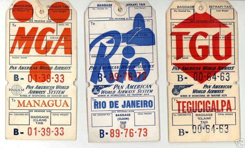
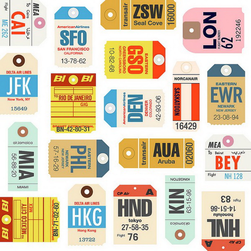
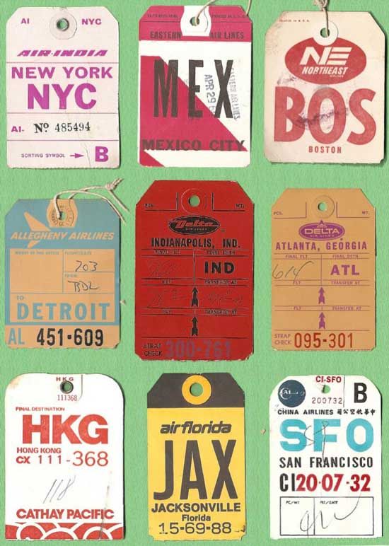
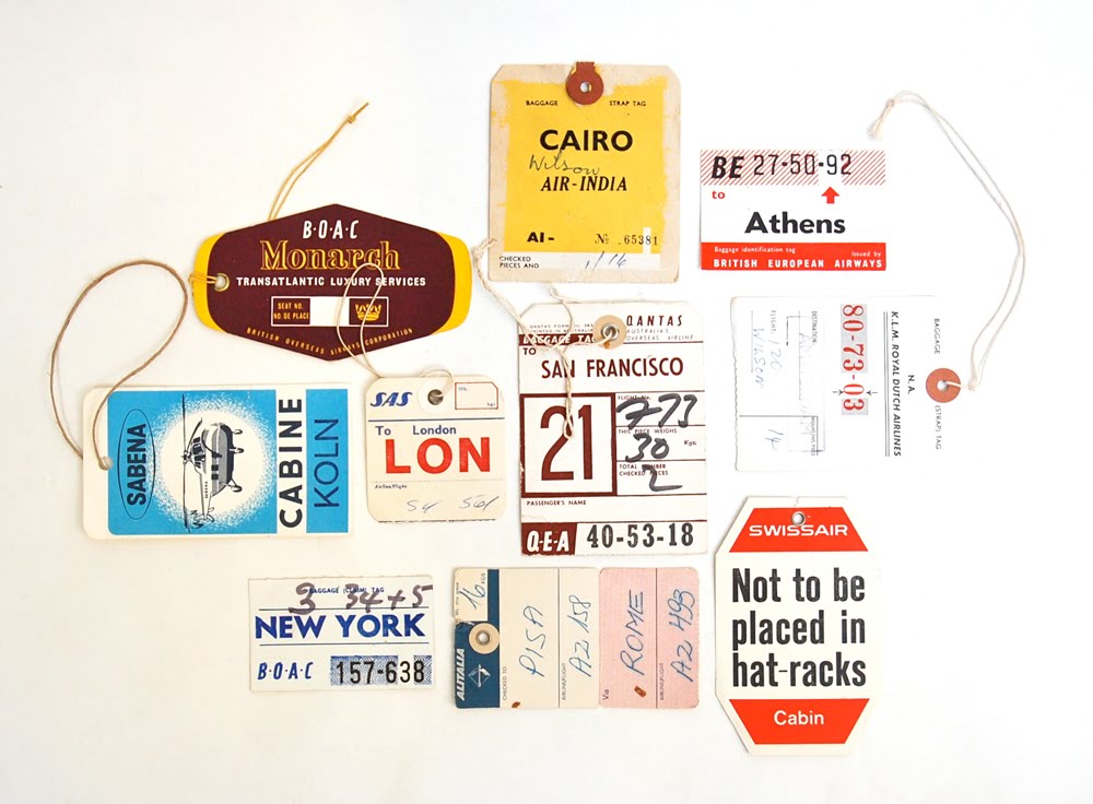
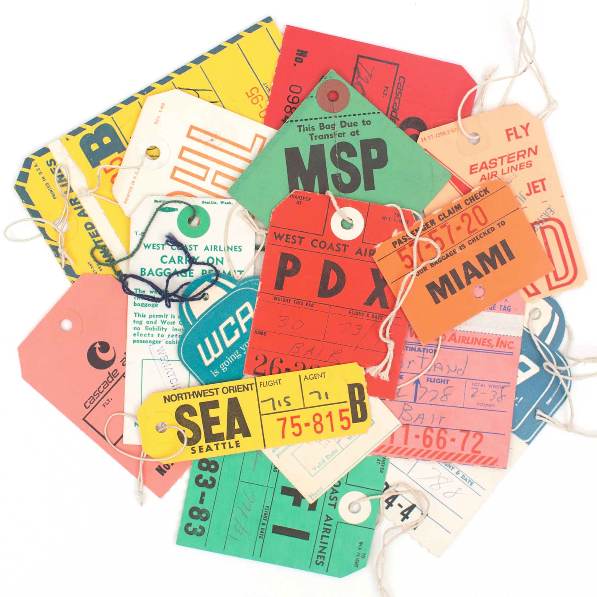
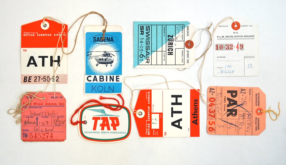
_ luggage tag examples: 1 | 2 | 3 | 4 | 5 | 6 | 7 | 8 | 9 | 10 | 11 |
HOMEWORK
BLOG: Based on the Character Characteristics / Letter Fountain readings answer the following on your blog:
What is another name for Uppercase Letters? What is another word for Lowercase Letters? What is the difference between Font and Typeface? Where do we see the first example of Roman Captitals? What are the 14 Square shaped letters in our alphabet? What is the difference between italic and oblique (give and show examples) What is a type family, give examples. What letters are drawn to be optically corrected and why are they corrected optically? What are the first 6 - 9 letters drawn when creating a typeface and why are they first? What word do type designers use to test a typeface they are drawing/creating? Why are those letters used? Explain the history of measuring type. What are points and picas? How many points are in an inch? How many picas? What is an em? What is an en? Define wordspace, kerning, and leading. Name at least 6 pairs of letters that need to be kerned and why. What is a ligature? What are the 3 kinds of type alignment? What do we "hang" in typography? What are lining figures? Show an example. When do you always want to use aligning figures (numbers). What are old style / non-aligning figures? Name a few fonts with non-aligning figures. When do you use non-aligning figures? Lastly know your parts of the letter. Take the Quiz in the back of your workbook. (you will see it again)
READ and SUMMARIZE on your Blog: The Art of the Luggage Tag
DO in this order...
Create a Color Palette: create a color palette for your "brand"
Select the secondary font for your brand. What goes with, compliments or contrasts your mark. Place your mark 4 times on one sheet of paper and type out the name of your city under it. Try at least 12 secondary fonts. Try all caps, Try mixed case, Try all lowercase. Look at the proportions of size, contrast, style. What works and why?
Refine Mark: “the best” digital mark.
Refine your mark at least 10 times. Looking at the letterforms, how can you customize the logo type? Make it better.
Show each
Show each of the 10 on its own piece of paper show it at least 5 inches wide
Reduce it to 1 inch wide
Create a color version of the mark. Lock up a secondary font
(*each paper needs to have 5 inch logo, 1 inch logo, 1 inch logo with secondary font, 1 inch logo in color)
Design and print 10 different airport luggage tag designs. (first you need to research and descide on what size they shouldbe and what goes on them?
Print all of this out. You will need it all in color. Your pages should look professional.
- - - - - - - - - - - - - - - - - - - - - - - - - - - - - - - - - - - - - - - - - - - - - - - - - - - - - - - - - - - - - - -
MONDAY SEPT 5 is LABOR DAY: NO CLASS (but you do have homework - don't wait.
- - - - - - - - - - - - - - - - - - - - - - - - - - - - - - - - - - - - - - - - - - - - - - - - - - - - - - - - - - - - - - -
Wednesday, September 7
_ review the questions that you were to blog (what is still unclear)
review logos and type studies and airport tags
_ make sure your blog posts are done before class begins
_ what are pms colors and cmyk?
_ how to print in the epsons
HOMEWORK
Refine the best mark and tag and see below on how you should present it for the final on Monday.
- - - - - - - - - - - - - - - - - - - - - - - - - - - - - - - - - - - - - - - - - - - - - - - - - - - - - - - - - - - - - - -
DUE MONDAY, Sept 12
class crit + and Quiz (Character Characteristics)
Brand Board: print out one 13 x 19 on the Epson printer with all the following organized on the 13 x 19 sheet
see example, file is on dropbox
_ your name
_ Airport code (at least 4 x 4 and 1 x 1)
_ color palette (cmyk colors noted)
_ 3 words that describe the city your airport is in AND the logo type
- secondary font (example and why)
_ baggage tag (can reduce the tag for the board)
** Mount your 13 x 19 Epson print onto 13 x 19 foam core.
***
do not spray mount inside or right ouside the building, Use Studio Tac or Double Tac
****no that is not double sided tape -- do not use double sided tape it will look BAD.
Craft 10% of your grade, clean straight edges, not mangled, securely attached to the board, and CLEAN
Black and White PRINT of your Brand Board
please print your brand board black and white, scale to fit on a 11 x 17 so when we are grading we can make comments on that and leave your beautiful 13 x 19 board clean and not marked up. *this has been added since class.
Comped version of the baggage tag (full size, full color, trimmed and looking like a tag)
yes that means there are 2 sides to the tag.
Process Book: spiral bind (jayhawk, fedex,...)
_ Title page: your name, name of the project
_ Project Description
_ ALL of your process .. this means all process is 50% of your grade. (all of it neatly organized in chronological order best if you label each step of your process) you may need to copy or scan in your tracing papers and irregular papers onto 8.5 x 11 sheets.
_ Project Reflection
*also bring your files we will go through how to upload ot Behance in class.
___
No class Wednesday you are just lucky.
So here is your homework for next
Monday, Sept 19.
Post your Airport Code project onto Behance and email your prof the link.
Tips for Behance. Save your parts at RGB jpgs. The Max width is 1400px if you want something to bleed off the edges make it 1400 wide can however long you need it. Write a project description. Tags: your name, airport code, KU Design, ...
PRINT 15 copies Black and White on 8.5 x 11 (prints or copies you just need 15 of the grid)
READ Chapter 5 in the Typographic Workbook. Make of copy of the quiz. Take it and hand it in for homework.
READ Chapter 9 in the Typographic Workbook. Make a copy of the quiz. Take it and hand it in as homework.
Answer on your BLOG: How do you tell the 5 classifications (Old Style, Transitional, Modern, Slab Serif and Sans Serif) apart. Give at least 5 characteristics for each classification and name at leaset 5 typefaces that fit under each classification.
check out these TM Research Archive and Thinking Form (after you check out TM and TF you can google)
BLOG: Choose 5 designers that are no longer living (from the list) and write a short blurb and include at least 3 images for each of the designers. Post on your blog. George Olden, Paul Rand, Massimo Vignelli, Josef Muller Brockman, Max Huber, Emil Ruder, Max Bill, Herb Lubalin, F.H.K Henrion, Robert Massin, El Lissitzky, Piet Zwart. (include sources)
BLOG: Choose 5 living designers (from this list) and write a short blurb and include at least 3 images for each of the designers. Post on your blog. Erik Spiekermann, Matthew Carter, Gail Anderson, Wim Crouwel, Stefan Sagmeister or Jessica Walsh, April Grieman, Jessica Hische, Paula Scher, Bobby Martin (OCD Design), Bruno Monguzzi, Emil Ruder, Armin Hoffman, Wolfgang Wiengart, Neville Brody, Emery Douglas. (include sources)
*look for a good video with your person or about your person and include that on your blog.
** Feel free to tell me who should be on the list that we didn't include! This is only part one we will do this again, and again...
this is only the first list.