Professor: Andrea Herstowski
Office: 353 Chalmers Hall
Office
hours: by appointment
email: herstow@ku.edu
.................................................................
Wed. January 19
Mon. January 24
Wed. January 26
Mon. January 31
::::
A Study of Lowercase Letters
_ _ _ _ _ _ _ _ _ _ _ _ _ _ _ _ _ _ _ _ _ _ _ _ _ _ _ _ _ _ _ _ _ _ _ _ _ _ _ _ _ _ _ _ _ _ _ _ _ _ _ _ _ _ _ _ _ _ _ _ _ _ _
"Modularity is a very important concept in type design. It means that a typeface system is made out of smaller components and they are repeated all across a system to create this visual pattern that you can then interpret as letter forms". — Lynne Yun Watch: modularity-of-type
Create an original nclopdh (lowercase only) perfectly drawn in Glyphs
using the pdf as a starting point design your own nclopdh.
Objectives:
basics of traditional text face design and basics of Glyphs
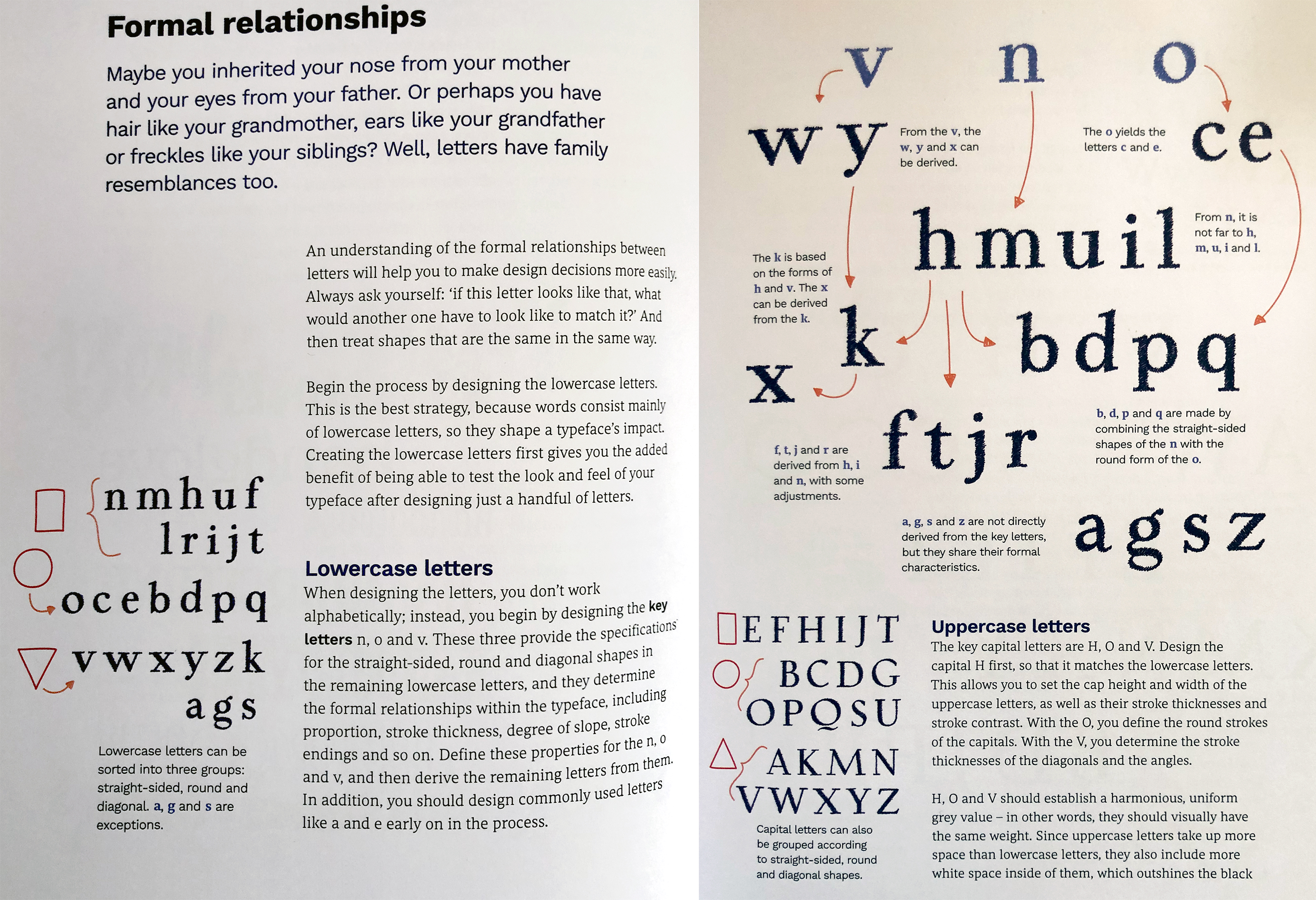
understand construction of the n and understand why it is a key letterform
understand how font design is a system - similarities and differences between characters.
understand
the extrema, points and handles, how to draw and correct in Glyphs
understand and construct
overshoots
Fred Smeijers is a Dutch graphic, type designer and writer.
- Watch https://adobe.eyedo.com/fr-FR/#!/Live/Detail/16423 (11:15 -
_ _ _ _ _ _ _ _ _ _ _ _ _ _ _ _ _ _ _ _ _ _ _ _ _ _ _ _ _ _ _ _ _ _ _ _ _ _ _ _ _ _ _ _ _ _ _ _ _ _ _ _ _ _ _ _ _ _ _ _ _ _ _
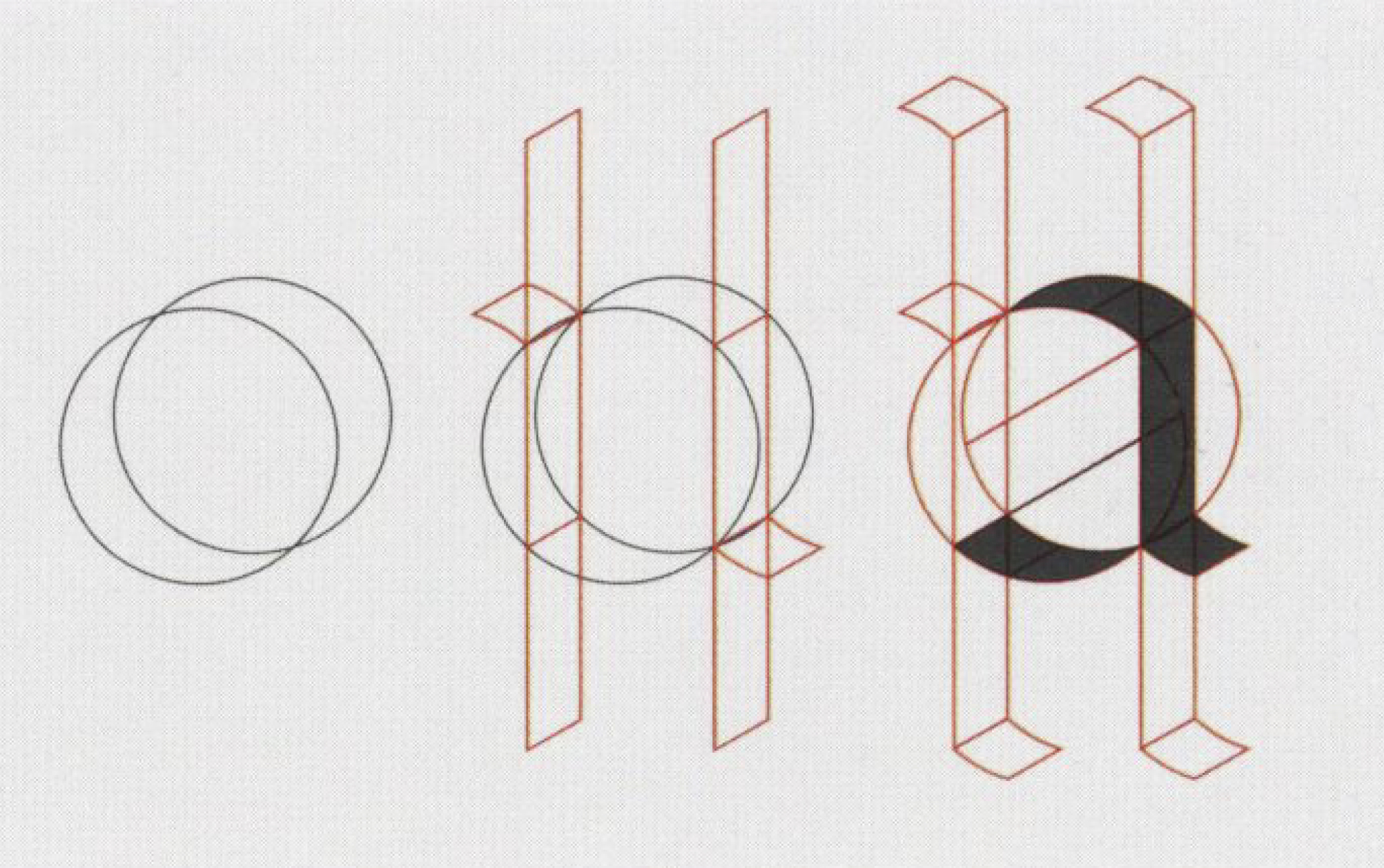
Frank E Blokland (image from Reading Letters: Designing for Legibility, Sofie Beier :
Dr. Frank E. Blokland’s PhD research at Leiden University: On the Origin of Patterning in Movable Latin Type: video https://www.youtube.com/watch?v=IORbqkDZdoY
_ _ _ _ _ _ _ _ _ _ _ _ _ _ _ _ _ _ _ _ _ _ _ _ _ _ _ _ _ _ _ _ _ _ _ _ _ _ _ _ _ _ _ _ _ _ _ _ _ _ _ _ _ _ _ _ _ _ _ _ _ _ _
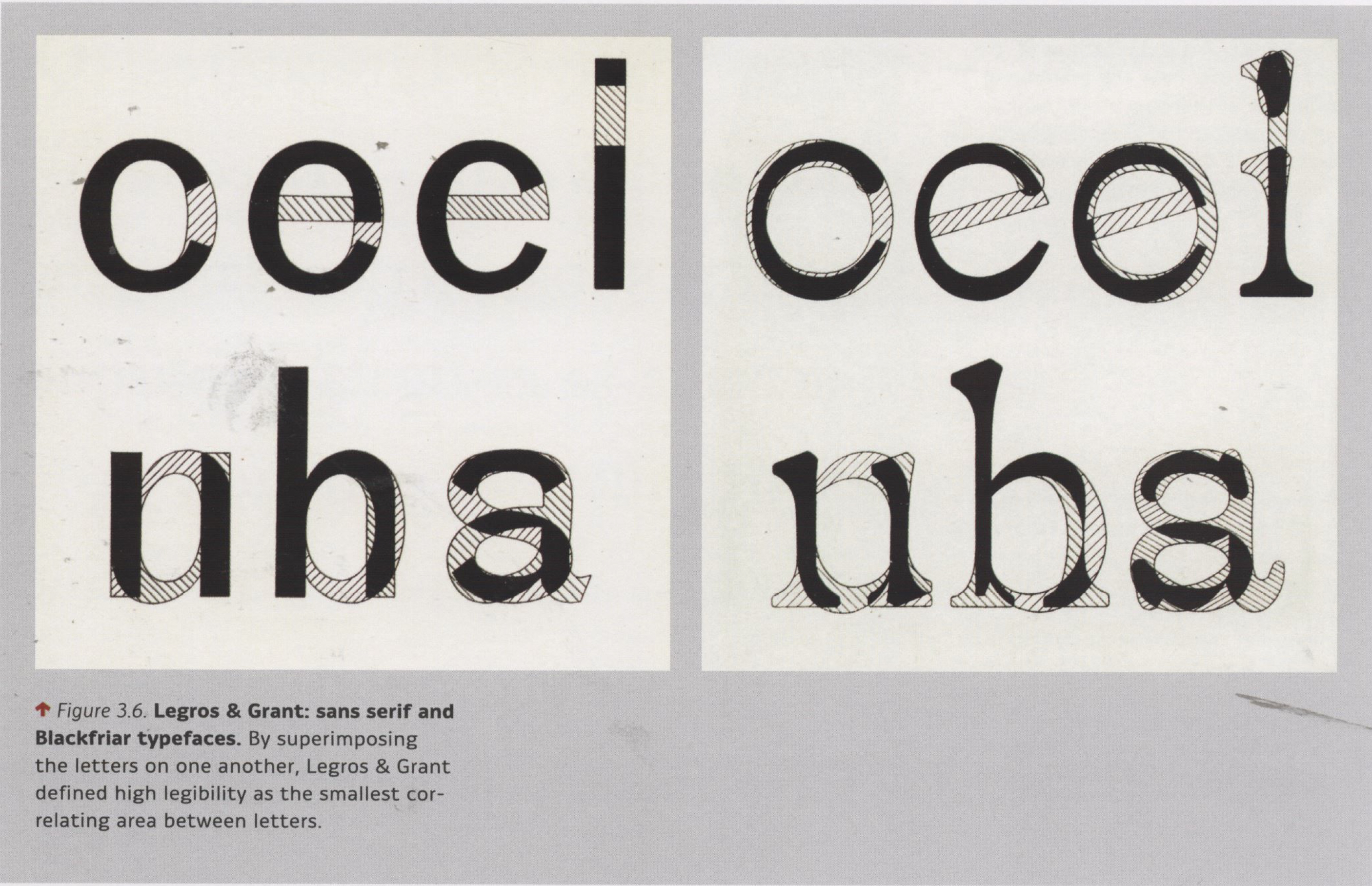
from Reading Letters: Designing for Legibility, Sofie Beier
_ _ _ _ _ _ _ _ _ _ _ _ _ _ _ _ _ _ _ _ _ _ _ _ _ _ _ _ _ _ _ _ _ _ _ _ _ _ _ _ _ _ _ _ _ _ _ _ _ _ _ _ _ _ _ _ _ _ _ _ _ _ _
RESOURCES
Homework.pdf
Examples.pdf
Anatomy refresher
Formal Characteristics.pdf
Characteristic Choices
Adobe.eyedo.com/fr-FR/#!/Live/Detail/16423 (11:15 -
LetterFountain
_ _ _ _ _ _ _ _ _ _ _ _ _ _ _ _ _ _ _ _ _ _ _ _ _ _ _ _ _ _ _ _ _ _ _ _ _ _ _ _ _ _ _ _ _ _ _ _ _ _ _ _ _ _ _ _ _ _ _ _ _ _ _
Wed. January 19
_ Syllabus
_ Slack: typeuniverse.slack.com
Intro to project
_ Watch Paristyle : Tobias
_ Formal Characteristics.pdf
_ LetterFountain
_ Proportions
_ Watch: Modularity of type
_ Watch: Letters based off of other letters
_ Watch: https://adobe.eyedo.com/fr-FR/#!/Live/Detail/16423 (11:15 -
Work in class to finish 1 set so you know what is expected for homework.
HOMEWORK
Review the links from the lecture, watch and read something. Look at your notes, look at what you started in class.
As part of your homework if you want to watch these they could be interesting at this stage...
_ If you didn't watch this before... Gail Bichler : found
Please Read: this article -- it is very short. Thoughts? Letters/Fonts/Typefaces you think are particularly beautiful or ugly -- add to #inspriration with some comment.
Thinking about what we talked about letter construction/ typographic systems create your own original nclopdh. To start use the Homework.pdf. Choose one of the 4 examples and go from there to create new new letterforms and then expand the number of letters to nclopdh. Explore at least 8 different nclopdh ideas. Use the resources above, read over what we talked about in class. Have fun. Work only by hand. Work full-size (original size).
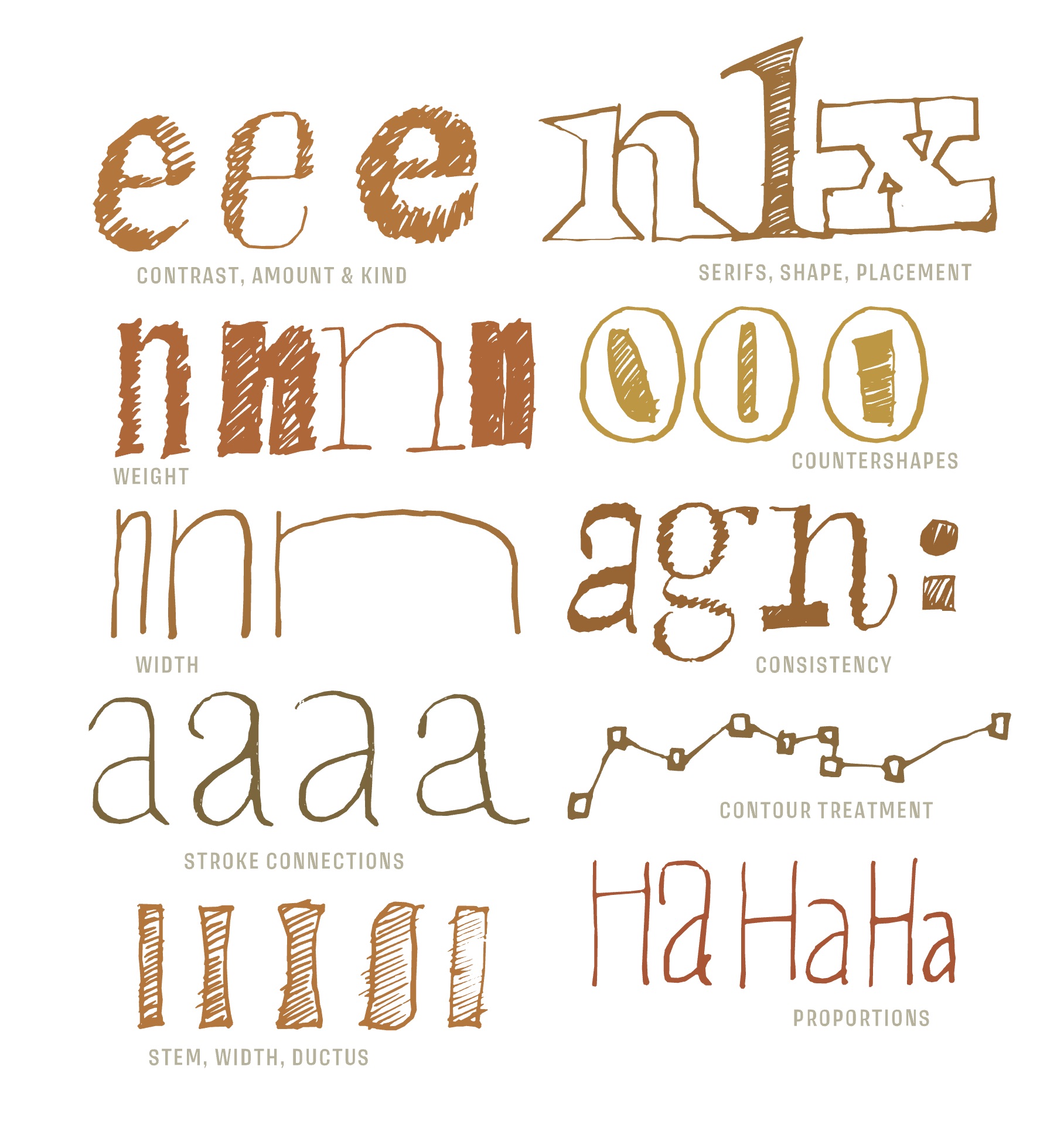
Think about (explore) contrast (difference between thick and thins, weight (light vs bold), x-height/ ascenders/ descender. Think about (explore) character width, serifs, counters and consistency. Think about (explore) how tall you make the ascender of the h and how effects the feeling of the letters. I understand the WANT to make something cool/funky/'different', but please try and keep your letters on the simple side. And please try to stick with some sort of serif. You will learn more about drawing in glyphs if you embrace the serif for this assignment.
Use tracing paper, grid paper.
Don't outline. Draw filled in shapes.
Constructed letters only.
NO hand-lettering.
Try to sketch neatly or go back and straighten things out and refine consistency.
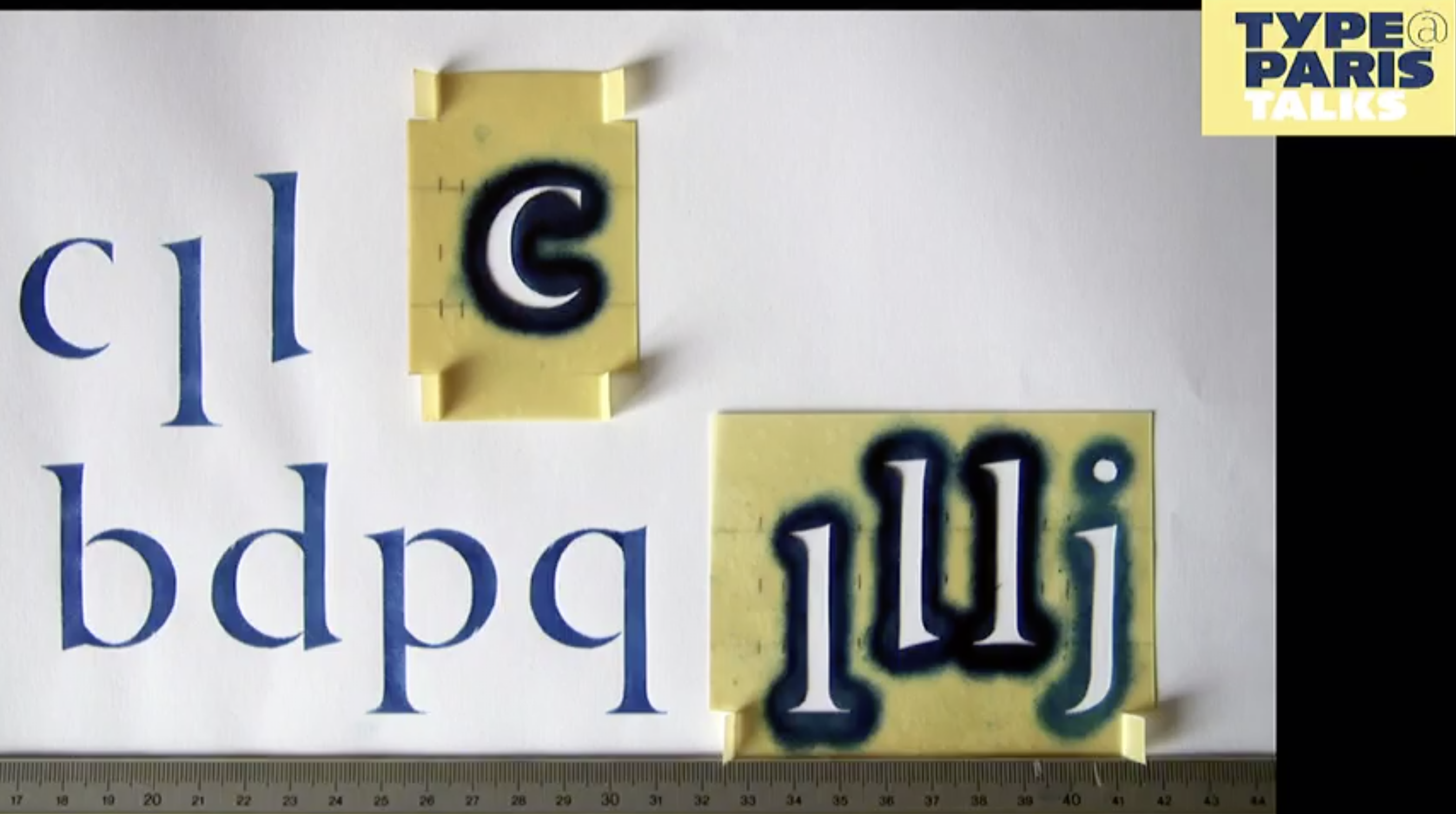
Bring your 10 different nclopdh explorations. By hand not digital. Be prepared to talk about them and have some favorites. Have no fear. Don't think about what I want. Make 10 different explorations of the set. Try to establish or at least think about a set of rules for each set. Think about it as a system. Notice and work with how the letters are constructed, build each character from the other. c + l = d. flip the d to make the p. etc.
We will start in Glyphs next class if youlike to learn by watching videos then start here
Starting with the h: www.youtube.com
Watch: https://glyphsapp.com/get-started
Read: glyphsapp.com/tutorials/drawing-good-paths
there are vidoes on Lynda.com....
- - - - - - - - - - - - - - - - - -
Mon. January 24
Readings or Videos: show and tell
Crit letters/sets. Discuss parts. Scan the or take a photo of the best idea to put into Glyphs. I use the Lightroom app or Adobe Scan. Make sure the work is square / meaning straight, square on the page/straight. Horizontal/ right reading! Rotate them if necessary. Place the scans into your Scans on the google drive.
_ Make a folder on the class google drive and follow the structure below
Make folder on the google drive. Use this folder/file structure for every project.
Folder: YourName_Poject Name inside that folder a
Folder: Scans with your Scans/Sketches,
Folder: Glyphs with your glpyhs app file and the otf file,
Presentation pdf,
Project Overview (google doc or word) your review of the project
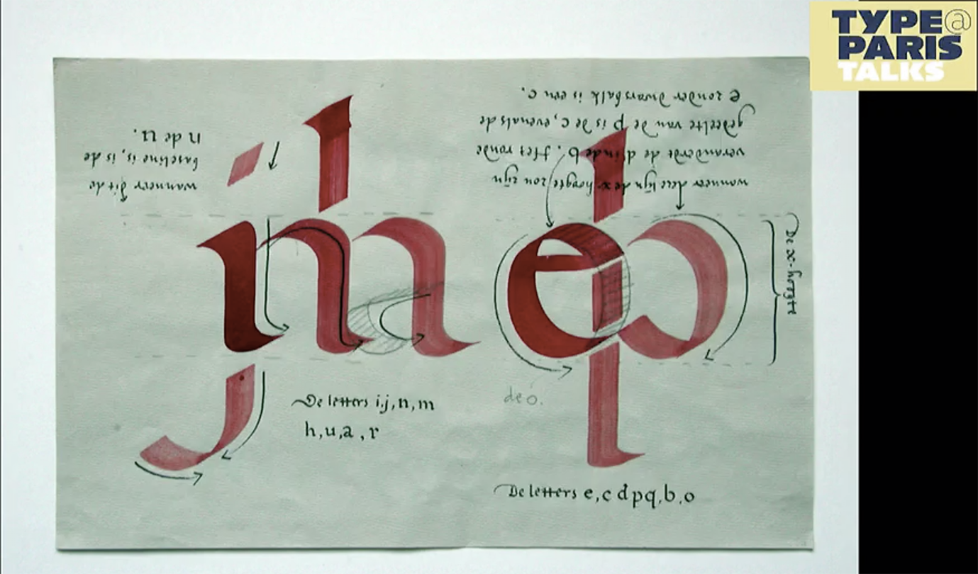
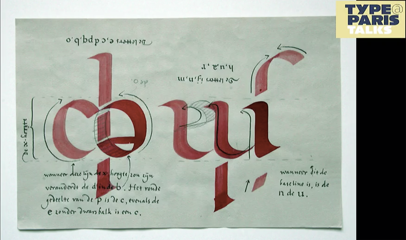
Look at the letters, break them into parts, look at the stems, arches, counters.
Intro to Glyphs tutorial.
Tutorial Steps
___ Draw an H, A, O
___ Change the Fit Curve
___ Draw Good Paths: glyphsapp.com/tutorials/drawing-good-paths
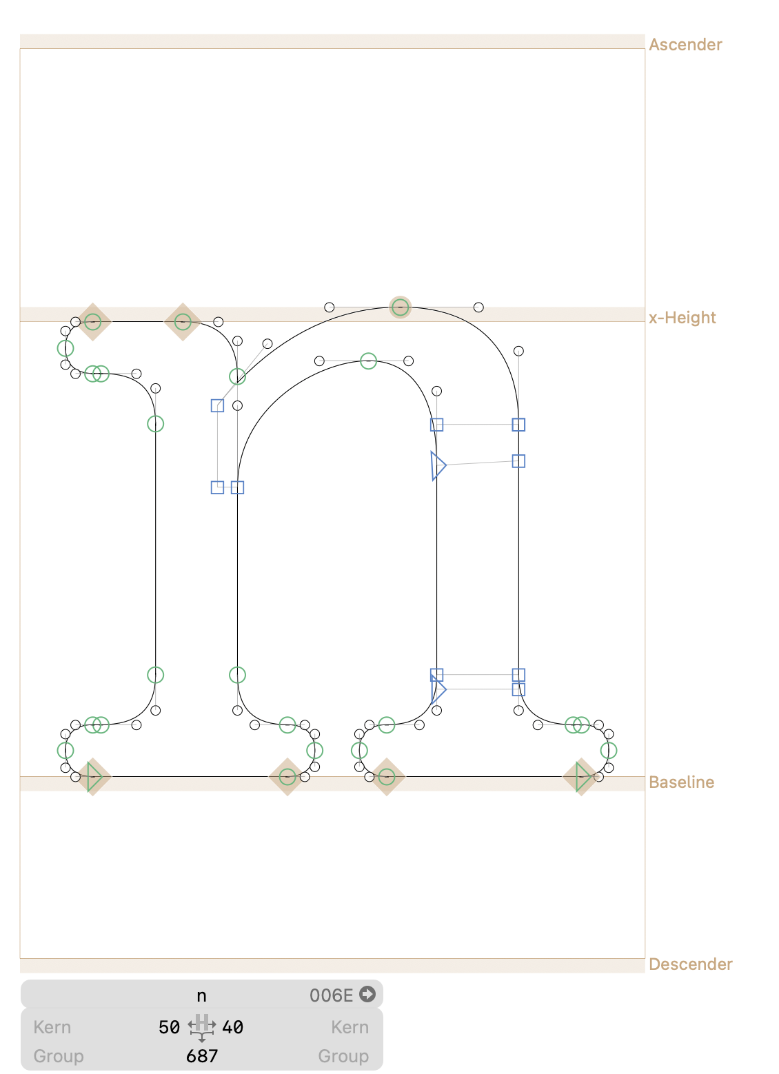
___ Start with the n
___ Initial drawings: define key components to use over and over (stem width, contrast, serifs)
___ Draw the stem - note the Dimensions
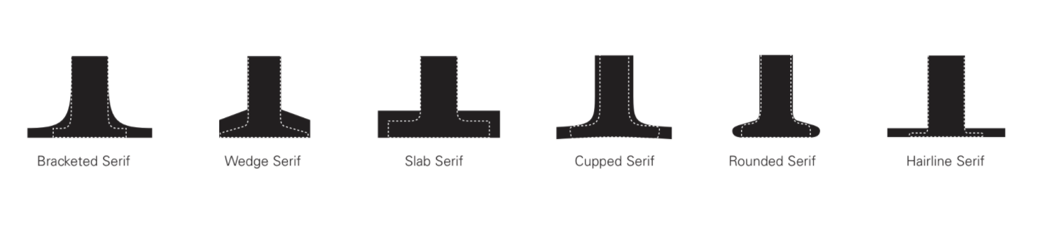
___ Draw the serif. Use components for serifs: until you have them settled on.
___ Draw the arch of the n. Correct round anchors and square anchors
___ Correct the extremes, correct the handles, balance the handles (fit curve)
___ Note Dimensions
___ Background layer. Copy and paste the n into the background and then refine the n.
___ Font info
___ Name your font even it you are going to change it later
___ Set up your Master so the x-height, cap height, overshoot are set.
___ Turn on Red Arrows and try an correct.
___ Merge the letter
___ Use Reconnect Nodes when you need to adjust.
Once your n is drawn as perfectly as you can. you have the l and the h. make them. make the o next.
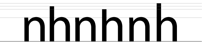
___ letterspace nonoonno then space nolonln then honohhn try to grasp the system.
___ Spacing Tips Read: Walter Tracy: Letters of Credit | Spacing pdf: Spacing
HOMEWORK
Finish getting nclopdh into Glyphs draw them as correctly as you can. Take your time.
Make some design refinments in Glyphs please read and apply refinements to your designs. visual
Refine so all your stems are the same, all your curves/arches are the same.
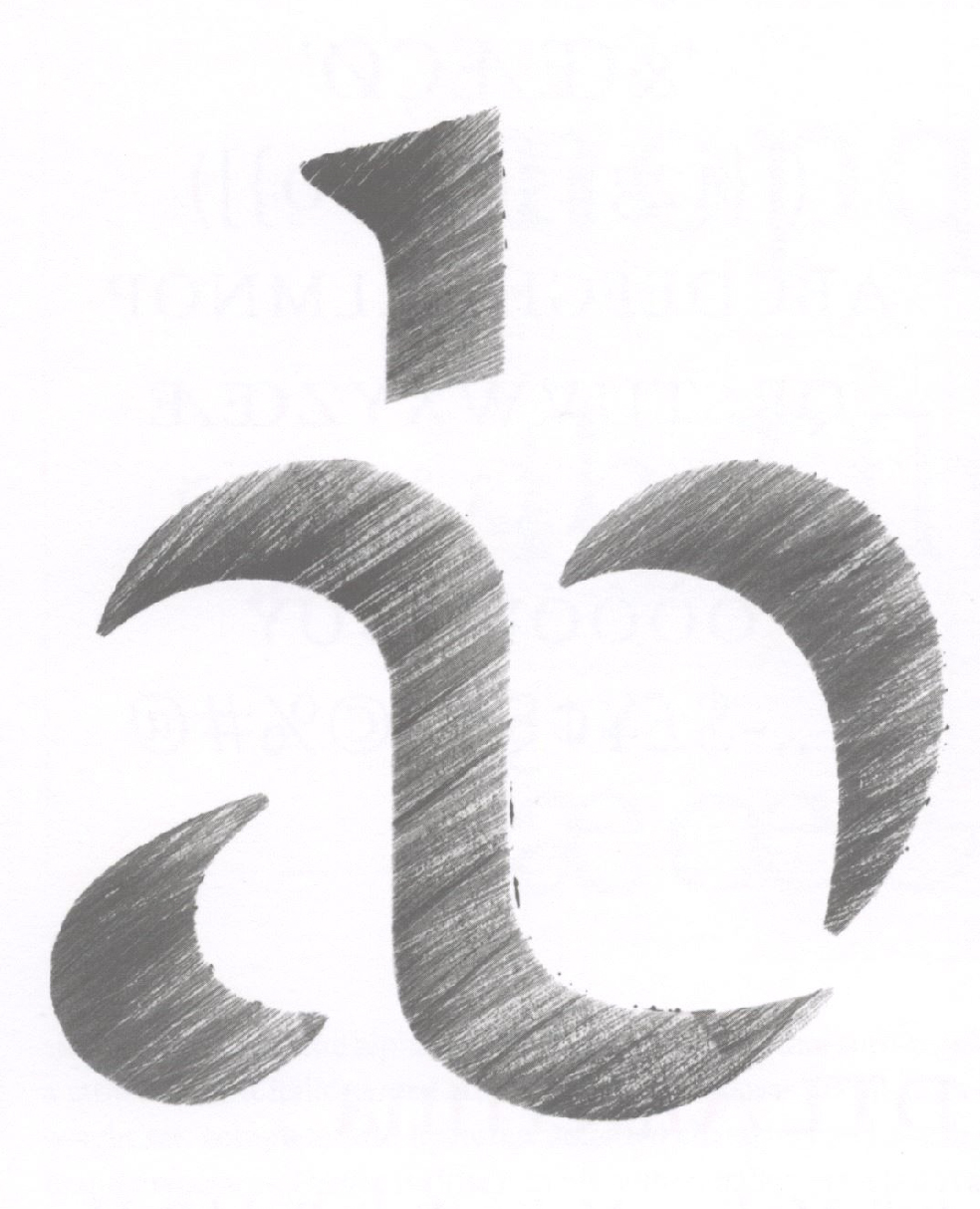
Start to pay attention to extrema (go up to Paths add Extremes), anchors where they should be, handles vertical or horizontal, length of the handle. (study this example, try to undersand the anchor and handle placement)
Please put your glyphs file in your folder on the google drive so we can look at them in class. google drive.
Export the font as a .otf file (open type file) (not .ttf, true type file) drop it into .otf into FontBook.
Use Illustrator or InDesign to print out nclopdh and at least 6 words 150pt tall.
https://adhesiontext.com will give you words (does not work in Chrome)
Watch: Monotype Vairable start at 3:30minute to 7:45minute (you can watch more :).
Terms: Optical Sizes, Variable Font File, Axis, Masters, Instances
Plugins (watch video if you need a quick visual/tutorial)
to from the WINDOW -> Plug-in Manager
Reporters
Fix Zero Handles
Red Arrows (just tried it and it is cool)
Stem Thickness
Speed Punk
- - - - - - - - - - - - - - - - - -
Wed. January 26
Review and refine nclopdh
Letterspace nonoonno then space nolonln then honohhn try to grasp the system.
Spacing Tips Read: Walter Tracy: Letters of Credit | Spacing pdf: Spacing
Monotype Vairable start at 3:30minute to 7:45minute
Make one letter variable _ use this Glyphs file (no stress just try)
Insta: a : word
Plugins
to from the WINDOW -> Plug-in Manager
Reporters
Fix Zero Handles
Red Arrows (just tried it and it is cool)
Stem Thickness
Speed Punk
HOMEWORK
Refine your nclopdh (the best you can, I can help if you need/want) then create a PDF Presentation (create a nice professional a presentation about your font (as many pages as you want). Include process, final nclopdh, show the variable, at least 6 words, and call out some characteristics). Format:
Landscape. Wide Screen. (examples: | 1 | 2 | )
If you rather make a behance post you may do that instead of a pdf.
https://adhesiontext.com will give you words (does not work in Chrome)
Make at least one square instagram ready image (1080 x 1080). Put that into your presentation folder.
Look at the proportion of the letters: use https://www.letterfountain.com/drawingtofont.html
and pages 12 - 70 in Designing Type (link in slack) as a reference for proportion and construction of each letter .
Please bring tracing paper, grid paper (square grid you can make your own if you want), circle template, triangle, ruler, pencil, eraser, pens...
Watch: Monotype Vairable
Terms: Optical Sizes, Variable Font File, Axis, Masters, Instances
- - - - - - -
Mon. January 31
Discusss Monotype Video
Due nclopdh
Present
Follow the folder hand-in structure...
Make folder on the google drive. Use this folder/file structure for every project.
Folder: Your name: Project Name inside that folder a
______ Folder: Scans with your Scans/Sketches, (shows process)
______ Folder: Glyphs with your glpyhs app file and the otf file
______ Presentation pdf
______ Instagram image(s)
______ Project Overview (google doc or word) your review of the project
::