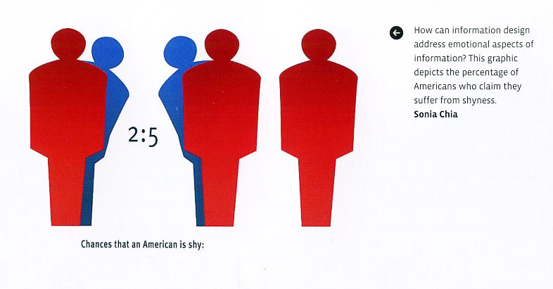
Visual Communication
Graphic Design Two
:: GD 02 :: project 1 :: project 2 :: project 3 :: resources :: class blog
:::::::::::::::::::::::::::::::::::::::::::::::::
RESOURCES
:
- Design for Democracy
Voting
:- declare yourself
:- rock the vote
:- generationeng age
:- citizen joe
:- america.gov
History of Voting
:- activoteamerica.com
:- flaglerelections.com
:- history of elections and voting
Information Design
:- information design | graphics |
:- funnelinc
Explanation Graphics
:- nigel holmes
:- think ink studios
:- johngrim wade
:- edward tufte
:- fibonacci
Other: don't miss
:- Indexed Blog: great simple ideas
:- Church vs. Football
:- Good Magazine
:- the Economy video
:- Fundrasing
:- Le Grand Content
:- Airport
- - - - - - - - -
:- Creating a City
:::::::::::::::::::::::::::::::::::::::::::::::::
READINGS
:- Reading 0ne | pdf |
:- Attractive Things Work Better (pdf)
:- Reading Two | pdf |
:- Reading Three | pdf |
:- Reading Four | pdf |
:::::::
:::::::::::::::::::::::::::::::::::::::::::::::::::::::::::::::::::::::::::::::::::::::::::::::::::::::::::::::::::::
PROJECT ONE: Information Graphic in Motion
Get Out the Vote Explanation
or turn reflective data into a experiential message
Screen-based communication is unique in that the designer designing for this context is able to control time, motion and sound in ways that are not possible in print. This control over the affordances of time, motion and sound allows for rich presentation of normally static data.
The audience(s) we engage with as designers are diverse negotiators of meaning. And while meaning is situated within a particular individual, point of view, social relationship, value and belief system, culture etc... Studies have shown that patterns emerge in regards to how people prefer to perceive and process the information we communicate. A basic understanding + empathy of these learning preferences is necessary when trying to present data in a manner that makes it meaningful to somebody.
Donald Norman, cognitive psychologist and author of “Things That Make Us Smart”, discusses two types of cognition or processes of knowing: experiential and reflective. In experiential cognition “...patterns of information are perceived and assimilated and the appropriate responses generated with apparent effort or delay”, it is sensory and reactive and leads to “...a continual flow of focused concentration”. This optimal flow tends to occur in computer games, entertainment, films and other recreational activities. Reflective cognition “...requires the ability to store temporary results, to make inferences from stored knowledge, and to follow chains of reasoning backward and forward, sometimes backtracking when a promising line of thought proves to be unfruitful.”
Many textbooks and classroom activities explain concepts in the abstract. Abstract: text and/or numerical in form and testing favors students who have strong memorization and reflection skills in response to this data. This disadvantages students who learn best by perceiving information concretely and processing it by sensing, feeling and doing.
There is a current need for research that defines, explores and promotes critical issues when trying to marry the entertainment world’s skills of capturing the user’s engagement with the educator’s skill of reflective analysis. Which raises the question: Using Time, Motion and Sound how can abstract text be presented concretely?
Your challenge is to design a motion graphic (movie, explanation graphic, infographic, Instruction art, etc) that allows the viewer to experience a statistic concretely. Meaning: use motion, scale, color, sound, transitions, fades, zooms, etc. Create an experience that lets the viewer see and feel or sense the data.
Make sure you choose a statistic that is relevant to the election. It should be non-partisan or about voting in general. After choosing it as content for your project... your goal is to visually represent that stat. You will quote your source in your project, so make sure you document it.
- - - - - - - - - - - - - - - - - - - - - - - - - - - - - - - - - - - - - - - - - - - - - - - - - - - - - - - - - - - - - - - - -
Step One
Find statistics about voting, voting facts or statistics or facts about the issues of this election. Find something that interests you and think it might be something others should know. Print them out and bring them to class to discuss. We’ll need to figure out structure and the potential “stories” of the data.
- - - - - - - - - - - - - - - - - - - - - - - - - - - - - - - - - - - - - - - - - - - - - - - - - - - - - - - - - - - - - - - - -
Step Two
Determine two “stories” and develop a written statement for each that sums it up. If you can’t write what needs to be represented than you have no story...get one...fast! Bring those two written statements on one nicely designed sheet of letter-sized paper to class. Bring a copy for everybody.
- - - - - - - - - - - - - - - - - - - - - - - - - - - - - - - - - - - - - - - - - - - - - - - - - - - - - - - - - - - - - - - - -
Step three
Concept/Story: Based on previous feedback finalize your statement what needs to be represented.
REMEMBER: Quantitative thinking comes down to one question: Compared to what? Try very hard to show cause and effect.
Associated Word List: Create an associate word list and define key terms. (list should be exhaustive and provide you with opportunities for visual representation strategies). Using the list you will need to create moodboard to define your motion graphic’s visual identity. The goal of this visual identity is to create a meaningful context for the data so that it becomes resonant with the audience.
Keywords: Choose three keywords that best describe your theme. These might be found in associative wordlist! These words help communicate your theme to others, but are also your reminder of what your design should ultimately communicate. Incorporate these words as typographic elements in your poster.
Create Moodboard: Think of the moodboard as a poster version of your movie’s atmosphere/feeling. The moodboard is your guide in communicating your overall visual and conceptual identity to others. The poster format allows you to explore your design ideas outside of the constraints of After Effects and general motion graphic design expectations. Suggested size approximately 11x17. Saved as a pdf to project in class.
Moodboard/Designer’s Toolbox: Your poster must include the 1) typography, 2) iconography/ imagery,
3) color palette, and 4) any stylistic ornamentation that represent your motion graphic’s conceptual and visual identity. All of these visual assets become a part of your “designer’s toolbox” and that you will use next in the storyboard phase.
- - - - - - - - - - - - - - - - - - - - - - - - - - - - - - - - - - - - - - - - - - - - - - - - - - - - - - - - - - - - - - - - -
Step Four
Create 2 storyboards testing your visual concept and moodboard concept. Apply it differently in each storyboard (we are testing to see how it could work). They can look similar but still explore the “toolbox”. The storyboards pdfs that we can click through in order to see the sequence. 10 “pages” minimum.
- - - - - - - - - - - - - - - - - - - - - - - - - - - - - - - - - - - - - - - - - - - - - - - - - - - - - - - - - - - - - - - - -
Step Five
Based on feedback, create an animated storyboard. Quicktime, MPEG-4, 20 secs min, 640x480 with sound. Storyboard should show the emotional qualities, personality and rhythm that you are striving for in your final.
emotional qualities on the content and the context of a message. For example, if the content of a message is optimistic, the motion’s emotion must convey a behavior that people can identity as being positive. Yet, the behavior would ‘remind us’ rather than ‘tell us’ in a literal sense.
personality: attributes such as color (literal and figurative), size, type of imagery and typeface…
rhythm: where should you pause for dramatic effect, which words do you stress, what voice quality
do you use, etc.
- - - - - - - - - - - - - - - - - - - - - - - - - - - - - - - - - - - - - - - - - - - - - - - - - - - - - - - - - - - - - - - - -
Step Six: FINAL
– Motion graphic in AfterEffects. Quicktime, MPEG-4
– 20 secs min
– size: 640x480
– sound
– last frame for 5 sec: Good Design makes choices clear. www.designfordemocracy.org
- - - - - - - - - - - - - - - - - - - - - - - - - - - - - - - - - - - - - - - - - - - - - - - - - - - - - - - - - - - - - - - -
CORE OBJECTIVES OF ASSIGNMENT
– to be able to pre-plan/visualize by creating storyboards.
– to be able to organize a sequence and narrative of both type and image with respect to some specific, clearly stated aesthetic and/or communicative purpose.
– to have kinetic sensitivity in 4D and be able to control the variables of motion, specifically (weight, path, area, and speed), in achieving clear and expressive visual meaning.
– to have temporal sensitivity 4D and be able to control the variables of time, specifically (sequence, duration, montage, transition, arc and proximity), in achieving clear and expressive meaning.
– to have audio sensitivity 4D and be able to control the variables of sound, specifically (choreography, contrast, dominance and synchronization: parallel + counterpoint ), in achieving clear and expressive meaning.
– to have an understanding of motion design software concerns and begin to form a foundation in which they will be able to make informed decisions regarding which software is appropriate for a particular problem.
- - - - - - - - - - - - - - - - - - - - - - - - - - - - - - - - - - - - - - - - - - - - - - - - - - - - - - - - - - - - - - - - -
THU AUG 21
-- Class Introductions
-- Syllabus
-- Project One Introduction
-- go to lab: server, website, blog
-- watch powers of ten
-- go to Nigel Holmes
-- blog set up (use your name)
Homework:
-- Finish setting up your personal blog. Email me your blog link BEFORE Tuesday.
--
Read over project brief and describe objectives in your own words (1 paragraph)
-- Go through Resources (upper left) familarize yourself with them. Take notes/observations.
-- Read: Reading One (located on the server). In the reading there are a couple of exercises.
-- DO Exercise 2. (pg 28 in the pdf). Choose one from the list and create avisual representation. You decide if it could be done in one frame or needs many. Keep it simple. Sketch it, refine it, make dark enough to read across the room. Use 8.5 x 11. (nice example: Church vs. Football)
--
Complete Step One: gather voting statistics and facts
Step One
Find statistics about voting, voting facts or statistics or facts about the issues of this election. Find something that interests you and think it might be something others should know. Print them out and bring them to class to discuss. We’ll need to figure out structure and the potential “stories” of the data.
!! Give the viewer a piece of information they didn't know not a get out and vote message per se. the look should be more graphic and typographic less video and imagery (ie Nigel Holmes, Ed Tufte)
- - - - - - - - - - - - - - - - - - - - - - - - - - - - - - - - - - - - - - - - - - - - - - - - - - - - - - - - - - - - - - - - -
TUE AUG 26
-- Names: Wurman, Holmes, Tufte
-- Powers of Ten Video
-- Discuss reading one
-- Discuss Excersice 2 from the reading
-- Discuss moodboard examples/expectations
-- Small group review of statistics, begin Steps 2 and 3
Homework:
Read: Reading Two (Information workbook chapters 1 and 4 *Read Chapter 4 for Thursday)
Complete Step 2: What will you explain? What’s the story? How will it look?
Begin Step 3: Moodboard
Blog: please add your paragraph about this project, your statistic/info/fact/timeline and the "stories"
Who are: Richard Saul Wurman, Nigel Holmes, Edward Tufte post an entry on any reaseach, compare and contrast the 3, post links to more information and post at least 1 example from each of the information designers. (use your own words: this who are should be posted on your blog by Sept 4)
- - - - - - - -
Step Two
Determine two “stories” and develop a written statement for each that sums it up. If you can’t write what needs to be represented than you have no story...get one...fast! Bring those two written statements on one nicely designed sheet of letter-sized paper to class. Bring a copy for everybody.
- - - - - - - - - - - - - - - - - - - - - - - - - - - - - - - - - - - - - - - - - - - - - - - - - - - - - - - - - - - - - - - - -
THU AUG 28
-- Blog Check-in and Updates
--
Presentation of your stories to small groups
Homework:
-- Based on feedback Refine Step 2 (story)
-- Prepare Moodboard Step 3
-- Complete Step 4: create 2 storyboards testing your visual concept: on the computer
-- Read: Reading Two (Information workbook chapters) AND post on your personal blog a question to the class about the reading. (thoughtfull question)
-- Blog: add your refinded story to your personal blog, the pdf of your moodboard and pdf(s) of your storyboards. (new blog entry: Ask a question about the reading.
ON TUESDAY So we can move along when class starts PLEASE before class starts put your moodboard pdf and the storyboard pdfs on the server. Make sure you use your name in the naming of the files.
- - - - - - - -
Step three
Concept/Story: Based on previous feedback finalize your statement what needs to be represented.
REMEMBER: Quantitative thinking comes down to one question: Compared to what? Try very hard to show cause and effect.
Associated Word List: Create an associate word list and define key terms. (list should be exhaustive and provide you with opportunities for visual representation strategies). Using the list you will need to create moodboard to define your motion graphic’s visual identity. The goal of this visual identity is to create a meaningful context for the data so that it becomes resonant with the audience.
www.visualthesaurus.com user name: awertzberger@mac.com password: viscom
Keywords: Choose three keywords that best describe your theme. These might be found in associative wordlist! These words help communicate your theme to others, but are also your reminder of what your design should ultimately communicate. Incorporate these words as typographic elements in your poster.
Create Moodboard: Think of the moodboard as a poster version of your movie’s atmosphere/feeling. The moodboard is your guide in communicating your overall visual and conceptual identity to others. The poster format allows you to explore your design ideas outside of the constraints of After Effects and general motion graphic design expectations. Suggested size approximately 11x17. Saved as a pdf to project in class.
Moodboard/Designer’s Toolbox: Your poster must include the 1) typography, 2) iconography/ imagery,
3) color palette, and 4) any stylistic ornamentation that represent your motion graphic’s conceptual and visual identity. All of these visual assets become a part of your “designer’s toolbox” and that you will use next in the storyboard phase.
- - - - - - - -
Step Four
Create 2 storyboards testing your visual concept and moodboard concept. Apply it differently in each storyboard. You are testing to see how it could look and feel. The 2 storyboards can look similar but should explore the “toolbox” in a different way. Save the storyboards as pdfs that we can click through in order to see the sequence. 10 “pages” minimum. Have them on the server BEFORE class begins.
- - - - - - - - - - - - - - - - - - - - - - - - - - - - - - - - - - - - - - - - - - - - - - - - - - - - - - - - - - - - - - - - -
TUE SEP 02
Inclass: Large group reviews of final moodboard and storyboard
Homework:
-- Storyboard and Animatic: Based on feedback refine storyboard and translate it into an animatic (get it into AfterEffects). Include note about transitions. See examples on the server under Jeremy's class. (TRY. Next class we will have a AfterEffects Tutorial.) Please read Step Five.
-- Questions and Answers: Visit your classmates blogs and answer 3 questions about the reading. (try and be insightful if someone has answered the question before you, you need to add something more to the answer or move onto another question by another classmate. If there are already 3 responses to a question you must move onto another question. In the end all questions should have 3 comments.
-- Blog... Who are: Richard Saul Wurman, Nigel Holmes, Edward Tufte post an entry on any reaseach, compare and contrast the 3, post links to more information and post at least 1 example from each of the information designers. (use your own words)
-- Blog: please add a design objectives in the form of a To Suggest List. Describe how the final motion graphic will look and feel -- emotion, personality, rhythm. Use desciptive words.
To Suggest (the design suggest)...
-- a sense of supense
-- a sese of doom and gloom
-- a feeling of the 1930's
-- film noir
-- etc...
- - - - - - - - - - - - - - - - - - - - - - - - - - - - - - - - - - - - - - - - - - - - - - - - - - - - - - - - - - - - - - - - -
Step Five
Based on feedback, create an animated storyboard. Quicktime, MPEG-4, 20 secs min, 640x480 with sound. Storyboard should show the emotional qualities, personality and rhythm that you are striving for in your final.
emotional qualities on the content and the context of a message. For example, if the content of a message is optimistic, the motion’s emotion must convey a behavior that people can identity as being positive. Yet, the behavior would ‘remind us’ rather than ‘tell us’ in a literal sense.
personality: attributes such as color (literal and figurative), size, type of imagery and typeface…
rhythm: where should you pause for dramatic effect, which words do you stress, what voice quality
do you use, etc.
- - - - - - - - - - - - - - - - - - - - - - - - - - - - - - - - - - - - - - - - - - - - - - - - - - - - - - - - - - - - - - - - -
THU SEP 04
Inclass: AfterEffects tutorial (brush up)
Due on your blog... Who are: Richard Saul Wurman, Nigel Holmes, Edward Tufte post an entry on any reaseach, compare and contrast the 3, post links to more information and post at least 1 example from each of the information designers. (use your own words)
-- Show Animated Storyboard to at least 3 people: get feedback.
Homework
begin step six...
-- - - - - - - - - - - - - - - - - - - - - - - - - - - - - - - - - - - - - - - - - - - - - - - - - - - - - - - - - - - - - - - - -
Step Six: start making final
make significant progress for Tuesdays's class. Bring files to class we will be working in class.
– Motion graphic in AfterEffects. Quicktime, MPEG-4
– 20 secs min
– size: 640x480
– sound
– last frame for 5 sec: Good Design makes choices clear. www.designfordemocracy.org
- - - - - - - - - - - - - - - - - - - - - - - - - - - - - - - - - - - - - - - - - - - - - - - - - - - - - - - - - - - - - - - - -
TUE SEP 09
Working in class. By the end of class pleas put your animated storyboard on the server (yourname_animatedstoryboard) AND put your first round of step six (yourname_round01)
Homework
Step Six add sounds even if they are "place holder". Work and refind. Bring to class a render at Half size with sound. (yourname_round02) put on the server before class.
- - - - - - - - - - - - - - - - - - - - - - - - - - - - - - - - - - - - - - - - - - - - - - - - - - - - - - - - - - - - - - - - -
THU SEP 11
Working in class. Have what you did for homework rendered half size with sound
Homework
Refinements based on feedback. Before class add your rendered file onto the server. (yourname_round03). Use the weekend to make big strides in your motion piece. This is the time to explore options, test ideas... next week refine.
Read: Reading 03. Blog by Thurs Sept 18 a summary/main points of the reading.
Reading Three | pdf |
- - - - - - - - - - - - - - - - - - - - - - - - - - - - - - - - - - - - - - - - - - - - - - - - - - - - - - - - - - - - - - - - -
TUE SEP 16
Individual review, half-size, 20 secs min with sound.
Thursday's class small groups... looking for examples listed below and BE CRITITCAL.
What work is a good example of any of these?
Write down your groups insights on the paper given to you to give to each of your classmates, including yourself.
ORGANIZE: Organizing the available information and coming up with a plan for presenting it is the first and probably the most difficult stage in designing any infographic. The key to reconstructing an event is to establish the role of geography, the cause, the chronological sequence, and the facts of the objects involved. All of these pieces of information have to be organized effectively with right amount of detail and emphasis to make sure the viewer experiences the incident as an authentic whole.
MAKE VISIBLE: It is the essential quality for an infographic. The fishermen of Marshall Islands have for centuries used maps (fig.25) made using shells tied together by bamboo sticks, to visually represent the distance between the various islands, their locations with respect to each other, and the direction of currents.
ESTABLISH CONTEXT: Going back to the train accident example, establishing context begins with locating the geography of the accident site so that the viewer get the bearings on the topography of the event. The designers have chosen the top view because the key components are the highway and the tracks below. Notice the view is closer when the first collision happens and gets wider during the second collision. Through this the difference in scale of collision is established. The viewer is able to experience the fact that a small vehicle has triggered a catastrophic collision.
SIMPLIFY: Representations that are simple and direct are easier to interpret. We get easily distracted by extraneous properties of representation. The NYT graphics on the spread of the SARS virus (fig.26) exemplifies the principle of simplicity – most notably in its visual treatment of the map and use of colors. The graphic talks about a spread from country to country. Hence a coarse representation is good enough to convey that message. Colors are used to indicate the primary, secondary and tertiary spreaders of the virus and it is critical piece of information. Hence you see only 3 colors in the entire graphic.
ADD REDUNDANCY: Redundancy is a concept which has emerged from the information theory to communication. Redundancy is the opposite of information. Something that is redundant adds little, if any, information to a message. Yet much of the information we deal with in everyday life contains a good deal of redundancy.
The English language, for example, can be mostly understood if you remove the vowels.
Cnsdr ths sntnc, fr xmpl.
One of the purposes of adding redundancy to a stream of information is to make it easier for us to digest information. Although the sentence without vowels can be read, it is harder to read. On a noisy transmission channel, the redundancy enables the reader to correct errors that may have been introduced into the stream of information. Noise is any factor in the process that works against the predictability of the outcome of the communication process. For example, traffic lights communicate through color. They also use position to reinforce the message.
While adding redundancy offsets noise, too much redundancy is inefficient. Using repetition, reiteration and restatement, we run the risk of burdening or boring the audience. So, maintaining an optimal balance between predictability and uncertainty is the key to success in communication.
SHOW CAUSE AND EFFECT: When we try to comprehend something, we are looking for information to understand the underlying mechanisms. Reasoning is about examining causality. Earlier we saw an example which shows cause and effect in of Dr. John Snow's medical detective work in which he identified the cause of Cholera epidemic in London. Similarly the decision diagram (fig.27), lucidly shows the cause and effect by taking the viewer through a decision diagram about whether a particular is suitable for them or not.
COMPARE AND CONTRAST: Together with what is the cause, and what is the effect, the third important question that needs to be answered is, compared to what? In the NYT graphic on the spread of SARS, comparison comes across through the use color coding, which differentiates primary, secondary and tertiary infections. Dots are used to indicate the number of infected people. This helps us to make a quick visual comparison of the volumes infected people across different countries.
CREATE MULTIPLE DIMENSIONS: We saw earlier the graphic by Minard in which he manages to portray six dimensions - the size of the army, latitude, longitude, direction the army is moving, temperature, and date. On a single sheet of paper with no text, he eloquently captures Napoleon's failed march to take Russia. The NYT SARS graphic too is multi-dimensional. The graphic informs us about space (map of South East Asia), volume (numbers of infected), and movement of infected people (arrows to indicate the direction of spread).
INTEGRATE: It is importance to tell a "coherent story". This means avoiding references for figures and examples, which are physically removed from the flow of the text. Also information for comparison should be put side by side. That is, within the eye span, not stacked in time on subsequent pages. Bookscan present a coherent story by placing visual and references within the eye span and not at the end as an appendix.
Homework
Refinements based on feedback. Before class add your rendered file onto the server. (yourname_round04)
- - - - - - - - - - - - - - - - - - - - - - - - - - - - - - - - - - - - - - - - - - - - - - - - - - - - - - - - - - - - - - - - -
THU SEP 18
Small groups, be critical!
Use the list above.
Blog
*make sure your latest motion is on the server so i can look at it over the weekend and get back to you with any comments before monday.
Homework
refine and finalize. Before class add your rendered file onto the server. (yourname_round05). Start finalizing your process book (handing in a pdf only but it should be designed and professionally presented)
reading 04: blog a comment and a considered question to the class by Thursday 25th.
- - - - - - - - - - - - - - - - - - - - - - - - - - - - - - - - - - - - - - - - - - - - - - - - - - - - - - - - - - - - - - - - -
TUE SEP 23
Class crit, all done: then one week to refine
Homework
Have your project rendered and on server so we can crit it. Before class add your rendered file onto the server. (yourname_round06)
:- Reading Four | pdf |
:-
and Read Order of the Order and Ladislav Sutnar and blog a summary for each reading
:- read through what we are doing in the next class (below)
- - - - - - - - - - - - - - - - - - - - - - - - - - - - - - - - - - - - - - - - - - - - - - - - - - - - - - - - - - - - - - - - -
THURS SEP 25
Project 2 (Planning Stages)... see project 2 page
- - - - - - - - - - - - - - - - - - - - - - - - - - - - - - - - - - - - - - - - - - - - - - - - - - - - - - - - - - - - - - - - -
TUES SEP 29
Have files uploaded to server PRIOR to class: if you are still loading it onto the server when class starts the project will be considered late. (yourname_p1_final)
FINAL
– Motion graphic in AfterEffects. Quicktime, MPEG-4 Full Size
– Motion graphic in AfterEffects. Quicktime, MPEG-4 Half Size
– 20 secs min
– size: 640x480
– sound
– last frame for 5 sec: Good Design makes choices clear. www.designfordemocracy.org
- Project Brief: your process saved as a pdf. (yourname_p1.pdf)
-- cover
-- title page: your name, project name, semester
-- project description
-- your fact/stat/piece of information
-- associated word list
-- key words (defined)
-- define: emotional qualities on the content and the context of a message. For example, if the content of a message is optimistic, the motion’s emotion must convey a behavior that people can identity as being positive. Yet, the behavior would ‘remind us’ rather than ‘tell us’ in a literal sense.
-- define: personality: attributes such as color (literal and figurative), size, type of imagery and typeface…
-- define: rhythm: where should you pause for dramatic effect, which words do you stress, what voice quality do you use, etc.
-- to suggest list (design objectives)
-- to suggest (mood/feelings, actions, reactions...)
-- color palette
-- image palette: images/graphics that you are going to use
-- moodboard
-- storyboard 1
-- storyboard 2
-- refined storyboard
-- (optional) rounds 1 - 6*
-- required: storyboard of final*
*in aftereffects you can save frames as files then place in indesign or illustrator.