Syllabus :: Modular Font :: Long Read :: Class Google Drive
.................................................................
Professor: Andrea Herstowski
Office: 353 Chalmers Hall
Office
hours: by appointment
email: herstow@ku.edu
Professor: Alex Anderson
Office: 353 Chalmers Hall
Office
hours: by appointment
email: alex-anderson@ku.edu
................................................................
:: Links : start following...
:- Type Wolf
:– Font of the Month Club
:– Future Fonts
:– Swiss Typefaces Lab
Rules
:- Thinking with Type
:- Practical Typography
Compendium
:- 25 Type Designers
:- 8 Faces
Find an article
:- I love Typography
:-Typotheque.com
:- Typographica.org
:- Typeroom
:- FontShop News
:- Medium
:- Eye Magazine
:- Shady Characters
:- c-a-s-t
................................................................
:: Short films :: Audio
:- films by Hillman Curtis
:- Type Radio
:- Type Cultur
:- Abstract on Netflix
:- Type@Cooper
:- Type@Paris
..........
- - - - - - - - - - - - - - - - - - - - - - - - - - - - - - - - - - - - - - - - - - - - - - - - - - - - - - - - - - - - - - - - - - - - - - - - - - - - - - - - - - - - - -
Long Read
mastering the column and other typographic details
Typographic grids control the visual organization of the page space by supplying a particular kind of structure developed for typographic organization. This structure consists of margins, alleys, grid fields, and intersection points. Grids allow the designer to codify groups of typographic information. This process of codification allows the viewer to proceed through a complex page environment, tracking information in a seamless, linear manner.
A good grid forces order onto the layout and so acts as an orienting device enabling the reader to knows where to look for information and to understand its relative importance. Just as importantly the grid works on an aesthetic level. The readers might not consciously be aware of it, but subliminally they pick up on the fact that everything is well ordered and in its place. If a picture juts fractionally into the column next to it something seems to be slightly amiss, but if the lines of text align neatly across the columns on a page some fundamental and reassuring logic seems to be at work.
Your design should be typographically beautiful, simple without being simplistic, have a clear hierarchy, an attention to detail. It needs to be interesting, inviting, dynamic. Only the finest typography will be accepted. There are typographic standards we will cover in class lectures and readings and they will need to be practiced: column width, text size, word spacing, hyphenation...
Traditionally we read right to left, top to bottom. Elements that look alike are associated – same font, same point size, same leading and line length will visually link information into groups.
There are several goals for this project: Style Sheets InDesign, understanding and constructing a leading grid, developing clear hierarchies, learning to use typographic rules consistently, focusing attention to typographic details, and of course creating dynamic compositions.
- - - - - - - - - - - - - - - - - - - - - - - - - - - - - - - - - - - - - - - - - - - - - - - - - - - - - - - - - - - - - - - - - - - - - - - - - - - - - - - - - - - - - -
You will be using a chapter from Malcolm Gladwell as the text (you should familiarize yourself with who he is.
You will using the text from one of these three chapters.
Elements/Standards/Rules you will need to address
_ leading grid/baseline grid: margins, alleys, modules
_ hierarchy, composition
_ type size, type color, line length (column width), leading
_ headlines, subheads, call outs
_ page numbers
_ paragraph breaks, justification, letter & word spacing, hyphenation, widows, orphans
_ dashes, quote marks, apostrophes
_ vertical and horizontal pull (clotheslines)
- - - - - - - - - - - - - - - - - - - - - - - - - - - - - - - - - - - - - - - - - - - - - - - - - - - - - - - - - - - -
TECHNICAL RESTRICTIONS
_ Page 12 x 18 (.5 inch margins -- no bleeds)
_ Use the provided document (below)
_ 12 Pages or 16 pages (not 9. 10 or 11 or 13 or.. has be be multiples of 4)
_ Color: Black + 1 color, tints ok
_ Fonts: based on font studies one serif, one sans serif
_ Typographic Rules: You may use rules, bars...
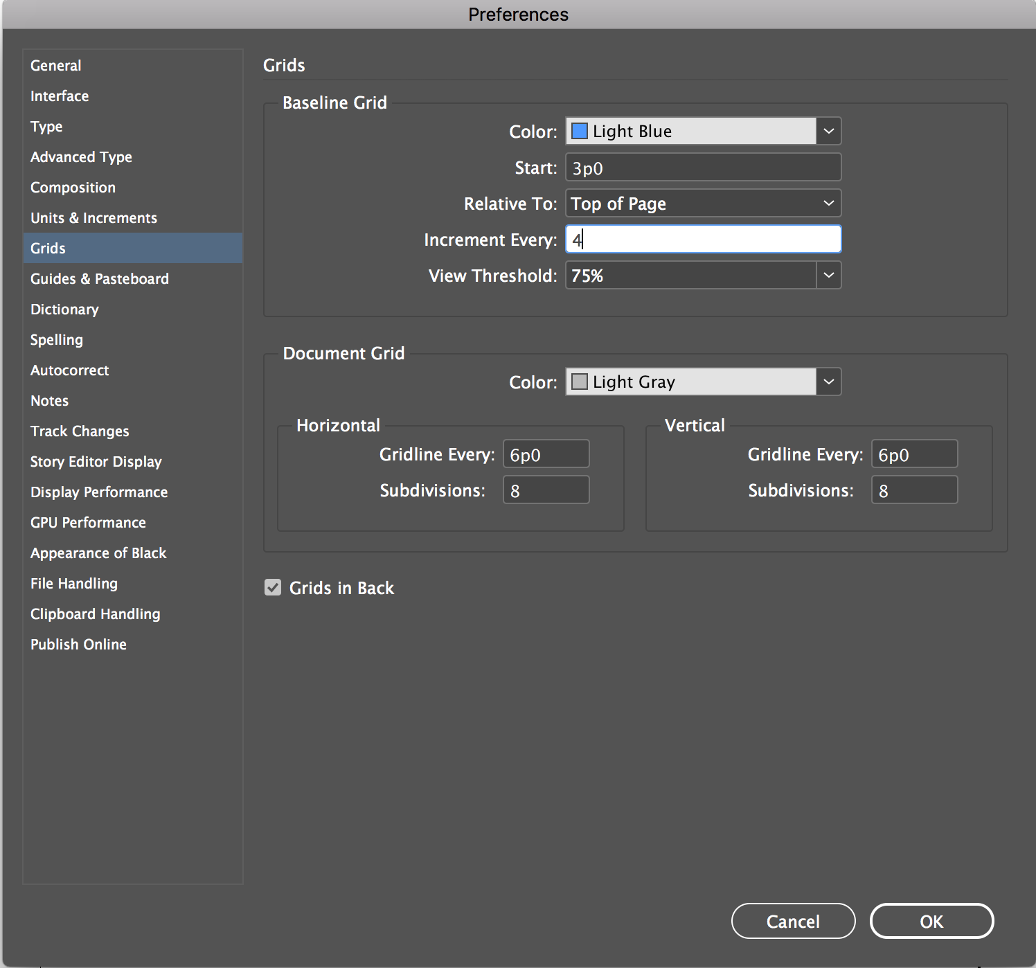
_ Leading Grid/BaselineGrid: 10 column, 12pt leading grid will be built in class using the body text’s leading as a measure. (9/12pt). The leading grid – should be used – no exceptions.
Final Newspaper
The final can be printed on Canson paper or French paper using the Epson printers.
Content must include (all of the text in the chapter)
_ Title of the article
_ by line (author's name)
_ intro text
_ body text
_ at least 3 – 8 callouts
_ page numbers (odd number goes on right side).
_ running head
_ colophon:
Designed by (your name). Class project for Typographic Systems at the University of Kansas. Fall 2019. The (name the article) text by Malcolm Gladwell is for education purposes only for. The fonts used are (name the font, designed by, classification and the year designed) and (name the font, designed by, classification and the year designed). Printed on (name the paper).
- - - - - - - - - - - - - - - - - - - - - - - - - - - - - - - - - - - - - - - - - - - - - - - - - - - - - - - - - - - -
DESIGN CONSIDERATIONS
When designing/exploring/refining remember the design principles of SCALE, CONTRAST, RHYTHM.
Pay attention to how long the text is, white space, alignment horizontally and vertically, how to get the type and images to work together, elements should group together, space, scale, movement/ rhythm, asymmetric, call outs…
How can you draw the reader into the article?
What are different ways to show a new paragraph?
What can you do with call outs... the title, subtitle, author, intro text
How can elements align?
What can you do typographically to the title to make it a typographical solution: contrast, size, cropping, cutting, connecting, positive negative.
Be cautious of/avoid...
_ avoid making your type into organic shapes, type in circles, text on a curve
_ avoid checkerboard layouts
_ avoid too much space between elements
_ avoid filling the page, start with the text lower on the page
_ avoid a symmetric spread, think as spreads not pages.
Tips
_ avoid all the text being "high" on the page - works better lower on the page
_ have elements align on the same baseline
_ avoid white more white space "inside" the page.
_ have your white space outside of the elements
_ do not crowd the page
_ do not have too little on the page
_ take your time be neat
_ explore some layouts conservative/traditional, other really push scale, tension, overlap,...
- - - - - - - - - - - - - - - - - - - - - - - - - - - - - - - - - - - - - - - - - - - - - - - - - - - - - - - - - - - -
Wednesday, November 20
_ Intro to the Long Read Project
_ Lottery for Articles.
_ refresh: http://www.thinkingwithtype.com/contents/letter
_ refresh: http://www.thinkingwithtype.com/contents/grid/
_ refresh: http://www.thinkingwithtype.com/contents/text/ | paragraph breaks
HOMEWORK
Using this document flow the article assigned to you into the InDesign Document. (Do this inclass before you leave). Change the font to 9/12 (9pt font, 12 pt leading). SAVE your file.
READ the article and as you read highlight words, sentences you find interesting. Do it as you read. HIGHLIGHT them. Actually make them a different color so you can see them easily.
Write a summary of the article and place your summary here in the Google Drive. Can be a google doc. Name it your name! Put your summary in the Summary Folder:
*After Wednesday you need to pick an article to design. You may switch to one of the other 2 articles. Has to be one of the 3 Gladwell articles.
Explore 12 different FontSpec Sheets/ Type Tool Kits
11 x 17 for each tool kit.
For each tool kit show.
__ The title
__ Subtitle
__ Malcolm Gladwell
__ Intro text
__ Body text. (9/12pt)
__ Call out (s)
__ Page number
__ Running head
__ You can use rules if you want. You can use color (no more than 2)
__ You should use 1 serif and 1 sans serif per study.
__ Use Google fonts or Adobe Fonts/Type Kit
__ Make sure you capture (type in the font names!)
PRINT your font studies B/W on 11x17. And SAVE them as pdf, as your name. Upload them to the FontSpecs folder on the Google Drive.
Take your time, you need to have some great choices to choose from. Print them out and look at them! If fonts are not working well you need to change and reprint.
- - - - - - - - - - - - - - - - - - - - - - - - - - - - - - - - - - - - - - - - - - - - - - - - - - - - - - - - - - - -
Monday, November 25
Pick 2 -4 font spec sheets that you think are working and use them for your initial spread designs.
Discuss articles.
***** CHANGE YOUR DOCUMENT SIZE to 12 x 18! .5 margins, no bleeds. DO IT NOW. SAVE and make sure you use that doc.
HOMEWORK
Explore 8 designs for the first spread, use only type (yes that does mean no images). What do you think has to be on the opening spread? What is the most need to have on it? What is the least amount of information? How do you create something that someone will pick up and want to read? What can you use in th text to call out, make big. Create 8 different explorations of the first spread. You must have a full range of solutions think of it as a scale from expected/conservative (what you have seen, what you think you are supposed to do) to something that is not what we topically see. Do not just warp type ... don't just make stuff without meaning, how can you make something cool and meaningful. This is a big challenge.
You have over Thanksgiving to make some great work. Do not wait to do your homework until Sunday night. You only have a short time left in this semester. If you can't push through. If this is a drag, if you are naming your files fuck this -- then think seriously about a different major. This should be fun. Everyone will understand if you switch majors. No one will understand why you are suffering when you don't need to be.
PRINT BW on 11 x 17 for class as pages not spreads. Yes this will be 16 pages :) you don't need to print in color.
Don't hang the work up until we get to class...
Also save your spreads as pdf, your name and drop them in the Google Drive folder Opening Spreads.
- - - - - - - - - - - - - - - - - - - - - - - - - - - - - - - - - - - - - - - - - - - - - - - - - - - - - - - - - - - -
WED is no class!
T H A N K S G I V I N G
yes you have homework to do
- - - - - - - - - - - - - - - - - - - - - - - - - - - - - - - - - - - - - - - - - - - - - - - - - - - - - - - - - - - -
Monday, December 2
Crit homework. What is interesting? What is working. What is the expected. Who went the furthest from the expected.
What are different ways to show paragraph breaks? Write down list in class.
HOMEWORK
Refine/or create new 6 different opening spreads. Print them out for class. And save them onto the (same folder as first round *name it your name_r2) Google Drive.
Paragraph Breaks. Use this InDesign doc and try 20 different paragraph break solutions. change the body text to a font you are thinking about using. (Save as a pdf, save it as your name and put on the Google Drive). Start this in class. Look at your notes for different ways to show a paragraph break. That means you will have 20 pages. Save them as a pdf and put them on the google drive. Do not print these out.
- - - - - - - - - - - - - - - - - - - - - - - - - - - - - - - - - - - - - - - - - - - - - - - - - - - - - - - - - - - -
Wednesday, December 4
Crit refined opening spreads. (bring in Monday's and today's spreads. All of them.
Crit Paragraph Breaks.
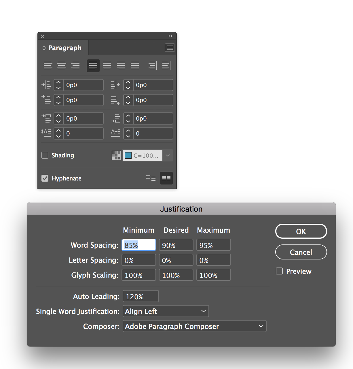
Create (download) Justification setting studies: pick best justification for your text. (Save as a pdf, save it as your name and put on the Google Drive).
Create horizontal guides on the master page.
Change baseline grid to 4pt.
Lock body text to the baseline grid.
Lock everything to the baseline grid.
HOMEWORK
Explore 3 different solutions for the entire article. Think broad strokes. Think range. Each solution should be completely different from each other. Take your time. Make sure they are different from "expected" to "unexpected". Think about different ways to treat paragraph breaks, call outs.... SCALE, CONTRAST, WHITE SPACE, TENSION, Alignments. Three different directions on the computer.
*Print as pages shrink to fit on 8.5 x 11 (tall). NOT spreads. Not on 11 x 17. You should have a 12 pages (that include front and back cover (x) for each direction. 3 yes that is 36 pages. I know it is a lot. Just do it. Inclass we are going to make the perfect most interesting direction from all your 36 pages. Can print BW.
** also (Save as a pdf, save it as your name and put on the Google Drive ). In the Full Article Exploration
Don't forget the colophon: Designed by (your name). Class project for Typographic Systems at the University of Kansas. Fall 2019. The (name the article) text by Malcolm Gladwell is for education purposes only for. The fonts used are (name the font, designed by, classification and the year designed) and (name the font, designed by, classification and the year designed). Printed on (name the paper).
This is weekend homework so you have to take your time. You need to not do it all the night before.
- - - - - - - - - - - - - - - - - - - - - - - - - - - - - - - - - - - - - - - - - - - - - - - - - - - - - - - - - - - -
Monday, December 9
Crit layouts create a great one from what you have.
Don't forget the colophon: Designed by (your name). Class project for Typographic Systems at the University of Kansas. Fall 2019. The (name the article) text by Malcolm Gladwell is for education purposes only for. The fonts used are (name the font, designed by, classification and the year designed) and (name the font, designed by, classification and the year designed). Printed on (name the paper).
*check that you spelled Malcolm correctly will have to take off points if you spell his name wrong :)
HOMEWORK
Refine new direction on the computer.
Based on the crit create 1 direction and refine it and then create 1 variation (and I mean VARIATION not refinement)
PRINT IT OUT 11 x 17 as pages (NOT SPREADS).
AND print out a smaller version b/w as spreads with the grid (and horizontal lines showing so we can make sure you are using the grid correctly.
also (Save as a pdf, save it as your name and put on the Google Drive ). In the Full Article Exploration save it your name r2)
- - - - - - - - - - - - - - - - - - - - - - - - - - - - - - - - - - - - - - - - - - - - - - - - - - - - - - - - - - - -
Wednesday, December 11
Crit layouts create a great one from what you have. Make it your final.
HOMEWORK
Getting it all perfect.
Please correct...
Leading Grid. Alter the leading grid and lock all text to it.
Lock all text to the BASELINE!
Kern when needed
Indent or space between paragraphs not both
When indenting don't indent the first paragraph
Make sure you are using REAL quotes (smart quotes) not inch marks (check your text)
Hang punctuation
Make sure you are using apostrophes not foot marks
Use en dash
If you are
justifying text, use hyphenation and adjust Justification settings.
- - - - - - - - - - - - - - - - - - - - - - - - - - - - - - - - - - - - - - - - - - - - - - - - - - - - - - - - - - - -
Workdays days during finals week
Need some extra feedback before the final -- take advantage of my offers...You can always email me for 1 round of feedback (we can't go back and forth in an email).
Or if you want to meet in person you can just ask for a time to meet
Or you can show up to a work day on Monday Dec 16 3pm - 5pm
Or you can show up to a work day on Monday Dec 17 3pm - 5pm
*IF you want to take paper to Jayhawk Ink it is .50 a sheet and you should get it before Thursday. (one sheet will give you 4 pages so if you have 12 pages it is $1.50 and if you have 16 pages it is 2.00 for the paper. Cash only :)
- - - - - - - - - - - - - - - - - - - - - - - - - - - - - - - - - - - - - - - - - - - - - - - - - - - - - - - - - - - -
Thursday December 19, FINAL 1:30pm (that is our official day and time)
Print your final at Jayhawk ink No Cropmarks no trim you should have a 12 x 18 doc. no bleeds.
If you want to print on colored paper you can get some from me you need to trim it to 12x18 and take it to jayhawk ink. Tell them it is 70lb text wieght paper.
Create a folder with your name and put your files in it and upload it to the Google drive.
1) pdf saved as SPREADS.
2) pdf saved as SPREADS GRID VISIBLE
No process book (I have graded your process as you handed it in. If you blew off your homework your process grade will suffer. 10 points for every homework missed.
Make a behance post at your leisure. It is not due for this project. When you go to upload your project do not use a mock-up that is the wrong size -- will look bad. Start with something simple maybe flat like this...