:: Syllabus :: Modular Grid :: Modular Font :: Typesetting Rules :: Resident Expert :: class google drive
.................................................................
Professor: Andrea Herstowski
Office: 353 Chalmers Hall
Office
hours: by appointment
email: herstow@ku.edu
................................................................
jump to date
- Wednesday, Nov 10
- Monday, Nov 15
- Wednesday, Nov 17
- Monday, Nov 22
- Wednesday, Nov 24 (no class)
- Monday, Nov 29
- Wednesday, Dec 1
- Monday, Dec 6
- Wednesday Dec 8
- Dec 10: Stop Day
- Tuesday, December 14 Final
................................................................
Project Links
;- Watch Read Summarize
:- AfterEffects TutorialS
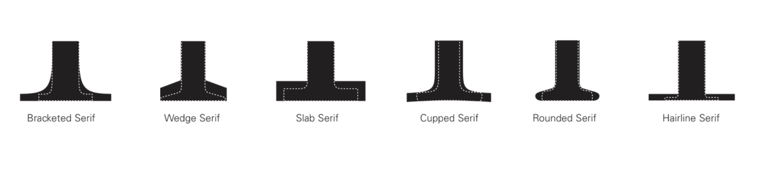
:- Type Classifications
:- Typeface research
Resources: use them
Type Classifications / Thinking with Type
Designing Type by Karen Cheng
Mac is not Typewitter (download pdf
LetterFountain: Names and classifications
Glossary of Terms.pdf
Character Characteristic
Anatomy of the letter
if you like a video here you go
glossary here
pdf compulation Anatomy refresher.pdf
................................................................
Fonts and fountry or type house
:- by Foundry
:- Type Wolf
Links : start following...
:- Thinking with Type
:- Practical Typography
:- designobserver.com
:- friendsoftype.com
:- typographica.org
:- welovetypography.com
:- FontShop Spotlights
:- Fontshop Essays
:- I love Typography
..........
- - - - - - - - - - - - - - - - - - - - - - - - - - - - - - - - - - - - - - - - - - - - - - - - - - - - - - - - - - - - - - - - - - - - - - - - - - - - - - - - - -
THIS HAS NOT BEEN UPDATED YET FOR FALL 2021...
- - - - - - - - - - - - - - - - - - - - - - - - - - - - - - - - - - - - - - - - - - - - - - - - - - - - - - - - - - - - - - - - - - - - - - - - - - - - - - - - - -
Resident Expert: Teach us about a Typeface
Project three focuses on learning to identify fonts, font characteristics and type classifications. And then teaching them to us -- you are the resident expert of a Typeface. Your task it to teaching us everything there is to learn about a specific typeface. Who designed it, when, its character, how to identify it... You will become the resident expert of your font. We must learn about the typeface through your final animation(s).
Graphic design professionals are expected to recognize an almost infinite number of typefaces; it is essential, therefore, that students begin by learning the parts of the letter (terms), characteristics and to classify typefaces into these major historical, categories (type classifications): Old Style, Transitional, Modern, Slab Serif, Sans Serif.
A typographic hierarchy expresses the organization of content, emphasizing some elements and subordinating others. A visual hierarchy helps readers scan a text, knowing where to enter and exit and how to pick and choose among its offerings. Each level of the hierarchy should be signaled by one or more cues, applied consistently across a body of text. A cue can type size, style, color, horizontal or vertical alignments, placement, leading, or tracking. Infinite variations are possible. Past examples | 1 | 2 | 3 |
- - - - - - - - - - - - - - - - - - - - - - - - - - - - - - - - - - - - - - - - - - - - - - - - - - - - - - - - - - - - - - - - - - - - - - - - - - - - - - -
LEARNING OBJECTIVES
_ understand the anatomy of letterforms
_ understand history of typography
_ understand type classifications
_ explore the expressive potential of typography
_ solve communication problems within given parameters
_ methodically document relevant design inspiration and process
_ present and assess work in a visually and verbally articulate manner
_ professionally document outcomes
- - - - - - - - - - - - - - - - - - - - - - - - - - - - - - - - - - - - - - - - - - - - - - - - - - - - - - - - - - - - - - - - - - - - - - - - - - - - - - -
The Final Artifacts/Deliverables
18 x 24 poster folded to 8 x 12
Behance post with 1 animation min.
Process Book
Poster/Flyer
Columns: 12 columns
Color: 3 colors + tints
Fonts: Your assigned font + secondary font
Contents
_ Front and Back Cover
_ Inside Spread
_ Full poster
_ Font Characteristics: minimum 6 characteristics
_ Entire Character set: uppercase, lowercase, numbers and ! @ ? * & . ; ”
_ Bio about the Designer/Include other fonts they designed (list or show them)
_ History about the font/designer/classification 750 - 1000 words
*Don't forget any of these: Your Name, Year, Font Name, Designer's Name, Designer's birth and death, Font Name, Font Classification, Definition of Classification, Date font was designed and at least 1 quote.
- - - - - - - - - - - - - - - - - - - - - - - - - - - - - - - - - - - - - - - - - - - - - - - - - - - - - - - - - - - - - - - - - - - - - - - - - - - - - - -
drawingtofont.html
- - - - - - - - - - - - - - - - - - - - - - - - - - - - - - - - - - - - - - - - - - - - - - - - - - - - - - - - - - - - - - - - - - - - - - - - - - - - - - - - - -
Wednesday, November 10
_ Intro to the project
_ Watch Read Summarize
_
Font Classification
_ Obervation sheet
Homework
Wednesday will be a Quiz on Characteristics -- looks like this...
Watch Read Summarize: google drive doc
We will do some of this in class and anything we don't get to in class you have as homework.
Learn the typeface classifications. google drive doc
Have notes and examples. You could make a google doc or google slide show to make a source for reference. We will do some of this in class and anything we don't get to in class you have as homework.
Start Research on your Typeface. Research start now. So if you have questions or have trouble finding info you have time to ask. also use https://lib.ku.edu/
- - - - - - - - - - - - - - - - - - - - - - - - - - - - - - - - - - - - - - - - - - - - - - - - - - - - - - - - - - - - - - - - - - - - - - - - - - - - - - - - - -
Monday, November 15
Discuss Research and start observations in class...
Italic or Oblique understand the differences. (one isn't wrong you just need to know the difference)
Types of numbers aligning/oldstyle or lining?
PLEASE USE...
Use these book for reference Typography Referenced, Designing Type and Letter Fountain: drawing to font.
Process grade will be based on nerd factor of 10. 10 most nerdy.
! >> Use this file for an outline.
>> if you want to measure use this
Finish Research and observations. Be as specific as possible. You may need more research. Please type up your research, you will need it typed up. The more nerdy you can be here the better. Also try different ways to show and tell your observations. MORE not less.
- - - - - - - - - - - - - - - - - - - - - - - - - - - - - - - - - - - - - - - - - - - - - - - - - - - - - - - - - - - - - - - - - - - - - - - - - - - - - - - - - -
Wednesday, November 17
Inclass
Finish the Research on your Typeface. Post it somewhere so I can take a quick look.
Expand on your observations
outline.
Looking at your observation worksheet. Stay nerdy here. Be specific. Be obsessed.
Write out / identify in some way at least 20 characteristics you found about your typeface.
What are the 6+ most obvious, recognizable features of your typeface? You could start off with serif or sans serif an then somethings you can point to a non-designer to teach them about your typeface. They would see to understand what you are talking about.
What are 15+ characteristics that you want to point out to designers? What else do you want us to learn about your font: ligatures, special characters, different styles, real italic vs oblique, kind of numbers...
You can use the document I gave you or create something new. Create pdf presentation that you can present to your group. And hand in as process for me to grade. Include the full font so they can see it all at once, and then all your observations. Be careful on how your present. Design it in a clear way. Let your group help you confirm the 6 top distinguishing characteristics.
Homework
Finish any of the things listed above that you didn't get to in class.
You have collected a lot the written research. Edit it so you can use it.
Biography of Designer: Edit/Rewrite a bio for the designer(s). 150 - 300 words
Moment in History (art movement, news or pop culture).
150 - 500 words + images
Classification and classification traits (generic). 150+ words
Why your font fits into that classification or why it doesn't fit into a clear classification
300+ words
20 + characteristics (edit what you have done so far)
You can do this in a google doc, word or in what ever is easiest for you.
- - - - - - - - - - - - - - - - - - - - - - - - - - - - - - - - - - - - - - - - - - - - - - - - - - - - - - - - - - - - - - - - - - - - - - - - - - - - - - - - - -
Monday, November 22 (mess from here down)
Show and Tell. Research, Typeface Observations.
Optical Compensation. Take one more look at your observations through the lense of optical compensation
Watch: https://www.youtube.com
Read Type Mechanics Part One | Part Two
Work in class: Create InDesign Document.
Explore seconary font choices:
Type out any letter uppercase, lower case and a word in your font and look for at least 6 different fonts that could work as a secondary font to your typeface. What are you using for criteria.
HOMEWORK
The poster MUST include the following...
_
diagrammatically show at least 12 characteristics of your font
_
include the entire alphabet, punctuation, numbers (show it other than abcdefg...)
_
your font's classification
*nowhere does it say tell us the name of the font -- so do not use the name of the font anywhere on the poster. Don't do it. I may kick you out of class if you do it :) Not kidding. You will be so tempted so NO! Just no. Not interesting. Do you actually think you are the first student to think about using the name of the font big you are the 20,000th student to think that thought so nope! Use the CHARACTERISTICS of your poster as the HERO. Also remember we will be looking at the posters from far away and close up so your small text can be as small as 7pt!
Steps... Using your diagrams what worked best? Sketch 15 - 20 poster ideas. Take 10 to the computer and make them quickly. Pick your favorite 5 and spend more time on them. You will show all your sketches and print the 10 (and 5 of those 10 have to be great)
For this project use Adobe Illustrator.
Poster size is 22 x 34inchs (tall). Use the provided ai file.
Limit your color palette to 3 - 5 colors + black/white. Use kuler.adobe.com or colourlovers.com
Secondary font: you may use a secondary font (a different classifcation than your font)
REMEMBER: scale, color, size relationships, how to make it look "technical", mechanical, informational. Big's BIG smalls small. Smallest size can be 5pt. No limit on LARGE.
Print your 10 posters on the color laser: shrink to fit onto 11 x 17. Print Trim and tape together 1 poster at full size b/w is fine. You just need to see how big this poster is.
- - - - - - - - - - - - - - - - - - - - - - - - - - - - - - - - - - - - - - - - - - - - - - - - - - - - - - - - - - - - - - - - - - - - - - - - - - - - - - - - - -
Wednesday, Nov 24 (no class): thanksgiving. eat. hang out. do homework. nap. repeat... do not take days off. this is not the time. your break is so close. push through and use these days to work a bit every day.
- - - - - - - - - - - - - - - - - - - - - - - - - - - - - - - - - - - - - - - - - - - - - - - - - - - - - - - - - - - - - - - - - - - - - - - - - - - - - - - - - -
Monday, November 29
Front Back Inside Spread
Create on the computer at least 10 Content poster compositions. Explore variations different ways the poster can look, do not make iterations, explore how these can look, feel, communicate.
The "Content" poster must include the following...
_ 1000 words (you can shorten your text to 1000 word min)
_ title (come up with a title)
_ name of the designer
_ birth/death
_ one quote (about your font or designer)
No type on curves
No type in shapes
No type fitted curved around letters
No drop shadows
No stacked type (that includes the alphabet.
Use your paragraph explorations as structure for this poster. Use the "structure" to define where your additional text should go. The grid and/or internal paragraph structure determines the alignments.
Use the provided grid: 22 x 34 page (tall, no horizontal format)
Limit your color palette to 3 - 5 colors + black/white. Use kuler.adobe.com or colourlovers.com
Secondary font: you may use a secondary font (opposite to yours)
REMEMBER: scale, color, size relationships, how to make it look "technical", mechanical, informational. Big's BIG smalls small. Smallest size can be 5pt. No limit on LARGE.
PRINT all 10 on 11 x 17 full color. Bring your characteristics posters in again! Don't forget them you will need them in class.
- - - - - - - - - - - - - - - - - - - - - - - - - - - - - - - - - - - - - - - - - - - - - - - - - - - - - - - - - - - - - - - - - - - - - - - - - - - - - - - - - -
Wenesday, December 1
HOMEWORK
Taking from what you have done so far you need to design/refine the explore the 4 different posters sets (series) 1) characteristic poster and 2) "content" poster into a set/series. A series means they work together, share the same feeling, color palette (you should consider the use different proportions of the colors but the same palette.) How can the visual language be shared between the 2 posters. EXPLORE.
_
Grid: use the provided grid. Lock all elements to a corner of a module.
_
Poster size:
22 x 34 page (tall no horizontal posters),
_
Color:
Limit your color palette to 3 - 5 colors + black/white. *use the same color palette on your final posters in the series.
Print all out in color on 11 x 17. Print one set in color or b/w full size so you have context of how large or small everything is.
- - - - - - - - - - - - - - - - - - - - - - - - - - - - - - - - - - - - - - - - - - - - - - - - - - - - - - - - - - - -
Poster. Characteristics
The poster must include the following...
_
diagrammatically show at least 12 characteristics of your font
_
the entire alphabet, punctuation, numbers
_
classification
_
classification description
- - - - - - - - - - - - - - - - - - - - - - - - - - - - - - - - - - - - - - - - - - - - - - - - - - - - - - - - - - - -
Front/back/Spread. Content: Information about the designer
The poster must include the following...
_ 1000 words (you can shorten your text to 1000 word min)
_ title (come up with a title)
_ name of the designer
_ birth/death
_ one quote (about your font or designer)
_ pull quote
_ (you may use content from poster 1)
- - - - - - - - - - - - - - - - - - - - - - - - - - - - - - - - - - - - - - - - - - - - - - - - - - - - - - - - - - - - - - - - - - - - - - - - - - - - - - - - - -
Monday, December 6
_ Using the Grid
_ Consistancey in form and typography
_ Write better headlines (title, titles for text heavy spreads)
HOMEWORK
_ Design/Refine and create 1 variation
*
exploring pacing, scale, tension
_ How can you use the grid consistantly, horizontal alignment througout, consistant type sizes.
_ How can you have dense pages followed by visual break...
_ Write better headlines and subheads.
_ Use Mac is not a Typewriter as a guide to make all your typography correct: follow the rules in the book
_ Storyboard/ start your Animated Gif / Animation (photoshop or aftereffects)
*at least your the font name and 1 characteristic
_ Start getting your process book together: maybe GroupMe an outline (you all create it
Explore your ONE chosen direction with 3 variations. You are exploring how you can make the posters more dynamic, more informational, more compelling, so VARIETY of exploration is key here. Not small movements. Big Changes. So on Wed you know what you have to refine and make perfect for the final.
Print one on the plotter you can put your files next to each other (see directions)
in color and the other 2 sets full size tiled in color or b/w.
- - - - - - - - - - - - - - - - - - - - - - - - - - - - - - - - - - - - - - - - - - - - - - - - - - - - - - - - - - - - - - - - - - - - - - - - - - - - - - - - - -
Wednesday, December 8
Test Print in small groups, try to print.
Attention to details. Space between periods. Quotes. En Dash. Em Dash. Leading. Word Spacing. Kerning. Alignments through spreads. Consistent use of the grid. Consistency of type sizes (use character styles to make sure everything is correct). This is your last push to make it all better and as perfect as you can.
- - - - - - - - - - - - - - - - - - - - - - - - - - - - - - - - - - - - - - - - - - - - - - - - - - - - - - - - - - - - - - - - - - - - - - - - - - - - - - - - - -
Friday, Dec 10: Stop Day
- - - - - - - - - - - - - - - - - - - - - - - - - - - - - - - - - - - - - - - - - - - - - - - - - - - - - - - - - - - - - - - - - - - - - - - - - - - - - - - - - -
Final Tuesday December 14
12:30 section at 1:30
3:20 section at 4:30
_ Printed Poster and Flyer. Trim and fold
_ Process book as a pdf OR printed out (all of your process, notes, research....)
_ Pdf of your poste/flyer with the grid tunred on.
_ Packaged InDesign File
_ Post to behance with at least 1 animation.
*Put all digital files on the google drive. One folder with your name. Name all your files.