visual communication
VISC 302
Professor: Andrea Herstowski
Office: 200 Marvin Hall
Office
hours: by appointment
email: herstow@ku.edu
.................................................................
:: Research
:- Thinking with Type
:- Typotheque
:- Type Capture
:- Visual Thesaurus
:- Type Base
:- bitique.co.uk
:- dailydropcap.com
:- designobserver.com
:- designworklife.com
:- formfiftyfive.com
:- friendsoftype.com
:- ilovetypography.com
:- ministryoftype.co.uk
:- thevisualdictionary.net
:- typographer.org
:- typographica.org
:- welovetypography.com
.................................................................
:: Short films :: Audio
:- films by Hillman Curtis
:- sagmeister | scher | carson
:- Type Radio
:- Type Culture Movies
::::
:::::::::::::::::::::::::::::::::::::::::::::::::::::::::::::::::::::::::::::::::::::::::::::::::::::::::::::::::
Project Two:
Typographic Workbook
The type workbook is a series of investigations you will be conducting. The content ranges from typographic studies to type setting rules in typography. It is a time intensive project that requires a lot of attention to details. The workbook should hold together as one document. There are different types of information you will be "displaying" As design professionals it will be apparent if you know the rules or if you don’t. When a professional looks at your type, they can immediately tell if you "know" type. Getting and keeping the job you want requires that you know and master these rules/terms. The upper-level classes focus on the macro of typography, the big idea... this workbook focuses on the micro (all the typographic details) it is expected that you know this information and it will not be covered again.
.................................................................................................................................................. Intense Attention to Detail
To design professionals it will be apparent if you “know” type or if you don’t. When a good professional looks at your type, they can immediately tell. Getting and keeping the job you want, whether in traditional or digital design, requires that you know and master typographic rules, terms and application. Upper-level classes focus on the macro of typography, the big idea... this workbook focuses on the micro (all the typographic details). It is expected that you learn this information as it will not be covered again.
You are creating your own typographic resource that you can reference again and again. Take care, invest the time needed, and pay attention to every detail.
.................................................................................................................................................. Rules, Hierarchy and Pacing
The project is all about the rules and details of typography, using them to design your book and presenting them within the book content. Another important component is pacing: applying hierarchy through scale, contrast, position and arrangement to invite the reader into the page.
The investigations themselves are basic but how you apply all you learn through them will give you the tools to attain a sophisticated command of arranging complex information in elegant and understandable ways. You will use the learnings to highlight important content and treat title and chapter pages, running headers, captions and folios. Your use of typeface, type size and weight and your use of color is what will make the book beautiful, elegant and dynamic (or not). This is not an easy project, it is complex.
.................................................................................................................................................. Resources
Books
The Elements of Typographic Style: Robert Bringhurst
Getting it Right with Type: Victoria Squire
Typographic Systems: Kimberly Elam
Mac is not a Typewriter
Letter Fountain. book and online
Read
Read the InDesign How to Document (pdf)
Read Mac is Not a Typewriter (pdf)
Watch: if you are not comfortable with InDesign you should watch Lynda.com. I suggest the ones by Nigel French.
.................................................................................................................................................. Rules & Restrictions
goals:
successfully design and typeset both a printed book about the principles of typography
tools: Adobe InDesign
size print: 8.25” x 10.75”
page count: unlimited so do not overcrowd pages
fonts: typefaces of your choice,
determined by investigation
color: full color
grid: 6 column
output: final output will be digitally printed with Lulu.com
..................................................................................................................................................
Baseline Grid (also called the leading grid)
Many people call the baseline grid, the leading grid. It maybe easier to understand the baseline grid thinking about it as the leading grid. The key is the baseline grid is based on leading. The leading should be related (a multiple) of the baseline grid.
*Make sure you use a baseline grid for your workbook. Change the baseline grid to what makes sense for your design. (hint a multiple of 3 or 4). Watch Video.
..................................................................................................................................................
Paragraph and Character Styles
To keep your text consistant in the entire book you should use Paragraph Styles and Charater Styles. If you need to make changes to the font, size, leading, color, style you can change them all globally through Styles.
..................................................................................................................................................
Wed Feb 8
crit behance pages
pick movements
HOMEWORK
Read Mac is Not a Typewriter (pdf)
(3) 11 x 17 sheets of paper (print them out for class) include the following information
__ Name of the Movement
__ Dates
__ Key Figures (key players)
__ Overview: who what when and where
__ Show examples of the movement
__ De-construct your movement visually and verbally.
example: How can you visually and verbally show us the attributes of DADA. If you had a make a kit of parts for someone to become a DADA artist what would be in that kit (again visually and verbally) Do this for your movement. Be thoughtful. Be though *this will take the most time
also 2 InDesign documents (save as a pdf you don't need to print these -- yet)
x-height: 10 sans and 10 serif fonts (all from the viscom folder)
font combos: 10 font combinations (combine a sans and serif together)
..................................................................................................................................................
Mon Feb 13
present movement research
discuss Letterfountain pages
look at x-height and font combos on screen
HOMEWORK
-- Recreate the content on this page into an InDesign Doc (see below)
-- Create a range of Visual Style Boards. Use all or part of the given text to demonstrate the visual style. You may use typefaces, color, graphic elements, but not illustration, photography or images from the movement on the board(s).
Using the content on this linked web page recreate the information in an InDesign file you can use as many pages as you need. You will formate it later to fit into your workbook. Right now you need to recreate it. You can do it a different way than shown. Has to be done in InDesign. Don't forget to click on MORE. You need to include from Aperture to Terminal. Use as many or as few pages as you need. Save. Save as a pdf.
3 Style Boards. These are not posters! Think of them as spreads. To be held in the hand.
Style Board 1/Spread : direct "homage" of the movement. Basically a one to one of that movement but in type/ graphic forms/ color... include the movement and your name on each board
Style Board 3/Spread: just the essence of the movement. How can you use the kit of parts in a more modern / contemporary way. *this is going to be hard. You will really have to think about it. Should remind us loosely of the style.
Style Board 2/Spread: what sits in the middle of these two extremes? You have designed the extremes one set of style boards that looks/feels exactly like the movement (homage/tribute) and one style board that looks like a very distant relative. What visually sits in between.
This will take time to create something that is successful for spread designed in a different range of the movement. Think. You will have to do more work than we see to get to the 3 boards/spreads you are presenting. Would be best for you to keep all the bad stuff for your process book.
TEXT: (use all of the text or just a portfion of it for you board/spread.
Chapter 05: Typographic Color
When typographers mention to color, they are typically not referring to a rainbow. They are speaking, instead, of black and white and the wide range of gray textures which are called forth when white and black interact. Every typeface has its own apparent lightness or darkness, or optical weight. A typeface’s color is determined by stroke width, x-height, character width and serif styles.
As the great Swiss typographer Emil Ruder* put it in 1960, “The business of typography is a continual weighing up of white and black, which requires a thorough knowledge of the laws governing optical values.
*Emil Ruder was a typographer and graphic designer who, born in Switzerland in 1914, helped Armin Hofmann form the Basel School of Design and establish the style of design known as Swiss Design. He taught that, above all, typography's purpose was to communicate ideas through writing. He placed a heavy importance on sans-serif typefaces and his work is both clear and concise, especially his typography.
Print out all 3 11 x 17 boards in color AND put them on the server. Name the pdf
NameoftheMOVEMENT_yourname.pdf
..................................................................................................................................................
Wed Feb 15
present style boards
discuss mac is not a typewriter (work on Mac is not a Typewriter doc inclass)
setting up document in class 8.25x10.75, 6 column
HOMEWORK
Explore and a develop visual concept for your typographic workbook. Include thinking about the name of the workbook. Your concept has to be at a minimum/ at least a derivative from a specific movement you are free to pick which one.
*If you are changing movements you need to FIRST come up with your own kit of parts, how you could use them directly, how you could use them loosely. And you can now add photography, illustrations,... your own or from online sources.
Explore visual directions at least 3 different chapters and explore what the chapter opening looks like and one following spread). Choose any 3 Chapaters to explor.. Visual concepts of any chapter opening and at least one spread of contents for the chapter. Print out the visual explorations. EXPLORE. After this phase you should have a clear idea of what your book is going to look and feel like. Make at least 1 variation for each chapter and following spread.
In your explorations you are looking to define the look and feel of your entire workbook. What do the chapter openings look like (explore options). What colors are you going to use? How are you going to use color? Do not decorate! How do you use color or elements to help with hierarchy? Do not FILL the pages. Use White Space. What typefaces are you going to use for the various levels of hierarchy? Make sure you try out ever level: Headers, Subheads, Call Outs, Text, Captions, Page Numbers, Running heads? Have all those figured out. EVERY PAGE should have at least 3 - 4 levels of hierarchy on it!
Make sure you are using the proper page size 8.25” x 10.75” and a grid 6 column is suggested but you can change your document grid to however many columns work for your design.
Save as a pdf. Put it on the server. Make sure you have your file with you in class.
..................................................................................................................................................
Mon Feb 20
review visual concepts
master pages (page numbers, running heads)
understanding baseline grid (InDesign Doc)
understanding paragraph and character styles (InDesign Doc)
HOMEWORK
complete at least 5 chapters a class period/homework. Please save your work often. Have a pdf of where you are for class feedback. Use a baseline grid. Use paragraph styles and character styles. Make sure you are using the correct document size 8.25” x 10.75”, Use a grid for everything! Every page has to use a grid. You have until March 6 to complete this project. Black and white perfect bound print out from Jayhawk Ink is due March 6.
Wed Feb 22
Paragraph Breaks (will work on in class together)
Justification
(will work on in class together)
Due Monday March 6
B/W perfect bound at Jayhawk Inc.
..................................................................................................................................................
C O N T E N T
..................................................................................................................................................
TITLE PAGE*
name of your book,
your name
University of Kansas, 2017
* come up with a title (and subtitle) for your book: type rules, typographic dogma, details...
.................................................................................................................................................. Add to the beginning or end of the book.
Designed by Your Name. Class project for Typographic Systems at the University of Kansas, Spring 2017. The text was compiled from the following sources: Elements of Typographic Style by Robert Bringhurst, Getting it Right with Type: the Do's and Don'ts of Typography by Victoria Square, Mac is Not A Typewriter by Robin Williams. This book is not to be sold to the public and to only be used by the designer for their reference and student design portfolio.
.................................................................................................................................................. TABLE OF CONTENTS
All the content below must be in your workbook. However you can organize it in any way you want. Each section can be a chapter or you can organize the content into groups and those become chapters. Once you figure it out you need to make a Table of Contents
01 SPECIAL CHARACTERS
02 RULES CHECKSHEET
03 TYPOGRAPHIC RULES
04 WIDOWS ORPHANS RIVERS
05 HYPENS AND DASHES
06 HYPHENATION RULES
07 QUOTES
08 APOSTROPHES
09 SMALL CAPS
10 NUMERALS/FIGURES
11 TYPOGRAPHIC COLOR
12 PARAGRAPH BREAKS
13 HEADERS SUBHEADS CROSSHEADS
14 CAPTIONS AND NOTES
15 JUSTIFICATION
16 COMBINING TYPEFACES
17 ANATOMY OF TYPE
18 FONT CLASSIFICATIONS
19 FONT SPECS
*When you are doing the sections make sure you get rid of all the directions, comments and assignment text.
.................................................................................................................................................. SPECIAL CHARACTERS
*we did this together in class pull what you did in class into your workbook document
*you will need to recreate this an x is in place of the "real" character, ALSO use tabs to tab text over to align
The following is a list of the most often-used special characters and accent marks.
x Option [ opening double quote
x Option Shift [ closing double quote
x Option ] opening single quote
x Option Shift ] closing single quote; apostrophe
x Option Hyphen en dash
x Option Shift Hyphen em dash x Option ; ellipsis
x Option 8 bullet (easy way to remember as it's the asterisk key)
x Option Shift 5 ligature of f and i
x Option Shift 6 ligature of f and l
x Option g copyright
x Option 2 trademark
x Option r registered
x Option Shift 8 degree symbol (e.g., 102°F)
x Option $ cent symbol
x Option Shift 2 Euro symbol
x Option Shift 1 (one) fraction bar
x Option 1 (one)
x Option Shift ?
x Option 3
x Option c
x Option Shift c
Use copyright, register, and trademark marks properly
The copyright, register, and trademark characters need to be reduced to work with body text. At times, depending on the typeface, you may need to reduce the mark between 50% and 70%. The goal is to match the x-height. The copyright mark should be approximately 70% of the surrounding text. Unlike the ™ symbol, the © should NOT be superscripted and should remain on the baseline. ™ is usually superscripted for the chosen font. ™ and ® are normally set higher then other marks. If you choose to superscript ®, reduce it to about 60% of the size.
Ellipsis Character
Use the ellipsis character and NOT three periods. You can access the ellipsis by typing Option + : (colon). Allow a small amount of space before and after. However if it is not crowding the text, leave no space at all.
Accent Marks
Remember, to set an accent mark over a letter, press the Option key and the letter, then press the letter you want under it. Or you can go up to Type Glyphs to find the correct accent.
´ Option e (try résumé, resume
` Option (try papà, papa
¨ Option u (try über, uber
˜ Option n (try niño nino
.................................................................................................................................................. RULES CHECKSHEET
we typeset this text in class. changed all the -- to something make sure you use the corrected text for this section
The following is a compendium rules and typographic details that should be checked before every project is completed.
-- Use only one space between sentences.
-- Use real quotation marks.
-- Use real apostrophes.
-- Make sure the apostrophes are where they belong.
-- Hang the punctuation off the aligned edge.
-- Use en or em dashes, use consistently.
-- Kern all headlines where necessary.
-- Never use the space-bar to align text, always set tabs and use the tab key.
-- Leave no widows or orphans.
-- Avoid more than 3 hyphenations in a row.
-- Avoid too many hyphenations in any paragraph.
-- Avoid hyphenating or line brakes of names and proper nouns.
-- Leave a least 2 characters on the line and 3 following.
-- Avoid beginning consecutive lines with the same word.
-- Avoid ending consecutive lines with the same word.
-- Avoid ending lines with the words: the, of, at, a, by...
-- Never hyphenate a words in a headline and avoid hyphenation in a callout.
-- Never justify the text on a short line.
-- Keep the word spacing consistent.
-- Tighten up the leading in lines with all caps or with few ascenders and descenders.
-- Use a one-em first-line indent on all indented paragraphs.
-- Adjust the spacing between paragraphs.
-- Either indent the first line of paragraphs or add extra space between them – not both.
-- Use a decimal or right-aligned tab for the numbers in numbered paragraphs.
-- Never have one line in a paragraph in the column or following.
-- Never combine two serif fonts on one page.
-- Rarely combine two sans serif fonts on one page.
-- Rarely combine more than three typefaces on one page.
-- Use the special characters whenever necessary, including super- and subscript.
-- Spend the time to create nice fraction or chose a font that has fractions.
-- If a correctly spelled word needs an accent mark, use it.
.................................................................................................................................................. TYPOGRAPHIC RULES
*
when designing this section develop an interesting way to show the list, do you show examples? how much text do you have on a page? are some more important than others -- could they be larger or in color or treated a different way? you can use as many or as few pages for this section.
1. Insert only a single space after all punctuation
Inserting two spaces after a period was common when using a typewriter. Monospace typefaces were designed to occupy the same amount of space no matter the width of the character. Therefore, two spaces were needed to identify the end of a sentence and the beginning of another sentence. With the introduction of the Mac and digital type, characters are designed proportionately, which allows for the correct practice of using one space after all punctuation.
2. Use proper ‘em’ dashes, ‘en’ dashes, and hyphens
An em is a unit of measure equal to the point size that you are using. An em dash is a type of punctuation used to offset clauses in a sentence or to indicate an abrupt change in thought. An en dash is equal to half the length of an em dash. En dashes are used to denote duration (time.)
3. Use proper quote and apostrophe marks
Use true quotation marks and apostrophes instead of using inch marks and feet marks. Place all punctuations inside the quotation marks.
4. Use True Small Caps
When setting text that contains acronyms, select a typeface with small caps as a family. Selecting small caps from the style menus is a poor choice because the compute reduces the overall size of the type by 80%. This changes the stroke weight and the feel of the font. Expert sets in the Adobe Type Library have small caps options.
5. Add letter spacing to capitalized text and small caps
Letterspacing is the amount of space between characters in a word. Some software programs caller letterspacing tracking. Use positive number values (to about 2 or 3) to open up letterspacing to capitalized text and small caps, except when periods are used between characters.
6. Use old style figures when appropriate
Old style figures, also known as non-lining figures do not line up on the baseline as regular or lining numerals do. They can be found in various fonts. If the body text has a significant amount of numbers, research a font family where they are included. If non-lining numerals are not available, use a slightly smaller point size for the lining numbers. Think of lining numbers as upper case numbers and non-lining numbers as lower case numbers.
7. Use caps properly
With options given to you by almost any type family (bold, point size, etc) you will seldom need to use all caps to draw attention to your text. Not all typefaces are legible when set in all caps; esp. true for script and decorative typefaces. Short headlines may be the once exception to this rule.
8. Use copyright, register, and trademark marks properly
The copyright, register, and trademark characters need to be reduced to work with body text. At times, depending on the typeface, you may need to reduce the mark between 50% and 70%. The goal is to match the x-height. The copyright mark should be approximately 70% of the surrounding text. Unlike the ™ symbol, the © should NOT be superscripted and should remain on the baseline. ™ is usually superscripted for the chosen font. ™ and ® are normally set higher then other marks. If you choose to superscript ®, reduce it to about 60% of the size.
9. Ellipsis Character
Use the ellipsis character and NOT three periods. You can access the ellipsis by typing Option + : (colon). Allow a small amount of space before and after. However if it is not crowding the text, leave no space at all.
10. Avoid underlined text
This was useful back in the days of the typewriter to draw attention to the text. With digital type and their families, you should not need to use underlined text.
11. Increase line spacing to improve readability in body text
Line spacing (aka leading) refers to the space between lines of text. It is important for readability and appearance. Leading is measured from baseline to baseline. As a rule of thumb, allow leading that is 120% of the point size. For sans serif, you may need 130% or more. When setting headlines, solid leading (leading = point size, 12/12) or negative leading (leading =< point size, 12/10) may be appropriate.
12. Body copy size
Body text is set anywhere from 9-12 points. When you print text, it is usually larger than what it looked like on the screen. So, print out your text before finalizing your layout. Type studies will help you determine the proper size before you proceed with your layout.
13. Altering fonts
Don’t alter the original typeface by stretching or condensing the letters improperly. Certain type families provide you with a lot of flexibility, so you should not need to destroy/alter text.
14. Legibility of fonts
Sans serif typefaces work well for headlines and to set text that is aligned to vertical/horizontal lines. Certain sans serif typefaces which are not very geometrical work well for body copy (i.e. Frutiger, Meta, Scala Sans, etc.)
15. Decrease line length and increase margins
Line length is a measure of text on one line. Any measure between 45 and 75 characters is comfortable for single column widths. The ideal measure for body text length is 66 characters (counting both letters, punctuation, and spaces.) For multiple columns, a measure between 40 and 50 characters is ideal.
16. Avoid letterspacing lowercase body copy
Don’t letterspace body copy as it really hampers legibility. Use letterspacing when working with caps. small caps, numbers and display text where looser type spacing may increase legibility.
17. Word spacing should be fairly close
For text meant for extended reading, the amount of space between words in a paragraph should be fairly close–about the width of a lowercase “i.” If the word spacing is too close, it appears as one giant word and legibility is decreased. Keep the spaces between words fairly thin, consistent and even!
18. Ideal column width
For single-column pages, 4.25 inches is ideal. For two-column width, columns can be as narrow as 2 inches. Turning on the hyphenation feature can improve word spacing.
19. Justification of text
Justification can be appropriate in certain places. However, it can create certain problems such as rivers and word spacing. Adjusting size of margins, decreasing body copy size, turning on auto hyphenation and manually hyphenating the text are all examples of possible solutions.
20. Choose the alignment that fits
Make sure the alignment chosen for all areas of text are legible and consistent with the design and guidelines. Left-aligned text is easier to read and set. Justified text is harder to set w/o inevitable word spacing problems. Right-aligned and centered are generally not used for body copy.
21. Rules of hyphenation
Don’t rely on the software to judge where hyphens should be placed. At the end of lines, leave at least two characters behind and take at least three forward. For example, “ele-gantly” is acceptable, but “elegant-ly” is not because it takes too little of the word to the next line. Avoid leaving the stub end of a hyphenated word or any word shorter then four letters as the last line of a paragraph. Avoid more then 3 consecutive hyphenated lines. Avoid hyphenating or breaking proper names and titles. Creating a non-breaking space before and after the name will ensure that the name will not break.
22. Avoid beginning three consecutive lines with the same word
Since software programs deal with line breaks automatically based upon a number of variables, it is possible to have paragraphs with consecutive lines beginning with the same word. When this happens simply adjust the text to avoid/fix the problem.
23. Always spell check!
Once you are finished with your design, spell check the text using both of the following:
a. Use spell=check option that comes with the software you are using for the project.
b. Print the document and read it. The monitor and design of the document will make text look perfect when it may not be. Even if text is given to you by a client, check it. Never ever assume that
it is correct. Keep a dictionary close as well.
24. Avoid widows and orphans
Widows are either single words alone on a line or single sentences alone on a new page. Orphans are single lines of copy alone at the end of a page.
25. Kerning in headlines
Adjust the space between two particular letters to allow for more consistent negative space.
26. Indents
In continuous text, mark all paragraphs after the first with an indent of at least one “em” (3 spaces). Do NOT use three spaces but rather use the tabs or indents option in your software.
27. Items in a series
Items in a series do not use a comma before the word “and.” (i.e., ‘peaches, apples and oranges.’)
.................................................................................................................................................. Column Width (formally known as WIDOWS ORPHANS RIVERS)
Having the right amount of characters on each line is key to the readability of your text. It shouldn’t merely be your design that dictates the width of your text, it should also be a matter of legibility.
The optimal line length for your body text is considered to be 50-60 characters per line, including spaces. Reading takes place in small leaps of 5–10 characters at a time. 55–60 characters per line could be considered an appropriate line length, allowing the eye 6–12 quick stops on each line. Narrower lines would cause the reader to have to switch from line to line unnecessarily often, and they also cause problems with the way justified columns appear.
If a line of text is too long the visitor’s eye will have a hard time focusing on the text. This is because the length makes it difficult to get an idea of where the line starts and ends. Furthermore it can be difficult to continue from the correct line in large blocks of text.
If a line is too short the eye will have to travel back too often, breaking the reader’s rhythm. Too short lines also tend to stress people, making them begin on the next line before finishing the current one (hence skipping potentially important words).
Never leave widows and orphans bereft on the page. Avoid both of these situations. If you have editing privileges, rewrite the copy, or at least add or delete a word or two. Sometimes you can remove spacing from the letters, words, or lines, depending on which program you’re working in. Sometimes widening a margin just a hair will do it. But it must be done. Widows and orphans on a page are wrong.
Widow
When a paragraph ends and leaves fewer than seven characters (not words, characters) on the last line, that line is called a widow. Worse than leaving one word at the end of a line is leaving part of a word, the other part being paraphrased on the line above.
Orphan
When the last line of a paragraph, be it ever so long, won’t fit at the bottom of a column and must end itself at the top of the next column, that is an orphan. ALWAYS correct this.
Rivers
In typography, rivers, or rivers of white, are visually unattractive gaps appearing to run down a paragraph of text. They can occur with any spacing, though they are most noticeable with wide word spaces caused by either full text justification or monospaced fonts.
.................................................................................................................................................. HYPENS AND DASHES
You corrected part of this page in the Mac is not a Typewriter document. Combine that information with this information for the Dash section.
Hyphens and dashes come in a variety of sizes.
hyphen -
en dash –
em dash —
Hyphen -
A hyphen is one third of the em rule and is used to link words. They are used as a symbol to break words. The second use of a hyphen is as a trait d’union. A hyphen is added when two consonants or vowels are pronounced separately rather than as a diphthong, for instance in bowl-like or anti-intellectual. It is also inserted when there is a chance of misreading, as for instance with co-worker (people might think a cow had an orker). Hyphens are also used to form compounds and to connect numbers and words in adjectival phrases.
Some multipart words are spelled with a hyphen (topsy-turvy, cost-effective, bric-a-brac). But a prefix is not typically followed with a hyphen (nonprofit, not non-profit).
No hyphen is necessary in phrasal adjectives that begin with an adverb ending in -ly (it’s a closely held company, not a closely-held company).
A hyphen is used in phrasal adjectives (listener-supported radio, dog-and-pony show, high-school grades) to ensure clarity. Nonprofessional writers often omit these hyphens. As a professional writer, you should not.
For instance, consider the unhyphenated phrase five dollar bills. Is five the quantity of dollar bills, or are the bills each worth five dollars? As written, it suggests the former. If you mean the latter, then you’d write five-dollar bills.
Thank you Matthew Butterick for the use of the hyphen
En dash –
To type an en dash
An en dash is half of the em rule (the width of a capital N). The en dash is longer than a hyphen and is used to demarcate a parenthetical thought or to indicate a sudden change of direction as in, for instance: ‘Unfortunately the document to be discussed – which you received via email – is no longer up to date’. Usually these dashes can be replaced by commas, or the phrase can be bracketed. Also the en dash is used to indicate a duration, such as time or months or years. Use it where you might otherwise use the word “to.” An en dash is equal to half the length of an em dash. En dashes are used to denote duration (time.)
October – December
6:30 – 8:45 A.M.
4 – 6 years of age
Pages 336 – 500
Em dash –
Option Hyphen
The em dash is twice as long as the en dash—it’s about the size of a capital letter M in whatever size and typeface you’re using at the moment. The em dash is used to demarcate parenthetical thought in English texts, but the dashes are unspaced (without white spaces on either side). An em is a unit of measure equal to the point size that you are using. An em dash is a type of punctuation used to offset clauses in a sentence or to indicate an abrupt change in thought. When using an—no space is used on either side.
Our equivalent on the typewriter was the double hyphen, but now we have a real em dash. Using two hyphens(or worse, one) where there should be an em dash makes your look very unprofessional.
.................................................................................................................................................. HYPHENATION RULES
Don’t rely on the software to judge where hyphens should be placed. At the end of lines, leave at least two characters behind and take at least three forward. For example, “ele-gantly” is acceptable, but “elegant-ly” is not because it takes too little of the word to the next line. Avoid leaving the stub end of a hyphenated word or any word shorter then four letters as the last line of a paragraph. Avoid more then 3 consecutive hyphenated lines. Avoid hyphenating or breaking proper names and titles. Creating a non-breaking space before and after the name will ensure that the name will not break. Avoid beginning three consecutive lines with the same word Since software programs deal with line breaks automatically based upon a number of variables, it is possible to have paragraphs with consecutive lines beginning with the same word. When this happens simply adjust the text to avoid/fix the problem. Hyphenation rules pay attention to:
-- how the text is read avoid widows (one word on the last line of a paragraph)
-- avoid hyphenating or line brakes of names and proper nouns
-- leave a least 2 characters on the line and 3 following
-- avoid beginning consecutive lines with the same word
-- avoid ending consecutive lines with the same word
-- avoid ending lines with the words: the, of, at, a, by..
-- never hyphenate a words in a headline and avoid hyphenation in a callout
................................................................................................................................................. QUOTES
You corrected part of this page in the Mac is not a Typewriter document.
Smart quotes are the quotation marks used in good typography. There are four smart quote characters: the opening single quote (‘), the closing single quote (’), the opening double quote (“), and the closing double quote (”).
Straight quotes are the two generic vertical quotation marks located near the return key: the straight single quote (') and the straight double quote ("). Straight quotes come to us from the typewriter.
Key strokes to get Smart Quotes
Opening double quote: “ Type: Option [
Closing double quote: ” Type: Option Shift [
Opening single quote: ‘ Type: Option ]
Closing single quote: ’ Type: Option Shift ]
"That's a 'magic' sock." wrong leave it wrong
"That's a 'magic' sock." correct it
*try the correct version in 2 different sans serif fonts and 2 different serif fonts to see the different look of smart quotes
"That's a 'magic' sock."
"That's a 'magic' sock."
"That's a 'magic' sock."
"That's a 'magic' sock."
Proper Foot and Inch Marks
Change to foot and in marks (you will need to use the pull down menu)
Bridge Clearance: 16’7”
The young man stood 6’2”
The length of the wall is 153’9”.
.................................................................................................................................................. APOSTROPHES
You corrected part of this page in the Mac is not a Typewriter document.
Apostrophe: ’ option shift ]
As as aside, people often are confused about where the apostrophe belongs. There are a couple of rules that work very well.
For possessives: Turn the phrase around. The apostrophe will be placed after whatever word you end up with. For example, in the phrase in the phrase the boys' camp, to know where to place the apostrophe say to yourself, "The camp belongs to the boys." The phrase the boy's camp says "The camp belongs to the boy."
“The big exception to this is “its.” “Its” used as a possessive never has an apostrophe! The word it only has an apostrophe as a contraction — “it’s” always means “it is” or “it has.” Always.
It may be easier to remember if you recall that yours, hers, and his don’t use apostrophes — and neither should its.
For contractions: The apostrophe replaces the missing letter. For example: your’re always means you are; the apostrophe is replacing the a from are. That’s an easy way to distinguish it from your as in your house and to make sure you don’t say: Your going to the store.
As previously noted, it’s means “it is”; the apostrophe is indicating where the i is left out. Don’t means “do not”; the apostrophe is indicating where the o is left out.
For omission of letters: In a phrase such as Rock 'n' Roll, there should be an apostrophe before and after the n, because the a and the d are both left out. And don’t turn the first apostrophe around — just because it appears in front of the letter does not mean you need to use the opposite single quote. An apostrophe is still the appropriate mark (not 'n').
Rock 'n' Roll
House o' Fashion
Gone Fishin'
In a date when part of the year is left out, an apostrophe needs to indicate the missing year. In the 80s would mean the temperature; In the ’80s would mean the decade. (Notice there is no apostrophe before the s! Why would there be? It is not possessive, nor is it a contraction — it is simply plural.
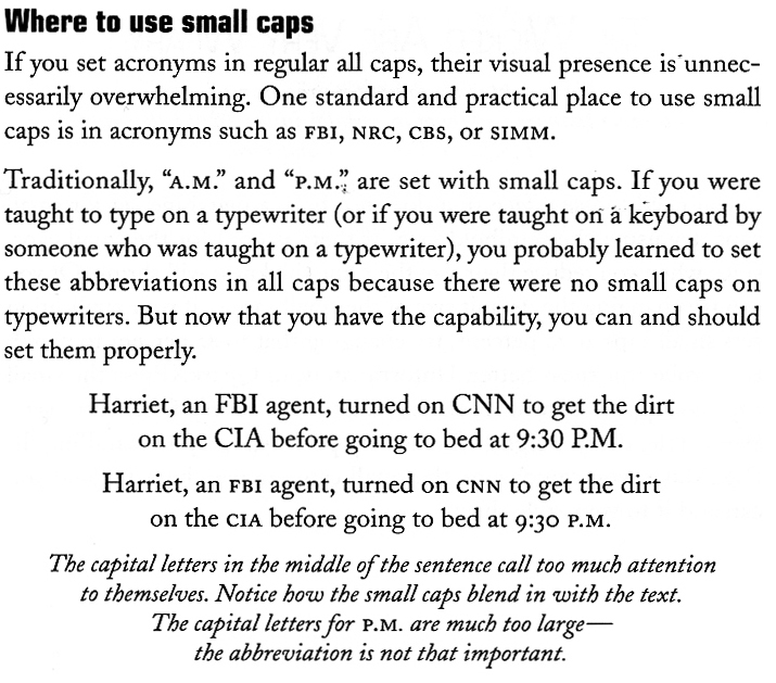
.................................................................................................................................................. SMALL CAPS
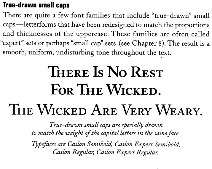
Small caps are uppercase (capital) letters that are about the size of normal lowercase letters in any given typeface. Small caps are less intrusive when all uppercase appears within normal text or can be used for special emphasis. Computer programs can generate small caps for a any typeface, but those are not the same as true small caps. True small caps have line weights that are proportionally correct for the typeface, which me and that they can be used within a body of copy without looking noticeably wrong.
When setting text that contains acronyms, select a typeface with small caps as a family. Selecting small caps from the style menus is a poor choice because the compute reduces the overall size of the type by 80%. This changes the stroke weight and the feel of the font. Expert sets in the Adobe Type Library have small caps options.
Use small caps for acronyms. Set acronyms such as NASA or NASDAQ in small caps when they appear in body text or headlines. Use small caps for common abbreviations. Set common abbreviations such as AM or PM in small caps so they don't overpower the accompanying text. Use small caps for A.M. and P.M.; space once after the number, and use periods. (if the font does not have small caps reduce the font size slightly)
Use true small caps fonts. Avoid simply resizing capital letters or using the small caps feature in some programs. Instead use typefaces that have been specifically created as small caps.
Assignment:
Identify and list 6 Serif fonts and 3 Sans Serif fonts that have small caps.
Recreate the sample text below using fake small caps and an example with real small caps. Harriet, an FBI agent, turned on CNN to get the dirt on the CIA before going to bed at 9:30 P.M
*you have to change the FBI to fbi to use the small cap correctly. Same with CNN cnn, CIA cia PM to pm then change to small caps.
.................................................................................................................................................. NUMERALS/FIGURES
You corrected part of this page in the Mac is not a Typewriter document.
NUMERALS/FIGURES
Our uppercase alphabet came from the indiscrimination capitals of the Romans. Our lowercase alphabet came from the European uncial alphabets of the Middle Ages, which themselves evolved from scribal approximations of the uppercase alphabet.
But our figures were invented in India. They spread westward through the influence of Persian and Arab mathematicians. Traditionally they were known as Arabic numerals, but latterly as Hindu-Arabic numerals. Arabic and Indic languages, of course, look very different from European languages. Thus figures have always presented a challenge for type designers, as they rely on shapes that are found nowhere in the uppercase and lowercase alphabets.
Lining figures
Lining figures are usually the same height as caps, but not always. Some fonts have lining figures that fall between lowercase and cap height (for instance, Equity).
*SHOW AND EXAMPLE OF LINING FIGURES
Oldstyle figures
“Oldstyle” is a curious term for these, because the oldest figures—the original Hindu-Arabic numerals of the first century—look more like lining figures.
Unlike lining figures, oldstyle figures are designed to look more like lowercase letters. The ones in Equity (shown below) are typical—some are short, some descend below the baseline, and some ascend. You won’t be surprised to hear that oldstyle figures work best in lowercase body text.
Oldstyle figures have more of a traditional, classic look and are very useful and quite beautiful when set within text. They are only available for certain typefaces, sometimes as the regular numerals in a font, but more often within a supplementary or expert font.
*SHOW AND EXAMPLE OF OLDSTYLE FIGURES
How to use numbers in tables (using TABS)
Exercise in aligning numbers in a table (create exercise using tabs)
Use lining figures
12 134 17 1023 323
22 667 21 9730 356
12 589 56 8431 409
Use oldstyle (non-alinging)
12 134 17 1023 323
22 667 21 9730 356
12 589 56 8431 409
Use lining figures
12.5 134.4 17.8 1023.4 323.0
73.05 86.5 22.11 923.55 595.0
10.25 76.10 36.70 1023.4 323.0
Use aligning numbers in an example: Dear John, please call me at 438. 9762 at 3:00 to discuss marriage or write me at Route 916, zipcode 87505
Use old style/ non-aligning numbers in an example: Dear John, please call me at 438. 9762 at 3:00 to discuss marriage or write me at Route 916, zipcode 87505
.................................................................................................................................................. TYPOGRAPHIC COLOR
we did the exercise in-class/homework (x-height doc) you need to add the text to the section
When typographers mention to color, they are typically not referring to a rainbow. They are speaking, instead, of black and white and the wide range of gray textures which are called forth when white and black interact.
Every typeface has its own apparent lightness or darkness, or optical weight. A typeface’s color is determined by stroke width, x-height, character width and serif styles.
As the great Swiss typographer Emil Ruder put it in 1960, “The business of typography is a continual weighing up of white and black, which requires a thorough knowledge of the laws governing optical values. Readability and legibility are two key elements of printed text that typographer strive to maximize. Readability extended amount of text – such as an article, book, or annual report – is easy to read. Legibility refers to whether an refers to whether a short burst of text – such as a headline catalog listing, or stop sign – is instantly recognizable.
As a designer, if you are only asked to make the text readable on the page the following questions should be asked
Who is to read it? Someone that wants to read it? Someone that has to read it?
How will it be read?
Quickly. In passing. Focused. Near. Far.
Assignment
You will be exploring one type of typographic color. (you should have this done already X-height comparison document.)
To achieve results that can be compared you need to use the same sizes, same leading and the same column width. *there is an InDesign document on the server for you to use, you may alter it as you wish. However all the content has to be on the page: 1) display the x-height 2) name the font, name the designer 3) paragraph of text; all paragraphs use the exact same size and leading 4) describe the color...
Choose any 12 serif fonts and 12 sans serif fonts from the approved font list. And compare the fonts based on the x-height.
Please make sure all the following information is on the page {do not crowd the pages.
-- x-height comparison
-- name of font
-- designer’s name
-- body copy all set to 8.5/12 It is critical that you see the same size fonts, leading and column width.
Only change the font in the example no other settings should change. notes: After you have made the comparison. Look carefully how the x-height, stroke weight and character width effect the color of the type. Also note how the visual size of the type faces that are the same size do not appear the same size. Is there a difference in readability? Describe the font its x-height, character width and color. copy and paste this copy to use in your assignment...
Futurism was first announced on February 20, 1909, when the Paris newspaper Le Figaro published a manifesto by the Italian poet and editor Filippo Tommaso Marinetti. The name Futurism, coined by Marinetti, reflected his emphasis on discarding what he conceived to be the static and irrelevant art of the past and celebrating change, originality, and innovation in culture and society. Futurism rejected traditions and glorified contemporary life, mainly by emphasizing two dominant themes, the machine and motion.
-- name of font
-- classification
-- designer’s name
-- notes (see above)
..................................................................................................................................................
PARAGRAPH BREAKS
Paragraph breaks set a rhythm for the reader. The breaks have a relationship with the column of text as well as the page margins. A break may be introduced as an indentation, as a space or both. The over all page feel will be influenced by your choice.
In typography there are 4 rules regarding paragraph breaks:
1. first line at the beginning of an article should be flush left (do not indent first paragraph)
2. block paragraphs are flush left and are separated by extra leading not a full return 3. the amount indent is = to the leading (sometimes needs a bit more)
4. never hit two returns between paragraphs
Assignment:
explore at least 10 different ways to show that there are 3 paragraphs. The investigation should be of NEW and DIFFERENT ways to show a paragraph break. Begin with 8.5/12 as a baseline size and leading. You may make text smaller or larger to show a new paragraph. You are exploring only how to show a paragraph break NOT how to alter layouts. {There is a big difference}.
All solutions should be legible, clear and interesting.
Correct the text below before you begin; dashes, quotations marks, apostrophes, italic title of newspaper, superscript, accent marks: libertà. Mallarmé use this text for your assignment (first correct the text before duplicating it)
Futurism was first announced on February 20, 1909, when the Paris newspaper Le Figaro published a manifesto by the Italian poet and editor Filippo Tommaso Marinetti. The name Futurism, coined by Marinetti, reflected his emphasis on discarding what he conceived to be the static and irrelevant art of the past and celebrating change, originality, and innovation in culture and society.1 Futurism rejected traditions and glorified contemporary life, mainly by emphasizing two dominant themes, the machine and motion. The manifesto's rhetoric was passionately bombastic; its tone was aggressive and inflammatory and was purposely intended to inspire public anger and amazement, to arouse controversy, and to attract widespread attention.
But is is the movements which survive, oddly, here where we live and work as poets and artists: or, if not the movements, then their sense of art as an life itself. All of which, as futurism, had come sharply into focus by the start of the world war: a first radical mix of art and life, the epitome in the poplar mind of an avant-garde. It was, on both its Russian & Italian sides, the first great "art" movement led by poets; and if its means now sometimes seem exaggerated or unripe in retrospect, they carry within them the seed of all that we were later to become.
While Marinetti's opening manifesto for Italian Futurism bristled with a polemical stance in favor of the transformed present (1909), the later manifestos of Futurist poets and artists offered formal, "technical" approaches to the works then getting under way. The key term--still resonant today--was parole in liberta2, by which poetry was to become "an uninterrupted sequence of new images… (a) strict bet of images or analogies, to be cast into the mysterious sea of phenomena." This freedom-of-the-world, while it resembled other forms of collage and of image juxtaposition, more fully explored the use of innovative and expressive typography in the visual presentation of language, as set in motion by forerunners like Mallarme. Outrageous and aggressive, the Futurists' performances mixed declamation and gesture, events and surroundings, indifference and engagement, to break the barriers between themselves and those who came to jeer or cheer them. Wrote Marinetti selbst3 (circa 1915), "Everything of any value is theatrical."
.................................................................................................................................................. HEADERS SUBHEADS CROSSHEADS
Please use all of the following text: the text is the same from the last exercise you are just adding a header and subheads. Look back at your font combinations to get an idea on typefaces you could use in combination.
Words in Liberty
A Prologue to Futurism
Futurism was first announced on February 20, 1909, when the Paris newspaper Le Figaro published a manifesto by the Italian poet and editor Filippo Tommaso Marinetti. The name Futurism, coined by Marinetti, reflected his emphasis on discarding what he conceived to be the static and irrelevant art of the past and celebrating change, originality, and innovation in culture and society.1 Futurism rejected traditions and glorified contemporary life, mainly by emphasizing two dominant themes, the machine and motion. The works were characterized by the depiction of several successive actions of a subject at the same time. Marinetti's manifesto glorified the new technology of the automobile and the beauty of its speed, power, and movement. He exalted violence and conflict and called for the sweeping repudiation of traditional cultural, social, and political values and the destruction of such cultural institutions as museums and libraries. The manifesto's rhetoric was passionately bombastic; its tone was aggressive and inflammatory and was purposely intended to inspire public anger and amazement, to arouse controversy, and to attract widespread attention.
Radical mix of art and life
But is is the movements which survive, oddly, here where we live and work as poets and artists: or, if not the movements, then their sense of art as an life itself. All of which, as futurism, had come sharply into focus by the start of the world war: a first radical mix of art and life, the epitome in the poplar mind of an avant-garde. It was, on both its Russian & Italian sides, the first great "art" movement led by poets; and if its means now sometimes seem exaggerated or unripe in retrospect, they carry within them the seed of all that we were later to become.
While Marinetti's opening manifesto for Italian Futurism bristled with a polemical stance in favor of the transformed present (1909), the later manifestos of Futurist poets & artists offered formal/"technical" approaches to the works then getting under way. The key term--still resonant today--was parole in liberta 2 , by which poetry was to become "an uninterrupted sequence of new images… (a) strict bet of images or analogies, to be cast into the mysterious sea of phenomena." This freedom-of-the-world, while it resembled other forms of collage and of image juxtaposition, more fully explored the use of innovative and expressive typography in the visual presentation of language, as set in motion by forerunners like Mallarme. But the verbal liberation didn't end with the page; it moved, rather, toward a new performance art and a poetry that "scurried off the page in all directions at once," as Emmett Williams phrased it for the "language happenings" of a later decade. Outrageous and aggressive, the Futurists' performances mixed declamation and gesture, events and surroundings, indifference and engagement, to break the barriers between themselves and those who came to jeer or cheer them. Wrote Marinetti selbst 3 (circa 1915): Everything of any value is theatrical." .................................................................................................................................................. CAPTIONS AND NOTES
Footnotes and endnotes Footnotes and endnotes are necessary components of scholarly and technical writing. They’re also frequently used by writers of fiction, from Herman Melville (Moby-Dick) to contemporary novelists. Whether their intent is academic or artistic, footnotes present special typographic challenges.
Specifically, a footnote is a text element at the bottom of a page of a book or manuscript that provides additional information about a point made in the main text. The footnote might provide deeper background, offer an alternate interpretation or provide a citation for the source of a quote, idea or statistic. Endnotes serve the same purpose but are grouped together at the end of a chapter, article or book, rather than at the bottom of each page.
These general guidelines will help you design footnotes and endnotes that are readable, legible and economical in space. (Note that academic presses and journals can be sticklers for format: before proceeding, check with your client or publisher to see if they have a specific stylesheet that must be followed.)
Numbers or Symbols: Footnotes are most often indicated by placing a superscript numeral immediately after the text to be referenced. The same superscript numeral then precedes the footnoted text at the bottom of the page. Numbering footnotes is essential when there are many of them, but if footnotes are few they can be marked with a dagger, asterisk, or other symbol instead. Endnotes should always use numerals to facilitate easy referencing.
Size: Footnotes and endnotes are set smaller than body text. The difference in size is usually about two points, but this can vary depending on the size, style and legibility of the main text. Even though they’re smaller, footnotes and endnotes should still remain at a readable size.
Assignment:
using 6 solutions from the header and subhead investigation use the footnotes, subscript numerals and superscript numerals correctly. Important questions to ask yourself: am I using the rule correctly, if am not why? How they are treated? How to they relate to the text? How to the react to the page?
add the footnotes (but don't use them at the foot of the page, how can they react or interact with the text on the page, think of them as "side notes)
1. Philip Meggs, History of Graphic Design, Van Nostrand Reinhold, 1988
2. parole in liberta = words set free (liberty)
3. selbst = himself *in your current project make sure you follow the rules you have learned about captions, notes, superscripts...
.................................................................................................................................................. JUSTIFICATION
Justify text only if the line is long enough to prevent awkward and inconsistent word spacing. The only time you can safely justify text is if your type is small enough and your line is long enough, as in books where the text goes all the way across the page. If your line is shorter, as in newsletter, or if you don't have many words on the line, than as the type aligns to the margins the words space themselves to accommodate it. It usually looks awkward. You've seen newspaper columns where all text is justified, often with a word stretching all the way across the column, or a little word on either side of the column with a big gap in the middle. Gross. But that's what can happen with justified type. When you do it, the effect might not be as radical as the newspaper column, but if your lines are relatively short, you will inevitably end up with uncomfortable gaps in some lines, while other lines will be all squished together. When your work comes out of the printer, turn it upside down and squint at it. The rivers will be very easy to spot. Get rid of them. Try squinting at the example on the bottom of the previous page.
Reminder:
A general guideline for determining if your line length is long enough to satisfactorily justify the text: the line length in picas should be about twice the point size of the type; that is, if the type you are using is 12 point, the line length should be at least 24 picas (24 picas is 4 inches-simply divide the number of picas by 6, as there are 6 picas per inch). Thus 9-point type should be on an 18-pica line (3 inches) before you try to justify it, and 18-point type should be on a 36-pica line (6 inches). The rulers in most programs can be changed to picas, if you like.
Assignment:
use one size, one leading, one column width. JUSTIFIY the text. All you are changing is the Justification setting in InDesign. The goal is to find a setting that has a comfortable wordspace and letterspace.
Try 5 different settings using one SERIF font, try the same settings with a SANS SERIF (10 total)
a. change the min, desired, maximum numbers
b. write down the numbers for each setting write down what the problems are ie. too large wordspacing, too tight...
..................................................................................................................................................
COMBINING TYPEFACES
You have done this exerecise already you just need to add it to this chapter.
When combining serif and sans serif text fonts, one shroud try and match the characteristics of form and type color: proportion, x-heights.
“There is not binding recipe for type combinations. It is a matter of typographic sensitivity and experience. Expert typographers, as well as careless amateurs permit themselves combinations that would horrify colleagues with more traditional sympathies.”
Although there is not recipe there is a place to start: keep an eye on the characteristic shapes of the letterform. A well designed page contains no more than two different typefaces or four different type variations such as type size and bold or italic style. {Using 2 different serif fonts or 2 different sans serifs fonts in the same composition is never a good idea}
Assignment
Try the 10 type combinations
Combine serif with sans serif
Write down the font in the combination. Why you think that particular font works well with the other and any changes you made to make the fonts combine “well”.
..................................................................................................................................................
ANATOMY OF TYPE
You have done this exercise already you just need to add it to this chapter.
..................................................................................................................................................
FONT CLASSIFICATIONS
Humanistic
The oldest Italian, mostly Venetian, printing type, designed at the end of the fifteenth century during the Italian Renaissance, are based on the handwriting of the humanists. This script went back to the Carolingian minuscule of the ninth century. In 1470, Nicolas Jenson, a French printer who worked in Venice, was one of the first to cut a refined humanistic typeface. This is generally seen as the prime example for the first group of types we use to this day: the humanists.
Garalde
Appeared during the French Renaissance period. The name ‘garaldes’ is a contraction of the names of the French punchcutter Claude Garamond and of the Venetian printer Aldus Manutius. The first garaldes were based on the humanists, but they are more sophisticated, have narrower proportions and more fluent transitions.
Transitional
The transitionals are the early neoclassical typefaces that appeared in the middle of the eighteenth century and were usually designed for a specific purpose. They are seen as the first types that were really designed. The transitionals mark the transition between the Renaissance and neoclassicism.
Modern or Didone
These are the late neoclassical seriffed types and their name is a combination of the French printing family Didot and the Italian printer Bodoni of Parma. The typeface Bodoni by Giambattista Bodoni, also known as the ‘king of the typographers’ (principe dei tipografi) or ‘printer to the kings’, is seen as the highlight of the didones.
Slab-serif
The slab-serifs are constructed typefaces and in general have hardly any thick-thin contrast. Some early slab-serifs are called egyptians – allegedly after the popularity of the Napoleonic campaign in Egypt and the resulting interest in Egyptology. (Confusingly, many of the geometrically constructed slab-serifs designed a hundred years later all bear egyptian place names such as Karnak, Luxor, Memphis etc., but they have nothing to do with the shape of the earlier egyptians which used the Grotesque form as their basis.) The Clarendon typeface is so typical for this group that in some English classifications the term ‘slab-serif’ is replaced with ‘Clarendon’.
Humanistic sans-serif
Sans-serifs are typefaces that owe their essential form to writing. The French word ‘linéal’ unsurprisingly means ‘advancing in a straight line.’ They first appeared at the beginning of the nineteenth century (Caslon Foundry, 1812/14), but only in capitals. The first sans-serif with lowercase appeared in England in 1834. Towards the end of the nineteenth century, every self-respecting foundry had a number of sans-serif typefaces with several variants. The humanistic sans-serifs are different because they follow the proportions of the classical Roman capital for the capitals and the humanistic manuscript hand for lowercase letters.
Grotesque sans-serif
The sans-serif grotesques appeared as a result of the popularity of the Swiss style of typography after the Second World War. Sans-serif started to get used more and more frequently with the advent of the Helvetica in 1957, created by the Swiss Max Miedinger.
Geometric sans-serif
The geometric sans-serifs seem to be drawn with ruler and compass. It takes a lot of skill to produce clearly legible typography with these typefaces. Good microtypography, such as choosing the right letter spacing and line interval, is very important.
..................................................................................................................................................
FONT SPEC
This has already been done for you you just have to add it to your document. You may have to use a school machine if your fonts are not working. Format it to match your workbook and make sure things are locked to the rules. No type should float above or below the rules.
..................................................................................................................................................
THE END!!!
.................................................................................................................................................. LULU INSTRUCTIONS
1) In your workbook you will need to have your title page on the SINGLE first page of the InDesign document. If you don't your entire book will be 1 page off. Meaning spreads will not be spreads.
2) Have a second InDesign document with your COVER. Front Spine Back. LULU will TELL YOU THE SIZE when you are uploading your file. So wait to design the cover until you have uploaded your book to lulu.
3) Once you are ready to upload. you have proofed your book a couple of times. you have extended your bleads out .25 then you are ready. EXPORT your FILE as a PDF in SINGLE PAGES. Do not export as spreads. MUST be SINGLE PAGES.
4) http://www.lulu.com/publish/books/ Create an account Bleed info (will need to be signed in)
5) Browse for your pdf (single page) and click Upload
6) Depending on your connection it could take several minutes
7) Once is it uploaded you can see you have options including DELETE. Click MAKE PRINT READY FILE.
8) Save and continue. Go to the Advanced Cover it will TELL you the exact size of your cover including the spine. Make the Cover in InDesign. Follow the sizes lulu give you.
9) Go through the rest of the steps. Do not make your book public. Do not sell it on the market place.
10) Just because you uploaded your book does not mean you have purchased it. THAT is the last step you have to purchase the book.
..................................................................................................................................................
REFINE BOOK AND ADD cover, title page, table of contents... save as pdf and put it on the server so i can look at it BEFORE you send it off to lulu.
.................................................................................................................................................. DUE:
LULU info and tips http://www.lulu.com
Cover Sprine Back Cover has to be in a different document. LULU will tell you the exact size so just have the design set for now. Have the iile handy to change/
Page 1 is YOUR TITLE PAGE the inside first page of your book. Do not LEAVE it blank.
MAKE SURE ALL YOUR FONTS are turned on do not export to pdf if you have any font errors -- lulu gets mad;
MAKE SURE ALL your IMAGES are linked. Otherwise it won't print.
Export pdf as PAGES not SPREADS!
Upload and continue and save
COVER you can use the LULU cover maker but most of you will want to click on ONE-COVER WIZARD it will tell you exactly want size to make you cover * you can do all this and not SEND to lulu. Just try it.
example.
One-piece cover requirements:
Your file must be a PDF, JPG, GIF, or PNG
Spine width: 46 Postscript points wide (0.639") (192 px)
Spine begins 657 Postscript points (9.13") (2738 px) from the left.
Total cover width: 1360 X 900 Postscript points (18.89" X 12.50") (5667px X 3750px)
If using an image, its resolution should be set to 300dpi
Also post a minum of 6 spreads on Behance. The more time you can spend getting your behance pages ready when you are done with a project then closer you are to an internship. You will be ready to apply. If you don't make your behance pages great as you go. You will have to go back and redo them. Do it now while you have all your files handy.
You can export your spreads as EPS and then you can open it in Photoshop to make your mock-ups. Save as EPS not jpg to open in photoshop. Save photoshop files a RGB jpg or png. Remember Behance is 1400px wide. Some good examples on how to show publications. Find your solution these are examples.
No Service
An Eye for Typography
Public Type
Swell