visual communication
VISC 302
................................................................
Professor: Andrea Herstowski
Office
hours: by appointment
email: herstow@ku.edu
.................................................................
:: Research
:- Thinking with Type
:- Typotheque
:- Type Cultur
:- Visual Thesaurus
:- Type Base
:- dailydropcap.com
:- designobserver.com
:- formfiftyfive.com
:- friendsoftype.com
:- ministryoftype.co.uk
:- typographica.org
:- welovetypography.com
.................................................................
:: Short films :: Audio
:- films by Hillman Curtis
:- Type Radio
POSTCARD: Design Principle: Due at the Review make sure you have it printed on 100lb card stock(can be front only or front and back) put your name on it in 6pt type (legible). You will have to find time to work on it between now and then (worth 5% of your final grade)
......................................................................................................................................................................
Project 4: Festival/Fair
Your next challenge is to imagine, design and produce the materials for multiple day festival/fair.
Festival branding has to be successful across such a vast range of scales — from huge stage scrims to tiny wristbands. The most successful and honest festival branding, it seems, relies not only on type, color, logomarks and a suite of photography, but on creating a holistic identity built around more abstract and experiential concepts.
There are many unknowns for this project that you will have to figure out and define. Be prepared to be uncomfortable with the unknown. This is your last test of the semester.
“The thing you love [about a design project] is the stuff that no one asks for but someone made it anyway. It’s not generated by thinking ‘who is this for and who will like it,’ it’s just stuff that’s relevant to what you want to do. That confidence means you’re creating a lot of joy in making that world. You can tell when someone’s ticking a box or thinking too literally. That’s the kind of spirit we’ve tried to work in.”
Look and Feel: The final solutions must be an organic/kinetic series. The audience shouldn’t be able resist your promotional piece and want to find out more.
......................................................................................................................................................................
READ: https://eyeondesign.aiga.org/what-does-it-really-mean-to-brand-a-festival/
Inspiration: 21 inspirations | more inspiration
Kinetic Systems | Dropbox casestudy | PopTech | YBCA | Espacio | Fathom | BrandNew Awards
Tips: Posters (read it)
Brand Guidelines | we work | chocolate | Barre | Medium | KAE |
......................................................................................................................................................................
Project is due 9am May 14th (Review Day)
— Deliverables outlined here
— Poster on the Epson 19.5 x 44 (paper is 44 wide so keep it to that size)
— Post on Behance (include promotion, motion, web -- everything) poster is in same proportion.
— Project Brief + Process (pdf)
— Small Brand Guideline (8 page -- digitally only)
..................................................................................................................................................
!!! CALENDAR !!!
At the mid-way point of this project what you need to do is not going to be clearly defined by me. You will be working on different deliverables. You know the design process: Ideate, explore, refine... you know when the project is due. So you need to figure out / define what you need to do each class to finish the project. This will be hard. Many of you are not going to like this. But in a job your creative director won't always tell you how much they want to you to make. This is a test on your motivation, responsibilities, skills and you have to pass it to make it onto next semester.
..................................................................................................................................................
Monday, April 8
— Crit Behance
— Project Intro
— Thinking Wrong
HOMEWORK (type it all up, design it in a nice simple clear way, save as PDF and present on Wed)
*yes this is a lot and if you can't do it you may want to concider a different / easier life for yourself.
— What are 3 festivals/fairs you considered
— What did you consider them and why did you decide on the top choice?
Picking one of your ideas...
— What are the events -- make a long list. Speakers, Shows, Events, Tastings, ....
— What are 3 key events? Who, What, Why
— Where is it? Somewhere unexpected? Is it a traveling ____?
— What could be all the deliverables
*make a long list and keep adding to it (you are not making them all :)
— and THEN
— create a mind map/word list, define words, mash up words
— Write a 6 word pitch about you overall theme or idea of your festival (big picture)
— Develop 6 Concept. Name. Tagline. And 2 - 3 Sentences (1 slide for each concept)
(most of you did a great job with this for the conference. So this should be familiar to you ... you can do it!
*On the last slide please have all
6 names and taglines together on one slide so we can talk about each one easier than clicking back through.
..................................
Examples...
Converge
Disciplinarians and Digital Scholarship
Converge encourages design educators, design researchers, and designers to take advantage of opportunities in digital scholarship, learn how to collaborate on interdisciplinary projects, and find new intersections within their existing research trajectories. To redefine what it means to be a designer and a design researcher today, we ask: How can design converge with digital scholarship in more than a superficial way? How might aspects of digital scholarship impact design research? What are the key questions at the intersection of design and the humanities?
RGD DesignThinkers 2015 Conference
Converge. Inspire. Transform.
RGD DesignThinkers, Canada's largest annual conference for the communication design industry, is a two-day event where International and Canadian creative visual communicators converge in downtown Toronto. Registrants have the opportunity to attend high-profile speaker presentations, panel discussions, network with colleagues, attend workshops and participate in a variety of other programs related to the design industry.
"Converge. Inspire. Transform” became the tagline for the event. “Converge", because of people coming together physically at one location with unity of purpose. “Inspire", because of the exchange of new ideas and ways of thinking. And lastly, “transform” because of emotional or intellectual change after attending the conference. Visually, we wanted the branding to encapsulate the digital feel of data but in contrast to something tactile and hand-crafted. To this end we executed the visuals by moving between making things by hand and finishing them off in the computer or by generating assets off the computer and finishing them by hand.
*Converge and Transform gives you visual cues on the visual direction of the conference. If you use the word inspire then you better make something that looks inspired!
Nuts + Bolts
Tightening up classroom fundamentals, reinforcing careers, and constructing the future of the discipline
Nuts + Bolts, a national AIGA Design Education conference for emerging and established design educators, administrators, students, and designers to strip away the mystique of academia and help build a solid foundational knowledge of discipline specific teaching methods.
..................................................................................................................................................
Wednesday, April 10
-
present ideas
-
have 3 - 6 key words that help with visuals
HOMEWORK FOR MONDAY
1) Do a visual audit of other events/festivals/fairs in your space.
2) Create three seperate moodboards for directions of the brand**
** Push them in different directions.
3) Start sketching. 50 sketches (have at least 30 for Monday). Use a pencil and paper. Graph paper could help you keep things in scale and aligned. Explore literal and abstract concepts for a wide variety of solutions. Also think about monograms and characters / mascots.
Some inspiration from a past student... her sketches looked like this...
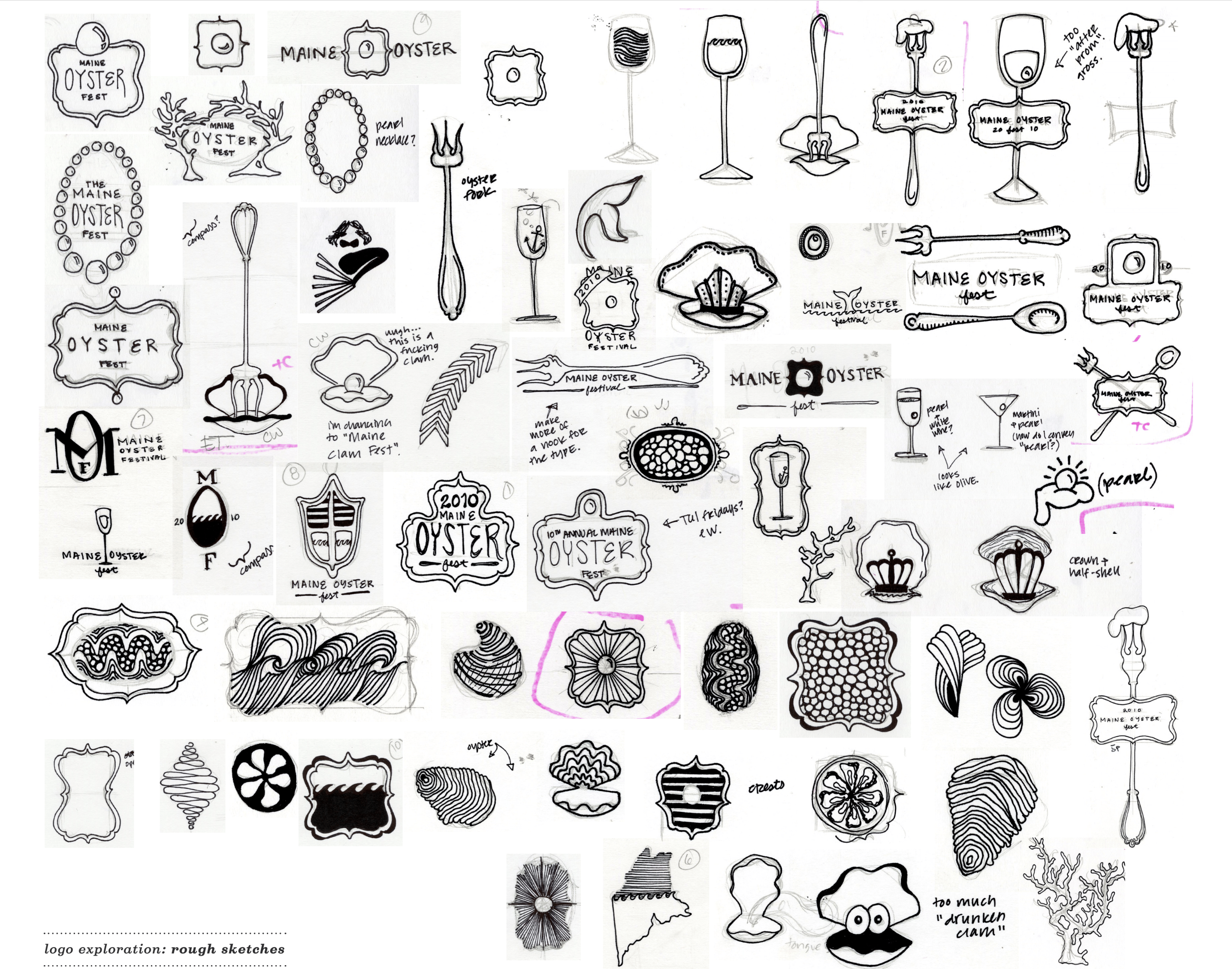
type studies on the computer (you can do thise by hand and/or on the computer -- looking for range of ideas
..................................................................................................................................................
Monday, April 15
How can your concept become visual?
This is should be fun! You get to dream/explore/combine how your concept becomes visual.
HOMEWORK
Continue to sketch and refine your marks, move into the computer.
Begin to develop your (3) three brand concepts. Make them feel different. Even within one moodboard you will have plenty of room to explore. Be prepared to present like your would be presenting/pitching to a client.
TIPS
Type Exploration or Type and Image or Type and Pattern
Type solution/ lock-up how are using typography for the title and tagline of your Festival/.
Make sure you have a concept
Title, Tagline, blurb and moodboards all should have a concept around them!
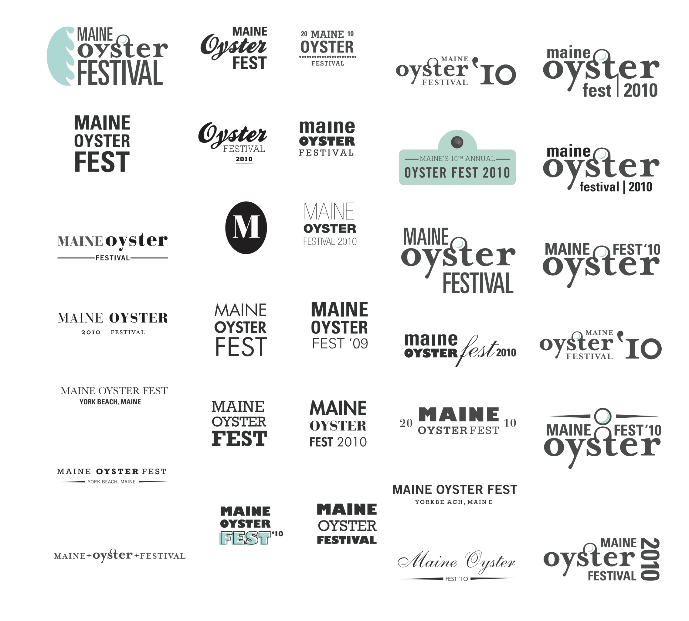
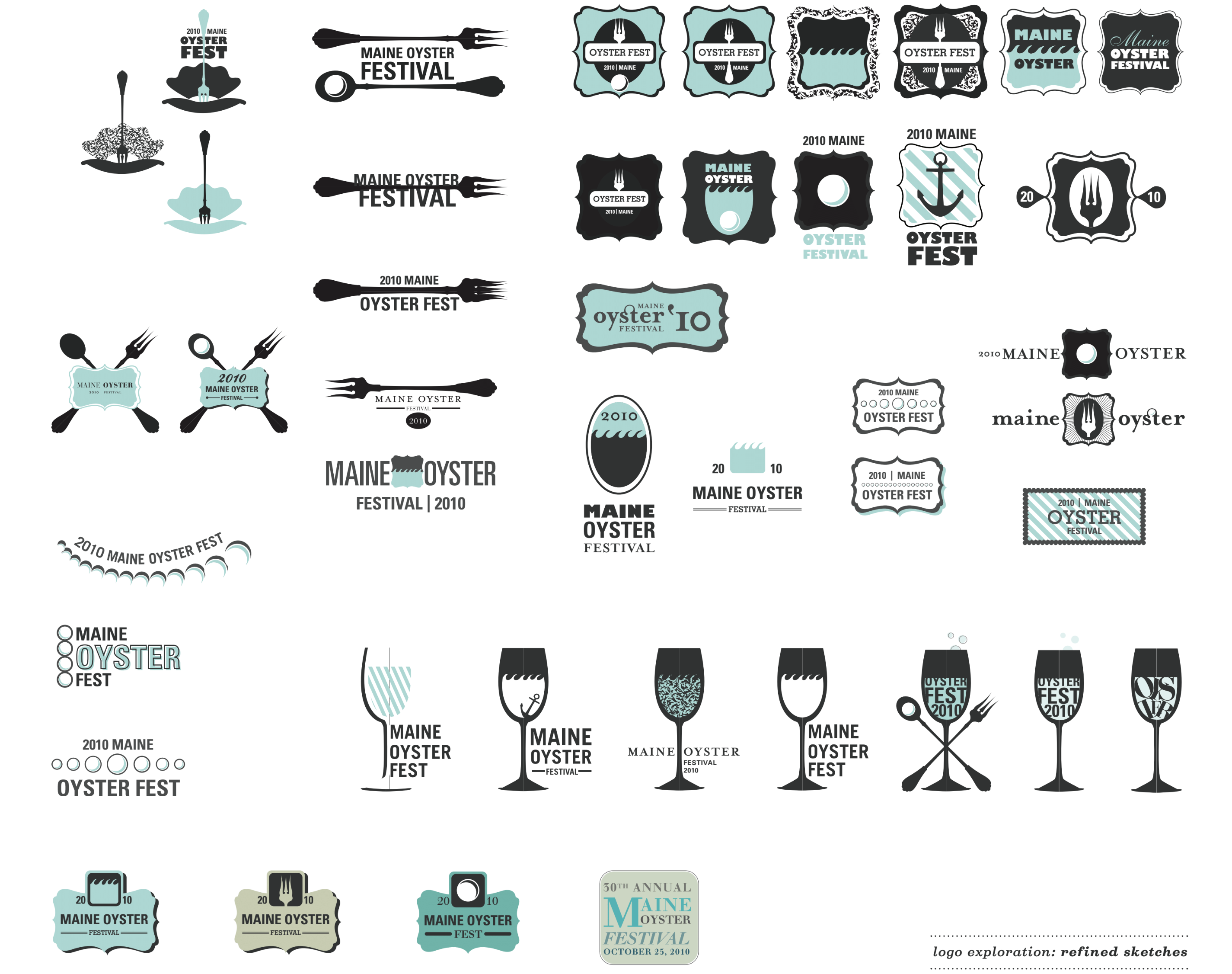
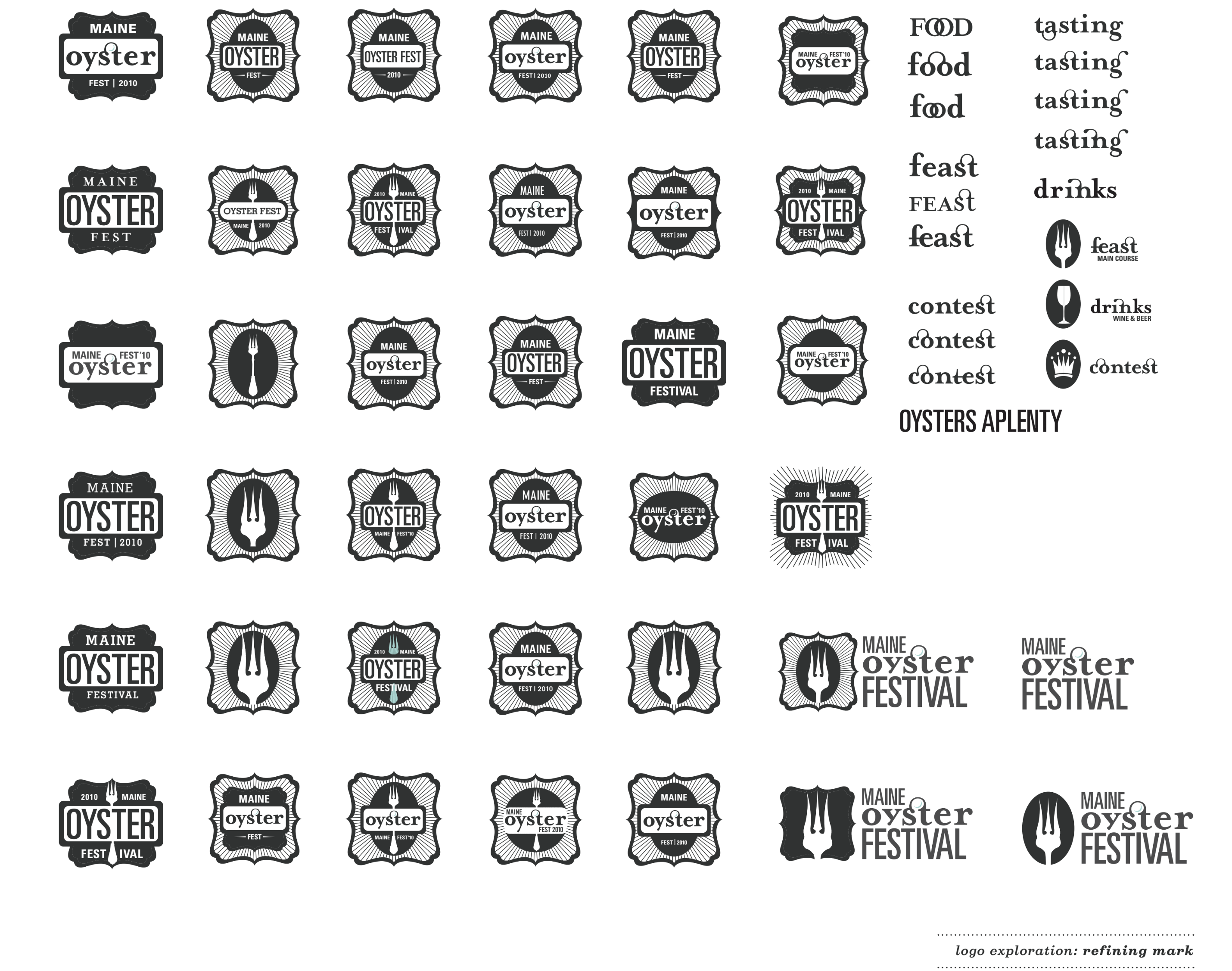
What refinement and exploration of marks looks like...
 ..................................................................................................................................................
Wednesday, April 17
present your sketches
HOMEWORK
Title, Tagline, Sentence, Concept. Refine them if they are still not great.
From your sketches put on the computer and refine at least 6 different logotypes
Think about primary usage, secondary usaga (different lock ups).
Explore your color palette. How can you use it in different proportions of color?
What fonts will you use? Primary, Secondary, (fonts, styles, typopgraphic color) Explore at least 2 options regarding typography.
Photography / Illustrations / Icons / Patterns. How can use use, treat, manipuate... images in different ways?
Thinking of your deliverables you must do / or applications you want to do. Pick 3 different proportions, medias...
ie Billboard, Instagram, Poster (long, square, tall)
After you have done all of that you should be able to...
Refine (2) two distinct visual directions using different ways to approach imagery, typography, typography *font, styles ect, color... Do several explorations of applications/think kinetic system for each concept.
See how you can extend the brands you have created.
Use at least (2)
11 x 17 for each direction. No need to crowd a page. Include above... we need to see to understand your concept and how it plays out to at least 3 applicatons.
..................................................................................................................................................
Monday, April 22
Present and select the direction.
HOMEWORK
Continue building 2 different directions (yes you can love one more)
———
Name Tagline Sentence(s) on the boards
2 different logotype directions
Show each all these ways
1) name only 2) mark only 3) mark and name 4) mark name tagline 5) tagline only
*customize logotype/type
Fonts
Look at your font choices for legibility and personality
If you have a super display font you can still have 2 supporting typefaces.
Make sure you have a typeface that works small for body copy.
Color Palette
2 different color palettes
Photos
6 different images you can use (at least 6)
and 2 different ways to use photography (one way goes with one direction the other way with the other direction)
and/or
Illustration
6 different illustrations
Done in 2 different ways (one way goes with one direction the other way with the other direction)
Pattern (optional)
3 - 6 different patterns?
..................................................................................................................................................
Wednesday, April 24
crit Toolkit.
Work in class on a rough draft of your brand guidelines (this is a tool kit) 5x8 in page (10 x 8 spread, portrait)
Develop Project Brief Document: Project objectives, Name, Tag Line, Sentences, Concept Statement, Audience, List Deliverables, Content of Deliverables. Timeline of Deliverables process, and what is due at the end.
HOMEWORK
Complete draft of brand guidelines so you have at least an outline of what you need to put into it. wework | issuu | maggie : how standards are applied | vote for pete toolkit (is online you are making a booklet)
Finish a Draft of the Project Brief. The project Brief and Brand guide lines are different and both are due at end of the semester as a pdf. Finish them now. Outline the content (what goes on each deliverable. WRITE IT DOWN as part of the project brief
Pick your deliverables.
(make sure you are looking at the list and have something that fits each requirement.)
Design exploration of at least 3 deliverables. 10 - 20 sketches (this is for your benefit you need to think before you start -- by hand or computer). Put your best 3-5 solutions on the computer. Save as a pdf. Keep your system kinetic. Are you missing something in your tool kit? Add to it.
Print everything for Monday.
............................................................................................................................................
Monday, April 29
crit and work in class.
refine brand guideline booklet/brand standard/toolkit (8pages) -- start the content outline in class. So you know exactly what you are doing over the weekend!
HOMEWORK (uncomfortable zone)
Refine Brand guideline booklet/brand standard/toolkit (8pages). Refine and Design in a Kinetic system. Now you are at different spots in the project. You have different deliverables. You know the design process. Ideate, explore, refine... so you need to figure out what you need to do each class to finish the project. This will be hard. Some of you will not be able to be responsible for yourself. For the rest of the semester I am here to give you feedback not to tell you want steps to take to finish. This is a test on your motivation, responsibilities, skills and you have to pass it.
For each class have something new to show. Printed or on-screen. Have questions to ask. Have a plan on what you are going to do next. Please package your files and work on the school machines in the 200A lab every class. Do not work on your laptops. Back up your files. Save as do not save over your projects.
.............................................................................................................................................
Wednesday, MAY 1
crit and work in class
HOMEWORK
Refine and Design, Have a pdf of all of the work you have so far. Be Prepared to present it to class on Monday for feedback. It maybe a hard day. What if you are behind. What if things are not working and we have to tell you. Be prepared. Include your brand guideline booklet. Last slide list all your deliverables and your next steps.
............................................................................................................................................
Monday, May 6
Presentations. Will take the entire class be prepared to participate.
HOMEWORK
Refine
............................................................................................................................................
Wednesday, May 8
crit and work in class
HOMEWORK
Refine and prep for the Final
............................................................................................................................................
Tuesday May 14, 9am Review and Project Due
Project is due 9am May 14th (Review Day)
— Put all deliverables on one poster
— Project Brief (1 - 2 pager include deliverable content outline) (pdf only)
— Brand Guideline (8 page) (pdf)
— If you have any motion please put it into the google drive folder.
* Print Poster on the Epson 20 x 44 (paper is 44 wide so keep it to that LENGTH. You can make it up to 44 wide but I suggest trying to keep it around 20 x 44. Also hand it in as pdf.
* Deiver: Please create a folder yourname_festival put all your pdfs into that folder please name it yourname_deliverable.pdf and put it on the google drive here is the folder !! >> HERE << !!
— Post on Behance (Before the last day of finals, May 17 ) -- you have an extension to get it online only)
* You may also include Brand Guideline on your poster / post it. You can scale it on the poster/post.
Also
POSTCARD: Design Principle: Due at the Review make sure you have it printed on 100lb card stock(can be front only or front and back) put your name on it in 6pt type (legible). You will have to find time to work on it between now and then (worth 5% of your final grade)
REVIEW
You can start to hang/present all your work after 4pm on Monday in your ASSIGNED ROOM. All needs to be ready and you leave the room by 9am on Tuesday, May 14. If a assignment was due online then you do not have to do anything. You have to share space so be a good classmate and keep your work to 2 panels and 1 table. Get your conference posters out of the senior studio.