Professor: Andrea Herstowski
Office: 353 Chalmers Hall
Office
hours: by appointment
email: herstow@ku.edu
................................................................
Wed. February 9
Mon. February 14
Wed. February 16
::::
The Ampersand
_ _ _ _ _ _ _ _ _ _ _ _ _ _ _ _ _ _ _ _ _ _ _ _ _ _ _ _ _ _ _ _ _ _ _ _ _ _ _ _ _ _ _ _ _ _ _ _ _ _ _ _ _ _ _ _ _ _ _ _ _ _ _
The origin of the ampersand can be traced back to the Latin word “et,” meaning “and.” The E and the T that make up this word were occasionally written together to form a ligature (a character consisting of two or more joined letters). Writing the word this way saved the writer time, with one letter flowing seamlessly into the next – a form of cursive or joined up writing.
We know the origina of the symbol Et but where did the word Ampersand come from.
Traditionally, when reciting the alphabet in English-speaking schools, any letter that could also be used as a word in itself (“A”, “I”, and, at one point, “O”) was repeated with the Latin expression per se (“by itself”). It was common practice to add the “&” sign at the end of the alphabet as if it were the 27th letter, pronounced as the Latin et or later in English as and. As a result, the recitation of the alphabet would end in “X, Y, Z, and per se and”. This last phrase was routinely slurred to “ampersand”. The term "ampersand" had entered common English usage by 1837. explained
Create a at least 3 orginal ampersands based on your sketces and exploration. Define a visual system based on the information of one ampersands to create a logotype
Objectives:
understand the history of ampersand
expanding your drawing skills in Glyphs: extrema, points and handles
exploring how to define a system - similarities and differences between characters
use your defined system to develop 2 characters
_ _ _ _ _ _ _ _ _ _ _ _ _ _ _ _ _ _ _ _ _ _ _ _ _ _ _ _ _ _ _ _ _ _ _ _ _ _ _ _ _ _ _ _ _ _ _ _ _ _ _ _ _ _ _ _ _ _ _ _ _ _ _

The invention of the ampersand is usually credited to Marcus Tullius Tiro, who was the faithful slave and secretary to the Roman lawyer and politician Cicero. Tiro invented a shorthand writing system in 63 B.C. called Tironian Notes, which included the ampersand. https://creativepro.com/ampersand-history-usage/
_ _ _ _ _ _ _ _ _ _ _ _ _ _ _ _ _ _ _ _ _ _ _ _ _ _ _ _ _ _ _ _ _ _ _ _ _ _ _ _ _ _ _ _ _ _ _ _ _ _ _ _ _ _ _ _ _ _ _ _ _ _ _
Jan Tschichold, 1902 – 1974. Tschichold devoted an entire study to the development of the ampersand in his 1953 booklet “The Ampersand: Its Origin and Development,” where he collected hundreds of examples of the symbol throughout history, recording its development from the piece of ancient graffiti to the familiar ‘&’ used today. Within this collection are examples from the eighth century which are already recognizable as the modern ampersand. (we have an original copy at KU and zeug made a beatiful reproduction + a contemporary take)
Tschichold’s masterful contribution to the study of the ampersand came in 1953 in the form of a short booklet. Tschichold collected hundreds of ampersands to chronicle the character’s evolution from 1st century Pompeiian graffiti, through medieval manuscripts, and finally to 19th century printed forms. Even a single page of Tschichold’s menagerie of ‘and’-signs contains an embarrassment of typographical riches.
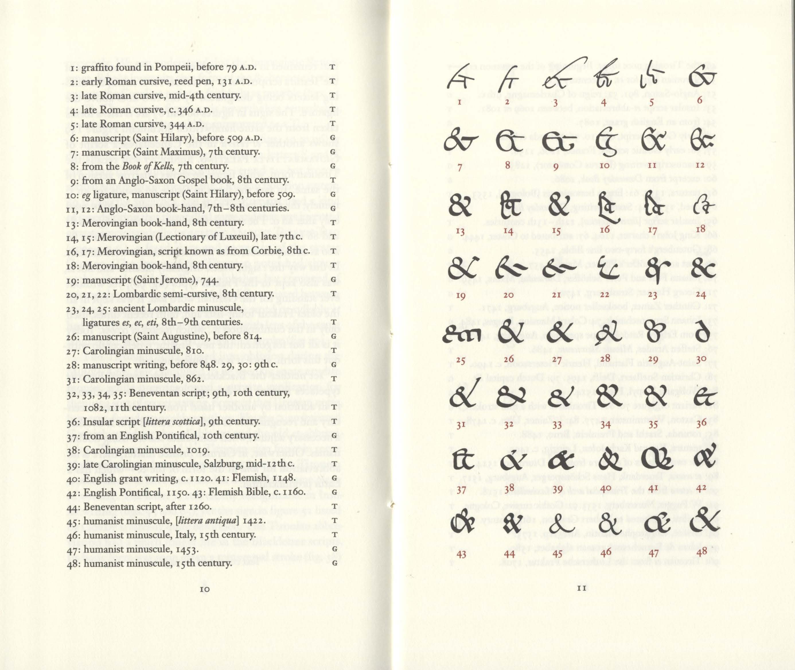
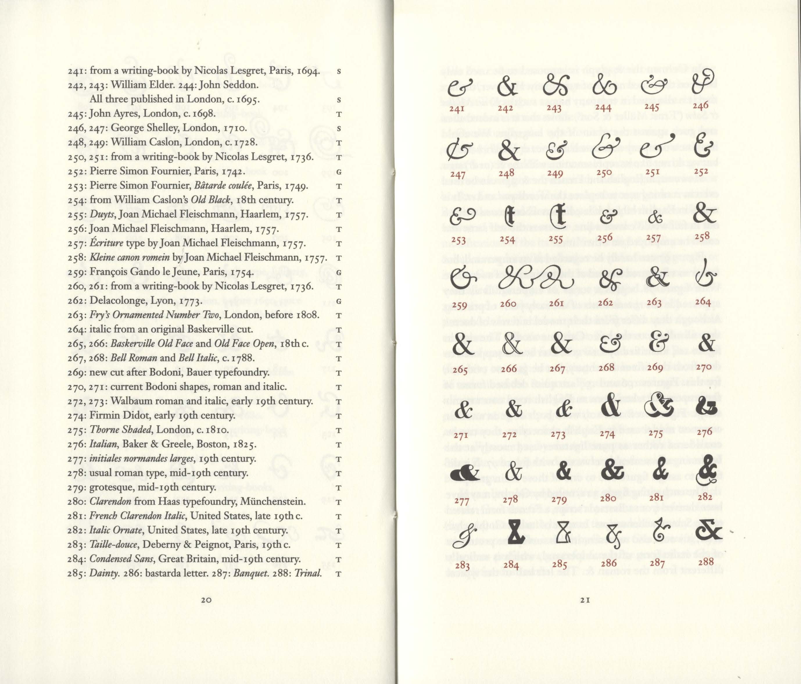
Full pdf from the Watson Library
_ _ _ _ _ _ _ _ _ _ _ _ _ _ _ _ _ _ _ _ _ _ _ _ _ _ _ _ _ _ _ _ _ _ _ _ _ _ _ _ _ _ _ _ _ _ _ _ _ _ _ _ _ _ _ _ _ _ _ _ _ _ _
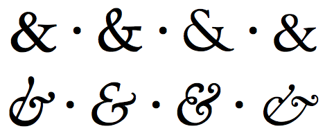
Roman (top row) and italic (bottom row) ampersands. From left to right: Hoefler Text (Hoefler & Frere-Jones), Palatino (Linotype), Goudy Old Style (urw) and Garamond (Monotype). please see shadycharacters.co.uk/2011/06/the-ampersand-part-2-of-2/
Jonathan Hoefler tried to sum up his love for the ampersand, which he says he’s been known to draw “to excess.” “It’s always an opportunity for adventure,” he says. “Even the most conservative typefaces can give sanctuary to a whimsical ampersand or two.”www.fastcompany.com/3055622/why-designers-love-the-ampersand
_ _ _ _ _ _ _ _ _ _ _ _ _ _ _ _ _ _ _ _ _ _ _ _ _ _ _ _ _ _ _ _ _ _ _ _ _ _ _ _ _ _ _ _ _ _ _ _ _ _ _ _ _ _ _ _ _ _ _ _ _ _ _
There are two basic forms of the ampersand, with many variations of both: the traditional, classic double counter version (&), and the style that looks more like an E or an et, sometimes with the addition of curves and flourishes. It is common for an upright, Roman typeface version to have the first style, with its companion italics switching to the second, more calligraphic version. Most fonts have just one ampersand, but with the expanded character set of the OpenType font format, some contain two or more versions, occasionally including a small cap ampersand that is designed to match their shorter height.
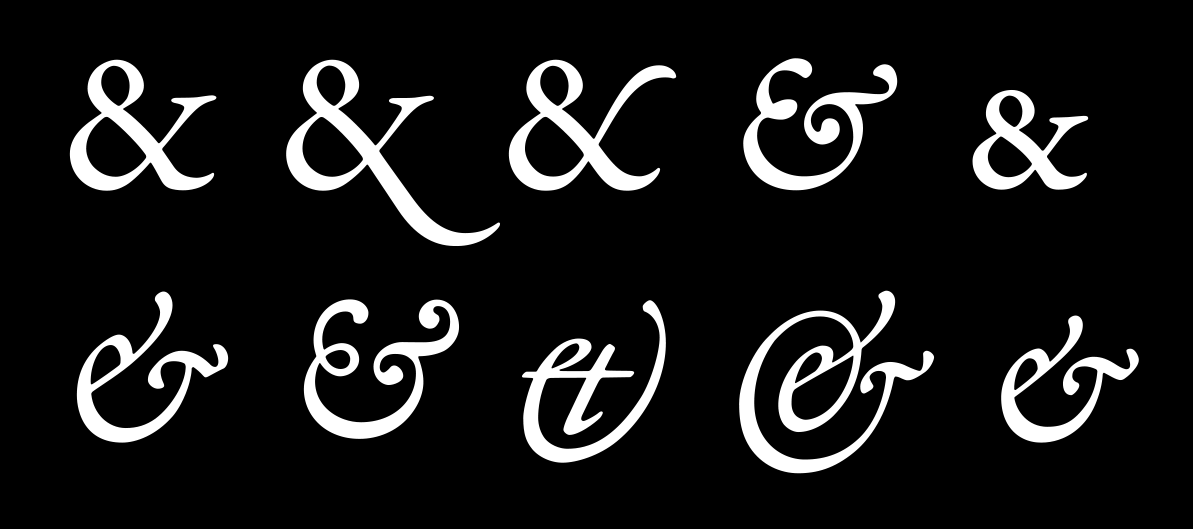
Adobe Garamond Premier Pro has five different ampersand glyphs for both the Roman (upper) and the Italic version (lower). https://creativepro.com/ampersand-history-usage/
Jeremiah Shoaf, Typewolf,...ampersands are usually only used for display type–the large or eye-catching type used in headlines, signage, and advertisements–so the character can be more ornate, even in fonts that are primarily designed for text. A good example of this effect in action are the ampersands of Kings Caslon, Bookmania, Didot Italic, and Cochin Italic, all of which really cut loose and be more flamboyant than their associated typefaces. www.fastcompany.com/3055622/why-designers-love-the-ampersand
_ _ _ _ _ _ _ _ _ _ _ _ _ _ _ _ _ _ _ _ _ _ _ _ _ _ _ _ _ _ _ _ _ _ _ _ _ _ _ _ _ _ _ _ _ _ _ _ _ _ _ _ _ _ _ _ _ _ _ _ _ _ _
RESOURCES (read them)
Print History: https://printinghistory.org/ands-ampersands/
History and Usage of the Ampersand: creativepro.com
Design History: Get to know your ampersands: 99designs.com
Ampersand for Branding: moshik.net
Why Designers love the Ampersand: fastcompany.com
Jan Tschichold: The Ampersand: Its Origin and Development.pdf
Today: Contemporary
Instagram :: 1 :: 2
_ _ _ _ _ _ _ _ _ _ _ _ _ _ _ _ _ _ _ _ _ _ _ _ _ _ _ _ _ _ _ _ _ _ _ _ _ _ _ _ _ _ _ _ _ _ _ _ _ _ _ _ _ _ _ _ _ _ _ _ _ _ _
Wed. February 9
Watch: sketching out of the confort zone
Sketching visual explainations: Sketching Techniques : double pencil
EXPLORE! make make make. Here is a guide.
When you have exhausted your making.
Pick three that you like the best, are the most different from each other.
HOMEWORK
Sketch more if you need/want.
Pick your favorite 3 ampersands (yes any of them).
Digitize/Draw the 3 in the same Glyphs file (-- just use ABC or 123)
_ _ _ _ _ _ _ _ _ _ _ _ _ _ _ _ _ _ _ _ _ _ _ _ _ _ _ _ _ _ _ _ _ _ _ _ _ _ _ _ _ _ _ _ _ _ _ _ _ _ _ _ _ _ _ _ _ _ _ _ _ _ _
Mon. February 14
Inclass show and tell
Refine Ampersands and Logotype
Intro Revival
HOMEWORK
Refine and finsh up Ampersands.
Pick one and sketch a logotype. Take your favorite ampersand and create a logotype. Create a custom letter for each side of the &. Look to your ampersand for clues about stem thickness, thick and thins, stroke endings, proportion.
Start a serious look for a revival. Start pulling examples of what you think you may want to revivie. Can be just uppercase or lowercase. Have lots of resources picked. On Monday February 21 present a pdf of what you concidered, your top 3 choices of typefaces to revivie, why you picked it and want to rivive it, and what you would alter or considerations you will have to make when digitizing.
Watch: https://www.youtube.com/watch?v=44gSzj5ORmo
_ _ _ _ _ _ _ _ _ _ _ _ _ _ _ _ _ _ _ _ _ _ _ _ _ _ _ _ _ _ _ _ _ _ _ _ _ _ _ _ _ _ _ _ _ _ _ _ _ _ _ _ _ _ _ _ _ _ _ _ _ _ _
Wed. February 16
If you want to join from Zoom today we have a guest...
(zoom link on Slack)
Lecture from David J Ross (djr) of Font of the Month... Look him up and have a couple questions.
After the lecture you will ... Present Ampersands and logottype
Crit.
And update us on any research you have done so far on revival homework
Follow the folder hand-in structure...
Make folder on the google drive. Use this folder/file structure for every project.
Folder: Your name: Project Name inside that folder a
______ Folder: Scans with your Scans/Sketches,
______ Folder: Glyphs with your glpyhs app file and the otf file
______ Presentation pdf
______ Instagram images or riso poster/postcard etc...
______ Project Overview (google doc or word) your review of the project.
::