:: Syllabus :: Modular Grid :: Modular Font :: Publication :: Finishing Up :: Ampersand :: class google drive
.................................................................
Professor: Andrea Herstowski
Office: 353 Chalmers Hall
Office
hours: by appointment
email: herstow@ku.edu
................................................................
jump to date
- Wednesday, Dec 1
- Monday, Dec 6
- Wednesday Dec 8
- Dec 10: Stop Day
- Wednesday, December 15 Final
................................................................
Project Links
;- Watch Read Summarize
:- AfterEffects TutorialS
:- Type Classifications
:- Typeface research
Resources: use them
Type Classifications / Thinking with Type
Designing Type by Karen Cheng
Mac is not Typewitter (download pdf
LetterFountain: Names and classifications
Glossary of Terms.pdf
Character Characteristic
Anatomy of the letter
if you like a video here you go
glossary here
pdf compulation Anatomy refresher.pdf
................................................................
Fonts and fountry or type house
:- by Foundry
:- Type Wolf
Links : start following...
:- Thinking with Type
:- Practical Typography
:- designobserver.com
:- friendsoftype.com
:- typographica.org
:- welovetypography.com
:- FontShop Spotlights
:- Fontshop Essays
:- I love Typography
..........
- - - - - - - - - - - - - - - - - - - - - - - - - - - - - - - - - - - - - - - - - - - - - - - - - - - - - - - - - - - - - - - - - - - - - - - - - - - - - - - - - -
Resident Experts: Teach us about a Typeface
The last 3 class periods we will do some workshops and focus a bit the details, looking very closely on characteristics and how letters are drawn and optically corrected to be come legitlble typefaces. An attempt to focus on learning to identify fonts, font characteristics and type classifications. And then teaching them to us -- you are the resident expert of a Typeface. Your task it to teaching us everything there is to learn about a specific typeface. Who designed it, when, its character, how to identify it... You will become the resident expert of your font. We must learn about the typeface through your final animation(s).
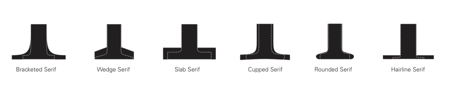
Graphic design professionals are expected to recognize an almost infinite number of typefaces; it is essential, therefore, that students begin by learning the parts of the letter (terms), characteristics and to classify typefaces into these major historical, categories (type classifications): Old Style, Transitional, Modern, Slab Serif, Sans Serif.
A typographic hierarchy expresses the organization of content, emphasizing some elements and subordinating others. A visual hierarchy helps readers scan a text, knowing where to enter and exit and how to pick and choose among its offerings. Each level of the hierarchy should be signaled by one or more cues, applied consistently across a body of text. A cue can type size, style, color, horizontal or vertical alignments, placement, leading, or tracking. Infinite variations are possible.
- - - - - - - - - - - - - - - - - - - - - - - - - - - - - - - - - - - - - - - - - - - - - - - - - - - - - - - - - - - - - - - - - - - - - - - - - - - - - - -
LEARNING OBJECTIVES
_ understand the anatomy of letterforms
_ understand history of typography
_ understand type classifications
_ explore the expressive potential of typography
_ solve communication problems within given parameters
_ methodically document relevant design inspiration and process
_ present and assess work in a visually and verbally articulate manner
_ professionally document outcomes
- - - - - - - - - - - - - - - - - - - - - - - - - - - - - - - - - - - - - - - - - - - - - - - - - - - - - - - - - - - - - - - - - - - - - - - - - - - - - - -
The Final Artifacts
Resident Expert: 11 x 17 Landscape Presentation: Observations
Ampersand drawn in Glyphs.
One Color 8.5 x 11 "poster" to Riso during finals
- - - - - - - - - - - - - - - - - - - - - - - - - - - - - - - - - - - - - - - - - - - - - - - - - - - - - - - - - - - - - - - - - - - - - - - - - - - - - - -
drawingtofont.html
- - - - - - - - - - - - - - - - - - - - - - - - - - - - - - - - - - - - - - - - - - - - - - - - - - - - - - - - - - - - - - - - - - - - - - - - - - - - - - - - - -
Wednesday, December 1
_ Hand in New York Times Project
_ Intro to the last 3 classes + final
_ Watch Read Summarize
_
Font Classification
_ Destiny has chosen for you...
_ Obervation sheet
_ Ampersands
In-Class and Homework
Watch Read Summarize: google drive doc
Read Type Mechanics Part One | Part Two
We will do some of this in class and anything we don't get to in class you have as homework.
Resident Expert. Using the Typeface you have been given start to fill out the Observation Guide. Get as much done as you can. Be very detailed. (there are past examples on the google drive it you need an example to shoot for) Please use *Designing Type any other resources for hints on what to look for and how to describe the attributes you are wanting to teach us. (save as a pdf so you can share it on screen to your classmates). Optical Compensation. Take one more look at your observations through the lense of optical compensation. Watch: https://www.youtube.com
Ampersands. Select 2 your favorite ampersands you drew/sketched and refine clean them up and scan them in to be placed in glyphs next class. If you use your iphone make sure it is straight and straight on. You are going to draw them in glyphs so your sketch just has to be a sketch but you want it refined a bit. Put your image in the class google drive).
Also have your illustrator files of the animal symbols you did for Alex. Lets make them a font! Have them digitally and we will copy and past into Glyphs next class.
Learn the typeface classifications. We have been talking about them reviewing for weeks now. It it time to commit them to memory. Names of the Classifications we talk about in class, Fonts that fit nicely into a classification. Characteristics about that classification.
- - - - - - - - - - - - - - - - - - - - - - - - - - - - - - - - - - - - - - - - - - - - - - - - - - - - - - - - - - - - - - - - - - - - - - - - - - - - - - - - - -
Monday, December 6
Discuss Research and observations in class... (present your observations that you have made so far)
Lecture: Italic or Oblique understand the differences. (one isn't wrong you just need to know the difference)
Lecture: Types of numbers aligning/oldstyle or lining?
Special Glyphs
In-Class and Homework
Draw Ampersands in Glyphs. Save and compile.
Create a Font of your animal symbols.
Keep working on and and add to Observations (due at at the final)
You can use the document I gave you or create something new. Create pdf presentation that you can present to your group. Include the full font so they can see it all at once, and then all your observations. Be careful on how your present. Design it in a clear way. (save as a pdf so you can share it on screen to your classmates).
What are the 6+ most obvious, recognizable features of your typeface? You could start off with serif or sans serif an then somethings you can point to a non-designer to teach them about your typeface. They would see to understand what you are talking about.
What are 15+ characteristics that you want to point out to designers? What else do you want us to learn about your font: ligatures, special characters, different styles, real italic vs oblique, kind of numbers.
- - - - - - - - - - - - - - - - - - - - - - - - - - - - - - - - - - - - - - - - - - - - - - - - - - - - - - - - - - - - - - - - - - - - - - - - - - - - - - - - - -
Wednesday, December 8
Riso demo
In-Class and Homework
Finish up Ampersands (if you are not done)
Finish up and add to Observations (due at at the final)
Add: Biography of Designer: Edit/Rewrite a bio for the designer(s). 150 - 300 words
Make sure you include: Classification and classification traits (generic). 150+ words
And why your font fits into that classification or why it doesn't fit into a clear classification
300+ words
Make sure you include: At least 6 typefaces that you think combine well with your typeface.
Create a one color 8.5 x 11
"poster" print as black and white. Will print them on the Riso for the final. Your layer will be printed on top of random background layers.
- - - - - - - - - - - - - - - - - - - - - - - - - - - - - - - - - - - - - - - - - - - - - - - - - - - - - - - - - - - - - - - - - - - - - - - - - - - - - - - - - -
Friday, Dec 10: Stop Day
- - - - - - - - - - - - - - - - - - - - - - - - - - - - - - - - - - - - - - - - - - - - - - - - - - - - - - - - - - - - - - - - - - - - - - - - - - - - - - - - - -
Final Wednesday December 15
12:30 section your final is 10:30am - 1:00pm
3:20 section your final is 1:30pm - 4pm
Due Riso "poster" (leaving me a copy)
Due pdf presenation of your Font Observations (put final pdf on the class google drive)
Glyph file of your ampersand (put glyph file on the class google drive)
please note: You will be there for most of the 3 hours. We will be making stuff together
please note: The times do not align perfectly to our classtimes. The University sets the times for finals. Professors don't just make up times for finals.