:: Syllabus :: Modular Grid :: Modular Font :: Publication :: Finishing Up :: class google drive
.................................................................
Professor: Andrea Herstowski
Office
hours: by appointment
email: herstow@ku.edu
................................................................
Calendar (go directly to date)
Monday, Nov 1
Wednesday, Nov 3
Monday, Nov 8
Wednesday, Nov 10
Monday, Nov 15
Wednesday, Nov 17
Monday, Nov 22
Monday, Nov 29
Wednesday, Dec 1
................................................................
People to Know...
Gail Anderson
Gail Bichler insta : short : long
Tina Smith web :: insta
Chloe Scheffe web :: insta
Matt Willey : nyt : interview : insta
Victor Williams
Tibor Kalman
Neville Brody
David
Carson
Alexey Brodovitch
NYT behind the cover
*must be logged in) all are here
Hannah Price
Mike McQuade
Sophy Hollington
Brian Rea
other
marian banjes
stefan sagmeister
nice spreads
SPD
Graphis GQ | 2021 | 2020 | 2019 |
................................................................
Design and Type Resources
:- Fundamentals of Design
:- Ten Rules to rule
:- Matthew Encina: contrast
:- Basics of Type: part one : part two
:- Parts of a Magazine
:- Type Specs | InDesign |
;- Combining Fonts : like an engineer
:- Toolkit Example pdf
:- Mac is Not a Typewriter.
................................................................
Fonts
:- By Classification
:- by Foundry
:- Adobe Fonts
:- Google Fonts
:- Future Fonts
:- Font of the Month
................................................................
Typography is
:- Glossary of Terms
:- 50 Type Tutorials
..........
- - - - - - - - - - - - - - - - - - - - - - - - - - - - - - - - - - - - - - - - - - - - - - - - - - - - - - - - - - - - - - - - - - - - - - - - - - - - - - - Publication Design
Exploration in concept, type as image and type + image.
- - - - - - - - - - - - - - - - - - - - - - - - - - - - - - - - - - - - - - - - - - - - - - - - - - - - - - - - - - - - - - - - - - - - - - - - - - - - - - -
Publication / Editorial design is a fascinating field that combines our abilities for creative typography, smart layouts and clever compositions. All around the world people wake up early and stay up late creating compositions that millions get a hold of in the form of newspapers, magazines, books, ebooks, iPad magazines. The amount of content included in the publication of things like books and magazines demand strict guidelines and rules for the use of typography and layout within the volumes and periodicals produced. The success of these publications depends on clear communication and consist story telling, both of which demand rigorous applications of grid layouts and the establishment of visual hierarchies in order to keep readers entertained while they consume the content.
The principles about what makes a good layout or series of spreads are the same design principles when you design a brand story, website, motion/animation, etc. Publication today is not restricted to print. To practice these principles we will be using print at the medium.
- - - - - - - - - - - - - - - - - - - - - - - - - - - - - - - - - - - - - - - - - - - - - - - - - - - - - - - - - - - - - - - - - - - - - - - - - - - - - - -
You will be designing a multi-spread print version of an on-line article on the New York Times website. You must choose a FEATURE article from the NYT Magazine section –- or maybe from here... any of the feature articles, they must be from the the New York Times. The article must have at least 1,000 words, at at least 6 - 8 images. Pick wisely. Are you interested in the topic or did you find the article interesting. Did it make you think? Are there any images or links that you could add to the article?
Using a leading grid you will be designing a multi-spread of an article of your choosing. Typographic grids control the visual organization of the page space by supplying a particular kind of structure developed for typographic organization. This structure consists of margins, alleys, grid fields, and intersection points. Grids allow the designer to codify groups of typographic information. The process of codification allows the viewer to proceed through a complex page environment, tracking information in a seamless, linear manner. A good grid forces order onto the layout and so acts as an orienting device enabling the reader to knows where to look for information and to understand its relative importance. Just as importantly the grid works on an aesthetic level. The readers might not consciously be aware of it, but subliminally they pick up on the fact that everything is well ordered and in its place. If a picture juts fractionally into the column next to it, something seems to be slightly amiss, but if the lines of text align neatly across the columns on a page, some fundamental and reassuring logic seems to be at work.
Your design should be typographically beautiful, simple without being simplistic, have a clear hierarchy, and an attention to detail. It needs to be interesting, inviting, dynamic. Only the finest typography will be accepted. There are typographic standards we will cover in class lectures and readings and they will need to be practiced: column width, text size, word spacing, hyphenation... There are several goals for this project: mastering InDesign, understanding and constructing a leading grid, a clear hierarchy, terminology, typographic rules, typographic details, and of course a dynamic composition.
You will be designing 4 spreads total: the opening spread and the 3 following spreads. If your article is over 1,000 words you will not have to use all the text. Don’t jam the pages.
All the text DOES not all need to be used; the article would just go on as you are not designing it all. The article you choose has to be over 1000 words. (No, you can't use an article with less words, so make sure you article as at least 1,000.)
Also make sure you article has at least 6 images. If it has less. Find another article. You need images.
Elements/Standards/Rules you will need to address
— develop a tool kit
— leading grid: margins, alleys. modules
— hierarchy, contrast, composition,
— type size, type color, line length (column width), leading
— parts of a magazine: headlines, subheads, call outs, page numbers, running heads
— paragraph breaks, justification, letter and word spacing, hyphenation, widows, orphans
— dashes, quote marks and apostrophes
— vertical and horizontal pull (clotheslines, flow line, hang-line)
- - - - - - - - - - - - - - - - - - - - - - - - - - - - - - - - - - - - - - - - - - - - - - - - - - - - - - - - - - - - - - - - - - - - - - - - - - - - - - -
TECHNICAL RESTRICTIONS
Design the first 4 (four) spreads of your article. Opening Spread plus the three following spreads (a spread is comprised of a left and right page) If your article is over 1,000 words you will not have to use all the text. Don’t jam the pages. All the text DOES not all need to be used the article would just go on you just are not designing it all of the article if it is over 1,000 words.
Size: PAGE = 9 wide by 13.5 tall -> SPREAD = 18 inches wide x 13.5 inches tall. (pages, make spreads)
Color: Black + 3 colors tints OK
Fonts: One sans serif and one serif family can be used from By Classification
Images: use 6 - 8 images (from the article or find new — credit images)(1 - 3 per spread)
Call outs/Quotes: incorporate 2 - 3 call outs/quotes (in total not per spread)
Typographic Rules: You may use rules, bars, and color fields, but avoid using them as decor.
Grid: 6 or 7 or 8 or 9 columns You decide what works for you but no less than 6.
Baseline/Leading Grid: The 4pt leading grid. We will be build in class using the body text’s leading as a measure.
- - - - - - - - - - - - - - - - - - - - - - - - - - - - - - - - - - - - - - - - - - - - - - - - - - - - - - - - - - - - - - - - - - - - - - - - - - - - - - -
DELIVERABLES: more directions will be given closer to the due date.
Final... Printed at Jayhawk Ink and pad bound
Behance post
Process as a pdf: must be organized and complete, labels, notes, all your homework and final
For grading print b/w spreads with grid on.
- - - - - - - - - - - - - - - - - - - - - - - - - - - - - - - - - - - - - - - - - - - - - - - - - - - - - - - - - - - - - - - - - - - - - - - - - - - - - - -
Monday, Nov 1
_ Hand-in Modular Typeface project.
_ Watch: Andrew Byrom 17min (describe it in 5 words
_ Introduce project
_ Make sure you can get to the articles
_ Watch: marian banjes : watch less than 4 min: watch (describe it in 5 words)
_ Watch: things I have learned less than 5 minutes: stefan sagmeister (describe it in 5 words)
_ Watch: john_maeda_designing_for_simplicity 15min
_ Watch: Gail Bichler 24 min
_ Watch: Behind the Cover
HOMEWORK
Post in the in the Slack Channel #inspiration anything you found interesting... From what we talked about in class, anything from the homework or tangents that these ideas lead you to.
Videos
Watch: Behind the Cover (watch take notes, capture at least 3 *that means watch reflect on at least 3 different behind the Cover. Reflect on the idea/concept. Capture and THINK.
If we didn't get through all the video listed above WATCH them and summarize in 5 words (you can also write more but try and get the gist in 5 words)
Articles
You should have access to the New York Times (if not you will have to ask a friend that does for access to finish your homework). Go to the Magazine Section (https://www.nytimes.com/section/magazine) and maybe from here. Read / look at several articles (at least 6 articles) until you really, really know you are interested in the article and the images. They go way back in time. You will be designing an online article as a printed article.
Please write down the titles of the articles you considered.
WHEN SELECTING YOUR ARTICLE: MUST HAVES
The article MUST be at least 1,000 words (you need at least that; many more is fine, but at least 1,000 words)
The article my have at least 6 (more is great, but not less. If there are not enough photos you have to choose a diff article.
Pick something that is interesting to you!
For the article(s) you choose.
Copy and paste all the text into Word/Pages/Google doc (pick one) including title, subhead, by line, captions (don't forget the captions). Remember you need an article with at least 1,000 words. More is fine. Less is not acceptable.
Download all the images you need at least 6 - 8 (put them in a folder). Click on the image so you know you are getting the largest size of it. More than 6 images is great. Less than 6 will not work find another article.
The Basics get the basics into a document and include them in your presentation for class and for your process book. Do not hand-in something handwritten.
— The title (and subtitle)
— What is the article about? A Summary.
— Why did you pick it?
— From the images which one do you "like best"
— Describe the article in 5 words (one sentence)
— What are 6 words to describe it? individual words and include at least 6 synonyms for each word
— Create at least 4 word combos: foggy-nightmare, gloomy-cloud, somber-mist
— How can visualize the idea of the article in typography thinking about what you saw in Behind the Cover, marian banjes
stefan sagmeister, john_maeda
Tip: start designing your process book from day one. Use the same document size as the project. Also start working in an organized manner. Make a folder for the project. Put your process book in the folder. Make a folder inside your project folder for all the images.
- - - - - - - - - - - - - - - - - - - - - - - - - - - - - - - - - - - - - - - - - - - - - - - - - - - - - - - - - - - - - - - - - - - - - - - - - - - - -
Wednesday, Nov 3
Present the basics and any thoughts on the Behind the Cover or other videos.
Word Combos
Look at Magazines for reference and inspiration
Typeface observations and combos
Type Classifications. Resource fonts.com, Design History, letterfountain, old style, tranistional, modern, slab
Sag and others
HOMEWORK
Continue to build word combos that help you.
Take a look at
Type Classifications.
Resources fonts.com, Design History, letterfountain, font smith, old style, tranistional, modern, slab
Make, Make a lot! At least 25 tests, ideas, explorations on how to treat your title (could be just one word or two words you don't have to treat the entire title or if you want to explore a new title, words). Not Sketches. MAKE. And I am not meaning take type into Illustrator and quickly stretching it. More conceptual. More thoughtful. More time... Look at your descriptive words, word combos and explore type only solutions for the headline (subhead if you want). This is not just typing them out and stretching them in Illustrator! Thoughtful solutions will only count. You do not need to make each idea perfect, just enough to test your idea and show it. If it is a good idea then you can refine it. Now is the time to explore. Put each exploration next to one of the images from the article. Think back to what you saw in Behind the cover, Banjes, Sagmeister and any of these people...Have them ready to pin up on Monday.
Look them all up.
What is the tread that connects all of these people? Select at least 2-3 examples from each and from that select a favorite to dissect: concept, form, materials, why you "like it". Did their work lead you to any other designers? Include all research in your process book. Feel free to share any favorites or resources in the #inspiration channel.
Gail Anderson
Tina Smith
Chloe Scheffe
Matt Willey : nyt : interview : insta
Claudia Rubin
Tibor Kalman
Neville Brody
David
Carson
Alexey Brodovitch
- - - - - - - - - - - - - - - - - - - - - - - - - - - - - - - - - - - - - - - - - - - - - - - - - - - - - - - - - - - - - - - - - - - - - - - - - - - - -
Monday, Nov 8
- Google Drive folder has been created take a look inside
- Present Homework (25 explorations on word/(words)
- Type Classification (sans serifs). When documentation refers to Roman Capital proportions
- Type Classification Outline : video
- Type Specs | InDesign | Fibonacci sequence 8, 13, 21, 34, 55, 89, 144 or proportional 9, 18, 36, 72, 144
- Watch: Basics of Typography part one (5 word summary and notes in the process book)
- Opening Spread: examples
Start in-class and finish as HOMEWORK
Type Specs | use this InDesign document | document and create 8 different type spec studies/ paragraph breaks studies. Use the sizes given for now. Create at least 8 different type spec studies/ paragraph breaks studies. Use the text from your article (not all of it of course!)
For body text... please use choose from the 18 typefaces view as a pdf and make all body text 8.5/12 point. For the headline, subhead, call out you can pick from any typeface on Adobe but have a good reason for your choice and why you think it is a good visual combination with the body text. (don't use the same body text on all 8 studies. Try out different ones.
What is a call out and why would we want to use them? Find/select at least 6 - 8 short quotes/sections of text that you could/could use as a call out. Color code them in your text so you can find them later. You want options. For the Type Specs just pick one to use as part of the study.
Think about all the typography, legibility and appropriateness. What makes a good font combination? Keep the studies black and white. Using typographic color would be a good idea (font style (reg, bold, italic etc), case (uppercase/lowercase, tracking). What is a call out?
What are ways to indicate a new paragraph?
(REMOVED FOR SPACE, they are on the google drive)
^ select body text from this group of typefaces (they are in the InDesign doc you are to use). view as a pdf^example of a type spec. (this is not what your spread will look like this is a type spec)
HOMEWORK
Review Font Classifications. Use handouts as reference so you can make some informed choices.
Finish the Type Specs | use this InDesign document | document and create 8 different type spec studies/ paragraph breaks studies. Use the sizes given for now. Create at least 8 different type spec studies/ paragraph breaks studies. Use the text from your article (not all of it of course!). What is body text? (please keet body text at 8.5 size on 12 pt leading for now. What is a call out? Just pick one to use for this. What are ways to indicate a new paragraph? Explore.
Create opening spreads in InDesign. Taking your best ideas that you shared in class or new ideas create 8 different opening spreads. 2 points... Opening spread and different. Working in InDesign. Look at Technical Restrictions. Work in the proper document size. Pages make spreads. Use 1 photo and at least the title, subtitle, byline, photo credit on the opening spread. Also try with more content. The goal of the opening spread is to visually communicate the idea of the article, the feeling, mood, tone... How can you visual communicate?
Minimum Content for Opening Spread: name of the article, subtitle, by line, photo credit line. Use the real text, real image. Don't use place holder text or images.
Also try ... adding 2-3 sentences from the article or the first paragraph,.
- - - - - - - - - - - - - - - - - - - - - - - - - - - - - - - - - - - - - - - - - - - - - - - - - - - - - - - - - - - - - - - - - - - - - - - - - - - - - - -
Wednesday, Nov 10
Crit Opening Spreads: ideas and text treatments do they match the mood/tone of the article. do they "say"/visually express the the message you want to express?
Lecture: tool kits
Lecure: photoshop basics
* We will try and do this in class to get you started.
video :: process book (template): character styles : parent pages
Please design your process book in the format as a 2 page facing page document and when you hadn it it you will save it as spreads. Overall it should feel more like a spread from a book. When preseted digitally it will look like a single landscape page. But if you want to print it out (someday) or post to issue it must be set up as facing pages.
Think of you processbook as a book not an onscreen presentation.* always ask and the next project we will make a presenation so you will experience the difference. Use a grid, use appropriate column width, have clear hierarchy, have a system, make good and appropriate type choices (fonts, styles, size, leading). It should include everything we do in class, all of your homework including readings, summaries, explorations... The Design of your process book will be worth a full letter grade for this project. For this project do not design it like a presentation. In a presentation the type maybe bolder, larger, wider column. I don't want a presentation. The process should not feel like a presentation.
HOMEWORK
Watch: Basics of Typography part two (5 word summary and notes in the process book) Don't forget to summarize part one we watched it in class.
Tool Kits
Make tool kit(s): What sort of visual system can you put together to use when desining your article? How can you treatHow can you expand the visual language and typography. How can you use typographic color, type styles (reg, bold, italic, condensed, expanded, caps, lowercase, tracking), graphic elements (keep it simple). How can you treat photographs? Black and White? Colorize? Bit map? Take your time and develop 3 different tool kit ideas (one page per tool kit idea). Print them out for class. (examples are in the google drive as well as process books)
Spread Thumbnails
Explore how to layout the entire article. These are just sketches by hand. Look at your opening spread (that is the first one). Look at your tool kit and now think about how the rest of your article could be laid out. Consider sequence/ pacing/ surprise/ use of the page and contrast/SCALE. Think about your call outs, image (image treatment), captions...Sketch out your ideas now before we move to the computer next week. Remember you have the opening spread and then 3 more spreads to work with. Don't make your sketches on the computer. Bring to class to pin up.
Opening Spreads.
Explore refine 6 different opening spreads. At least 3 different ideas. Have all the required content and try some with some text. Print each as a spread to fit onto 11 x 17.
- - - - - - - - - - - - - - - - - - - - - - - - - - - - - - - - - - - - - - - - - - - - - - - - - - - - - - - - - - - - - - - - - - - - - - - - - - - - - - -
Nov 15
Classification review: what have you started to commit to memory?
Basics in Typography part two: what did he cover?
- - - - - - -
Reflection: what were the learning objectives for project one: the Modular Grid? for the Modular Font? Sam's poster project? How is the publication project related to those projects?
What is your roll as a Graphic Designer? If we don't write the content, if we don't take the photos or make the illustrations. What do we get paid to do?
(please inc
lude in your process book under Project Overview.
- - - - - - -
Review toolkits: what is the roll of a tool kit? Why would I have you do it?
Review 6 opening spreads. *(hopefully they are all different and not just small differences). Crit Opening Spreads: ideas and text treatments do they match the mood/tone of the article. do they "say"/visually express the the message you want to express?
Demo: Moving Spreads to be side by side (beware maybe an issue later that you will have to re-deal with)
Demo: Running Head and page numbers on the Parent Page (parent = master)
HOMEWORK
Took kit : refine it. Take the time to do it now.
Move to the computer and get your entire article into InDesign (if you article is over 1000 words you don't have to use it all).
Design 3 different directions for your article. (all 4 spreads: 3 different ways) . Design your entire article. Save it and then try a different direction... do you need to pull back the design? do you need to add more things? These are studies on how your article can look. Now is the time to explore it on the computer. Then we can pick one and make it awesome. Now RANGE of exploration is the work. *do not come to class with very similar directions.
Apples, Oranges, Pineapple are all fruit but not the same.
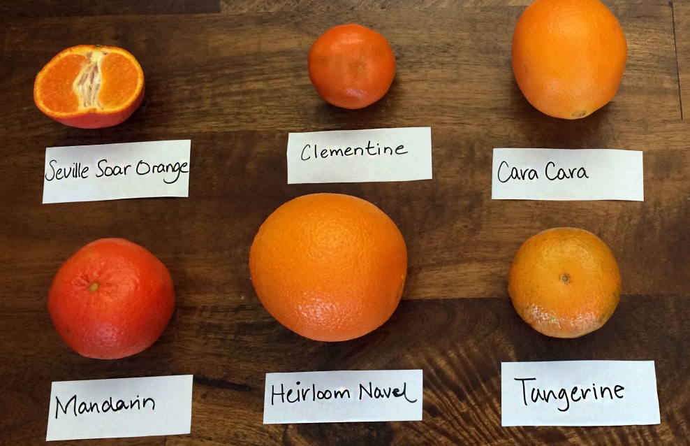
^ I do not want to see variations of the orange.
*
Please keep your body type to 8pt or 8.5 or at most 9pt! do not use larger for body type. Define Character style so you can make changes easily.
Print them out as spreads on 11 x 17 for class on Wed.
Things to include... Use your tool kit
Call outs have at least 1 per spread. Maybe 2. Use the same size for all your call outs. Then see if you need to use 2 sizes.
Use 1 - 3 photos per spread.
Running head you don't have to use the NYT logo but you can. Page numbers.
Intro text? How can you treat the intro text a bit differently than the body text?
How can you use Paragraph Breaks...
DESIGN TIPS... things to think about...
How can you draw the reader into the article?
What are different ways to show a new paragraph?
What can you do with call outs... the title, subtitle, author, intro text
How can elements align?
How can you make the text have the same feeling as the images?
How can you design the spreads without cropping the images?
How do type and images work together?
How can design work with imagery to tell a story?
Be cautious of/avoid...
_ avoid making your type into organic shapes, type in circles, text on a curve
_ avoid checkerboard layouts
_ avoid too much space between elements
_ avoid filling the page, start with the text lower on the page
_ avoid a symmetric spread, think as spreads not pages.
Please do not stuff images in the body text and wrap text around it -- I will have you undo this so just avoid it!
Tips
_ avoid all the text being "high" on the page - works better lower on the page
_ have elements align on the same baseline
_ avoid white more white space "inside" the page.
_ have your white space on the outside of the elements
_ do not crowd the page (you know if I am talking to you.)
_ do not have too little on the page
_ take your time be neat
_ explore some layouts conservative/traditional, other really push scale, tension, overlap,...
- - - - - - - - - - - - - - - - - - - - - - - - - - - - - - - - - - - - - - - - - - - - - - - - - - - - - - - - - - - - - - - - - - - - - - - - - - - - - - -
Nov 17
Review 3 different "full" article look and feels (all four spreads).
Read: Mac is not a typewriter -- it is short just read it! Take Notes. Please be ready to discuss and if you have questions about any of the content be prepared to ASK.
Design and Refine
Over the weekend refine your opening spread, refine the layouts (and then do it again how can you make them better?) Design your entire article 4 spreads. Look at it. Then think about and redo them... how you can make it better and make a variation of the entire article. ^ please look up at the design tips, things to be cautious about or avoid and Tips...
Print them out as spreads on 11 x 17 for class on Monday. 8 spreads total
- - - - - - - - - - - - - - - - - - - - - - - - - - - - - - - - - - - - - - - - - - - - - - - - - - - - - - - - - - - - - - - - - - - - - - - - - - - - - - -
Nov 22
Questions about Mac is not a typewriter
Review the two solutions and put one together to refine.
HOMEWORK
Refining your final solution.
Refine and start getting the typographic details set.
How can you add more typographic color, contrast, unity across all your spreads?
Leading Grid (lock everything to the baseline grid! I will check this can count off)
Hang punctuation
Kern headlines when needed
Indent or space between paragraphs not both
When indenting don't indent the first paragraph
Make sure you are using REAL quotes (smart quotes) not inch marks (check your text)
Make sure you are using apostrophes not foot marks
Use en dash
If you are
justifying text, use hyphenation and adjust Justification settings.
Avoid hyphenation in the header, subhead, call outs/pull quotes. (need to hyphenate body copy)
Running heads and page numbers should be the same size as the body or smaller.
Odd page numbers on the right.
Other things I will look for:
Use of the columns, column width for reading.
Use of multiple hang-lines
Clear hierarchy.
Consistence in type usage.
Multiple levels of hierarchy.
Visual Space, flow, contrast, scale and surprise.
Print it out FULL SIZE with crop marks. Trim and tape together. Pages are 9 inches wide by 13.5 inches tall. Print each on 11 x 17 (portrait) and trim down. Don't forget to put your crop marks on.
- - - - - - - - - - - - - - - - - - - - - - - - - - - - - - - - - - - - - - - - - - - - - - - - - - - - - - - - - - - - - - - -
THANKSGIVING: no class on Wednesday
You do have homework. You have to because we are almost done with the semester you can't stop. PLEASE do some work and GET THAT PROCESS BOOK DONE! it will be due and you do not need to pull an all nighters.
- - - - - - - - - - - - - - - - - - - - - - - - - - - - - - - - - - - - - - - - - - - - - - - - - - - - - - - - - - - - - - - - - - - - - - - - - - - - - -
Nov 29
Review and finish. Due WED!!!!!!!!
In-class start your Behance Post. Keep it simple like project 1.
In-class start work on your process book.
How to send to Jayhawk ink.
InDesign file will need to start with a single page (cover) keep it simple, and related. Will need to end with a single page (back cover). Same keep it related. Put your name (small) on the back cover). Your InDesign doc needs to be 10 pages. Save as single page pdfs. Send to Jayhawk no later than Tuesday night (I will know if you send it on Wednesday and it doesn't get printed in time. If you send it on Tuesday night. You will be fine.
--> Demo Recording on how to set up, save, export and upload to Jayhawk Ink.
REFINE and finish please look above at all the tips.
- - - - - - - - - - - - - - - - - - - - - - - - - - - - - - - - - - -
DUE WEDNESDAY
Dec 1
*printing at jayhawk ink
https://union.ku.edu/printing / https://www.jayhawkinkpod.com/Login?returnUrl=%2f
Save your spreads as PAGES with crop marks turned on and largest size pdf. Not smallest.
--> Demo Recording on how to set up, save, export and upload to Jayhawk Ink.
Have Jayhawk Ink print in color on 20lb paper, trim and PAD bind. Remember you have to design a cover and back cover -- can be really simple but if you don't have a cover cover and back cover your entire magazine won't print as spreads. MAKE SURE
you do this. You will be sad if you don't.
--> Demo Recording on how to upload to Behance and use the Photoshop Template.
- - - - - - - - - - - - - - - - - - - - - - - - - - - - - - - - - - - -
FINAL DELIVERABLES
Final printed and bound at Jayhawk Ink
Behance Post. Keep it simple.
Process as a pdf: must be organized and complete, labels, notes, all your homework and final.
Upload to class google drive:
Please package your final file (packaged folder should have fonts, images, InDesign file and pdf).
Compress it. Make it a zip file.
*** we will be working in class bring highlighter(s), any thick shapies or markers you have.
Bring at least 1 thick marker. THICK.
- - - - - - - - - - - - - - - - - - - - - - - - - - - - - - - - - - -
Please Note the final for VISC 202 is Wednesday Dec 15.
12:30 section your final is 10:30am - 1:00pm
3:20 section your final is 1:30pm - 4pm
please note: You will be there for most of the 3 hours. We will be making stuff together
please note: The times do not align perfectly to our classtimes. The University sets the times for finals. Professors don't just make up times for finals.