Syllabus : Publication Design :: Modular Font :: Characteristics :: Type Design (lowercase) :: class google drive
.................................................................
Professor: Andrea Herstowski
Office
hours: by appointment
email: herstow@ku.edu
................................................................
Calendar (go directly to date)
Monday, August 24
Wednesday, August 26
Monday, August 31
Wednesday, Sept. 2
Monday, Sept. 7
Wednesday, Sept. 9
Monday, Sept. 14
Wednesday, Sept. 16
Monday, Sept. 21
Wednesday, Sept. 23
................................................................
People to Know...
Gail Anderson
Gail Bichler insta : short : long
Tina Smith web :: insta
Chloe Scheffe web :: insta
Matt Willey : nyt : interview : insta
Victor Williams
Tibor Kalman
Neville Brody
David
Carson
Alexey Brodovitch
nice spreads
SPD
Graphis GQ | 2021 | 2020 | 2019 |
NYT behind the cover (must be logged in)
Hannah Price
Mike McQuade
Sophy Hollington
Brian Rea
other
marian banjes
stefan sagmeister
................................................................
Design and Type Resources
:- Fundamentals of Design
:- Ten Rules to rule
:- Matthew Encina: contrast
:- Basics of Type part one : part two
:- Parts of a Magazine
:- Type Specs | InDesign |
;- Combining Fonts : like an engineer
:- Toolkit Example pdf
:- Mac is Not a Typewriter.
................................................................
Fonts
:- By Classification
:- by Foundry
:- Adobe Fonts
:- Google Fonts
:- Future Fonts
:- Font of the Month
................................................................
Typography is
:- Glossary of Terms
:- 50 Type Tutorials
..........
- - - - - - - - - - - - - - - - - - - - - - - - - - - - - - - - - - - - - - - - - - - - - - - - - - - - - - - - - - - - - - - - - - - - - - - - - - - - - - - Publication Design
Exploration in concept, type as image and type + image.
- - - - - - - - - - - - - - - - - - - - - - - - - - - - - - - - - - - - - - - - - - - - - - - - - - - - - - - - - - - - - - - - - - - - - - - - - - - - - - -
Publication / Editorial design is a fascinating field that combines our abilities for creative typography, smart layouts and clever compositions. All around the world people wake up early and stay up late creating compositions that millions get a hold of in the form of newspapers, magazines, books, ebooks, iPad magazines. The amount of content included in the publication of things like books and magazines demand strict guidelines and rules for the use of typography and layout within the volumes and periodicals produced. The success of these publications depends on clear communication and consist story telling, both of which demand rigorous applications of grid layouts and the establishment of visual hierarchies in order to keep readers entertained while they consume the content.
The principles about what makes a good layout or series of spreads are the same design principles when you design a brand story, website, motion/animation, etc. Publication today is not restricted to print. To practice these principles we will be using print at the medium.
- - - - - - - - - - - - - - - - - - - - - - - - - - - - - - - - - - - - - - - - - - - - - - - - - - - - - - - - - - - - - - - - - - - - - - - - - - - - - - -
You will be designing a multi-spread print version of an on-line article on the New York Times website. You must choose a FEATURE article from the NYT Magazine section –- any of the feature articles, they must be from the NYT Magazine, the article must have at least 1,000 words, at at least 6 - 8 images. Pick wisely. Are you interested in the topic or did you find the article interesting. Did it make you think? Are there any images or links that you could add to the article?
Using a leading grid you will be designing a multi-spread of an article of your choosing. Typographic grids control the visual organization of the page space by supplying a particular kind of structure developed for typographic organization. This structure consists of margins, alleys, grid fields, and intersection points. Grids allow the designer to codify groups of typographic information. The process of codification allows the viewer to proceed through a complex page environment, tracking information in a seamless, linear manner. A good grid forces order onto the layout and so acts as an orienting device enabling the reader to knows where to look for information and to understand its relative importance. Just as importantly the grid works on an aesthetic level. The readers might not consciously be aware of it, but subliminally they pick up on the fact that everything is well ordered and in its place. If a picture juts fractionally into the column next to it, something seems to be slightly amiss, but if the lines of text align neatly across the columns on a page, some fundamental and reassuring logic seems to be at work.
Your design should be typographically beautiful, simple without being simplistic, have a clear hierarchy, and an attention to detail. It needs to be interesting, inviting, dynamic. Only the finest typography will be accepted. There are typographic standards we will cover in class lectures and readings and they will need to be practiced: column width, text size, word spacing, hyphenation... There are several goals for this project: mastering InDesign, understanding and constructing a leading grid, a clear hierarchy, terminology, typographic rules, typographic details, and of course a dynamic composition.
You will be designing 4 spreads total: the opening spread and the 3 following spreads. If your article is over 1,000 words you will not have to use all the text. Don’t jam the pages.
All the text DOES not all need to be used; the article would just go on as you are not designing it all. The article you choose has to be over 1000 words. (No, you can't use an article with less words.)
Elements/Standards/Rules you will need to address
— develop a tool kit
— leading grid: margins, alleys. modules
— hierarchy, contrast, composition,
— type size, type color, line length (column width), leading
— parts of a magazine: headlines, subheads, call outs, page numbers, running heads
— paragraph breaks, justification, letter and word spacing, hyphenation, widows, orphans
— dashes, quote marks and apostrophes
— vertical and horizontal pull (clotheslines, flow line, hangline)
- - - - - - - - - - - - - - - - - - - - - - - - - - - - - - - - - - - - - - - - - - - - - - - - - - - - - - - - - - - - - - - - - - - - - - - - - - - - - - -
TECHNICAL RESTRICTIONS
Design the first 4 (four) spreads of your article. Opening Spread plus the three following spreads (a spread is comprised of a left and right page) If your article is over 1,000 words you will not have to use all the text. Don’t jam the pages. All the text DOES not all need to be used the article would just go on you just are not designing it all of the article if it is over 1,000 words.
Size: SPREAD = 18 inches wide x 13.5 inches tall. Page = 9 wide by 13.5 tall
Color: Black + 3 colors tints ok
Fonts: One sans serif and one serif family can be used from By Classification
Images: use 6 - 8 images (from the article or find new — credit images)(1 - 3 per spread)
Call outs/Quotes: incorporate 2 - 3 call outs/quotes (in total not per spread)
Typographic Rules: You may use rules, bars, and color fields, but avoid using them as decor.
Grid: 6 column
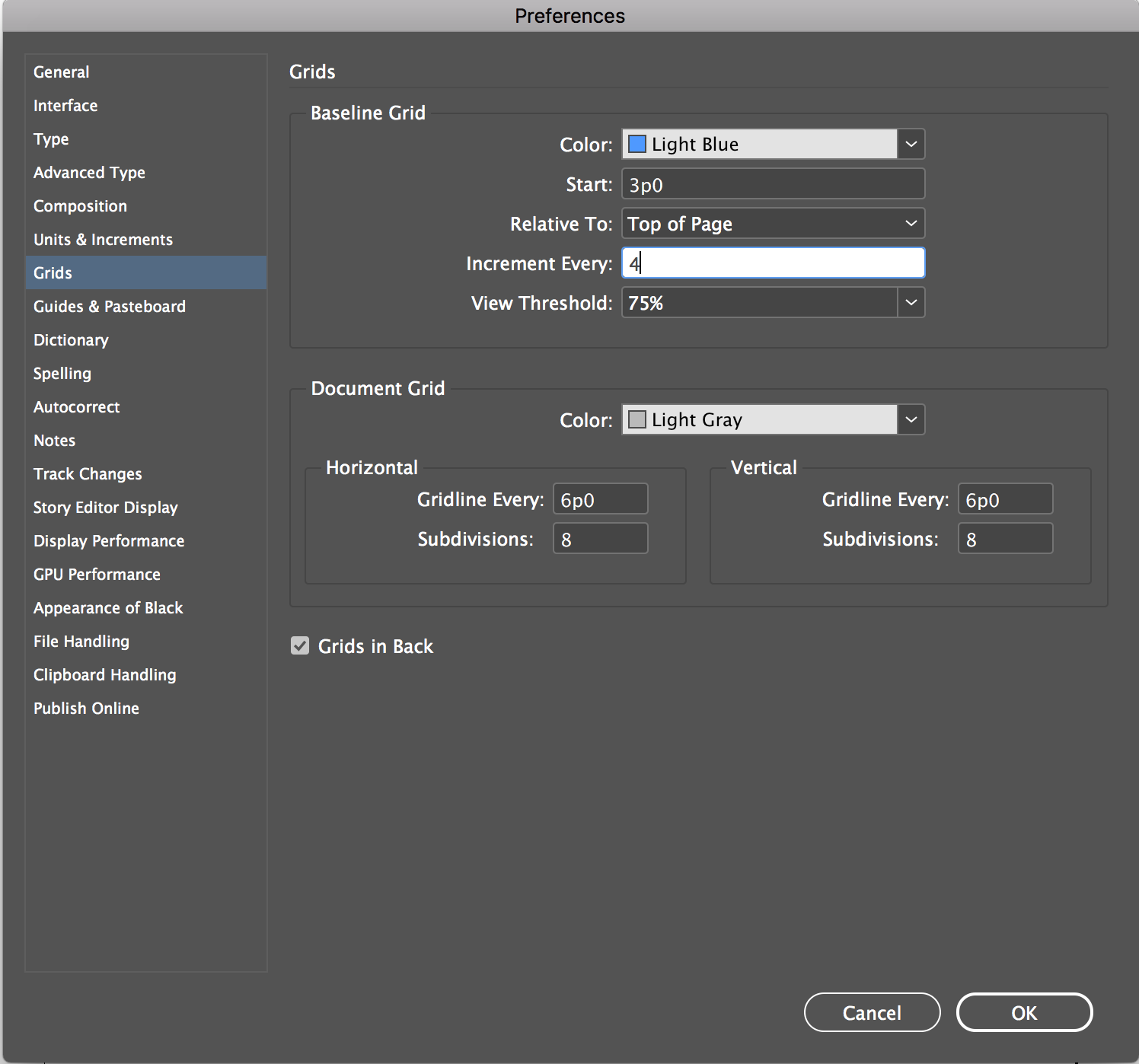
Baseline/Leading Grid: The 4pt leading grid. We will be build in class using the body text’s leading as a measure.
If you are interested in creating this as an ePub this is the tutorial for you!
- - - - - - - - - - - - - - - - - - - - - - - - - - - - - - - - - - - - - - - - - - - - - - - - - - - - - - - - - - - - - - - - - - - - - - - - - - - - - - -
DELIVERABLES: more directions will be given closer to the due date.
Printed at Jayhawk Ink or an epub (or both :)
Behance post
Process as a pdf: must be organized and complete, labels, notes, all your homework and final
Thing to add (completely optional)
Create an process animation of your opening spread (with or without voice over). ex. Behind the Cover
Animate your open spread using photoshop or aftereffects.
Add interaction to the article as a pdf: hyper links, animations, videos
.
Create your own "new" cover of the NYT mag based on your spreads.
- - - - - - - - - - - - - - - - - - - - - - - - - - - - - - - - - - - - - - - - - - - - - - - - - - - - - - - - - - - - - - - - - - - - - - - - - - - - - - -
Monday, August 24
Class will be held via Zoom please check email for Zoom link and password. We will most likely be online the entire time with a break so be prepared. *If you would like to be on campus, your studio is 307 Chalmers if there are more than 10 in the room the overflow studio is 308. Use your laptop to Zoom. Follow the Personal Responsibility/Heath Safety Requirements.
_ Intros: what I did this summer
_ Syllabus
_ Survey
_ Watch togehter: Gail Bichler : typographics lecture
_ Opening Spreads / Research
/ Explore
/ padlet
_ Intro to Project One: Publication Design:
_ Process book : character and paragraph styles : master pages
HOMEWORK
Watch: Ten Rules to Rule Type. Basics of Typography part one
Optional: Concept: Watch behind the cover (find links upper left
Optional watch:
zach-lieberman, finish or rewatch Gail Bichler
Post in the #inspiration anything you found interesting...
You should have access to the New York Times (if not you will have to ask a friend that does for access to finish your homework). Go to the Magazine Section (https://www.nytimes.com/section/magazine). Read several articles (at least 4 articles) until you really, really know you are interested in the article and the images. They go way back in time. You will be designing this online article as a printed article. I don't care at all if you have the same article as someone else but sometimes you care. If you all decide you want to keep track on who is doing what you can put the name of the article and link here.
Tip: start designing your process book from day one. Use the same document size as the project. Also start working in an organized manner. Make a folder for the project. Put your process book in the folder. Make a folder inside your project folder for all the images.
WHEN SELECTING YOUR ARTICLE: MUST HAVES
The article MUST be at least 1,000 words (you need at least that; many more is fine, but at least 1,000 words)
At least 4 - 8 images.
PROCESS (all goes in your process book : character and paragraph styles : master pages)
— Please write down the titles of the articles you considered.
For the article you choose.
— Copy and paste all the text into Word/Pages/Google doc (pick one) including title, subhead, by line, captions (don't forget the captions)
— Download all the images you need at least 6 - 8 (put them in a folder). Click on the image so you know you are getting the largest size of it.
The Basics get them down and include them in your presentation.
— Write down the title (and subtitle)
— What is the article about/summary
— What image (or 2 is the key image) describes the article the best)
— What are some descriptive words from the article. Words that come to mind. Write them down.
— Describe the article in 2 or 3 words? (Write them down). Try a few word combos.
— How can visualize the idea of the article?
Looking at all your thinking so far start making/sketching.
Sketch by hand 30 - 50 different opening spread ideas. Pick at least 1 image that could be your key image. Include it in your sketches so we can see it.
Yes at least 30 (you came up with several ideas in class for the articles in a short amount of time. Time to get serious this semester. How can you visualize the concept. Sketch quickly. Look back at your notes from class. With each sketch please annotate the sketch (yes annotate, write a note under the sketch). Remember you don't have to just use computer type (think Marian or Stefan), or you can manipulate type (again you can just write that in the notes), don't forget about changing perspective or contrast (think Matthew). Just sketch by hand don't move to the computer it is too slow. Work as tight or as loose as you like to work. Don't sketch them all the same. Maybe the image goes over the entire spread, maybe the image isn't that large, maybe it is only on the right or left. You are thinking about how the TYPE can work with your image. How can you make the type feel like the image(s), feel of the article... that is the task.
SKETCHING examples. The examples are sketches bookcovers -- that is why they are only one page -- remember you are designing a spread so you have the left and right page.
Getting your sketches ready to present to class: this is the painful part you need to get images of your sketches onto the computer: scan them in with a scanner or using an app. MAKE sure they are rotated to the correct orientation - do not make us turn our head 90* to see them.
Prepare to show and talk about the basics listed above and your sketches. Make a pdf - save as the smallest size. Click through it all to make sure it is all there. Put it here on the google drive: in your class section.
- - - - - - - - - - - - - - - - - - - - - - - - - - - - - - - - - - - - - - - - - - - - - - - - - - - - - - - - - - - - - - - - - - - - - - - - - - - - - - -
Wednesday, August 26
Crit large group then breakouts.
Tina Smith an others http://www.tinasmithdesign.com/project/new-york-times-magazine
Discuss... What are those words you wrote that describe the article? (Intricate: visceral: risky: punctuated: commanding: unpolished: political: heavy: dark: revealing: grunge: struggle: fast: intense: impulsive: emotional: loose: harsh: raw: shaky... )
How can you make the type feel like one or two of those words? Help each other give ideas on how to use type.
HOMEWORK
Watch: what-could-the-creative-career-of-the-future-look-like
Make, Make a lot! Have an idea(s). Take the descriptive words you like best create 6 - 12 (or more) different ways to treat the headline (maybe subhead) of the article. Continue to think about it as a spread. How type and image can work together. Use computer type, manipulate type, make type out of something..., combine. If your solutions are on the lame side (you know just typing out the words) then you should have more than 6. :) Have fun. If you didn't look at these people or watch the video do it over the weekend... Marian or Stefan, Matthew).
Post in your slack channel.
- - - - - - - - - - - - - - - - - - - - - - - - - - - - - - - - - - - - - - - - - - - - - - - - - - - - - - - - - - - - - - - - - - - - - - - - - - - - - - -
Monday, August 31
:- Present Homework
:- Type Specs | InDesign |
:- who/what is the fibonacci sequence?
HOMEWORK
Scan through: Thinking with Type: letter refresher
Watch: Combining Fonts
Watch: like an engineer
Take 3 different opening spreads that are working best (best idea, best form) and refine them -- does the treatment of type visually communicate what you indended / match the articles mood/tone/feeling. Watch your type sizes this is hard when we are only on screen but some things on the opening spead could be 8-9pt, 12-14pt. You are going to have to just trust point sizes for a bit.
*Content for Opening Spread: name of the article, subtitle, by line, photo credit line, at least 2 sentences from the article (can be more -- try different amounts), page number and running head. Use the real text and image(s) no placeholder.
Make sure the spreads have all the content from headline to page number. Save as a pdf as the smallest size and share with the class. Post to your channel in slack. Give feedback to at least 8 of your classmates. (don't just give feedback to your friends)
Also use the Type Specs | InDesign | document and create 6 different type spec studies. Use the sizes given for now. Think about all the typography. Is it legible? What makes a good font combination? Re-watch the videos or fine others ones that speak to you. Label the fonts so you know what you used. Save as a pdf as the smallest size. Post these to the Google drive: folder fontspecs
- - - - - - - - - - - - - - - - - - - - - - - - - - - - - - - - - - - - - - - - - - - - - - - - - - - - - - - - - - - - - - - - - - - - - - - - - - - - - - -
Wednesday, Sept. 2
Crit Opening Spreads: ideas and text treatments do they match the mood/tone of the article. do they "say"/visually express the the message you want to express?
Lecture: tool kits
Refresher: http://thinkingwithtype.com/grid/
Lecture: Paragraph Breaks \ ex
What is body text?
What is a call out?
What are ways to indicate a new paragraph?
HOMEWORK
Watch:
Basics of Typography part one
Your homework is a set of exercises/studies that should in the end help you develop interesting spreads. Please take them seriously have fun and explore. The homework will be... creating Paragraph Studies, Tool Kit(s), and Thumbnails. If you do them in that order it will help you. (Put your opening spreads on hold for the moment)
Paragraph Breaks
Go ahead and copy and paste your first 3 paragraphs into this doc (change the document size to your process book size) and explore different ways to show a paragraph. These studies are not in context they are just a way to explore: indents, extends, use of symbols or spaces.... *explore at least 10 different sets. in the doc I gave you there are 2 sets per page.
Use 8 or 9 pt type for body text. Save it as your name/pdf and put it on the Google Drive here is the folder.
Tool Kits
Make tool kit(s): looking at your opening spread how can you expand the visual language/typography to work in callouts, captions... take your time and develop 3 different tool kit ideas (one page per tool kit idea). Save them as pdfs and post them on Slack.
Spread Thumbnails
Explore how to layout the entire article. Look at your opening spread (that is the first one). Look at your tool kit and now think about how the rest of your article could be laid out. Consider sequence/ pacing/ surprise/ use of the page. Think about your call outs, image (image treatment), captions...Sketch out your ideas now before we move to the computer next week. Remember you have the opening spread and then 3 more spreads to work with. Don't make your sketches on the computer -- Scan or take a photo of your thumbnails so we can see your ideas. Have in someway to show me and your crit partner on Monday... You don't have to post to slack.
- - - - - - - - - - - - - - - - - - - - - - - - - - - - - - - - - - - - - - - - - - - - - - - - - - - - - - - - - - - - - - - - - - - - - - - - - - - - - - -
Monday, Sept. 7
Present tool Kits and Thumbnail ideas
Zoom Videos for help
Flowing in text and column width.
Changing Grids and Guides if you don't like what I have given you.
Moving Spreads to be side by side (beaware maybe an issue later that you will have to re-deal with)
Watch Character Style: andrea zoom : pro -> character styles video : adobe tutorial as text
Watch: if you haven't watched this about contrast do it now
HOMEWORK
Took kit : if you need to refine your tool kit take the time to do it now.
Full Article (InDesign doc if you want it MagSpreads.idml
Move to the computer and get your entire article into InDesign (if you article is over 1000 words you don't have to use it all).
Try 3 different directions for your article. (all 4 spreads: 3 different ways) . Design your entire article. Save it and then try a different direction... do you need to pull back the design? do you need to add more things? These are studies on how your article can look. Now is the time to explore it on the computer. Then we can pick one and make it awesome. Now RANGE of exploration is the work.
Save your pages as spreads. Upload to Slack. You can have 1 pdf with all 3 directions or you can upload 3 different pdfs - one for each direction. Please give feedback via slack to at least 8 of your peers.
*
Please keep your body type to 8pt or 8.5 or at most 9pt! do not use larger for body type. Define Character style so you can make changes easily.
InDesign Tips
Use Master Pages for your running head and page numbers. Look up how to unlock master page items.
Flow in all your body text. Flow it in do not copy an paste into each column you want to be able to move/remove things without loosing any text. DO not use the make column tool (if you were taught this in HS please unlearn it)
Change ALL your body text to the font you have decided works great for body text.
change the size to
8pt/12 8pt body text with 12 pt leading or
8.5/12
8.5pt body text with 12 point leading
Body text must be on 12 point leading.
Things to include...
Use your tool kit
Call outs have at least 1 per spread. Maybe 2. Use the same size for all your call outs. Then see if you need to use 2 sizes.
Use 1 - 3 photos per spread.
Running head you don't have to use the NYT logo but you can. Page numbers.
Intro text? How can you treat the intro text a bit differently than the body text?
How can you use Paragraph Breaks to a
** for now pick a columni width and use the same column width for each direction. I suggest 2 or 3 column width not wider.
** the document is set up with a 6 column grid.
DESIGN TIPS... things to think about...
How can you draw the reader into the article?
What are different ways to show a new paragraph?
What can you do with call outs... the title, subtitle, author, intro text
How can elements align?
How can you make the text have the same feeling as the images?
How can you design the spreads without cropping the images?
How do type and images work together?
How can design work with imagery to tell a story?
Be cautious of/avoid...
_ avoid making your type into organic shapes, type in circles, text on a curve
_ avoid checkerboard layouts
_ avoid too much space between elements
_ avoid filling the page, start with the text lower on the page
_ avoid a symmetric spread, think as spreads not pages.
Please do not stuff images in the body text and wrap text around it -- I will have you undo this so just avoid it!
Tips
_ avoid all the text being "high" on the page - works better lower on the page
_ have elements align on the same baseline
_ avoid white more white space "inside" the page.
_ have your white space on the outside of the elements
_ do not crowd the page (you know if I am talking to you.)
_ do not have too little on the page
_ take your time be neat
_ explore some layouts conservative/traditional, other really push scale, tension, overlap,...
- - - - - - - - - - - - - - - - - - - - - - - - - - - - - - - - - - - - - - - - - - - - - - - - - - - - - - - - - - - - - - - - - - - - - - - - - - - - - - -
Wednesday, Sept. 9
I will start the class in Zoom.
Meet in Chalmers 312 or via zoom to crit your layouts. If you come to the class room have your spreads printed out -- will be nice to see them at full size (print out each page) or at least shrink to fit on 11 x 17.
Watch during class: creating this as an ePub creating your spread as an epub is optional. if you are intersted start planning on what that means, collecting content, thinking about intearactivity. If you are not intersted that is completly fine. Your grade is not effected either way. If you need to log out of zoom and to watch it with better sound etc please do so. If this seesm like something you want to do watch one more video interactive pdf vs epub watch Tony.
HOMEWORK
Design and Refine
Over the weekend refine your opening spread, refine the layouts (make 1 variation of the entire article)
That means design your entire article 4 spreads. Look at it. Think about how you can make it better and make a variation of the entire article. Save your 2 versions as a pdf and post it to Slack.
Read: Mac is not a typewriter -- it is short just read it! Take Notes. Please be ready to discuss and if you have questions about any of the content be prepared to ASK.
Answer any of these and be prepared to discuss in class.
Read: https://www.canva.com/learn/grid-design/
Read: http://thinkingwithtype.com/grid/
_ What are the advantages of a multiple column grid?
_ How many characters is optimal for a line length? words per line?
_ Why is the baseline grid used in design?
_ What are reasons to set type justified? ragged (unjustified)?
_ What is a typographic river?
_ What does clothesline, hangline or flow line mean?
_ What is type color/texture mean?
_ How does x-height effect type color?
_ What are some ways to indicate a new paragraph. Are there any rules?
*I think there will be a quiz about all the things / videos I have had you watch so please refresh you memory and maybe as a group make a study guide? I want to make sure you are grasping the things we are talking about.
- - - - - - - - - - - - - - - - - - - - - - - - - - - - - - - - - - - - - - - - - - - - - - - - - - - - - - - - - - - - - - - - - - - - - - - - - - - - - -
Friday, Sept. 11 : Food for Thought with Elisa Martin
https://kansas.zoom.us/j/97599175507
Passcode: 301838
Meeting ID: 975 9917 5507
- - - - - - - - - - - - - - - - - - - - - - - - - - - - - - - - - - - - - - - - - - - - - - - - - - - - - - - - - - - - - - - - - - - - - - - - - - - - - -
Monday, Sept. 14 Lunch and Learn:
11:15 - 12:15
Leticia Gradington, who is the founding director of KU’s Student Money Management Services office and is an expert at helping students navigate challenging financial situations and avoid financially-related stress.
https://kansas.zoom.us/j/97496455570
Passcode: 263894
- - - - - - - - - - - - - - - - - - - - - - - - - - - - - - - - - - - - - - - - - - - - - - - - - - - - - - - - - - - - - - - - - - - - - - - - - - - - - - -
Monday, Sept. 14
Who is doing the epub or jahawk or both?
Reference: https://www.canva.com/learn/grid-design/
Any Questions about Mac is not a typewriter?
Lecture: Leading Grid set-up
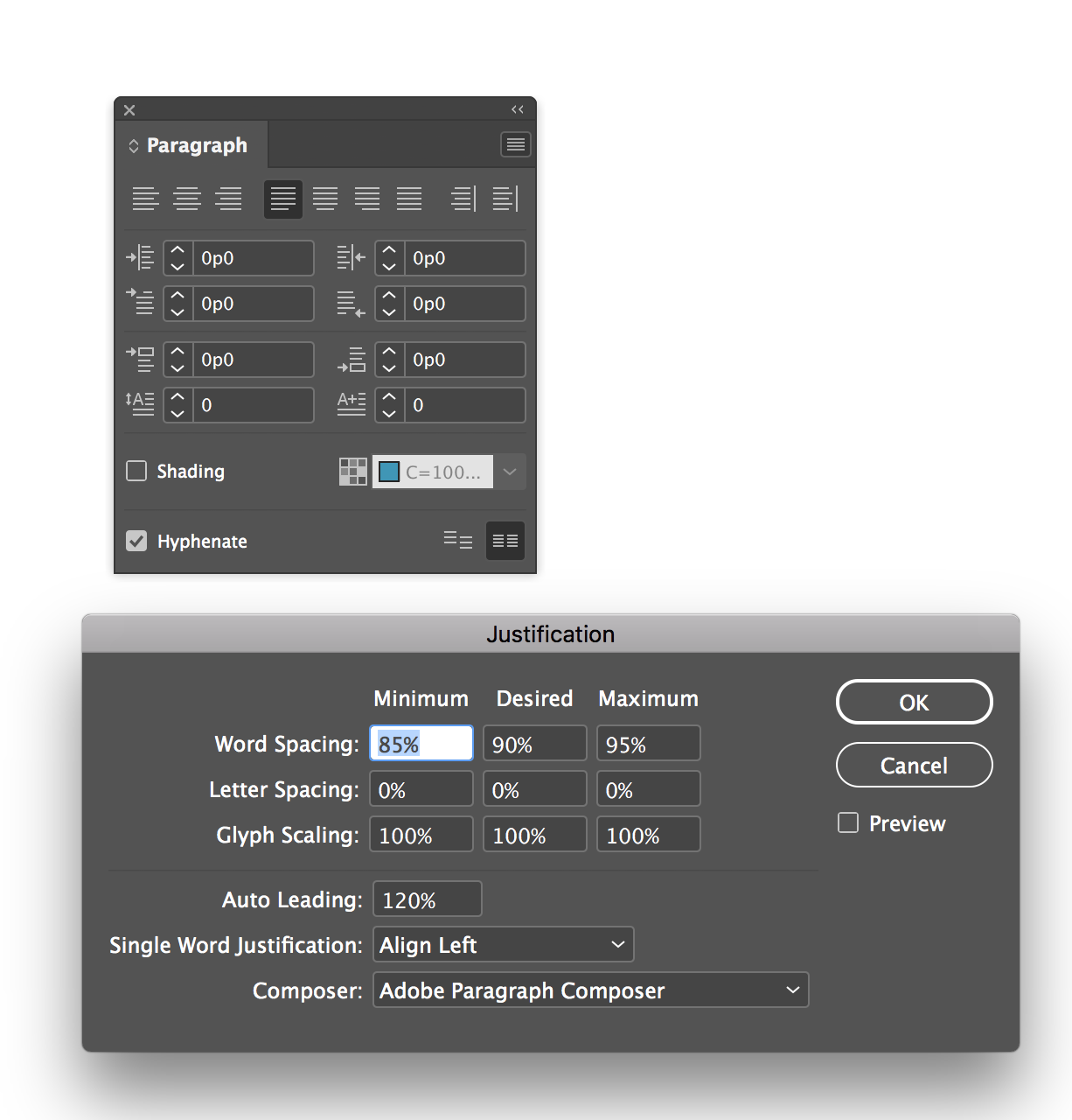
Activity: Create (download) Justification setting studies: pick best justification for your text.
TAB or Space Between
Hang Punctuation
Meet as a group at the beginning of class then we will move to pair feedback.
Pair feedback sign up for a time : MONDAY
Sign up ALSO for a time on WEDNESDAY
If you want to meet me up at school I can be there. OR you can just leave your spreads pinned to the wall. Here is the sign up if a time doesn't work for you let me know.
HOMEWORK
If you can please go up to school and print FULL SIZE. Trim your pages down.
*you can print in the Print Lab 203A Chalmers or through Jayhawk Ink.
Print Lab requires BeakumBucks.
Info for Jayhawk Ink is in the #generalinfo channel.
Pin up your article horizontally so we read the spreads across not down 309 or 312. *do this at once between now and when it is due. (you may need to bring pins I purchsed some)
Watch: Basics of Typography part two : tracking, widow...
Refine spreads.
Lock all your elements to the basline grid.
If justifying correct word, letter and hyphenation
if your body text is ragged pay attention to the shapes
Typographic Details (I will take off points in your final if you haven't fixed all of these things)
Leading Grid. Alter the leading grid and lock all text to it. ALL TEXT should be locked to the leading grid.
Hang punctuation
Kern headlines when needed
Indent or space between paragraphs not both
When indenting don't indent the first paragraph
Make sure you are using REAL quotes (smart quotes) not inch marks (check your text)
Make sure you are using apostrophes not foot marks
Use en dash
If you are
justifying text, use hyphenation and adjust Justification settings.
Avoid hypenation in the header, subehad, call outs/pull quotes. (need to hyphenate body copy)
Running heads and page numbers should be the same size as the body or smaller.
Odd page numebers on the right.
Other things I will look for:
USE a grid.
Comportable column width for reading.
Use of the columns
Use of multiple hanglines
Clear hiearchy.
Consistancey in type usage.
Multiple levels of hierarchy.
Visual Space, flow, contrast, scale and surprise
- - - - - - - - - - - - - - - - - - - - - - - - - - - - - - - - - - - - - - - - - - - - - - - - - - - - - - - - - - - - - - - - - - - - - - - - - - - - - - -
Wednesday, Sept. 16
Meet one on one today -- no big class today.
Finda time that works for you here is the SIGN UP. FIND A TIME
***** let me know if none of the times work for you.
PLEASE READ THROUGH WHAT IS DUE ON MONDAY SO YOU CAN ASK ANY QUESTIONS WHEN WE MEET! And study for the quiz just because we don't meet together doesn't mean you have the day off.
If you can print and leave your spreads at school great. If you want to meet at school in person we can make that work -- you can also stay home but I would like to you to see your spreads at full size before it is due so figure out how to print full size (you can also use jayhawk ink if you want to just run into the Union and grab your prints)
HOMEWORK
Refine and finish. You can put your spreads on slack for feedback or send me an email. You can have 1 round of feedback so use 'ask" wisely.
Typographic Details (I will take off points in your final if you haven't fixed all of these things)
Leading Grid. Alter the leading grid and lock all text to it. ALL TEXT should be locked to the leading grid.
Hang punctuation
Kern headlines when needed
Indent or space between paragraphs not both
When indenting don't indent the first paragraph
Make sure you are using REAL quotes (smart quotes) not inch marks (check your text)
Make sure you are using apostrophes not foot marks
Use en dash
If you are
justifying text, use hyphenation and adjust Justification settings.
Avoid hypenation in the header, subehad, call outs/pull quotes. (need to hyphenate body copy)
Running heads and page numbers should be the same size as the body or smaller.
Odd page numebers on the right.
Other things I will look for:
USE a grid.
Comportable column width for reading.
Use of the columns
Use of multiple hanglines
Clear hiearchy.
Consistancey in type usage.
Multiple levels of hierarchy.
Visual Space, flow, contrast, scale and surprise
- - - - - - - - - - - - - - - - - - - - - - - - - - - - - - - - - - - - - - - - - - - - - - - - - - - - - - - - - - - - - - - - - - - - - - - - - - - - - - -
Monday, Sept. 21: PROJECT IS DUE WHEN CLASS STARTS.
Meet for class at the regular time via zoom. No need to come to campus today.
I will show you how to make own mock-up -- since our size is odd.
QUIZ is today. It is better to fail it than to cheat.
If I catch you cheating on this quiz I will fail you for this entire project -- it is not worth it. And I mean it.
- - - - - - - - - - - - - - - - - - - - - - - - - - - - - - - - - - - -
FINAL DELIVERABLES
Loose spreads, pad bound and/or Epub
Behance Post
Process as a pdf: must be organized and complete, labels, notes, all your homework and final
Thing to add (completely optional)
Create an process animation of your opening spread (with or without voice over). ex. Behind the Cover
Animate your open spread using photoshop or aftereffects.
Add interaction to the article as a pdf: hyper links, animations, videos
.
Create your own "new" cover of the NYT mag based on your spreads.
If you BIND your spreads with Jayhawk ink you need a cover and back cover -- keep it simple
- - - - - - - - - - - - - - - - - - - - - - - - - - - - - - - - - - -
DUE MONDAY
Please package your final file (packaged folder should have fonts, images, indesign file and pdf).
Compress it. Make it a zip file.
Post your final spreads to Slack and give final feedback to your peers.
*if you made an epub or any of the optional deliverable you can get those to me on Monday or by Wed.
Put your zip packaged file in your folder here. *create a folder if you don't have one
- - - - - - - - - - - - - - - - - - - - - - - - - - - - - - - - - - -
DUE WEDNESDAY (since jayhawk ink is closed on Sundays)
You have until Wed to get your spreads printed at Jayhawk*.
You have until Wed to post your project on Behance. Add your link to the google folder.
You have until Wed to add your process book to the google drive (put it in your folder). *make sure you include your paragraph studies and font specs in your process book. For just this time -- don't worry that the pages are differnt size.
*printing at jayhawk ink
https://union.ku.edu/printing / https://www.jayhawkinkpod.com/Login?returnUrl=%2f
You have a couple of options.
Save your spreads as PAGES with crop marks turned on and largest size pdf. Not smallest.
1) print in color on 11 x 17 card stock or the 32 lb. Print with crop marks and trim the pages down.
You will just handin the 8 loose pages.
2) print in color on 32lb or 24lb paper, trim and PAD bind. A couple of things if you decide to do this. You may want to add more space in your gutter. AND you have to design a cover and back cover -- can be really simple but if you don't have a cover cover and back cover your entire magazine won't print as spreads. MAKE SURE you do this. You will be sad if you don't.
ALSO !!! Print out at least 1 copy of Grids for sketching. can use any 8.5x11 b/w printer. School, home, jayhawk, kinkos...
- - - - - - - - - - - - - - - - - - - - - - - - - - - - - - - - - - - - - - - - - - - - - - - - - - - - - - - - - - - - - - - - - - - - - - - - - - - - - - -
Wednesday, Sept. 23
Behance due.
And Process book as a pdf due. See above
If you printed your magazine please drop it off anytime Wed or Thurs in room 312 on the front table. Will pick them up on Friday. Please let me know if you are not able to get to campus. If you look at your classmates that is fine just please be careful.
Intro to Modular Font Project ... You will need the of Grids for sketching.
- - - - - - - - - - - - - - - - - - - - - - - - - - - - - - - - - - - - - - - - - - - - - - - - - - - - - - - - - - - - - - - - - - - - - - - - - - - - - -
Friday, Sept. 25
Food for Thought with Tina Smith
noon - 1pm
*I will give you participation points if you show up. You don't have to ask a question but it would be great if you did.
https://kansas.zoom.us/j/97214184593
Passcode: 492627
Meeting ID: 972 1418 4593
- - - - - - - - - - - - - - - - - - - - - - - - - - - - - - - - - - - - - - - - - - - - - - - - - - - - - - - - - - - - - - - - - - - - - - - - - - - - - -