Syllabus : Publication Design :: Modular Font :: Characteristics :: Type Design (lowercase) :: class google drive
.................................................................
Professor: Andrea Herstowski
Office: 353 Chalmers Hall
Office
hours: by appointment
email: herstow@ku.edu
................................................................
Wednesday, Sept. 23
Monday, Sept. 28
Wednesday, Sept. 30
Monday, Oct. 5
Wednesday, Oct. 7
Monday, Oct. 12
Animation in photoshop
Wednesday, Oct. 14
Monday, Oct. 19
Wednesday, Oct. 21
Monday, Oct. 26
................................................................
Illustrator Template HERE
................................................................
look here for resources
Bauhaus and Art Deco
Wim Crowel
Early Type Design
people you should know
Wim Crowel
Phillip Apeloig
Emigre/ Zuzana Licko
Hamish Muir
instagram tag #modularfont
:- future fonts
:- Old School
:- oh no
:- aka dope (lettering)
:- studio type
:- font of the month club
anatomy of the letter
if you like a video here you go
glossary here
pdf compulation Anatomy refresher.pdf
................................................................
Fonts and fountry or type house
:- by Foundry
:- Type Wolf
..........
- - - - - - - - - - - - - - - - - - - - - - - - - - - - - - - - - - - - - - - - - - - - - - - - - - - - - - - - - - - - - - - - - - - - - - - - - - - - - - - - - -
Modular Font: Parts make the Whole
Any lettering or type is based on a system. Like a moral code for the alphabet, typographic systems are sets of visual rules and guidelines that govern the actions and decisions involved in creating letters. These implicit systems enable characters to work together, by regulating and defining their appearance—dictating their shapes and sizes, how they fit together, and their visual spirit, as well as all other underlying tenets of the letters. Willi Kunz
A modular typeface is an alphabet constructed out of a limited number of shapes or modules. Modular describes any letter assembled from a limited palette of distinct elements, repeated, flipped and flopped but not scaled. Typically these elements are geometric and simple in shape—square pixels on a digital display or modernist circles, squares, and lines.
Traditionally, modular lettering has responded to the limitations and possibilities of the media used to create it. Today designers are using more ornate, complicated and/or organic forms (modular units) and even physical objects to construct modular letters. They have taken a broader approach to modular letter-forms, pushing the possibilities to create letters from more complicated elements.
Parts Make the Whole asks you to use the context of a modular letter construction to create a prototype for a modular font. Your letterforms must be modular: parts of the letters are used to make other letters. You will start by designing letters on a grid of squares or a grid of dots. You may substitute the curves and diagonals of traditional letterforms with gridded and rectilinear elements. Only rules are you can not use handlettering or develop letters based on some existing font, the letters must be constructed. Avoid making detailed “staircases,” which are just curves and diagonals in disguise. Explore your modular system. Once you have defined your system, made some letters, refined them to something new, the new will become your system to create all 26 letters of the alphabet. We will work in Adobe Illustrator and you will use the software Glyphs to output your final set of upper or lower case letters as a usable, shareable, font.
- - - - - - - - - - - - - - - - - - - - - - - - - - - - - - - - - - - - - - - - - - - - - - - - - - - - - - - - - - - - - - - - - - - - - - - - - - - - - - -
LEARNING OBJECTIVES
_ understand the anatomy of letterforms/characters/glyphs
_ explore the expressive potential of typography
_ solve communication problems within given parameters
_ methodically document relevant design inspiration and process
_ present and assess work in a visually and verbally articulate manner
_ professionally document outcomes
_ demonstrate exemplary visual craft—hand and digital
_ Adobe Illustrator (pathfinder, clean vectors)
_ Glyphs (beginner level of the Glyphs program) MAC only or Fontself if you are on a PC
PROJECT DELIVERABLES (more info given closer to the deliverable date)
working font (all caps or all lowercase -- not both)
instagram campaign
process book
behance post (specifics below)
SOFTWARE
Adobe Illustrator
Glyphs app: https://glyphsapp.com/ it is MAC only software. Trial version is available MAC only
FontSelf: https://www.fontself.com We have it for you to download if you are on a PC.
If you are on a PC can you fill this out for me.
- - - - - - - - - - - - -
Latin Letter History Lectures by Lynne Yun
By the end of this project you need to have listened the 5 videos about Latin Letter History in the #7-letterhistory channel. And do the quizzes. Do these when you get out of class early or on your own time.
- - - - - - - - - - - - -
PROCESS BOOK as pdf: examples are here
Process Book must be well organized, labeled, name on it!.
Make sure you include: Your name, Project Description, Project Overview, all of the process, notes you took, construction, final product. You can hand it in physically or you can create a pdf of all your process. (**All the homework, feedback, class notes etc go in to the process book.)
*process book
don't for get a title page, project description (what was the project), project overview (your thoughts on the project), all your process (all of it! organized by date)
- - - - - - - - - - - - - - - - - - - - - - - - - - - - - - - - - - - - - - - - - - - - - - - - - - - - - - - - - - - - - - - - - - - - - - - - - - - - - - -
LECTURE
the modular part one | part two | part three |
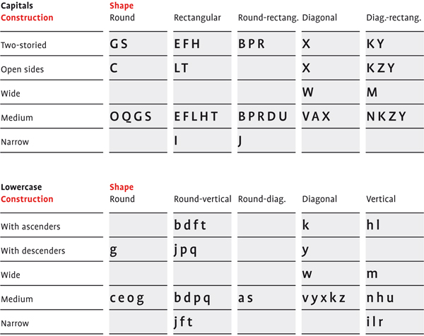
When designing fonts you always start with a few core letters, such as handgloves or hamburg and the you build out from there. As you can note from the chart below once you have the Cap H you can get the letters E F L T, once you have the B defined you can to the P R. etc. The same principle goes with the loer case. If you start with the h you can easily get to n, u, l, i, m, r. The d give you an idea of the p, b, q... etc.
Typographic Systems forms of construction.pdf
letterfountain.com/drawingtofont.html
- - - - - - - - - - - - - - - - - - - - - - - - - - - - - - - - - - - - - - - - - - - - - - - - - - - - - - - - - - - - - - - - - - - - - - - - - - - - - - - - - -
Wednesday, September 23
_ Intro to the project
_ Anatomy of the letters: refresh your memories. Links in the left column
_ the modular part one | part two | part three |
_ Typographic Systems forms of construction.pdf
_ Grids for sketching.pdf
_ Hallmark and Tina Smith this week.
- - - - - -
breakout groups
... share an observation from each of these links.
_ http://apeloig.com/type/typography
_ https://www.instagram.com/muirmcneil
_ https://twitter.com/hashtag/TypeSystemGrid
add your observations about each and any notes you want to pull from the lecture into your process book. Start designing your process book now. Digital pdf is the final deliverable for the process book. Start it now.
- - - - - -
Introduction to FontStruct, (online Tutorial, more tutorials)
andrea's zoom for fontstruct : process no sound : process voice over : lowercase
Before you leave class make sure you understand the homework and the difference between handlettering and constructed letterforms/characters. You can only make constructed modular letterforms.
Getting Started... You can draw all uppercase or lowercase. Try both. Try all uppercase H, E, N, A, O, D, G. Try all lowercase n, h, e, a, o, d, g. The main rule is the letters must be constructed and based on some set of modular forms.
Define a set of modular forms and build the letters using only that system. Modular Fonts: pinterest.com/modular-fonts/ Use as many or few shapes as needed for the set. Build the modular using curves, lines, and shapes that will reappear throughout the font. Italian modular font. Keep in mind that smaller grids provide a more limited set of design options. Maybe you need to work in multiples Noodge. Scale.
Keep the shapes proportional in one set; do not scale or distort any of the components. Do not overlap the elements or use a white shape knocked out of black forms. All the letters in a typeface are distinct from each other, yet they share many attributes.
HOMEWORK
_ READ, take notes and write one quiz question: Functionalism and the Grid. Direct message me one quiz question. Write a question about the reading that I could put onto a quiz :)
EXPLORE + CREATE: 25 sets/font ideas, each set has 7 key letters (examples)
H, E, N, A, O, D, G (if you are drawing caps draw them in this order -- should make sense why...
or
n, h, e, a, o, d, g (if you are drawing lowercase draw them in this order -- should make sense why...
*the a and g can be one story or 2 story try both
yes it is a lot 7 x 25 = 175 so don't wait to start --
25 sets with 7 letters in each set. a set is a design direction.
do not draw 25 H or then 25 E or e they should go together the H should inform the E (n inform the h) get it?
If you are confused post on slack.
Try not to jam up your pages give your different ideas some space around them.
Work in different sizes/ work in different proportions
.
Organize your sketches while you are working. Number them.
Use as many pages as you need to keep things organized and clear. Start by using the handouts to create the your initial studies. Once you get started
you can also create your own grids/parts/ modulars. EXPLORE have fun. This should not be torture. Ugly is awesome. You have to make. The only thing you can't do is hand-letter letterforms. You just can't hand draw letters they have to be constructed. Make sure you know what this means before you start your homework!
You can do all 25 studies by hand (each study has 7 letters in them)
OR
15 studies by hand and 10 in Fonstruct (you have to save and show them). If you hate fontstruct then don't use it! just try and and decide if you LOVE it you can only make 10 different fonts for your homework the rest have to be by hand)
Explore. Should be fun not torture. Fonstruct Shortcuts
** try both don't just draw CAPITAL LETTERS or don't just draw lowercase letters for the different sets try different ones.
H, E, N, A, O D, G /or/ n, h, e, a, o, d, g
Number your sketches so we can easily refer to them online. Take a photo or capture your sketches in some way. Post a pdf to your slack channel.
- - - - - - - - - - - - - - - - - - - - - - - - - - - - - - - - - - - - - - - - - - - - - - - - - - - - - - - - - - - - - - - - - - - - - - - - - - - - - - - - - - - - - -
Monday, September 28
Quiz Review. Learn these things there maybe another quiz.
Picking most interesting 3. Please put your top 3 choices in your slack channel so I can easily see what you are thinking and let you know if I think you should consider a different one.
HOMEWORK
Choose 3 most successful/interesting studies H, E, N, A, O D, G /or/ n, h, e, a, o, d, g , and put them into illustrator.
**
Use the template**
Yes the template is big. USE THIS TEMPLATE! YOU WILL BE SAD LATER. So you may have several art boards.
After you get your 3 sets in illustrator try a variations of the H or n. Make the letter taller, wider, heavier, rounder
(be selective on what you make round. (how can you make the letters better, more interesting?). ** WATCH THE DEMO **. **How to use snap to grid** From those studies on the H/or/n pick out 3 that you like and then do all your H, E, N, A, O D, G /or/ n, h, e, a, o, d, g in that variation. Play out at least 3 variations total. *class recordings are linked slack.
recap
1) 3 original sets in illustrator
2) take the H or n from each set and play with variation EXPLORE do a lot.
3) from your H or n variations studies pick 3 different ones build them out to the rest of the letters
H, E, N, A, O D, G /or/n, h, e, a, o, d, g
Number everything. Save as a pdf and put them in your slack channel.
Something to start thinking about is how you are going to put this all together in a process book so you don't have to do that in the end.
** need a bit of an illustrator refresher? WATCH: these | or top 10 illustrator tips |
- - - - - - - - - - - - - - - - - - - - - - - - - - - - - - - - - - - - - - - - - - - - - - - - - - - - - - - - - - - - - - - - - - - - - - - - - - - - - - - - - -
Wednesday, September 30
Picking most interesting 3.
When we get out of class early spend time watching the videos in the #7-letterhistory channel. And do the quizzes.
HOMEWORK
Adding letters to your top 3 directions.
Add T I U S M K X W Z /or/ i u s m k x w z
Explore different solutions to letters that are giving you trouble, refine in Illustrator
By adding the next of letters you are testing out your modular system and hopefully finding your favorite direction.
Number everything. Save as a pdf and put them in your slack channel.
Friendly reminder to: Watch the Latin Letter History in the #7-letterhistory channel. And do the quiz. You need to have all 6 watched before we start the next project.
Friendly reminder to make sure you have refreshed your memory on the parts of the letter. There are links on the upper left. We did a little quiz preview in class -- where I had you tell each other characteristics of each of the letters. The quiz will look very similar to what we did in class.
- - - - - - - - - - - - - - - - - - - - - - - - - - - - - - - - - - - - - - - - - - - - - - - - - - - - - - - - - - - - - - - - - - - - - - - - - - - - - - - - - -
Monday, October 5
Small group meetings. no big class today.
Watch this zoom recording it goes over all the things you need to do for Wednesday.
These are the things you need to do today and before Wednesday. The list is long because frankly when we don't meet as a class I have to give you more homework.
Watch: Tina Smith's Food for Thought and DM (direct message on slack) me your take aways from the talk.
Friendly reminder: Watch the Latin Letter History in the #7-letterhistory channel. And do the quiz. You need to have all 6 watched before we start the next project. FYI you do not want to wait until the last minute to do these.
From your three font ideas pick the typeface direction.
Refine any letters you have done so far. Clean them up.
Look at the stroke weights and correct.
Look at the counter shapes and correct.
Prep your illustrator file to copy and paste into Glyphs or Fontself. SAVE AS do not save over your sketches. For your favorite direction. Save your illustrator file and now SAVE AS name it something new and merge all your parts and clean up the letters. Please put you illustrator file on the google drive here is the link.
Write down some reasons WHY you pick it and make sure you include that reason in your process book.
What words would you use to describe your font? (sharp, soft, constructed, scifi, romantic, dramatic, vintage...
If it had an emotion what would it be?
A personality?
Pick least 3 - 6 words that describe the mood, tone of your letters.
Imagery
start looking for images that match or enhance or question your mood tone... Have at least 5 different photo/ illustrations topics as options. Please only find copy write free. See the class syllabus for a list of image sources<-- use the list!
Only for a bit of context. Here is some inspiration for where you can take your font and the final presentation. At the end the font is due. Part of this homework is starting to get the things you need for the final.
For on class on Wed... You should have watched 1) Tina Smith and 2) DM me your thoughts, 3) presentation pdf on slack, 4) your illustrator file cleaned up and 5) put here on the google drive, and 6) glyphs/fontself installed on your machine.
PDF includes...of all of above and include showing off a letter, word(s), set one of the words in your font, and photo(s). Have at least 5 different photo/ illustrations topics as options. Different topics/subjects that express or expand or push the personalty of your letters. Save all of this as one pdf and put on your slack channel. Give feedback to at least 7 of your peers on what words you feel fit their font -- feel free to give other words, and what photos are interesting to match with their font -- what photos would you suggest to them?
If you are on a MAC download the trial version of Glyphs.
You need it when class starts so download it before class starts on Wed!
PC people please install Fontself.
Next class we will work in Glyphs. And Fontself.
- - - - - - - - - - - - - - - - - - - - - - - - - - - - - - - - - - - - - - - - - - - - - - - - - - - - - - - - - - - - - - - - - - - - - - - - - - - - - - - - - -
Wednesday, October 7
Full class today... Will demo via zoom.
Spring Semster: survey please take...
Small group meetings on Monday sign up.
If you want to work on a school computer in 313 Chalmers and have me on the big screen as a demo it maybe easier for some of you to be able to work that way. I may have to talk you through how to get me on the big screen. 313 Chalmers has Glyphs installed so all you need is your illustrator file. Only if you want to come to school of course!
INTRO TO GLYPHS
Tools
Font
Tabs
Baseline, x-height, cap height, ascender height, descender length.
Copy and paste your o into the o
Cleaning up in Glyphs
Paths -> Correct Path Direction
Paths - > Tidy up Paths
Anchors and Handles
Save your Glyphs File
File Info: Name your font
Copy and past the n
Look at letter spacing the o, n
Can you make your n into your h (or do you have to copy and paste it from Illustrator)
Use the T tool an type in honohn fix the spacing should look even
Copy and past your d
Fix letter space donodh spacing should look even
Can you flip your d to make a p or do you have to copy and paste your p into glyphs
Transform palette
Save often glyphs will crash so SAVE.
Keep copy and pasting your letters into Glyphs if you can flip and flop them then do that — but not required.
Make sure you look at the letter spacing for each letter as you add it to glyphs always test it as you go.
Save often.
Space Glyph define the size.
Export as a font and test it :)
Want more Glyphs Tutorials...
A collection of tutorials are here
HOMEWORK
Finish all the 26 characters: all the lowercase OR all the uppercase. You can draw them in illustrator and copy and paste into Glyphs or you can just draw them in Glyphs. If you want to do numbers or some punctuation that is optional.
*Make variations of the letters that are giving you trouble. *if the s is giving you trouble then try a few versions of or the g or w or whatever letters now is the time to explore the trouble letters. Remember it might be easy to turn one letter into another one. Do that when possible. Refer to the handout forms of construction.pdf.
Think of a name for your font. Name it. Save your glyphs file AND export it and test it out in illustrator!!! Type out your letters in a pangram. Save as a pdf and post on your slack channel.
Start thinking /planning how to show off / teach us about your font.
What could be a compelling way to show off your font? Make a Pattern? Construction, Modules, a Quote, a lyric, peom, just words. What image(s) enhance the feeling or set the mood of your font? You started this now be more selective (maybe you need to research a bit more). What words can you use to show it off? (what are your favorite letters and what words use them? if you hate a letter don't use it :) Find a pangram you want to use. Or create your own.
Small group meetings on Monday sign up.
- - - - - - - - - - - - - - - - - - - - - - - - - - - - - - - - - - - - - - - - - - - - - - - - - - - - - - - - - - - - - - - - - - - - - - - - - - - - - - - - - -
Monday, October 12
Small group meetings no big class today.
Please have your pdf of your pangram ready to show in the small group and please put your glpyhs
here. Fontself people you can upload the otf file
_ Glyphs: Questions : what do you need help with?
_ how is the letterspacing?
_ crit letters, what are the problem letters?
_ also present what you have thought about so are as to how to show off your font/ teach us about it.
HOMEWORK
Refine any letters that are still giving you trouble. Work on your letter and word spacing.
1) Secondary Fonts. Your font is most likely a display font. Meaning it isn't very legible at body text sizes. What typeface combines well with your font. Please try at least 6 different fonts that combine well with yours. Fonts that you can use at smaller sizes with your font.
*PLEASE Watch this video it talks through Testing your font and why you are learning about patterns.
2) Testing. Test your font at different sizes so you know how SMALL you can use it in a behance post. Also test how small you can use your secondary font. I made a illustrator template for you. Change it to your fonts, change the words to your words... turn off the direction layer and post to behance so you can see them in context. (just an fyi next projects you should know to test your stuff before you make a post or print, and you need to figure out the best format for to test. I only made this for you so you clearly new what to do -- text time the directions will just say "test your primary and secondary fonts for size and legability".
3a) Patterns. before moving on to the tool kit play with making patterns. Use the Pattern Options under window. Play making patterns out of dots, squares, lines, maybe a letter, maybe your modules... just play so you understand how to make, use and edit patterns. here are some videos to get you started. You may not use patterns for this project but it is the time to learn about them so just embrace the learning experience! :) It would be great if you save your pattern tests as pdf and post them to slack (make sure you include the tests in your process book).
Andrea Video: I made a video that steps through the PLEASE WATCH 2 ways to make a pattern
(btw I can see if you watch it :)
Others there are so many videos I chose these if you need more videos take a look at the seond one for sure.
Using Swatches: create-edit-patterns using swatches
Using Pattern Options: pattern options
3) Tool Kits. Part of the final will be presenting your modular system, show how it is used, and describe 4 - 8 characteristics of your font. You will need to visuall show and verbally say -- we will call this Show and Tell. I pulled together this sheet of examples and then more 1 | 2 | 3 | 4 | 5 | What is important is at this stage you Explore. I don't want to give you any more direction than that: be inspired by the possibles by looking at apeloig posters, patterns by MuirMcNeil... Think of how to manuals or exploded views or …. try different ways to diagram the letters. (don't just do these examples! )
Please watch a video talking through step three.
To start ... concider making a page full of different ways you Show and Tell things about your letters. Things to show and tell are how a letter(s) use your modules to make a modular letter form, you should have characteristics about your letter(s) that you want to point out to us. How can you do that visually and verbally? Take any of your favorite letters, and visually and in a written form describe how they are constructed and describe the characteristics. Make a lot of different ways.
Look at all the different ideas and styles. Can you group them into a visual style. Create 2 or 3 different tool kits.
Here is a template to use for you tool kits. Go ahead and post one as soon as you have it done and I can give you a quick thumbs up or down if you are in the right direction.
You can just post your tests on behance. Post your tool kits on slack.
*I need to see your tool kits to decide what step we should do over the weekend so if you get one done post it.
- - - - - - - - - - - - - - - - - - - - - - - - - - - - - - - - - - - - - - - - - - - - - - - - - - - - - - - - - - - - - - - - - - - - - - - - - - - - - - - - -
Animation in photoshop: In Class tutorial on Wed.
Part of your final post on behance is using animation to show off your letters, teach us about how the modulars are used, teach us about characteristics, you may do more to express the mood or tone of your font. You must have a frame by frame animation and you must have a timeline animation and you should use them to teach us about your font. This part of the project is learning how to make the animations, planning the animations and making tests.
If you can't keep up in class I have pre-recorded lots of videos for you to watch again. Please stop me if you are confused. I will repeat myself a lot so if you get lost the first time wait until the second time to stop me.
- - - - - - - - - - - - -
Frame by Frame
Please download: Illustrator File for tutorial.
Pre-Recorded Tutorial: frame by frame: repeat video keep it simple, looking at frame by frame and timeline
Reading it: Frame by Frame
Test out a Frame by Frame animation. It is very useful and appropriate animation technique.
When are times you could use a frame by Frame animation -- what makes sense for frame by frame?
Thinking of your final presentation sketch a few Frame by Frame animation ideas. You need to have a plan before you start to build it. Build it in Illustrator or in Photoshop, using layers in either case. Build it to a one to one size that will work for behance. Here are the sizes that could make sense. In both cases use layers and make sure things are exact. Any shimmer or shake will be viewed as bad craft. Here is a visual in behance.
- - - - - - - - - - - - -
Timeline Animation
Please download this photoshop file and this one and this one for smart objects
We need to use the timeline because if you get it -- AfterEffects will make more sense.
Pre-Recorded Tutorial: Transition Move. Modulars move together.
Tutorial using Opacity.
Tutorial Scale with Smart objects.
Tutorial about making a compostion and working in the correct size.
*make some tests as you make https://www.behance.net/gallery/105837379/Testing
Videos I found : transform : transition, opacity, style, this one has no audio : animate a logo
Read the option: reating-advanced-animations-in-photoshop/
When thinking about your animation please don't get tricky making your letters 3D doesn't make much sense when you are supposed to be teaching us about your letters, also effects like glitch or bevel or shadow don't add anything like noise to your presentation -- make sure what you are doing is all about teaching us about your font. Keep them simple and clear. IF you want to have some special effects that is fine -- but don't do them in place of teaching us -- do them in addition to.
You need to have a plan before you start to build it. Build it in Illustrator or directly in Photoshop, using layers in either case. Build it to a one to one size that will work for behance. Here are the sizes that could make sense. In both cases use layers and make sure things are exact. Any shimmer or shake will be viewed as bad craft. Here is a visual in behance. You need to do at least one animation for your final using the timeline.
THE NEXT project will be in Aftereffects so learn these timeline basics now in photoshop.
- - - - - - - - - - - - - - - - - - - - - - - - - - - - - - - - - - - - - - - - - - - - - - - - - - - - - - - - - - - - - - - - - - - - - - - - - - - - - - - - - -
Wednesday, October 14
Photoshop Demo.
Motion / animation think about how things move on and off the "stage" screen. Do they move in from the top, bottom, left side, right side. How can you use scale as a transformation. Or transparency?
Tips
Engage in a dialogue with your viewers
Animate letters to form words, words to form phrases
Keep transitions consistent
Keep placement consistent
Type that is closer moves faster, type that is further away moves more slowly
The duration of a piece should allow enough time for reading to occur
Use type creatively (see treatment ideas below)
Transitions
Opacity
Position
Scale
Sketch/ plan out a few animated gif ideas on how to show how your modular works.
You need to have a plan before you start to build it. Build it in Illustrator or directly in Photoshop, using layers in either case. Build it to a one to one size that will work for behance. Here are the sizes that could make sense. In both cases use layers and make sure things are exact.
Sketch out some animated gif ideas on how to show off a characteristics of your font -- at least 3. You need to have a plan before you start to build it. Build it in Illustrator or directly in Photoshop, using layers in either case. Build it to a one to one size that will work for behance. Here are the sizes that could make sense. In both cases use layers and make sure things are exact.
*your sketches can be done by hand or in illustrator or photoshop -- however you want to start. If you start in illustrator or photoshop work at the correct size so you don't have to scale later. Show at least 6 frames.
*for the final you will must use photoshop for a frame by frame and timeline animation. This is not an AfterEffects project (next one is) please please please just use photoshop -- it can do what I expect from you. Even if you know aftereffects you must to a simple frame by frame in photoshop -- you need to know how to do this -- aftereffects is cool but not always appropriate.
*keep refining your letters
*keep thinking about how you want to present this all on behance.
*make some tests as you make https://www.behance.net/gallery/105837379/Testing
- - - - - - - - - - - - - - - - - - - - - - - - - - - - - - - - - - - - - - - - - - - - - - - - - - - - - - - - - - - - - - - - - - - - - - - - - - - -
Monday, October 19
Full class... Show and tell what you have done so far. Be prepared to share sketches, ideas, research AND you should have things moving...
HOMEWORK
Figure out how to present your font on behance (that means design and post your designs in Behance -- your ideas so we can see them and give comments on -- try a couple of solutions, add your images in parts not one long image.
*watch the videos I posted. on how to think about your behance post, how to set up your illustrator file and how to export so you are ready for Behance. and then post them.
Behance Post inludes at least these things
Font Name
3 words for the tone/mood
at least one image to set the tone.
Pangram (any) /poem, quote...
Entire uppercase or lowercase (numbers and punctuation optional)
at least 1 animation on how your modular works as an animated gif
at least 1 animation showing off a characteristic as an animated gif
Tips:
-- Use a grid.
-- Thinka about scale, and pacing don't be static.
-- You tested your secondary font as to how small you can use it so use it at that size and keep it consistent throught the post including in your animated gifs (if you use it -- keep it the same font, style, size)
--Design your post in illustrator using a place holder image for your animations so you can see how it all will look together.
-- You tested how small your font will work online so use it at that smallest size.
-- Don't be afraid to have us scroll and maybe we don't see everything until we scroll (you know SCALE.
-- other things can animate (patterns, images, text...
I understand this is abstract for some of you but you have to find your own way. How are you going to show off your font on a behance post?. You must have all the content above in any order. Remember your post can go very LONG, scrolling is great, do not cram it all in. I suggest trying at least 3 versions of your post you can design it in illustrator and upload it to behance in sections not one long image.
Friendly reminder to: Watch the Latin Letter History in the #7-letterhistory channel. And do the quizzes
Post your links to your behance post tests (it says links that means more then one post to test out how it is al working) on Slack and give at least 8 people critical feedback on what is working, what is not working. Be critical -- constructive critical not I like it or I don't like it...
- - - - - - - - - - - - - - - - - - - - - - - - - - - - - - - - - - - - - - - - - - - - - - - - - - - - - - - - - - - - - - - - - - - - - - - - - - - - - - - -
Wednesday, October 21
Small group meetings. no big class today.
HOMEWORK
Refine and and project is due on Monday!
Things I will consider when grading...
_Process: did you make progress every class / did you explore options (process book)
_Font construction is modular.
_Font construction craft: is it clean, did you attempt to remove points in glyphs
Letterspacing on your behance post. You may have issues in your glyphs file or fontself but when you use it you should be critical and correct your letter and word spacing when you use it.
I will be looking.
_Frame by Frame animation: appropriate, idea and craft (alignments and timing)
_Timeline animation: appropriate, idea and craft
(alignments and timing)
_Behance post is it professional, clear, appropriate, dynamic, use of page, content is complete... and craft.
Also included will be if you sent me the reflection of Tina Smith (when it was due) and the quizzes for Latin Letter.
*I will grade all the quizzes from the Latin Letter lectures. Due Monday Oct 26 when class starts.
- - - - - - - - - - - - - - - - - - - - - - - - - - - - - - - - - - - - - - - - - - - - - - - - - - - - - - - - - - - - - - - - - - - - - - - - - - - - - - - - - -
Monday, October 26
Project DUE
intro to next project.
- - - - - - - - - - - - -
PROCESS BOOK as pdf
Process Book must be well organized, labeled, name on it!.
Make sure you include: Your name, Project Description, Project Overview, all of the process, notes you took, construction, final product. You can hand it in physically or you can create a pdf of all your process. (**All the homework, feedback, class notes etc go in to the process book.)
*process book
don't for get a title page, project description (what was the project), project overview (your thoughts on the project), all your process (all of it! organized by date)
- -
BEHANCE (can have more in your post but must have these...)
Font Name
3 words for the tone/mood
At least one image (photo or illustration) to set the tone./mood.
Pangram (any) /poem, quote...
Entire uppercase or lowercase ((numbers or punctuation optional)
At least 1 animation on how your modular works (photoshop or aftereffects*
At least 1 animation showing off a characteristics show and tell (photoshop or aftereffects*
*only use aftereffects for your animations if you are competent in it! we will learn aftereffects for the next project. you can do these animations in photoshop.
- - - - - - - - - - - - -
DIGITAL FILES into the google drive*
_ YourFont.otf (the font file)
_ the glyph file (PC folks your illustrator file)
_ Process book as a pdf
_ Link to your final behance post
*make sure you have your work ALSO on your google drive or hardrive when the project is complete I will download my google drive stuff and delete it so save space for the next projects.
- - - - - - - - - - - - -
I will grade all the quizzes from the Latin Letter lectures so have them done by Monday Oct 26 when class starts.
- - - - - - - - - - - - - - - - - - - - - - - - - - - - - - - - - - - - - - - - - - - - - - - - - - - - - - - - - - - - - - - - - - - - - - - - - - - - - - - - - -
Preview to AfterEffects
https://openlab.bmcc.cuny.edu/mmp460/kinetic-typography/