:: Syllabus :: Modular Grid :: Modular Font :: Typesetting Rules :: Resident Expert :: class google drive
.................................................................
Professor: Andrea Herstowski
Office: 353 Chalmers Hall
Office
hours: by appointment
email: herstow@ku.edu
.................................................................
::::
The Modular: Part One (in progress)
The simplification and reduction of letterforms. Grid based, constructed, geometric.
part 1: Bauhaus, Art Deco, DeStil...
part 2: Wim Crowel...
part 3: Early Digital Type Design - now ...
________________________________________________________________________________________________________
Romain du Roi
_ _ _ _ _ _ _ _ _ _ _ _ _ _ _ _ _ _ _ _ _ _ _ _ _ _ _ _ _ _ _ _ _ _ _ _ _ _ _ _ _ _ _ _ _ _ _ _ _ _ _ _ _ _ _ _ _ _ _ _ _ _ _
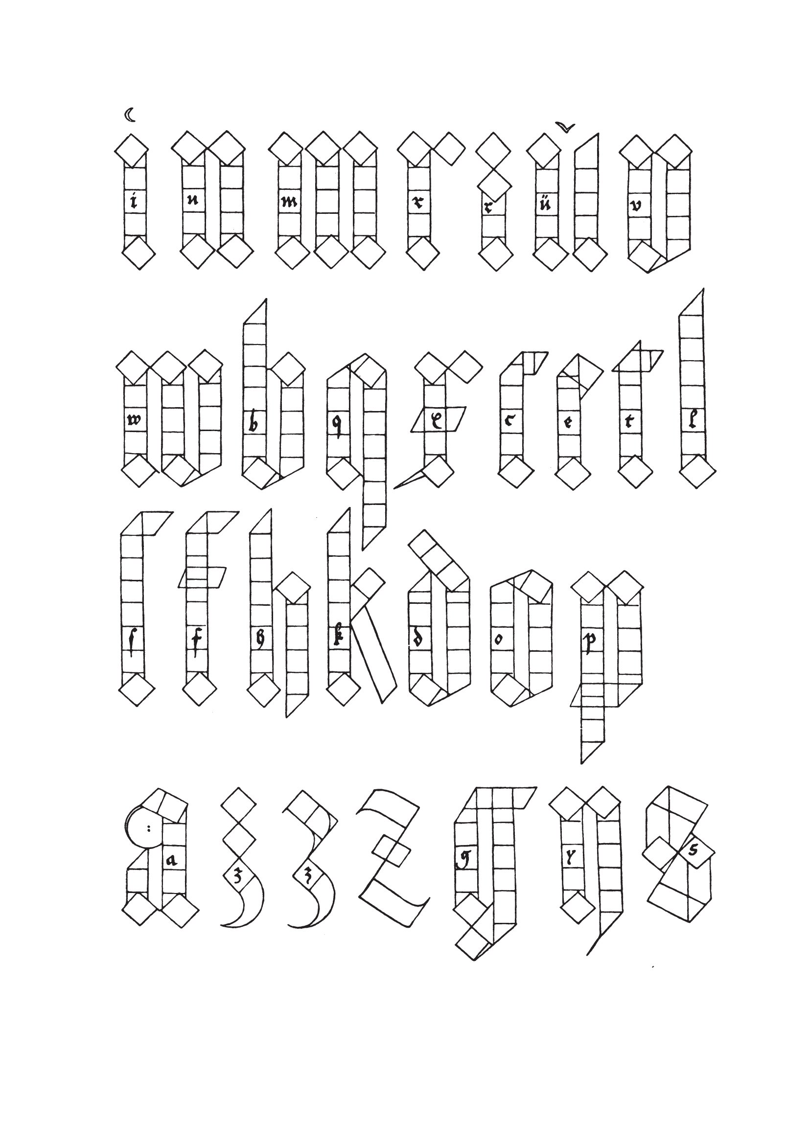
Albrecht Dürer, 1525.
Albrecht Dürer, 1471 - 1528 (German) A painter, printmaker, and theorist of the German Renaissance.
_ _ _ _ _ _ _ _ _ _ _ _ _ _ _ _ _ _ _ _ _ _ _ _ _ _ _ _ _ _ _ _ _ _ _ _ _ _ _ _ _ _ _ _ _ _ _ _ _ _ _ _ _ _ _ _ _ _ _ _ _ _ _
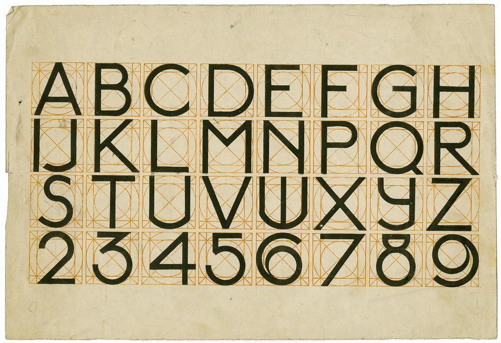
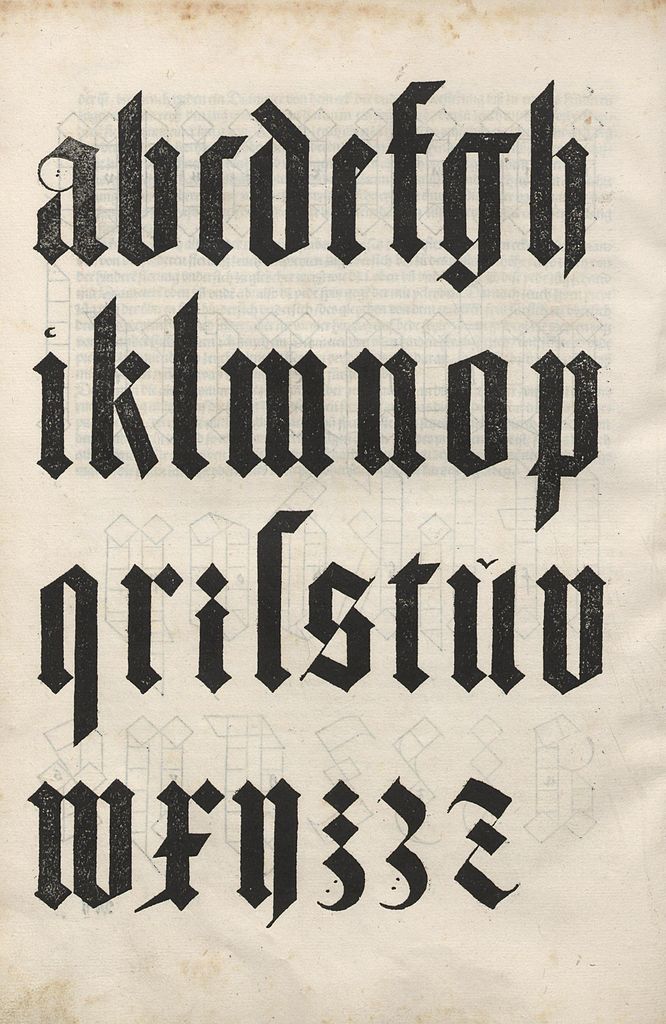
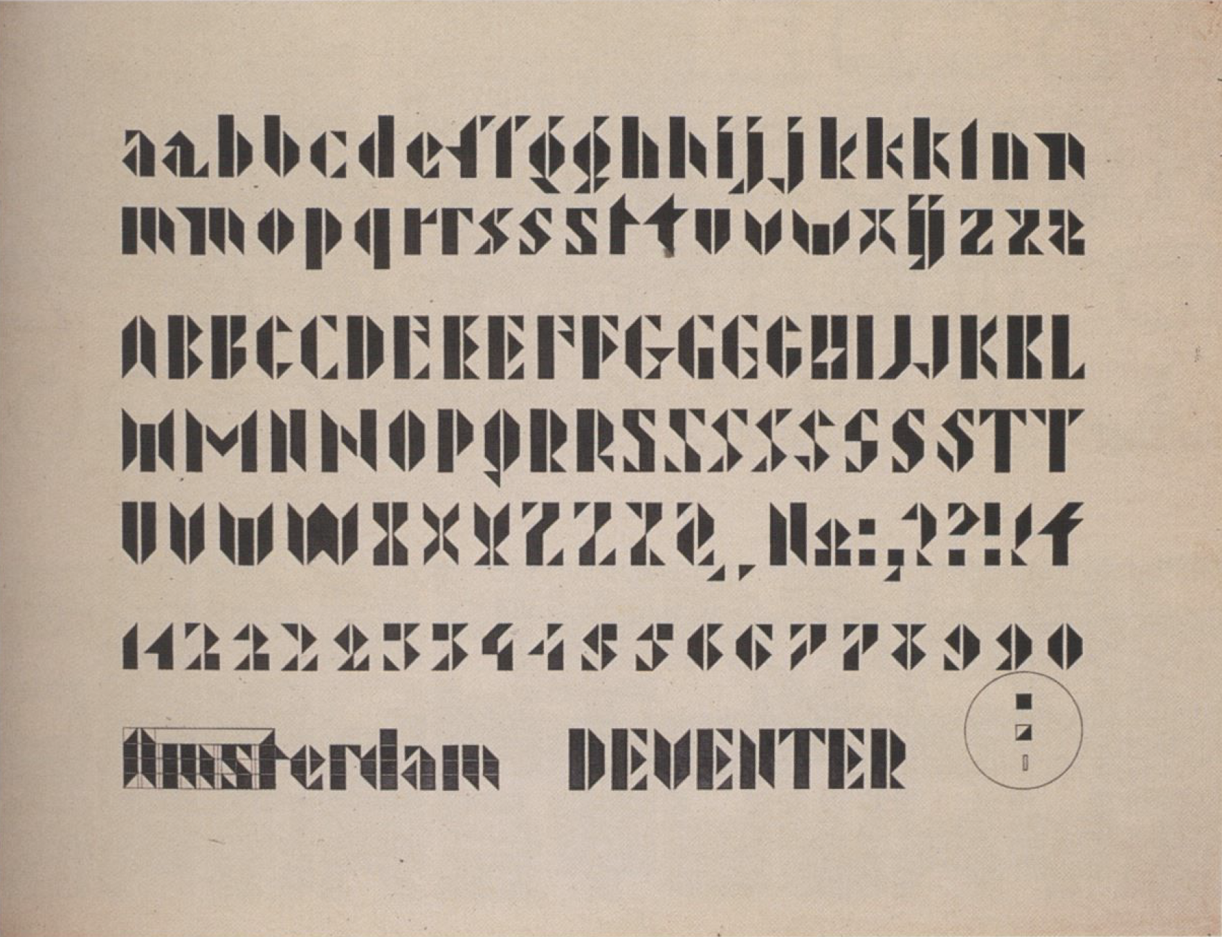
J.L.M. Lauweriks. Alphabet, [1900]
J.L.M. Lauweriks, 1864 - 1931, (Dutch) as a theorist and an artist, Lauweriks exerted great influence on early 20th-century movements such as the Amsterdam School, De Stijl and the Bauhaus. He was also a key propagator of proportion theory and system thinking.
_ _ _ _ _ _ _ _ _ _ _ _ _ _ _ _ _ _ _ _ _ _ _ _ _ _ _ _ _ _ _ _ _ _ _ _ _ _ _ _ _ _ _ _ _ _ _ _ _ _ _ _ _ _ _ _ _ _ _ _ _ _ _
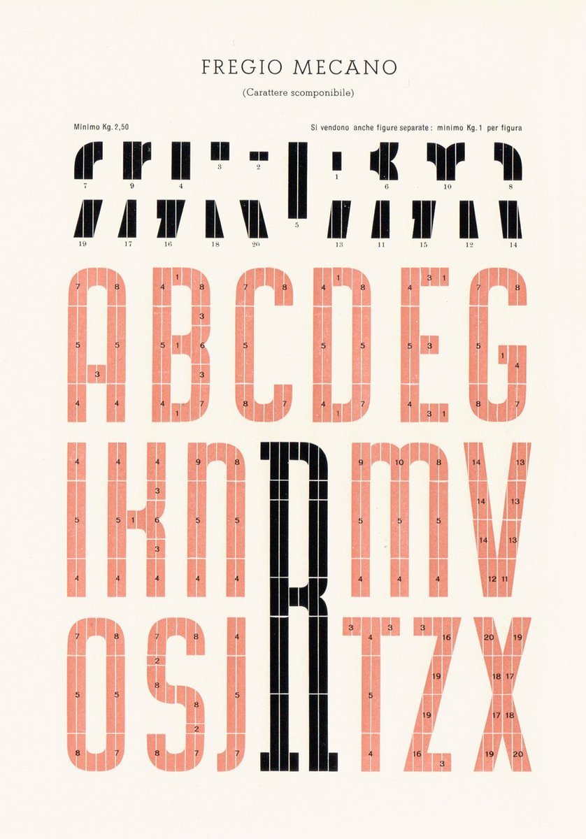
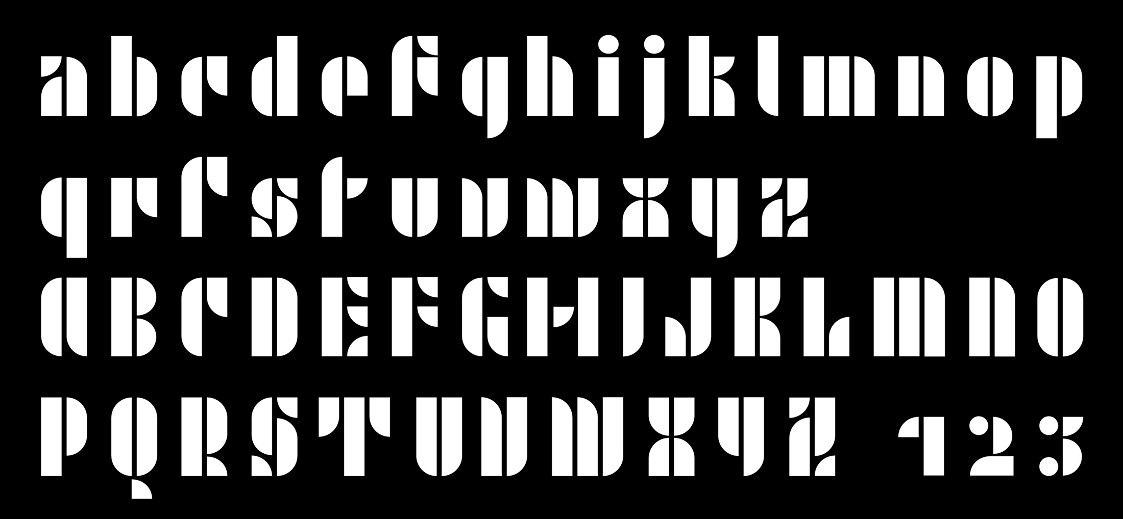
Fregio Mecano is a modular typeface of Italian origin that dates to the 1920s. The designer is unknown.
_ _ _ _ _ _ _ _ _ _ _ _ _ _ _ _ _ _ _ _ _ _ _ _ _ _ _ _ _ _ _ _ _ _ _ _ _ _ _ _ _ _ _ _ _ _ _ _ _ _ _ _ _ _ _ _ _ _ _ _ _ _ _
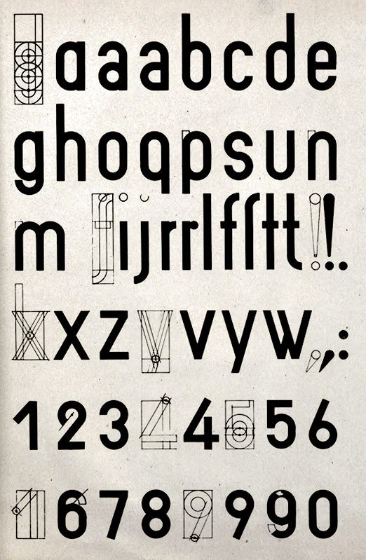
Typography during the Bauhaus movement in the 1920 strives for pure functionality –- to get rid of all superfluous elements on a letterform (you know -- serifs). No trace of personal handwriting or influence should come through in the forms (no humanist characteristics). They viewed sans serif as the proper representation of this idea. The Bauhaus modernist praised the work of engineers for their non-artisic but functionally driven approach. Type studies by Herbert Bayer, Paul Renner, Joesph Albers and Joost Schmidt.
Herbert Bayer, 1900 - 1985 (German) can be credited as the father of Bauhaus typography. And for his design of the Universal Alphabet ,1925. Bayer proposed the principles of the new typography that sought to reduce letters to their essentials, without additional adornments typical for the blackletter typography. He was an advocate of greater legibility which he provided with his design of geometrically formed characters with the greater distance between them. He removed the upper and lower cases and serifs, leaving simple, yet effective design, popular to this day. (geometric no optical adjustments)
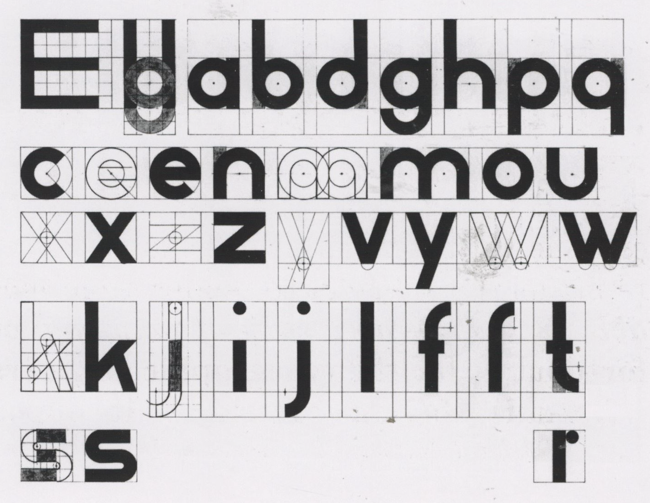
Herbert Bayer, 1925 Universal Type
_ _ _ _ _ _ _ _ _ _ _ _ _ _ _ _ _ _ _ _ _ _ _ _ _ _ _ _ _ _ _ _ _ _ _ _ _ _ _ _ _ _ _ _ _ _ _ _ _ _ _ _ _ _ _ _ _ _ _ _ _ _ _
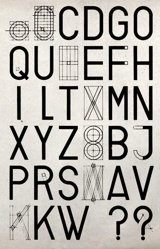
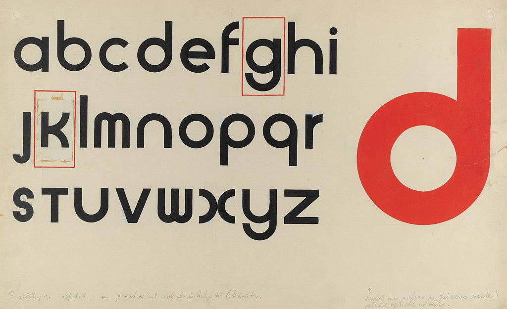
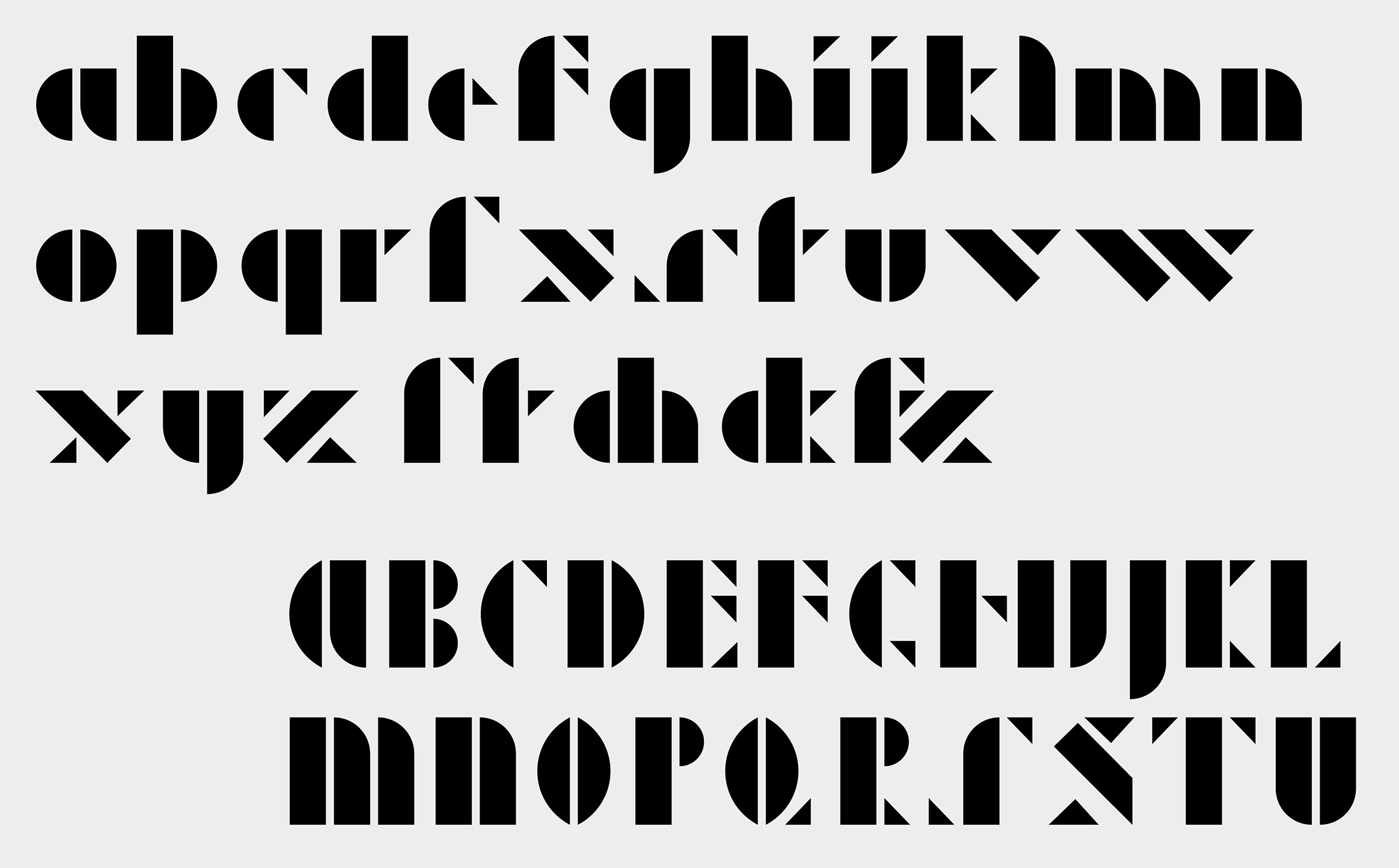
Joost Schmidt, Universal typeface (uppercase), 1924
Joost Schmidt, Universal typeface (lowercase), 1924
Joost Schmidt, 1893 1948 (German)
Joost Schmidt was a teacher or master at the Bauhaus and later a professor at the College of Visual Arts, Berlin. He was a visionary typographer and graphic designer who is best known for designing the famous poster for the 1923 Bauhaus Exhibition in Weimar, Germany
_ _ _ _ _ _ _ _ _ _ _ _ _ _ _ _ _ _ _ _ _ _ _ _ _ _ _ _ _ _ _ _ _ _ _ _ _ _ _ _ _ _ _ _ _ _ _ _ _ _ _ _ _ _ _ _ _ _ _ _ _ _ _
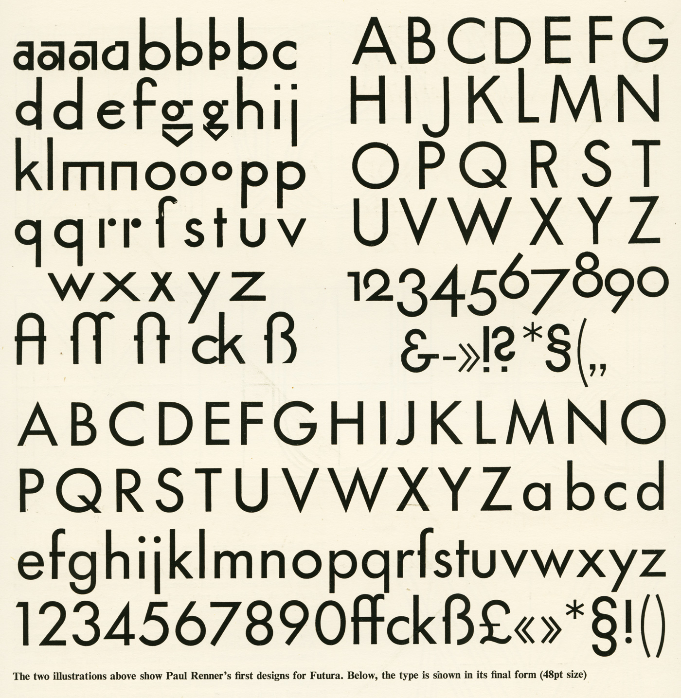
Paul Renner, 1927 Futura. Geometric build of the letterforms.
_ _ _ _ _ _ _ _ _ _ _ _ _ _ _ _ _ _ _ _ _ _ _ _ _ _ _ _ _ _ _ _ _ _ _ _ _ _ _ _ _ _ _ _ _ _ _ _ _ _ _ _ _ _ _ _ _ _ _ _ _ _ _
Josef Albers, 1888 – 1976 (German) studied to become a teacher in Büren and then taught in Westphalian primary schools from 1908 to 1913. After attending the Königliche Kunstschule in Berlin from 1913 to 1915, he was certified as an art teacher. In 1923, he began to teach the Vorkurs, a basic design course. When the Bauhaus moved to Dessau in 1925, he became a professor. In addition to working in glass and metal, he designed furniture and typography. After the Bauhaus was forced to close in 1933, Albers emigrated to the United States.
 www.guggenheim.org/artwork/173
 Josef Albers 1926
(https://www.fontshop.com/content/stencil-alphabets)
Josef Albers, 1931 Kombinationsschrift was to be manufactured from frosted glass and to be used for lettering in shop windows. www.fontshop.com/content/stencil-alphabets
_ _ _ _ _ _ _ _ _ _ _ _ _ _ _ _ _ _ _ _ _ _ _ _ _ _ _ _ _ _ _ _ _ _ _ _ _ _ _ _ _ _ _ _ _ _ _ _ _ _ _ _ _ _ _ _ _ _ _ _ _ _ _
Check out Adobe's collection call Adobe Hidden Treasures: https://adobehiddentreasures.com/
_ _ _ _ _ _ _ _ _ _ _ _ _ _ _ _ _ _ _ _ _ _ _ _ _ _ _ _ _ _ _ _ _ _ _ _ _ _ _ _ _ _ _ _ _ _ _ _ _ _ _ _ _ _ _ _ _ _ _ _ _ _ _
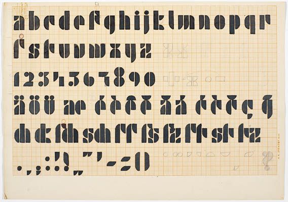
Jan Tschichold 1902 – 1974 (German) was a prominent twentieth century German typographer and book designer. He was a remarkable teacher and an author as well. He is best known for writing Die neue Typographie and Typographische Gestaltung which became standard textbooks for the next generation of typographers.
Tschichold converted to Modernist design principles in 1923 after visiting the first Weimar Bauhaus exhibition. He became a leading advocate of Modernist design: first with an influential 1925 magazine supplement mentioned above); then a 1927 personal exhibition; then with his most noted work Die neue Typographie. This book was a manifesto of modern design, in which he condemned all typefaces but sans-serif.
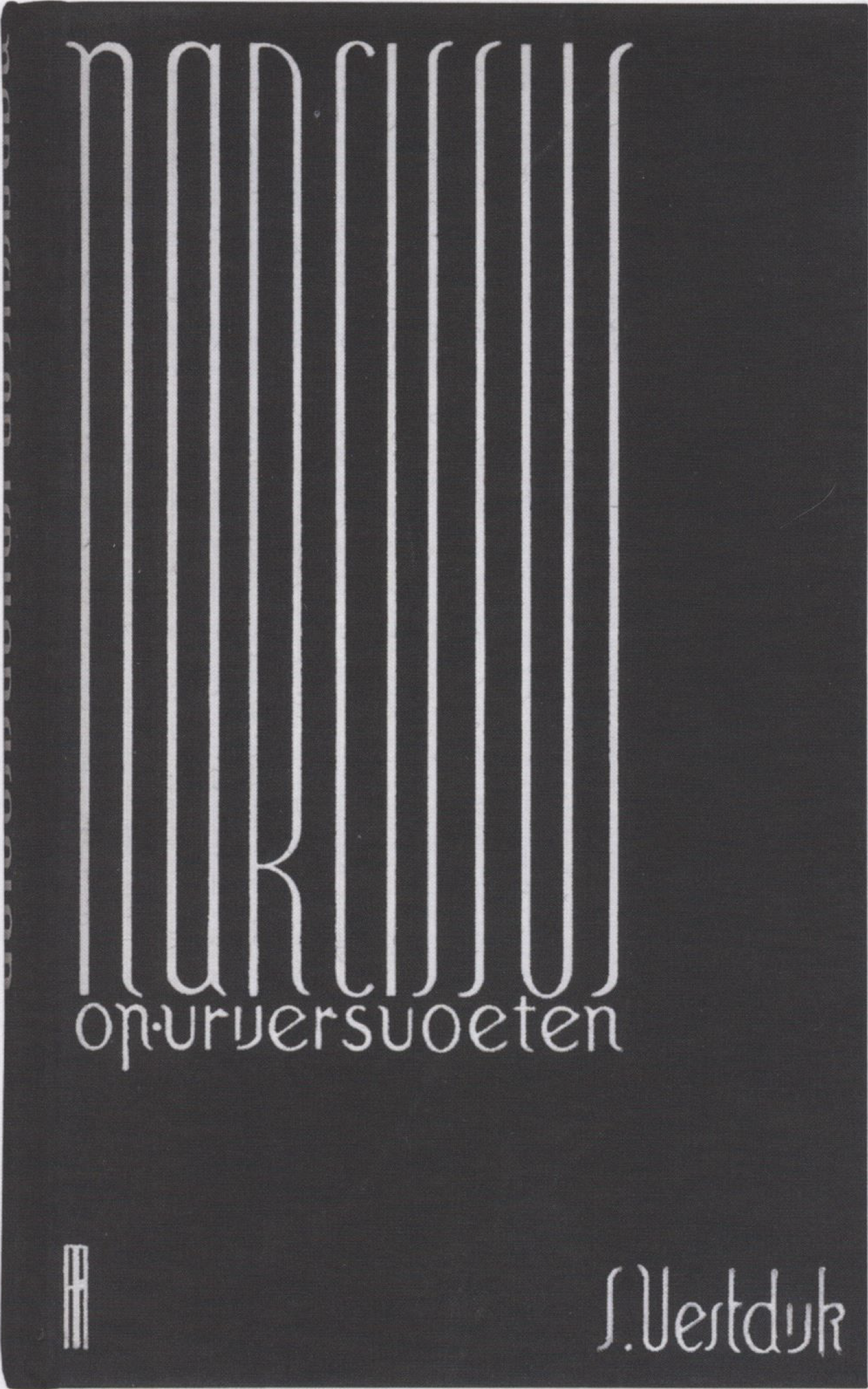
Jan Tschichold, Transito, 1929 sketch part of Amsterdam University Library's typographic collection

sketch with optical corrections (not purely based on the geometric form)
_ _ _ _ _ _ _ _ _ _ _ _ _ _ _ _ _ _ _ _ _ _ _ _ _ _ _ _ _ _ _ _ _ _ _ _ _ _ _ _ _ _ _ _ _ _ _ _ _ _ _ _ _ _ _ _ _ _ _ _ _ _ _
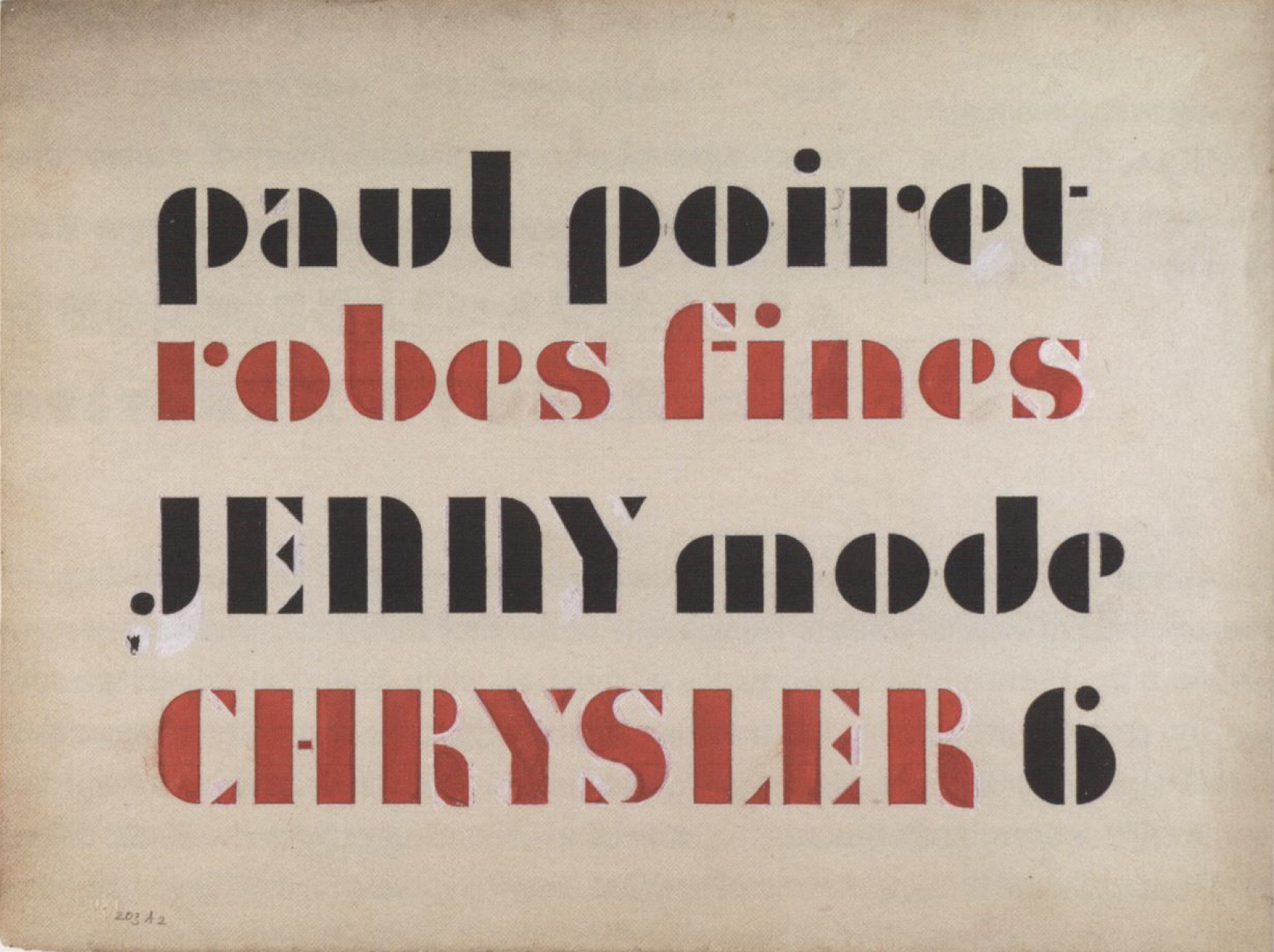
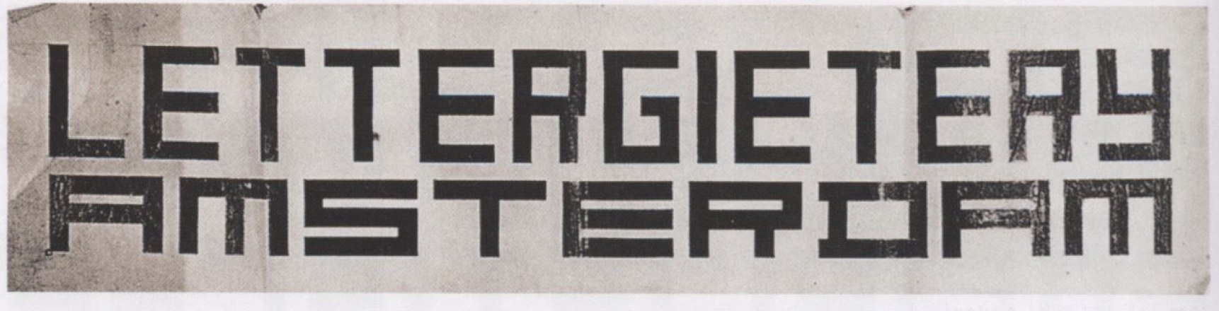
Art Deco had two distinct manifestations – the lush, curvilinear style found in Brussels, Paris and Barcelona, verses the more rational, geometric constructions of Vienna, Glasgow and Amsterdam.
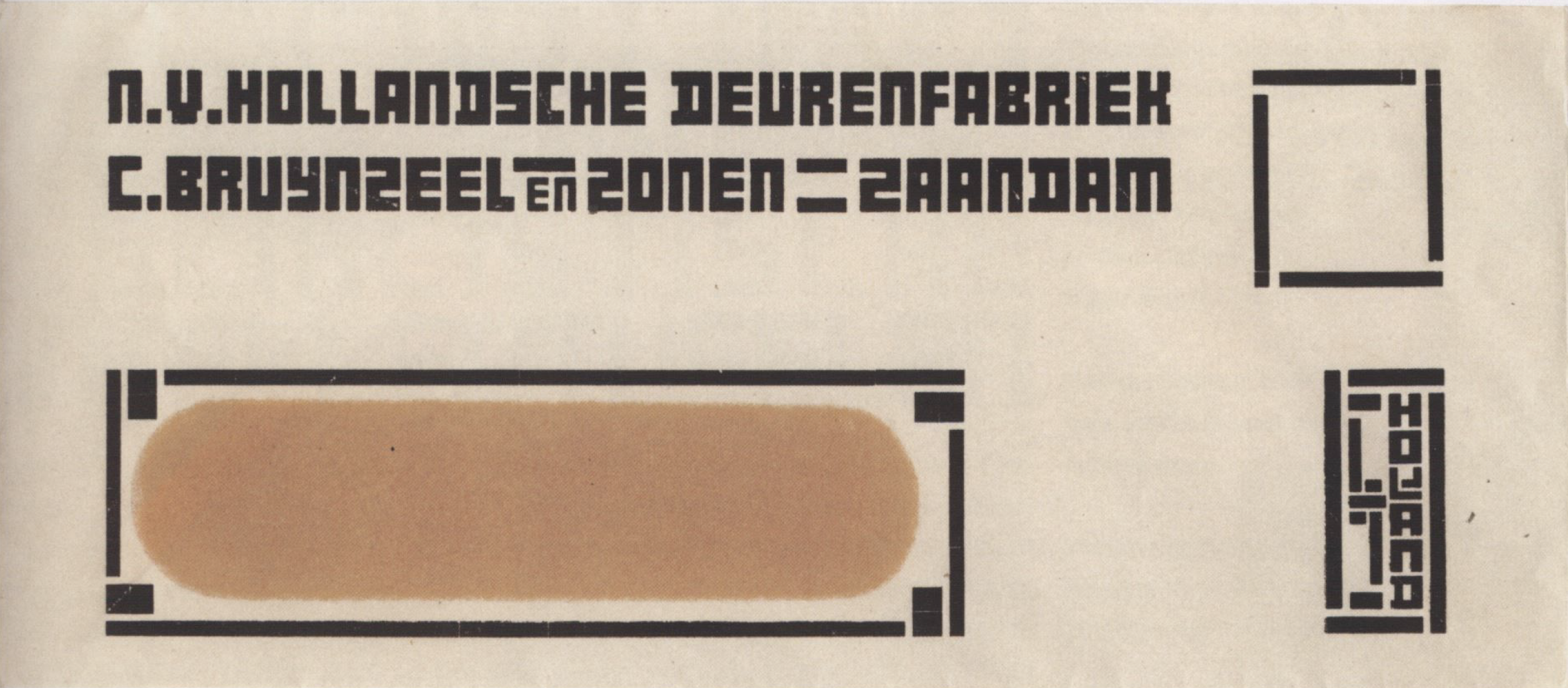
J.L.M. Lauwerik, 1929
_ _ _ _ _ _ _ _ _ _ _ _ _ _ _ _ _ _ _ _ _ _ _ _ _ _ _ _ _ _ _ _ _ _ _ _ _ _ _ _ _ _ _ _ _ _ _ _ _ _ _ _ _ _ _ _ _ _ _ _ _ _ _
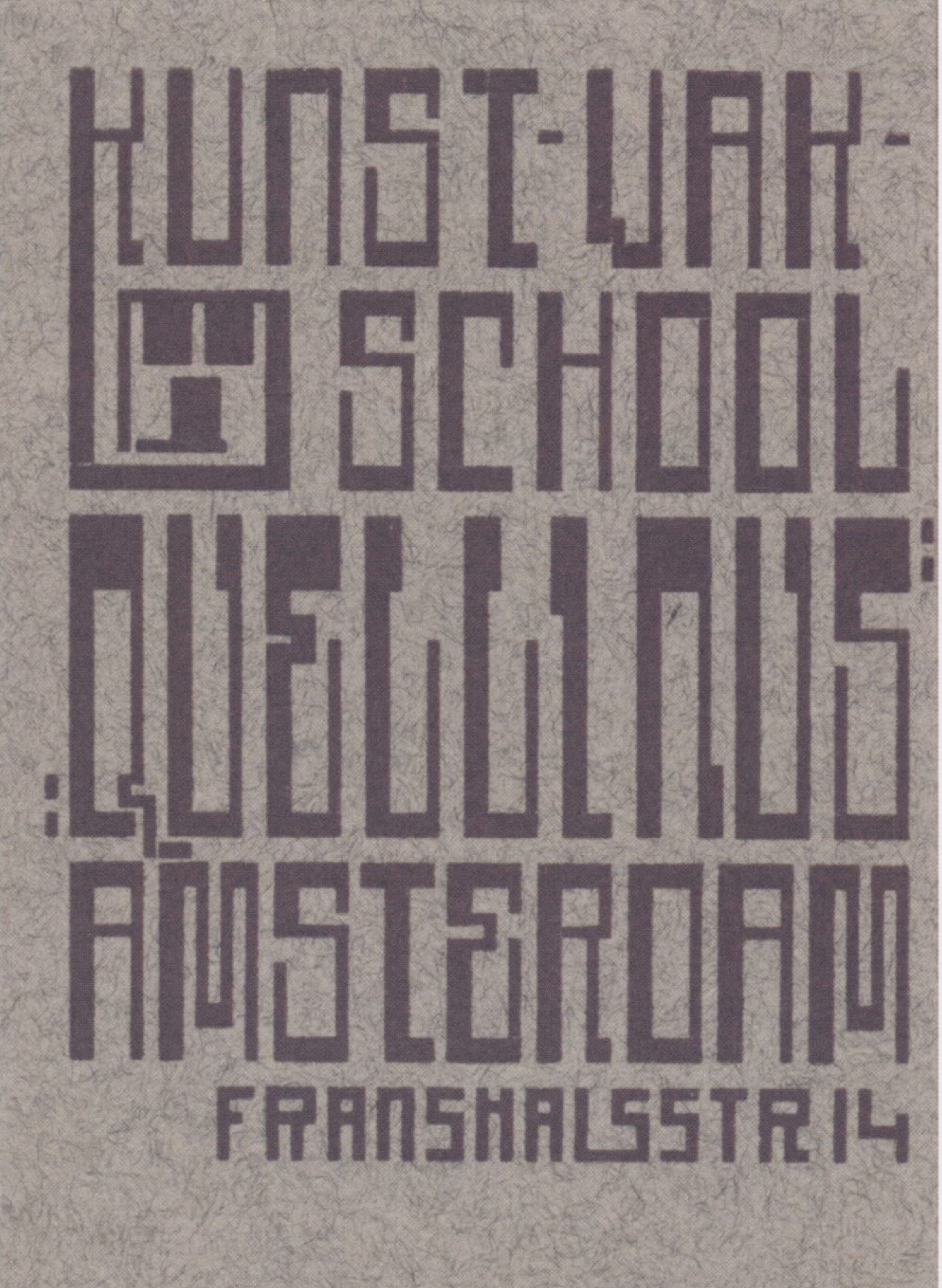
(1930, maybe Wijdeveld) Hendrik Wijdeveld, 1885 - 1987 (Dutch Architect) Wijdeveld designed many letter types for special projects, such as book covers, buildings, and letterheads
_ _ _ _ _ _ _ _ _ _ _ _ _ _ _ _ _ _ _ _ _ _ _ _ _ _ _ _ _ _ _ _ _ _ _ _ _ _ _ _ _ _ _ _ _ _ _ _ _ _ _ _ _ _ _ _ _ _ _ _ _ _ _
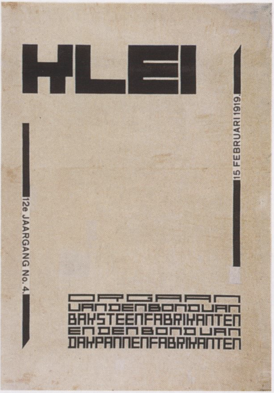
DeStil
Vilmos Huszár, 1884 - 1960 (Hungarian). Lived in Holland an was an active painter, interior designer, graphic designer and commercial artist. His earliest contributions to the DeStil were critical. Rectangular constructed letterforms.
_ _ _ _ _ _ _ _ _ _ _ _ _ _ _ _ _ _ _ _ _ _ _ _ _ _ _ _ _ _ _ _ _ _ _ _ _ _ _ _ _ _ _ _ _ _ _ _ _ _ _ _ _ _ _ _ _ _ _ _ _ _ _
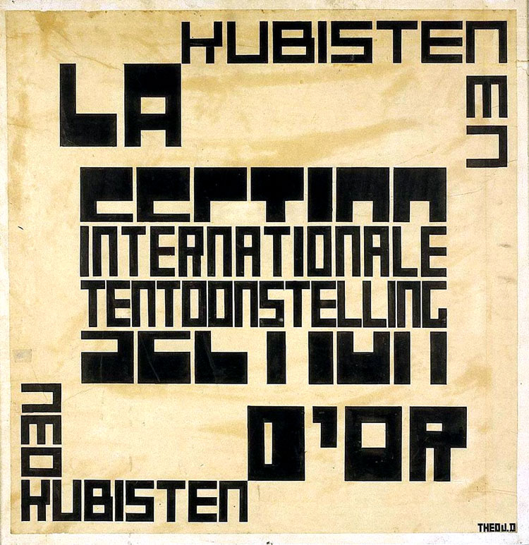
Theo Van Doesburg, 1883 - 1931 (Dutch) designed a typeface where each character was based upon a square divided into 25 smaller squares. Van Doesburg led the artistic style movement "De Stijl" into popularity and influenced graphic designers for many years to come with his theories, which conveyed the idea that there was a collective experience of reality that could be tapped as a medium of communication.
Theo van Doesburg proposed magazine cover featuring his alphabet.
_ _ _ _ _ _ _ _ _ _ _ _ _ _ _ _ _ _ _ _ _ _ _ _ _ _ _ _ _ _ _ _ _ _ _ _ _ _ _ _ _ _ _ _ _ _ _ _ _ _ _ _ _ _ _ _ _ _ _ _ _ _ _
| the modular part one | part two | part three |
::