The Modular: Part Three (in progress)
The simplilficaton and reduction of letterforms – today.
part 1: Bauhaus, Art Deco, DeStil...
part 2: Wim Crowel...
part 3: Early Digital Type Design - now ...
________________________________________________________________________________________________________
The digital technologies introduced in the late 1980s did not just change the conditions in which type was being designed and distributed, they also changed dramatically the circumstances in which type was being used. Most revolutionary of all was the rise of the independent type designer, individuals such as Zuzana Licko (Emigre) who had seized the design initiative. (Robin) Kinross called the then-current changes ‘as profound as any in the course of [typography’s] 550-year history’. (full article)
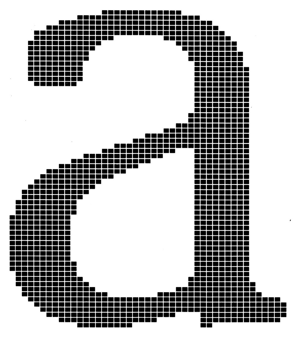
Lowercase letter ‘a’ of Gerard Unger’s typeface Demos
dot dot dot on Behance
_ __ _ _ _ _ _ _ _ _ _ _ _ _ _ _ _ _ _ _ _ _ _ _ _ _ _ _ _ _ _ _ _ _ _ _ _ _ _ _ _ _ _ _ _ _ _ _ _ _ _ _ _ _ _ _ _ _ _ _ _ _
Zuzana Licko, 1961 - , (Czechoslovakian) one of the first type designers to exploit the potential of the Apple Macintosh in its pre-designer days, Zuzana Licko transformed the pixel from low-resolution imitation to high-style original. Her early Emigre fonts not only revolutionized digital typography but also opened up the market for the smaller foundries whose quarter-page ads populate today’s design magazines. She has designed more than two dozen typeface families and oversees the Emigre foundry. www.emigre.com/Essays/ZuzanaLicko/Eye2002 | AIGA Metal 1997
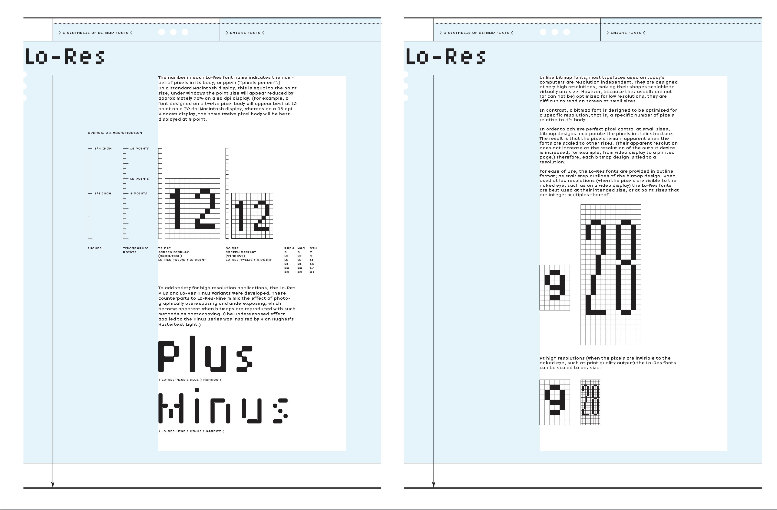
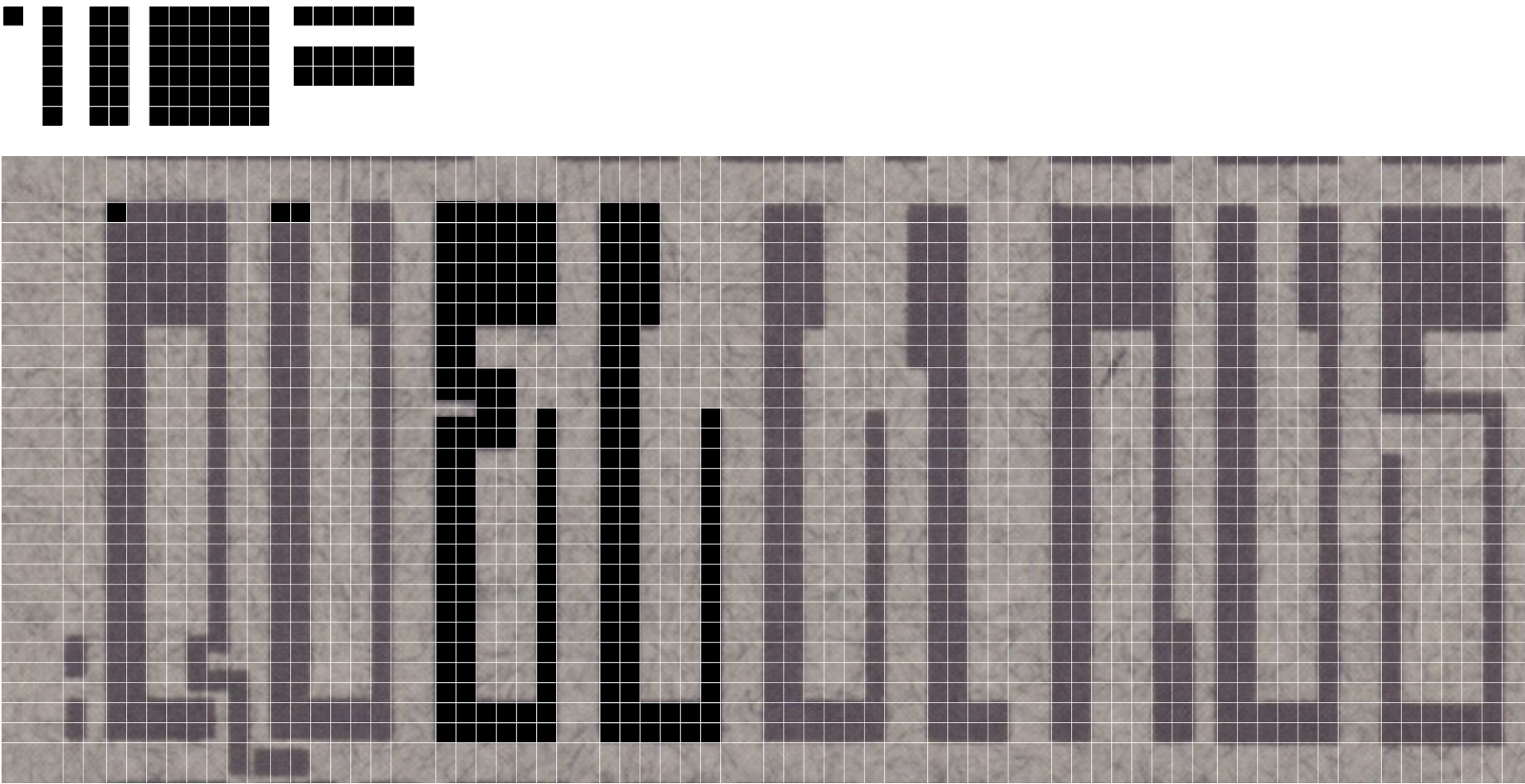
LoRes, Emigre (download pdf)
Digital Fonts, Emigre (download pdf)
_ _ _ _ _ _ _ _ _ _ _ _ _ _ _ _ _ _ _ _ _ _ _ _ _ _ _ _ _ _ _ _ _ _ _ _ _ _ _ _ _ _ _ _ _ _ _ _ _ _ _ _ _ _ _ _ _ _ _ _ _ _ _
Ben Bos, 1930 - 2017 (Dutch). He was the first employee of what was to become the largest Dutch design agency: Total Design.

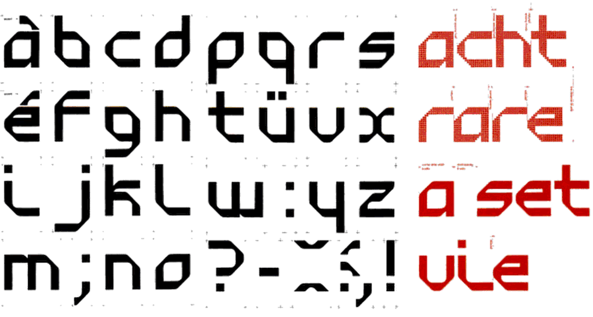
Ben Bos, 1970 Typeface is based on his Randstad logo.
_ _ _ _ _ _ _ _ _ _ _ _ _ _ _ _ _ _ _ _ _ _ _ _ _ _ _ _ _ _ _ _ _ _ _ _ _ _ _ _ _ _ _ _ _ _ _ _ _ _ _ _ _ _ _ _ _ _ _ _ _ _ _
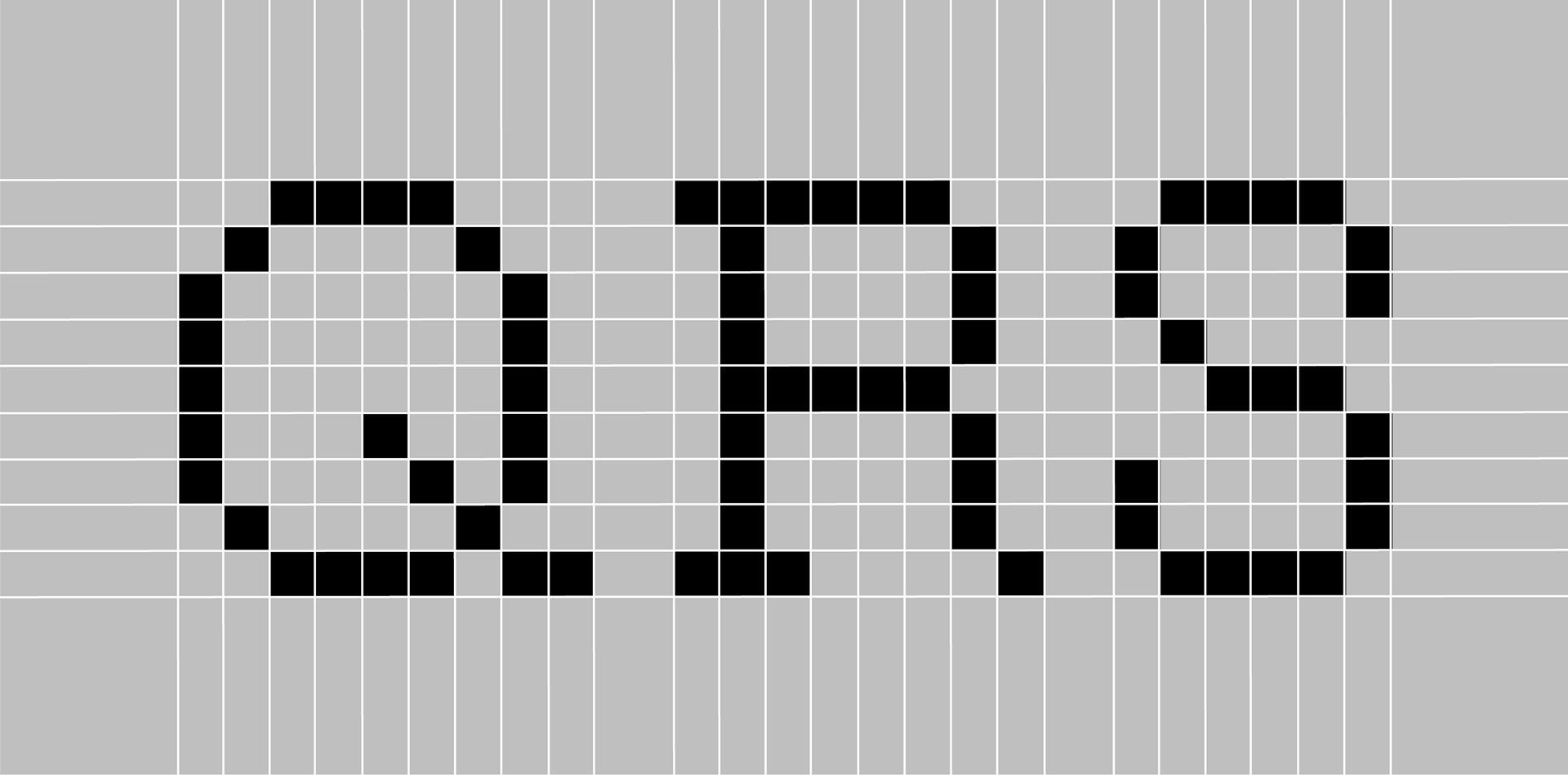
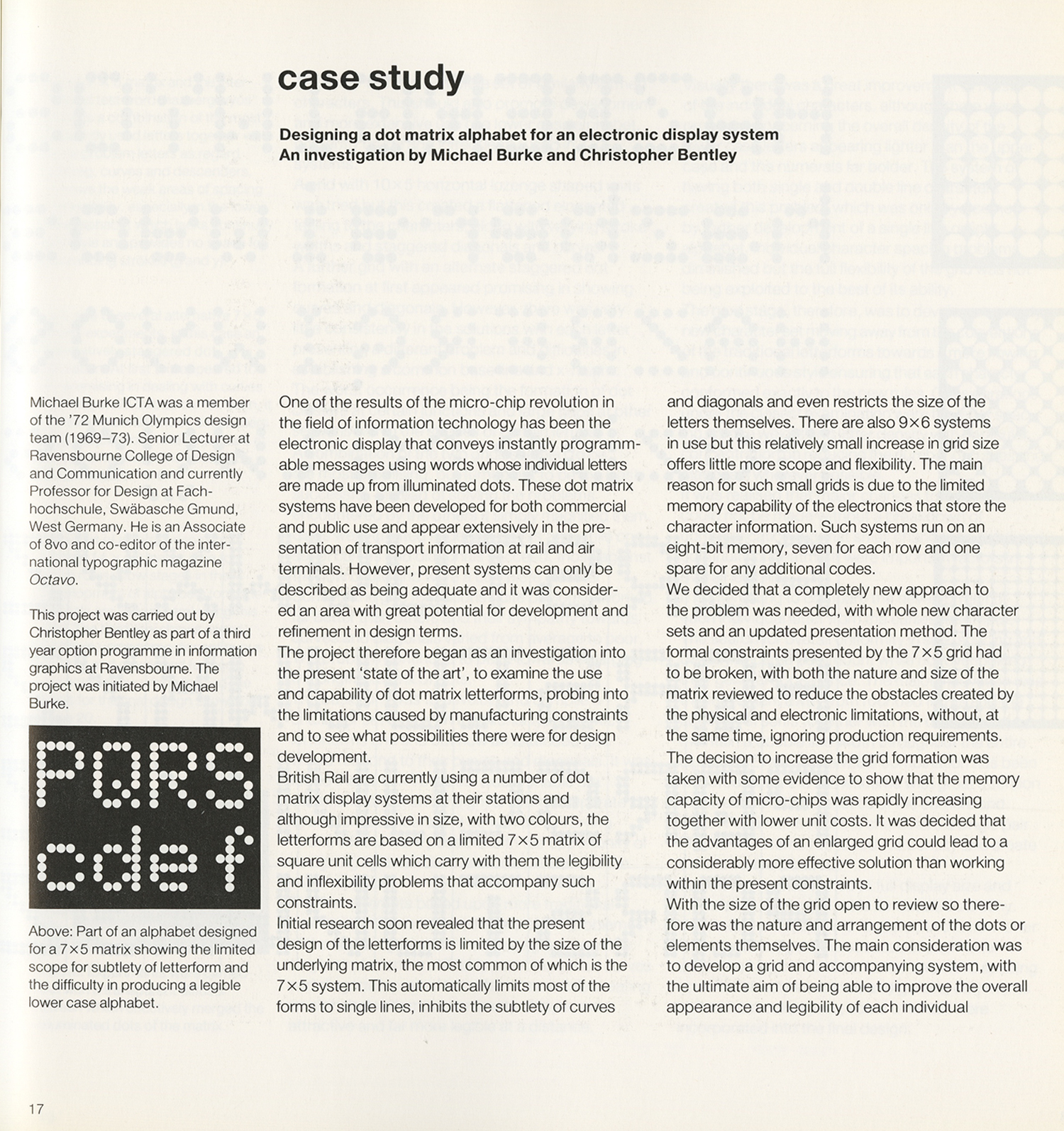
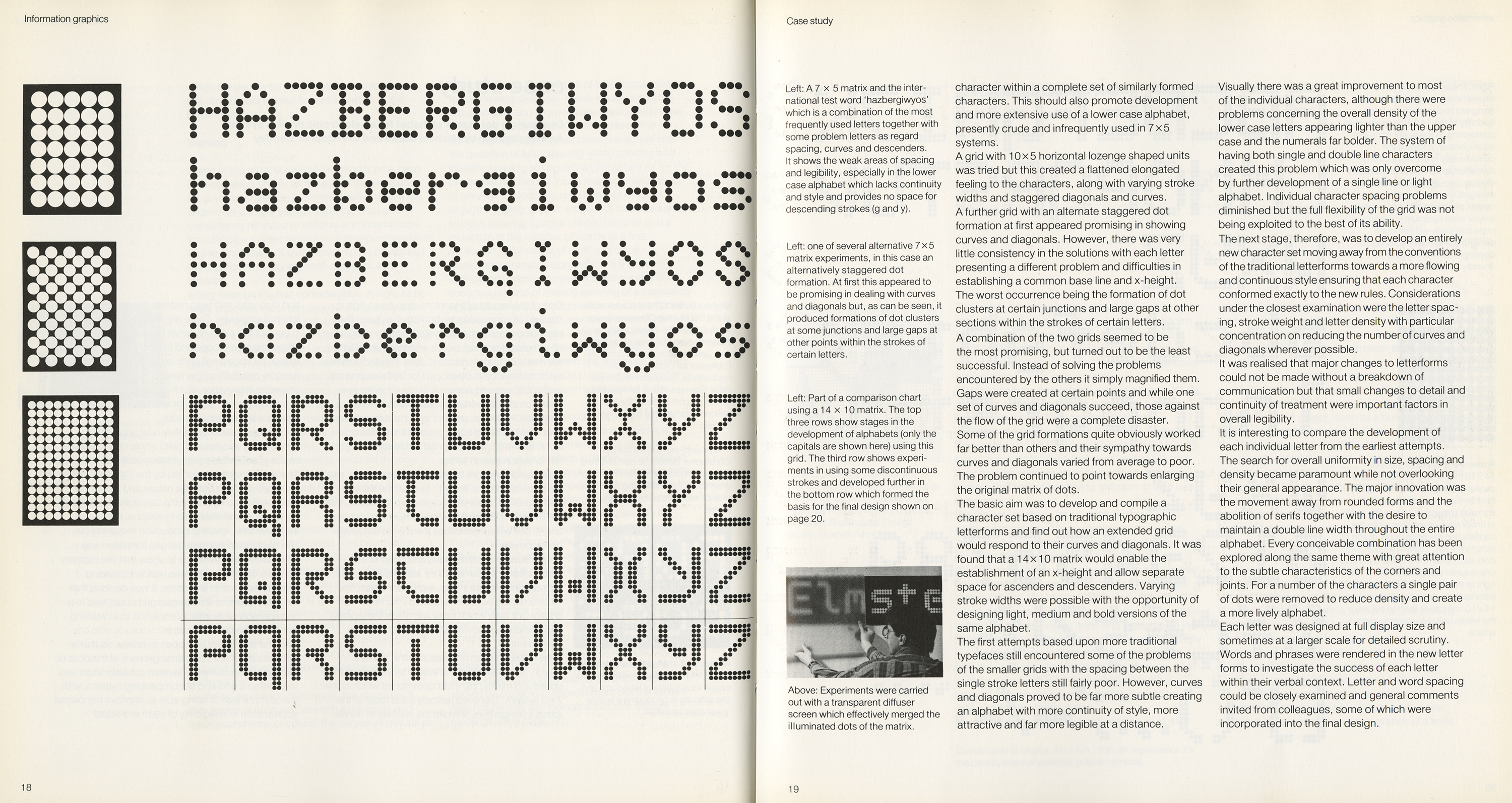
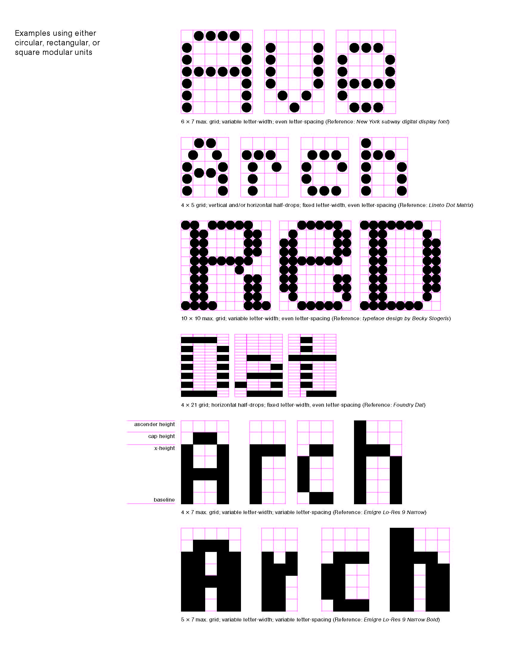
Michael Burke and Christopher Bentley, case study: designing a dot matrix alphabet for an electronic display system. As seen in Information Graphics: A Survey of Typographic, Diagrammatic and Cartographic Communication by Peter Wildbur, Van Nostrand Reinhold Co., New York, 1989.
_ _ _ _ _ _ _ _ _ _ _ _ _ _ _ _ _ _ _ _ _ _ _ _ _ _ _ _ _ _ _ _ _ _ _ _ _ _ _ _ _ _ _ _ _ _ _ _ _ _ _ _ _ _ _ _ _ _ _ _ _ _ _
MuirMcNeil (instagram: @muirmcneil (website)
Founded in 2009 by Paul McNeil and Hamish Muir, MuirMcNeil’s activities are focused on exploring systematic and algorithmic methods in type design, graphic design and moving image.
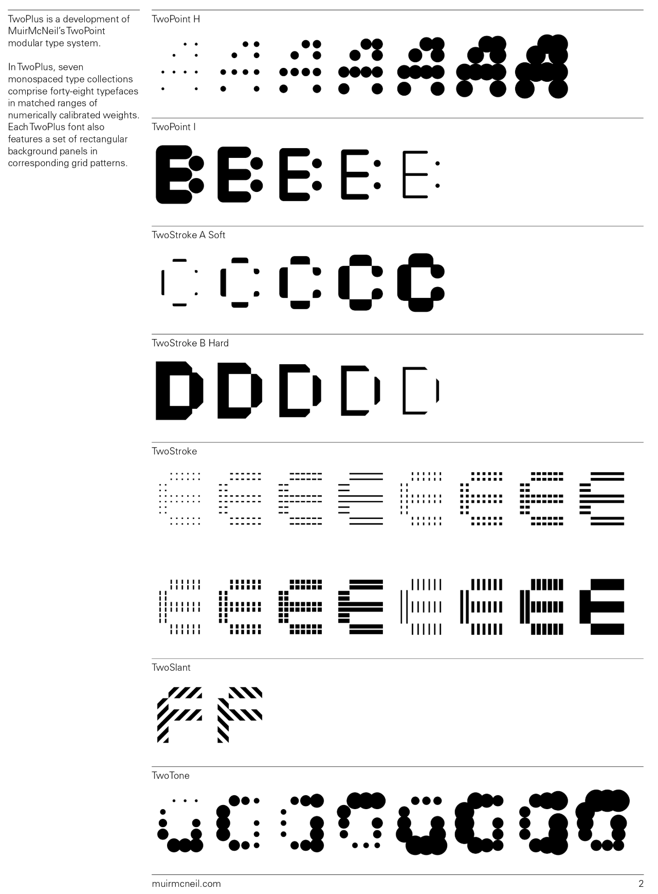
Read: https://typographica.org/typeface-reviews/twoplus/
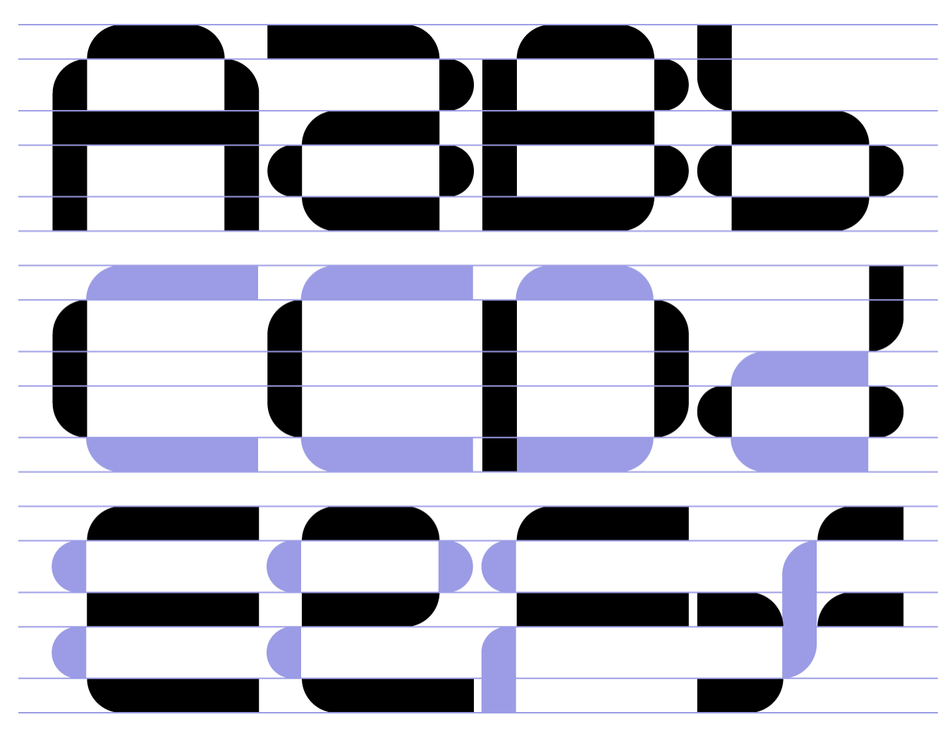
Bisect is a monospaced geometric type system produced by MuirMcNeil in collaboration with Natasha Lucas, a graphic designer interested in typography, editorial design and visual identity systems. http://www.muirmcneil.com/project/bisect-type-system/?section=typeface&typeface=bisect-a
_ _ _ _ _ _ _ _ _ _ _ _ _ _ _ _ _ _ _ _ _ _ _ _ _ _ _ _ _ _ _ _ _ _ _ _ _ _ _ _ _ _ _ _ _ _ _ _ _ _ _ _ _ _ _ _ _ _ _ _ _ _ _
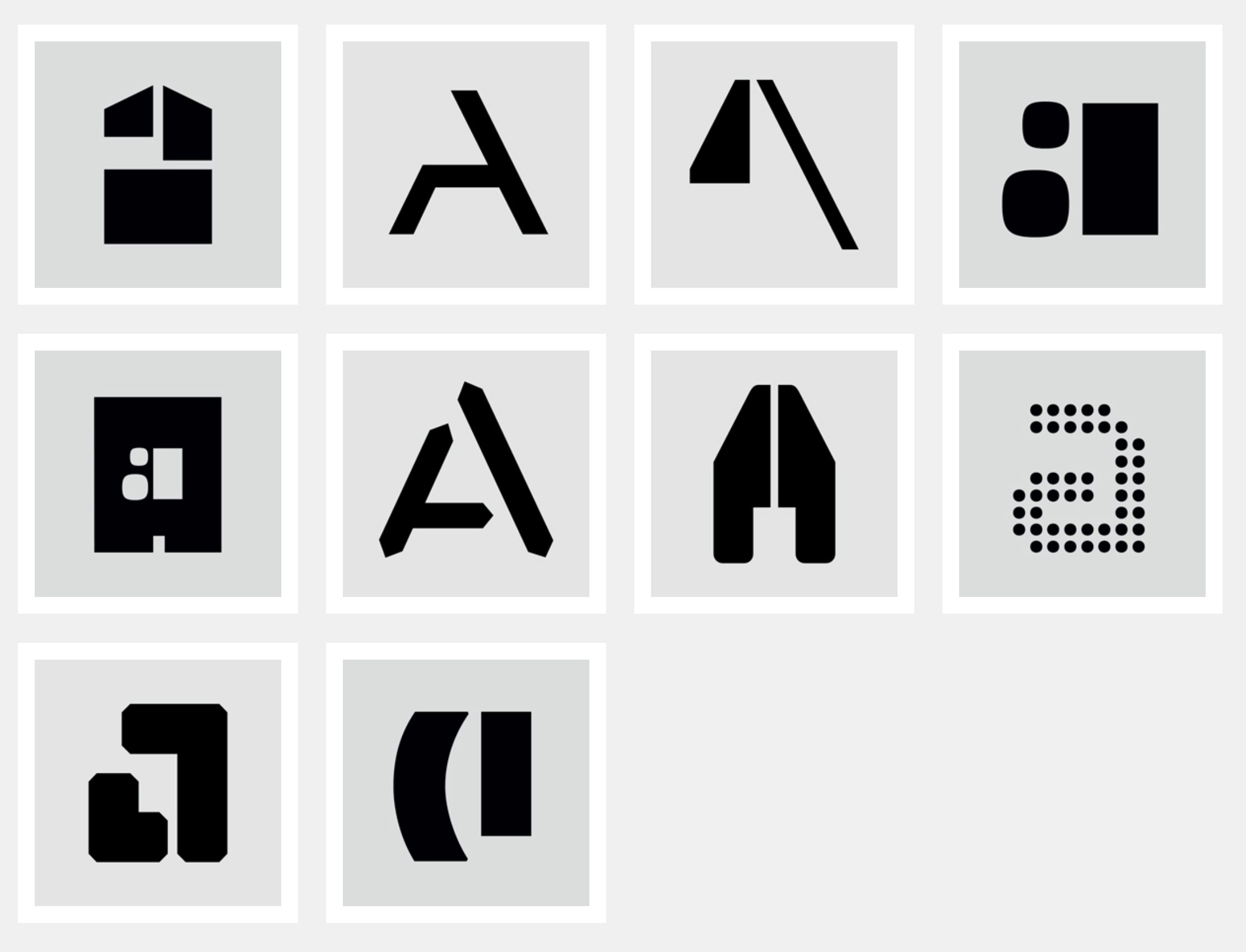
Philippe Apeloig, 1962 - , (French) (website)
Philippe Apeloig was born in Paris in 1962 and studied at the École Supérieure des Arts Appliqués Duperré and the École Nationale Supérieure des Arts Décoratifs (ENSAD). After two transformative internships at Total Design in Amsterdam, he was hired as a graphic designer at the Musée d’Orsay in Paris in 1985.
Watch: Quad Cinema Logotype designed by Paula Scher
typography
Aleph Studio Apeloig 1994
more: watch...
_ _ _ _ _ _ _ _ _ _ _ _ _ _ _ _ _ _ _ _ _ _ _ _ _ _ _ _ _ _ _ _ _ _ _ _ _ _ _ _ _ _ _ _ _ _ _ _ _ _ _ _ _ _ _ _ _ _ _ _ _ _ _
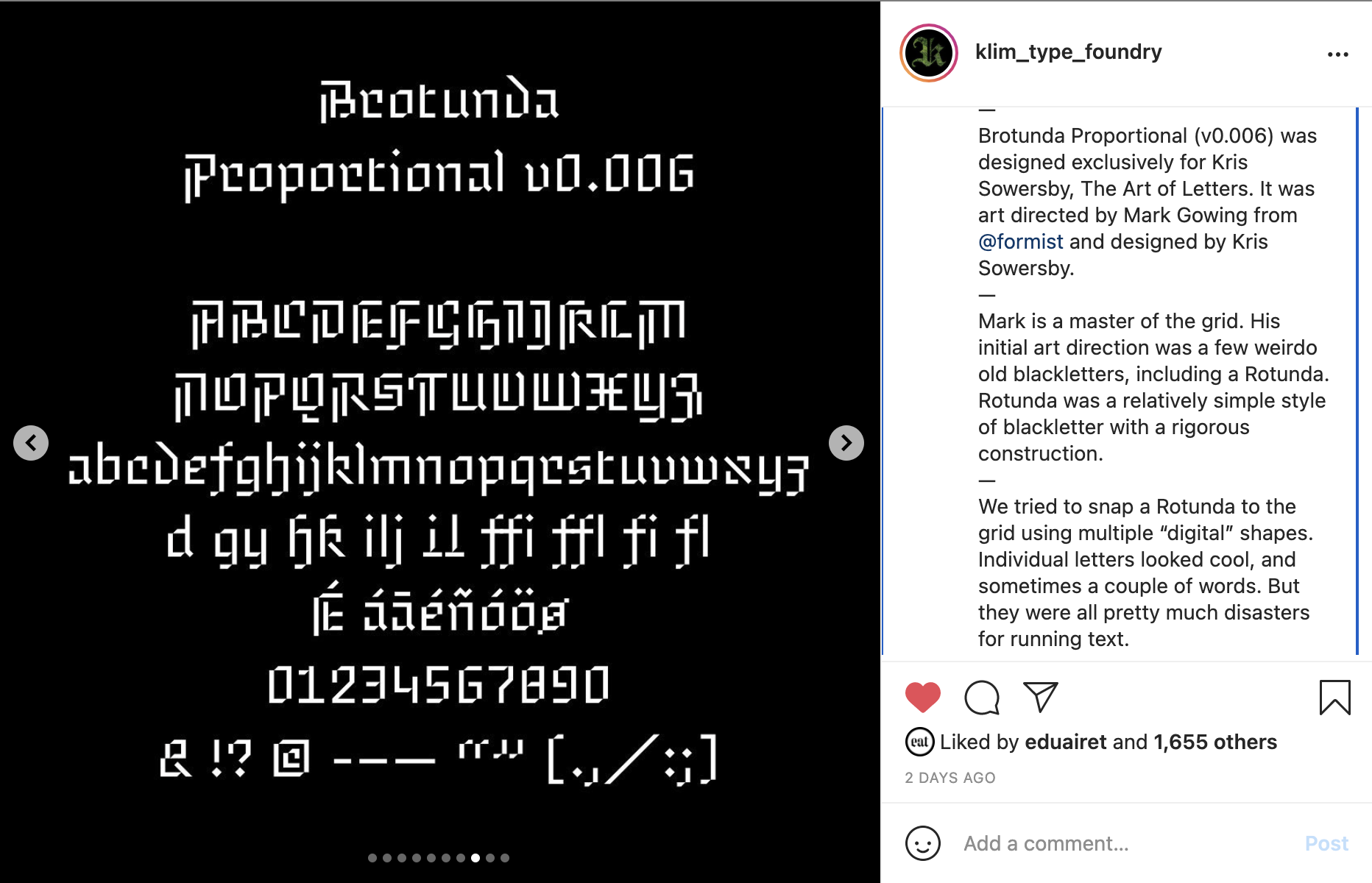
Brotunda Proportional: https://www.instagram.com/p/CSN81jEBBpU/
_ _ _ _ _ _ _ _ _ _ _ _ _ _ _ _ _ _ _ _ _ _ _ _ _ _ _ _ _ _ _ _ _ _ _ _ _ _ _ _ _ _ _ _ _ _ _ _ _ _ _ _ _ _ _ _ _ _ _ _ _ _ _
Sketching
Thinking with Type: Project Letterforms
_ _ _ _ _ _ _ _ _ _ _ _ _ _ _ _ _ _ _ _ _ _ _ _ _ _ _ _ _ _ _ _ _ _ _ _ _ _ _ _ _ _ _ _ _ _ _ _ _ _ _ _ _ _ _ _ _ _ _ _ _ _ _

_ _ _ _ _ _ _ _ _ _ _ _ _ _ _ _ _ _ _ _ _ _ _ _ _ _ _ _ _ _ _ _ _ _ _ _ _ _ _ _ _ _ _ _ _ _ _ _ _ _ _ _ _ _ _ _ _ _ _ _ _ _ _
_ _ _ _ _ _ _ _ _ _ _ _ _ _ _ _ _ _ _ _ _ _ _ _ _ _ _ _ _ _ _ _ _ _ _ _ _ _ _ _ _ _ _ _ _ _ _ _ _ _ _ _ _ _ _ _ _ _ _ _ _ _ _
LINKS
Ben by Marius Roosendaal: https://marius.systems/Ben
Inside Type: https://insidetype.tumblr.com/page/5
Twitter Hashtag: https://twitter.com/hashtag/TypeSystemGrid?src=hashtag_click
_ _ _ _ _ _ _ _ _ _ _ _ _ _ _ _ _ _ _ _ _ _ _ _ _ _ _ _ _ _ _ _ _ _ _ _ _ _ _ _ _ _ _ _ _ _ _ _ _ _ _ _ _ _ _ _ _ _ _ _ _ _ _
REFERENCES
https://www.emigre.com
http://indexgrafik.fr/ben-bos/
TwoPoint, ThreePoint, FourPoint, and TenPoint
: MuirMcNeil / Typographica
_ _ _ _ _ _ _ _ _ _ _ _ _ _ _ _ _ _ _ _ _ _ _ _ _ _ _ _ _ _ _ _ _ _ _ _ _ _ _ _ _ _ _ _ _ _ _ _ _ _ _ _ _ _ _ _ _ _ _ _ _ _ _
| the modular part one | part two | part three |
|