Professor: Andrea Herstowski
Office: 353 Chalmers Hall
Office
hours: by appointment
email: herstow@ku.edu
...............................................................
Mon. January 31
Wed. February 2
Mon. February 7
Wed. February 9
::::
The Rationalization of the Letter
_ _ _ _ _ _ _ _ _ _ _ _ _ _ _ _ _ _ _ _ _ _ _ _ _ _ _ _ _ _ _ _ _ _ _ _ _ _ _ _ _ _ _ _ _ _ _ _ _ _ _ _ _ _ _ _ _ _ _ _ _ _ _
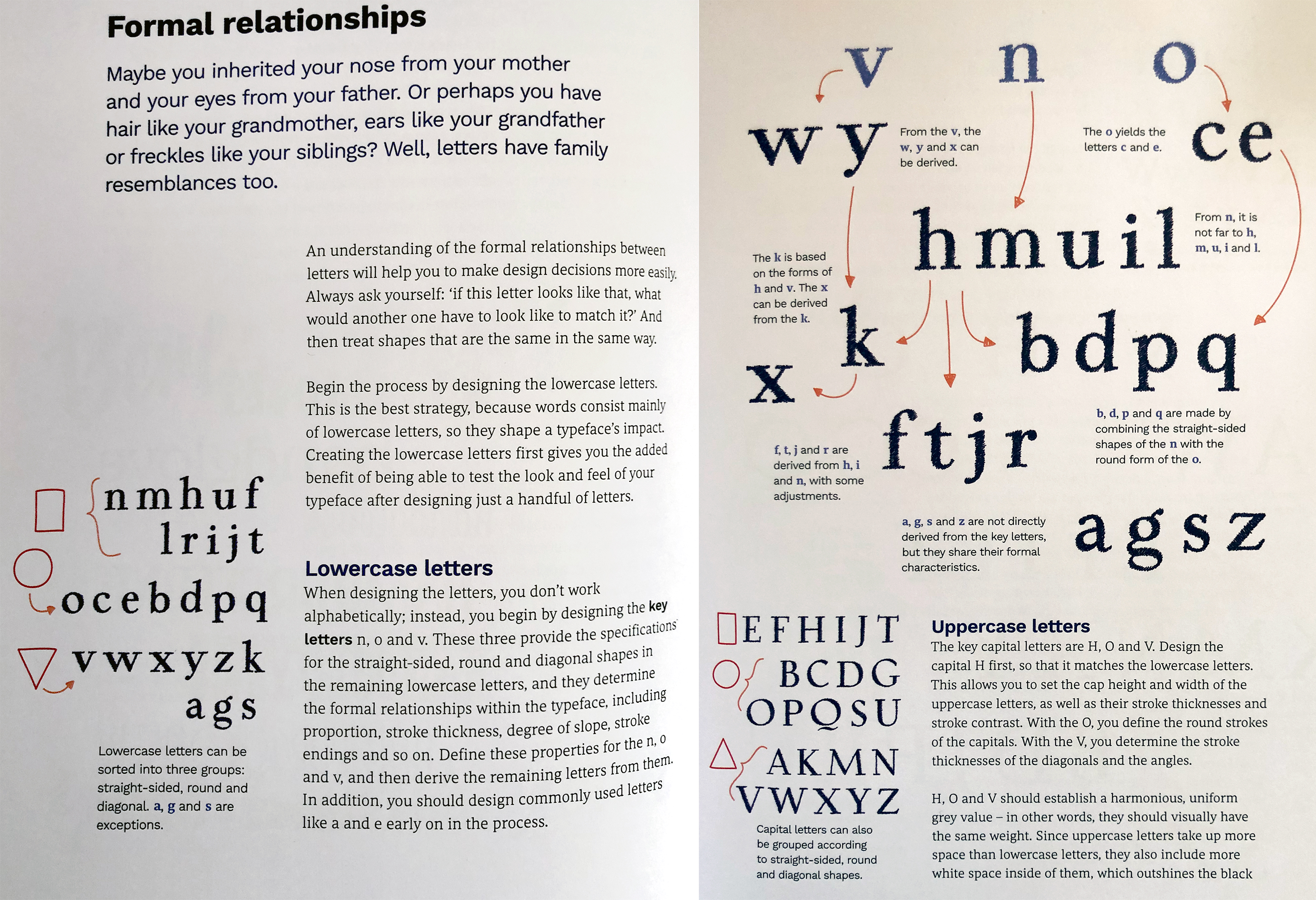
Understanding the Proportions of letterforms is a key compenent in type design. ‘Relationship’ is the most important word in type design. A typeface is a system governed by the relationships between characters, creating a coherent set of glyphs. — R. Hunter Middleton
Create an original set of constructed, serifed, varied stroke width captial letters HANDGLOVESMUI
Objectives:
understand the history of the Roman du Roi
understand
the extrema, points and handles, how to draw and correct in Glyphs
expanding your drawing skills in Glyphs
understand how font design is a system - similarities and differences between characters.
understand how to use and edit components
understend corner components
understand and construct
overshoots
understand optical compensation both in round letterforms and diagonals
understand cap height vs ascender height
understand the principles of spacing
understand how to create a variable font (later)
undertand how to create a contextual alternate
________________________________________________________________________________________________________
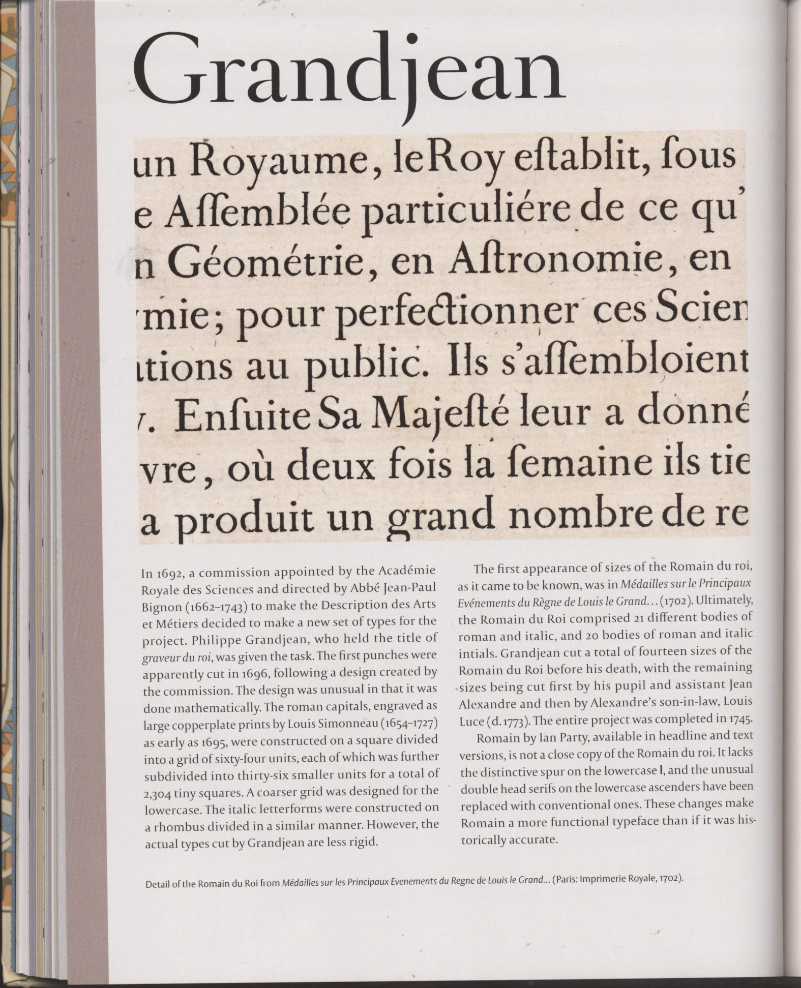
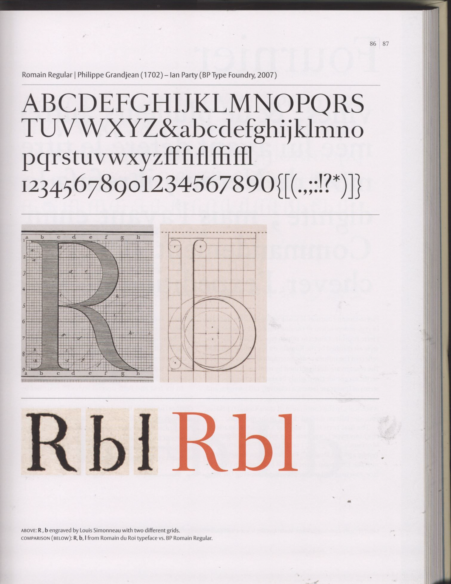
Romain du Roi
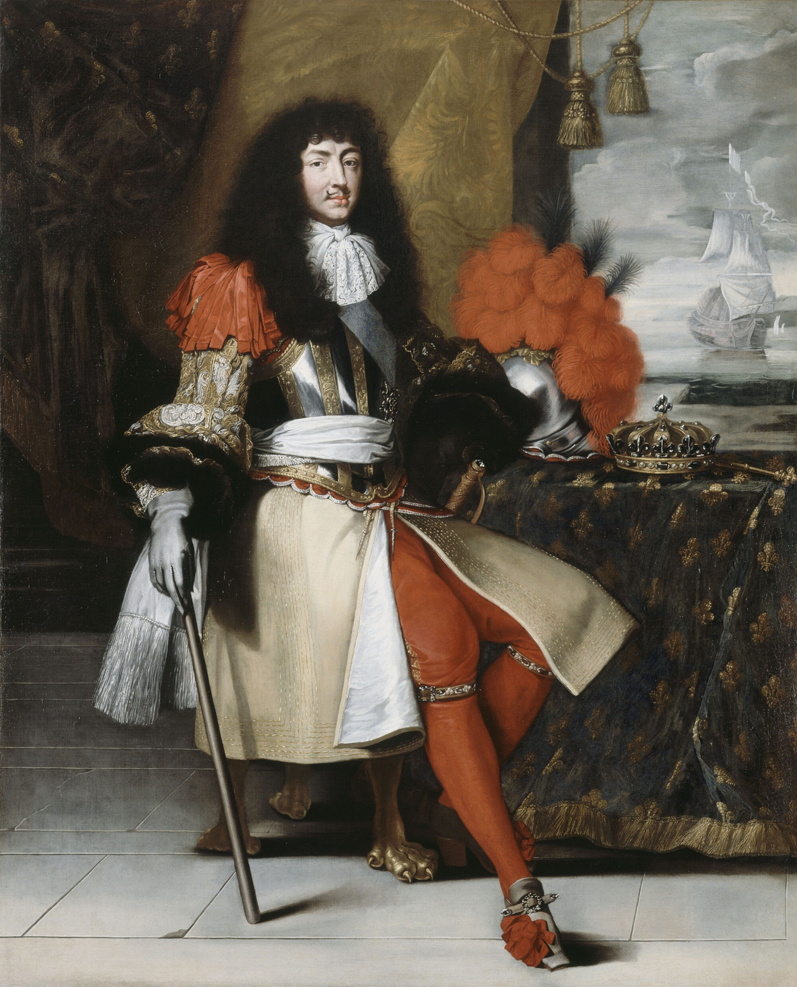
In 1694, King Louis XIV of France commissioned his own typeface for use by the Imprimerie Royale. It was so named "Roman of the King" or "Romain du Roi". The type was first used in 1702.
The Romain du Roi stands as a landmark of typography in the Age of Enlightenment. (The Enlightenment, also known as the Age of Reason, was a philosophical movement that took place primarily in Europe and, later, in North America, during the late 17th and early 18th century. Its participants thought they were illuminating human intellect and culture after the "dark" Middle Ages.)
click through.pdf
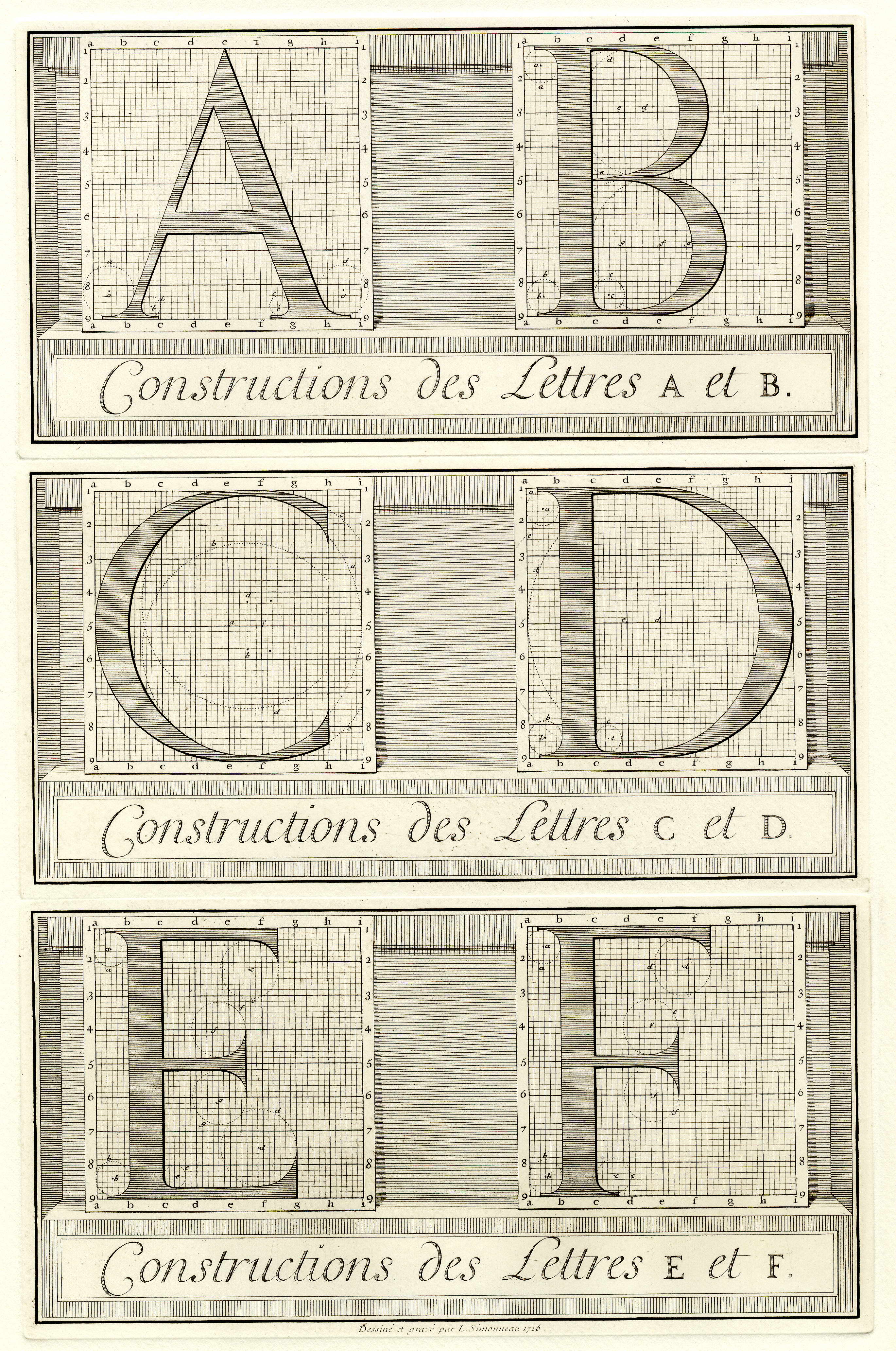
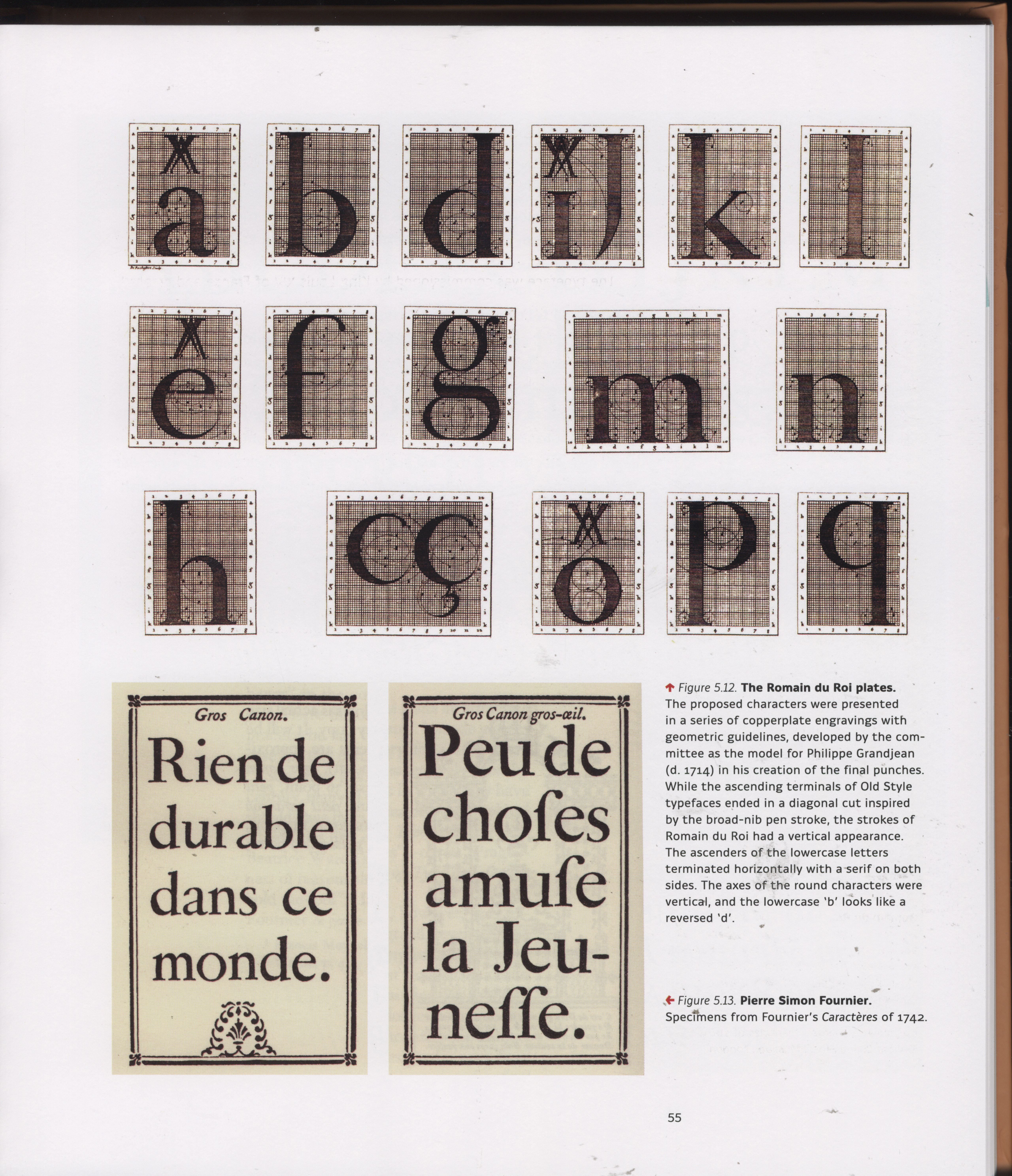
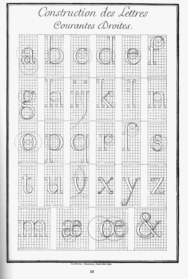
Romain du Roi is constructed on a square divided into a grid 8 units subdivided into 36 smaller units.
The conception of the letterforms reflects a difference in attitude from the prevailing roman typefaces before it. Whereas previous roman typefaces developed naturally over time, evolving in the hands of punch cutters from the typefaces of the fifteenth century, the Romain du Roi was the result of rational design: the letterforms were mapped on grids before being cut into metal.
The design of the letterforms was the work of a committee assembled from the Academy of Sciences. The capital letters were drawn on 8×8 grids*, the lowercase letters on rectangular grids. The committee's designs were engraved by Louis Simonneau. Punches for the metal type were cut by Philippe Grandjean, who took some liberty with his type, to moderate the cold geometry of the designs. The type was first used for Médailles sur les principaux événements du règne de Louis le Grand.
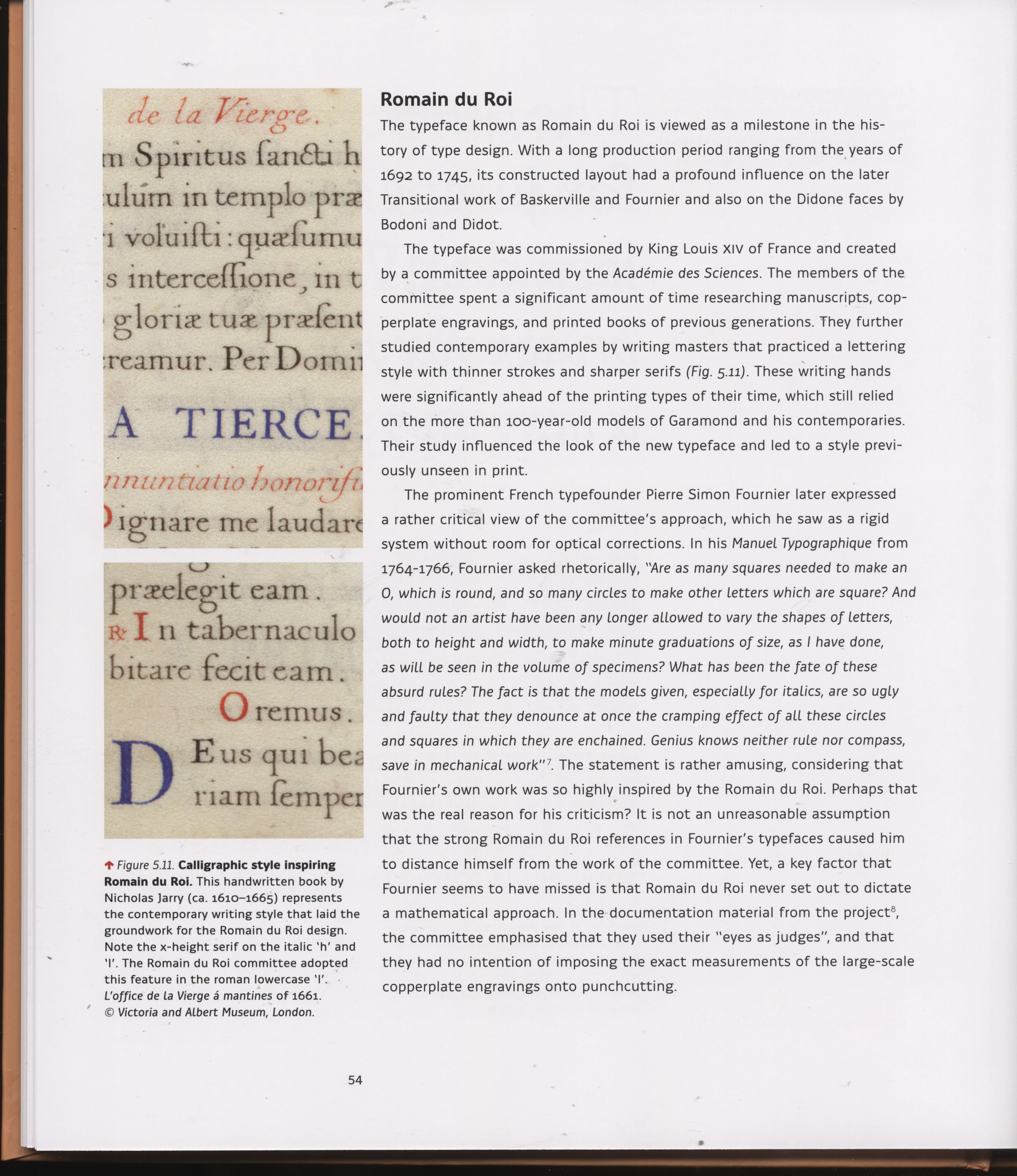
Reading Letters: Designing for Legiblity, Sofie Beier
_ _ _ _ _ _ _ _ _ _ _ _ _ _ _ _ _ _ _ _ _ _ _ _ _ _ _ _ _ _ _ _ _ _ _ _ _ _ _ _ _ _ _ _ _ _ _ _ _ _ _ _ _ _ _ _ _ _ _ _ _ _ _
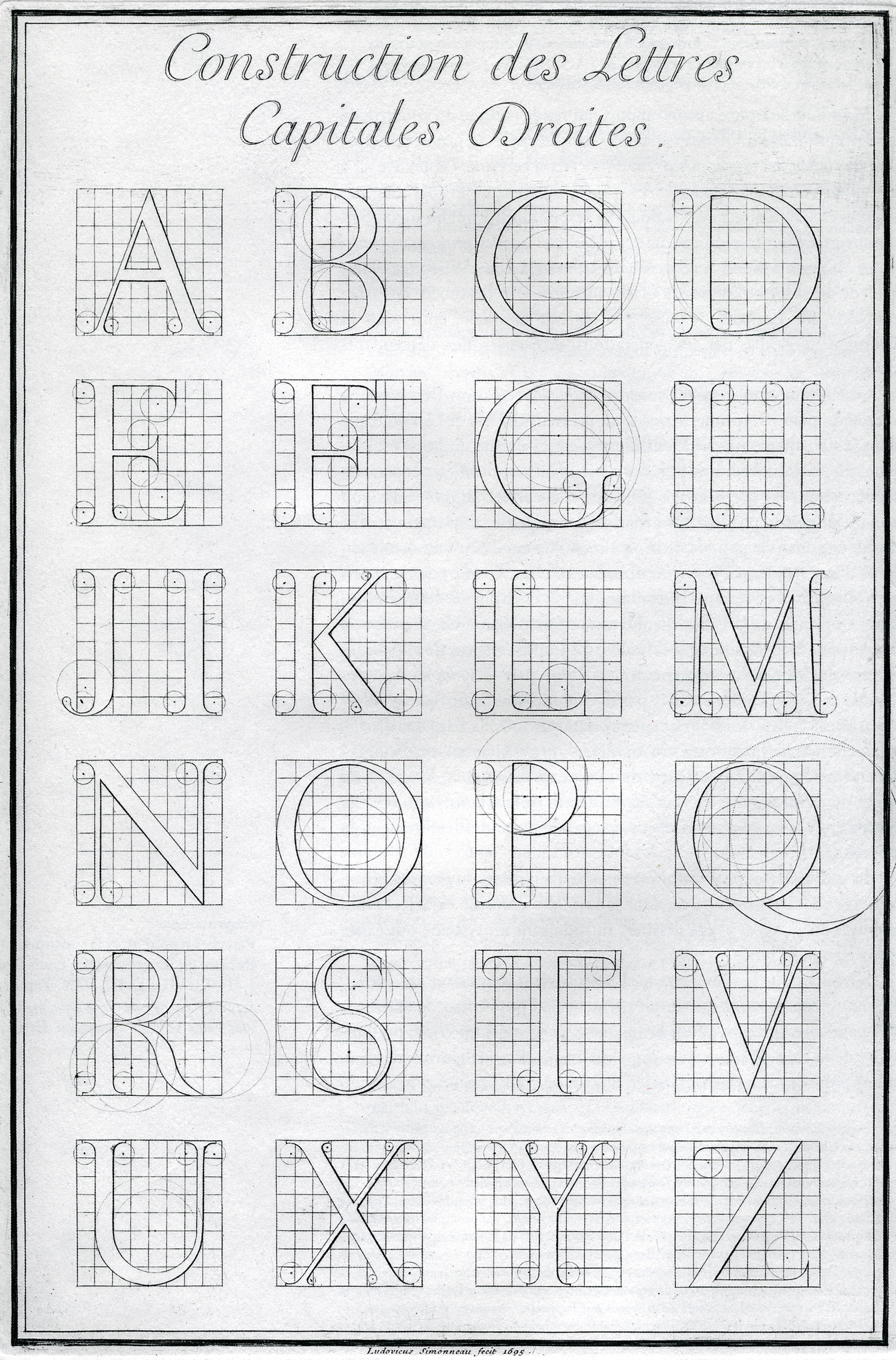
Louis Simonneau 1645 - 1728 (French). Engraver. Drew and engraved plates for Romain du Roi The roman Capitals engraved as large copperplate prints by Louis Simonneau
The Romain du Roi, because of its allegiance to the grid, shows a distinct shift in style, with an increased emphasis on verticality and increased contrast between thick and thin elements, a style that influenced the Transitional typefaces of Pierre Simon Fournier and John Baskerville.
_ _ _ _ _ _ _ _ _ _ _ _ _ _ _ _ _ _ _ _ _ _ _ _ _ _ _ _ _ _ _ _ _ _ _ _ _ _ _ _ _ _ _ _ _ _ _ _ _ _ _ _ _ _ _ _ _ _ _ _ _ _ _
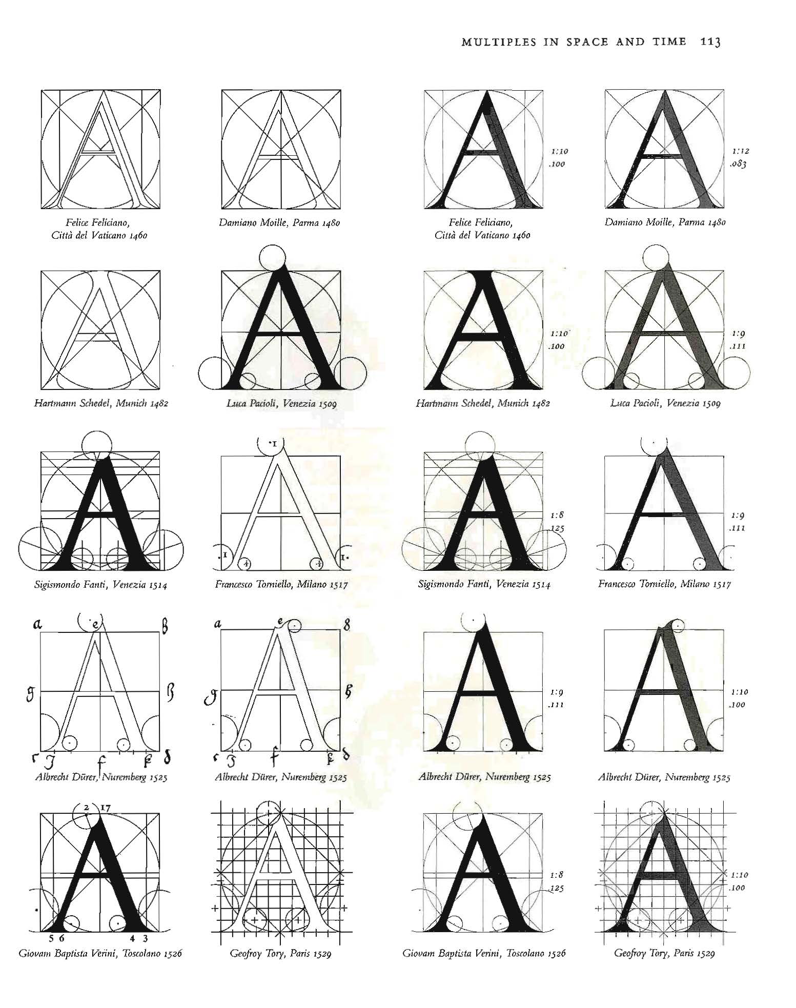
The Romain du Roi was not the first "constructed alphabet", Felice Feliciano, Geoffroy Tory and Albtecht Dürer studied the letterforms about 300 years before Romain du Roi. However, it was the start to the development of the modern (as in not old style) and lead to the Transitional classification of type.
Stepping further back, as early as 1463, Felice Feliciano (italian) geometrically recreated the alphabet of roman inscriptions and published as Alphabetum Romanum Codex Vaticanus 6852. In 1529, in his Champ Fleury, Geoffroy Tory (french) mapped letterforms on grids and showed their construction. And somewhere between 1471 – 1528 Albtecht Dürer (german) created On the Shaping of Letters.
The idea of geometrically created letterforms was again attempted but this time in sans serif. San Serif was the new life: simple and pure. It also is associated with the machine age. In 1925 Herbert Bayer, the father of Bauhaus typography designed the Universal Alphabet. (see the modular part one)
_ _ _ _ _ _ _ _ _ _ _ _ _ _ _ _ _ _ _ _ _ _ _ _ _ _ _ _ _ _ _ _ _ _ _ _ _ _ _ _ _ _ _ _ _ _ _ _ _ _ _ _ _ _ _ _ _ _ _ _ _ _ _
 Alphabetum Romanum Codex Vaticanus 6852 (orginal)
Felice Feliciano, 1433 – 1479
Felice Feliciano lived just long enough to see printing arrive in Italy. He was the first to recreate geometrically the alphabet of Roman inscriptions, in 1463. Alphabetum Romanum –written on vellum and colored to simulate the V-cut (found in stone inscriptions) – is his treatise on the geometrical construction of Roman capital letters using the square and circle. He geometrically constructed compass-and-ruler roman capitals alphabet in Alphabetum Romanum Codex Vaticanus 6852 (orginal) available as a facimile.
Aphabetum Romanum Codex Vaticanus 6852 facimile.
_ _ _ _ _ _ _ _ _ _ _ _ _ _ _ _ _ _ _ _ _ _ _ _ _ _ _ _ _ _ _ _ _ _ _ _ _ _ _ _ _ _ _ _ _ _ _ _ _ _ _ _ _ _ _ _ _ _ _ _ _ _ _

Geoffroy Tory, 1480 - 1533.
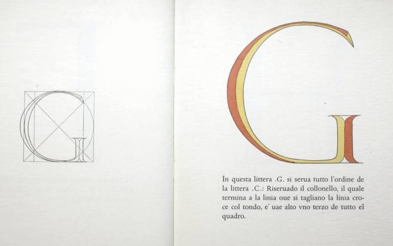
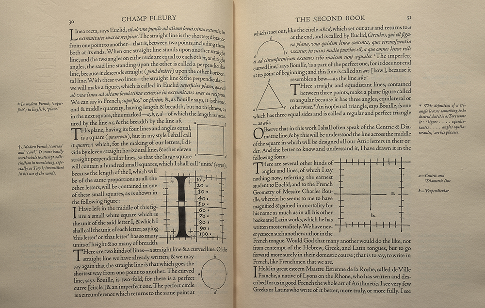
In 1529, Tory published his own book, Champfleury, one of the most important and influential works of the time. It set a standard for French publishing that in many ways is still followed today. Champfleury was written by Tory and published in 1529. It is divided into three books, and is concerned with the proper use of the French language, dealing with topics ranging from the elegance of the alphabet to the proper use of grammar. It was subtitled "The Art and Science of the Proportion of the Attic or Ancient Roman Letters, According to the Human Body and Face". Tory used a square grid to describe the shape of letters, which eerily predicts the use of pixelation in modern-day typefaces. Although "Champfleury" roughly translates to "flowery fields", it is also a French idiom for "paradise". Translated to english Champ Fleury.pdf (1827). Library of Congress. *The Spencer Research Library has a copy of this book if you want to see it live.
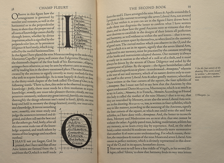
"I have arranged the Muses & Apollo around the I, I propose in the like manner to arrange the seven Liberal Arts, not around the O, but within it,..."
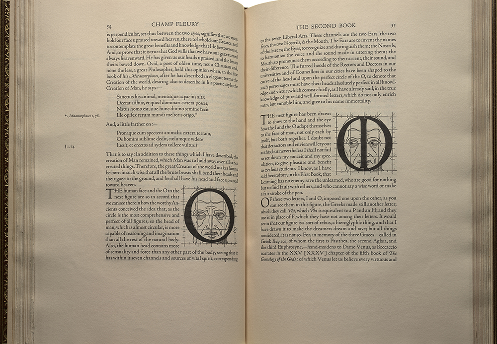
Geofroy Tory believed that the proportions of the alphabet should reflect the ideal human form. He wrote, “the crossstroke covers the man’s organ of generation, to signify that Modesty and Chastity are required, before all else, in those who seek acquaintance with well-shaped letters.”
_ _ _ _ _ _ _ _ _ _ _ _ _ _ _ _ _ _ _ _ _ _ _ _ _ _ _ _ _ _ _ _ _ _ _ _ _ _ _ _ _ _ _ _ _ _ _ _ _ _ _ _ _ _ _ _ _ _ _ _ _ _ _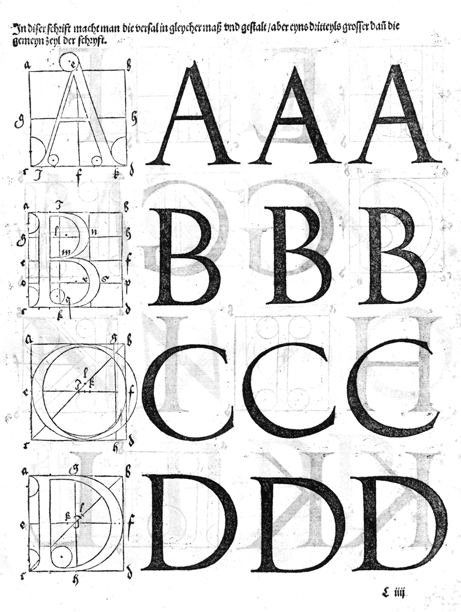
Albtecht Dürer, 1471 - 1528
In 1535 Albtect Dürer, created a Roman style typeface, based on geometry, the Golden Mean and the proportions of the human form. A facimile is available Of the Just Shaping of Letters download.pdf.
Dürer born in Nuremberg in 1471, is perhaps best known as an influential illustrator, who introduced chiaroscuro to wood cuts and engraving during the early days of printing. In addition he was a painter, book designer, mathematician, theorist and as we see here, type designer. His Roman style typeface, which is covered in the book, is based on geometry, the Golden Mean and the proportions of the human form.
_ _ _ _ _ _ _ _ _ _ _ _ _ _ _ _ _ _ _ _ _ _ _ _ _ _ _ _ _ _ _ _ _ _ _ _ _ _ _ _ _ _ _ _ _ _ _ _ _ _ _ _ _ _ _ _ _ _ _ _ _ _ _
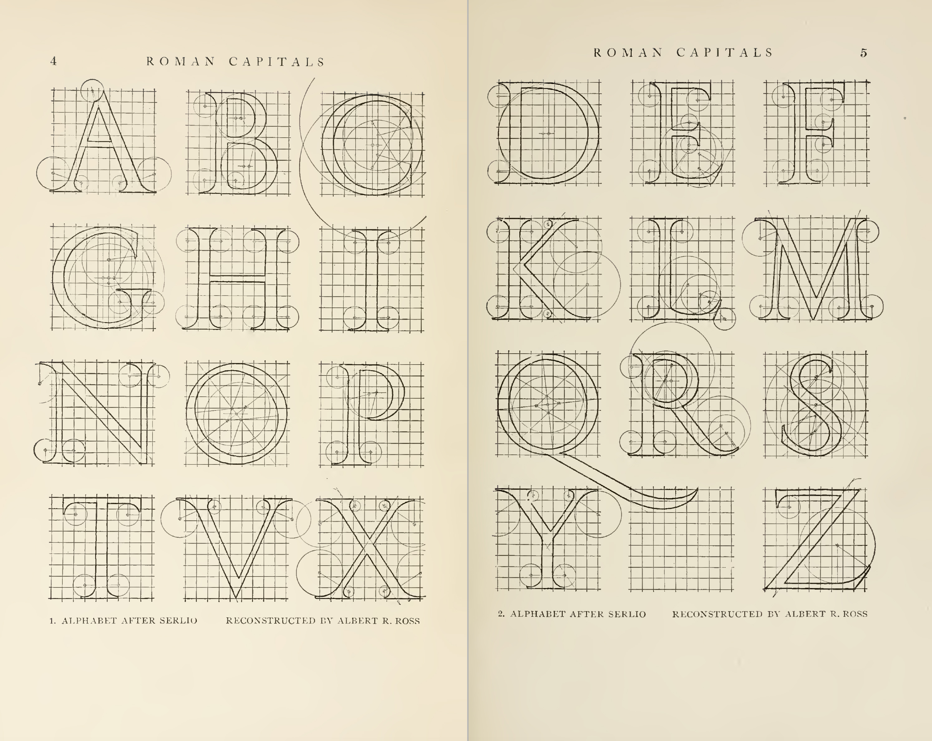
Constructed by Albert Ross
Letters & lettering https://archive.org/details/lettersletteringa00brow/page/n1
_ _ _ _ _ _ _ _ _ _ _ _ _ _ _ _ _ _ _ _ _ _ _ _ _ _ _ _ _ _ _ _ _ _ _ _ _ _ _ _ _ _ _ _ _ _ _ _ _ _ _ _ _ _ _ _ _ _ _ _ _ _ _
Visual Explanations, Edward Tufte .pdf
_ _ _ _ _ _ _ _ _ _ _ _ _ _ _ _ _ _ _ _ _ _ _ _ _ _ _ _ _ _ _ _ _ _ _ _ _ _ _ _ _ _ _ _ _ _ _ _ _ _ _ _ _ _ _ _ _ _ _ _ _ _ _
RESOURCES
Medium: https://medium.com/swlh/le-romain-du-roi-b65d708533d5
Riccardo Olocco lecture http://www.riccardolocco.com/img/romain_du_R_Olocco_slide_12.2013.pdf
David Lance Goines’ A Constructed Roman Alphabet. http://www.codex99.com/typography/58.html
Digital version: http://www.goines.net/acra_book/acra_content/files/text_a.html
Luc Devroye article http://luc.devroye.org/fonts-89919.html
Champ Fleury: Library of Congress
Alphabetum Romanum Codex Vaticanus 6852 (orginal) available as a facimile
Of the Just Shaping of Letters download.pdf
The Mathematical Quest...The Quest for the Perfect Letter.pdf
Resource pdf
Sketching Techniques
Drawing Vectors
Construction
Spacing
More grids if you need
_ _ _ _ _ _ _ _ _ _ _ _ _ _ _ _ _ _ _ _ _ _ _ _ _ _ _ _ _ _ _ _ _ _ _ _ _ _ _ _ _ _ _ _ _ _ _ _ _ _ _ _ _ _ _ _ _ _ _ _ _ _ _
Mon. January 31
Intro to Roman du Roi
Refresher: Font Classifications
In-class do the Capital proportional studies | ai | pdf (build reference pdf in class)
Try at least one old style typeface and then pick one of your favorite typefaces to study
upload a pdf of your study on the google drive so everyone can reference it.
Please refer to the proportion of the letters: use https://www.letterfountain.com/drawingtofont.html
12 - 70pg in Designing Type as a reference for proportion and construction of each letter (on the google drive)
HOMEWORK
Read: Type Mechanics, Tobias Frere-Jones part 1 | part 2
if you didn't do this in class do it. The Capital proportional studies | ai | pdf (build reference pdf in class)
Try at least one old style typeface and then pick one of your favorite typefaces to study
upload a pdf of your study on the google drive so everyone can reference it.
Based on what we discussed in class. Construct different kinds of serifs so you are comfortable with serifs. Be prepared to show this in your process (ie do it and take an photo of it)
Then Construct 7 capital letters :: HOMENVD
1) contrast in the stroke (no mono-weight)
2) serifed letterforms, using your defined construction/rules
3) pay attention to proportion.
Work by only hand, not on the computer.
Start with the H.
Please try a different height, wieght and characer width for each set.
Work at least 1 inch tall (letters do not have to be a square,
If you work in pencil make sure you fill in your letters so we can see them from a far. Start with the H and and move through the other letters in any order you wish.
* Pay attention to proportion.
* Capital letters only.
* Try to add weight to your letters not just mono-line (see sketching techniques).
* Must be constructed.
* Must have some sort of serif.
For the next class you should have 3 or more different sets of 7 letters. HOMENVD (it may take you time to figure out your system so you should have some misses before you come up with a direction). Looking for a range of solutions. Each set should fit on 8.5x11. Bring in originals, place a scan of your sets into your folder on the google drive.
_ _ _ _ _ _ _ _ _
Wed. February 2
SNOW DAY!!!!!
HOMEWORK
Pick a set
Read: Type Mechanics, Tobias Frere-Jones part 1 | part 2
Read: Stroke Opitics: scannerlicker.net / eyeballing-iv-the-stroke-optics
Watch: Optical Compensation: https://www.youtube.com/watch?v=NSwEe-vMfP4
Refine your proportions.
Define your stroke weights.
The Capital proportional studies | ai | pdf (build reference pdf in class)
Try at least one old style typeface and then pick one of your favorite typefaces to study
upload a pdf of your study on the google drive so everyone can reference it.
In Glyphs
Define your stem width
Define your bowl width it should be a bit wider than the stem (the thickest part of the round)
Explore Different Serifs (here is a video. just make a few so you have a sample)
Define and refine your serifs: (here is a video. types of serifs you will need)
Build the H (using a document grid: watch video)
Building a serif and make it a component watch the video
Use the default overshoot for you O
Things to think about/ practice...
Review extrema, points and handles, how to draw and correct in Glyphs
Review similarities and differences between characters.
Create components
Understand and set overshoots
Understand optical compensation both in round letterforms and diagonals
Understand cap height vs ascender height
Understand the principles of spacing start with HOHOOH
_ For Monday have HOMENVD in Glyphs
(optional if you have time: add the Ietters "I U G L A S" (you may have to work some out by hand first)
_ Watch if you are interested and haven't yet Monotype Helvetica Now
_ _ _ _ _ _ _ _ _
Mon. February 7
Crit HOMENVD
HOMEWORK
Watch this: https://www.youtube.com/watch?v=8QAZc3itnN0
Create a custom ligature or alternate character so we can get it working next class.
And I U G L A S
Refine and finalize HANDGLOVESMUI
Check extrema, points and handles
Check similarities and differences between characters.
Use components
Check overshoots
Refine optical compensation both in round letterforms and diagonals (readings from before
Refine spacing
DUE: pdf presentation (landscape), design it professionally: show all the letters, show them off in words, show the construction, show the sketches and show and verbally point out at least 3 design attributes. and at least 1 instagram ready or riso "thing" if you want something physical. (you can hand this in on Wed Feb 9 or have the weekend to finish it up.)
-- > Prep for next class:
Please have on hand large markers, bold ones, brushes, ink, lots of paper...
Read over and sketch the basic forms of the Ampersand
_ _ _ _ _ _ _ _
Wed. February 9
Begin to understand open type features, how to make them (liga, calt, .sso1)
Watch this: https://www.youtube.com/watch?v=8QAZc3itnN0
Demo how to make a ligature using Open Type Features
Demo create and code a contextural ligature: Part Part: Simple, Part Two: Contextual
In-class make one custom ligature and code it as a ligature. (just try ti so you have the experience)
Kerning :: Tutorial
We are moving foward with Ampersands at the same time. In class on Wed we will sketch Amepersands.
Read over and sketch the basic forms of the Ampersand.
Intro to the Ampersand and
Ampersand play. sketch in class
HOMEWORK
*because of the snow day you can have the weekend to finish up the HANDGLOVESMUI
Follow the folder hand-in structure...
Folder: Uppercase
______ Folder: Scans with your Scans/Sketches,
______ Folder: Glyphs with your glpyhs app file and the otf file
______ Presentation pdf
______ Instagram images
______ Project Overview (google doc or word) your review of the project
and! Ampersand
Sketch more if you need/want.
Pick your favorite 3 ampersands (yes any of them).
Digitize/Draw the 3 in the same Glyphs file (-- just use ABC or 123)
Virtual Guest next weee: check him out a bit... have a question to ask.
David J Ross (djr) of Font of the Month