visual communication
Typography 1
:::::::::::::::::::::::::::::::::::::::::::
professor: Andrea Herstowski
email: herstow@ku.edu
class blog
:::::::::::::::::::::::::::::::::::::::::::
professor: Michael Kidwell
email: mkidwell@ku.edu
phone/txt: 913 645 8944
:::::::::::::::::::::::::::::::::::::::::::
Documents relating to project
:- Project_01_grid.pdf
:- Jan_text.pdf
:- PDF Saving: | pdf |
::::::::::::::::::::::::::::::::::::::::::::
:: Research
:- Thinking with Type
:- Typotheque
:- Type Cultur
:- Visual Thesaurus
:- Type Base
:- bitique.co.uk
:- dailydropcap.com
:- designobserver.com
:- designworklife.com
:- formfiftyfive.com
:- friendsoftype.com
:- ilovetypography.com
:- ministryoftype.co.uk
:- thevisualdictionary.net
:- typographer.org
:- typographica.org
:- welovetypography.com
:::::::::::::::::::::::::::::::::::::::::::
:: Short films :: Audio
:- films by Hillman Curtis
:- sagmeister | scher | carson
:- Type Radio
:- Type Culture Movies
::::
:::::::::::::::::::::::::::::::::::::::::::::::::::::::::::::::::::::::::::::::::::::::::::::::::::::::::::::::::
Project Two:
Typeface Design—the practical, poetic and persuasive
Develop a compelling typeface that embodies some interesting attributes then communicate those attributes to persuade an audience of young designers that it really is well designed typeface.
The project looks back to the 1910s and 1920s, when avant-grade designers made experimental typefaces out of simple geometric parts. The project also speaks to the structure of digital technologies, from cash register receipts and LED signs to on-screen font display, showing that a typeface is a system of elements.
We will be looking at how all the letters in a typeface are distinct from each other, yet they share many attributes, such as x-height, line weight, stress, and a common vocabulary of forms and proportions. Producing a complete typeface is an enormous task. However, for people with a knack for drawing letterforms, the process is hugely rewarding.
Objectives
_ explore the expressive potential of typography
_ communicate essence graphically and textually
_ solve communication problems within given parameters
_ create a compelling/persuasive, sequential experience
_ experience combining (or pairing) typefaces
_ methodically document relevant design inspiration and process
_ present and assess work in a visually and verbally articulate manner
_ professionally document and photograph final design outcomes
_ demonstrate exemplary visual craft—hand and digital
You will use fontstruct (http://fontstruct.com/) to explore different font options then create a full typeface (all uppercase or lowercase, punctuation and numbers. With the font you designed and combining it with a complimentary typeface you will develop a content-rich, analogue/print specimen to persuade the recipient to ultimately use your typeface.
Consideration should be given to the audience—students, designers, art directors or other design-related, typeface-loving professionals conversant in basic typography and design. What are its connotations? Its attitude, voice, vibe, feeling, flavor, smell?
Deliverable: Mailer
Folded poster/mailer two large format, ink-jet prints showing the front and back of your design for a 16 page, double parallel fold brochure/poster. The sheet size is 21 x 24.5 inches. The finished (that's all folded up and ready to mail) folded size is 6.125 x 10.5 inches.
Content for the mailer
A textual overview that includes designer (that's you) information/bio, primary inspiration source, production date, place of development. Include distinguishing features of your typeface; the basic (a–z) character set,* (0–9) figures and punctuation; suggested application(s)—perhaps demonstrate your typeface being used.
Typefaces: in addition to the one you design, an additional supporting typeface(s) will be necessary. consider ones that enhances your design rather than upstaging it. You will need to do a series of type studies to identify which font will combine best with your font.
Imagery: photographs, development sketches, patterns, diagrams, inspiration, metaphors and usage/applications are all acceptable and should be considered supportive—clearly serving a persuasive or informative role.
URL: somewhere in the design your specimen, provide the url for your typeface to encourage down-loading from fontstruct.
:::::::::::::::::::::::::::::::::::::::::::::::::::::::::::::::::::::::::::::::::::::::::::::::::::::::::::::::::
Wed. Sept 16
_ Hand in Project 1, short crit
_ Begin Project 2:
_ modular fonts (http://ku-viscom.com/type1/modular.html)
- - - - - - - - - - - - - - - - - - - - - - - - - - - - - - - - - - - - - - - - - - - - - - - - - - - - - - - - - - - - - - -
HOMEWORK
I am giving you a break from designing this weekend but you do have reading and reasearch so do not put it off! Do some every day.
READ and print out: Anatomy of Type (http://ku-viscom.com/type1/images/AnatomyOfType.pdf)
READ: Meet your Type (http://ku-viscom.com/type1/images/MeetYourType.pdf), chapter 1.
Take notes
READ: Letter Fountain, 40-41, 76 (Modular), 91-97, 152 -181
Take notes. Post a summary and supporting images to your blog.
---
IF you do not own Letter Fountain read these THREE articles online...
Take notes. Post a summary and supporting images to your blog.
READ: Letterform construction (http://www.letterfountain.com/drawingtofont.html)
Take notes.
READ: The Fuse Box (http://www.salon.com/2012/06/13/the_fuse_box/)
READ: http://www.eyemagazine.com/blog/post/type-tuesday2
---
Please complete all the research, answer the questions for each and post to your blog.
RESEARCH: Who is Wim Crouwel
RESEARCH: Emigre fonts (http://www.emigre.com/fonts.php) Choose 3 from this list and closely look at/dissect and answer the questions*: Base 9 /12, Cholla, Modula, Oblong, Platelet, Priori, Variex, pick any 1 font you think should have been on the list.
RESEARCH: Fuse fonts, choose 3 from this list and closely look at/dissect and answer the questions* Can you read me?, Typeface Four, Pop, Disturbance, Moonbase Alfa
*QUESTIONS: Include this information for each on your blog. For each of the fonts you have “researched”: include an image of the font. Designer. What is different about the font? How is it constructed? What letters stand out as different/awkward/interesting. List at least 5 words about the Voice, Vibe, Feeling… (ex: strong, dynamic, gothic, awkward, pointed, sharp, aggressive,…)
---
LASTLY EXPLORE FONTSTRUCT (http://fontstruct.com/) you will be using it next week so sign up. IT IS FREE. Just open it up. And explore it. You will be using it for this project.
:::::::::::::::::::::::::::::::::::::::::::::::::::::::::::::::::::::::::::::::::::::::::::::::::::::::::::::::::
Mon. Sept 24
_ Inclass we will go over the readings and start in Fontstruct.
_
Parts of the Letter
_ Modular Font Examples
_ http://fontstruct.com/
_
Design on font of the 7 letters and print it out b/w
_People to watch: Hand Lettering vs Font Design
Erik Marinovich | Ken Barber | Riley Cran |
Friends of Type | Type Directors Club | House Industries |
- - - - - - - - - - - - - - - - - - - - - - - - - - - - - - - - - - - - - - - - - - - - - - - - - - - - - - - - - - - - - - -
HOMEWORK
DESIGN: Using fontstruct (http://fontstruct.com/)
only the following letters (all caps OR all lowercase) (explore both with different designs:
H, O, R, N, S, A, G
or
h, o, r, n, s, a, g
Explore at least 10 different font ideas (only those 7 letters). More ideas not more letters!
Explore what fontstruct can do! At the beginning you will feel like everything has been done — keep pushing what the program can do… what you can do with it.
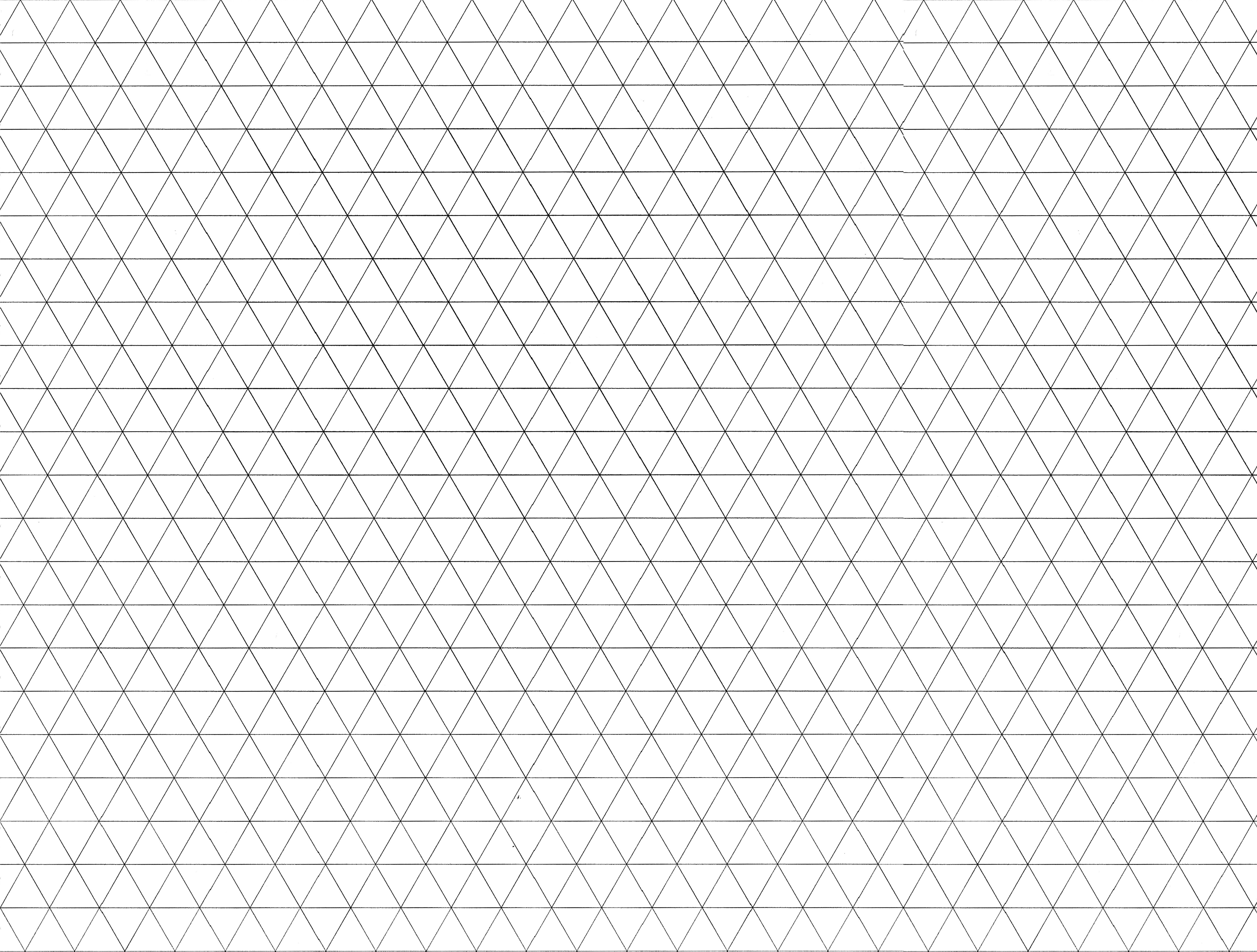
You can export your fonts and play with adding forms or subtracting parts of your letters to make new forms. You may explore ideas using graph paper. graph paper | diagonal graph paper Looking for 10 different great ideas! However you need to get there (fontstruct, illustrator, working by hand off th computer) All 10 fonts (only 7 letters for each) must modular and be completely different so however you can get there — do it.
Print each "font" on 1 8.5 x 11 sheet of paper. Black and White. Be prepared to pin them up. At least 10 pages with 7 letters on each page.
:::::::::::::::::::::::::::::::::::::::::::::::::::::::::::::::::::::::::::::::::::::::::::::::::::::::::::::::::
Wed. Sept 23
Meet your Type: http://ku-viscom.com/type1/images/MeetYourType.pdf
_ Crit letters and choose 2 of your best ideas.
- - - - - - - - - - - - - - - - - - - - - - - - - - - - - - - - - - - - - - - - - - - - - - - - - - - - - - - - - - - - - - -
HOMEWORK
REFINE AND ADD: With the 2 directions you have chosen, make any refinements to HORNSAG and add the letters B, C, D, E, K, M, Q, U, X, Z (remember to look at the letters that help define what the next letters should look like.
Continue to Design: choose 2 of your strongest directions and add the letters BCDEKMQUXZ
*
you can continue to explore a great typeface direction.
Concept: For each direction define a concept or at least a style. Describe them in 5 words
(ex: strong, light, dynamic, romantic, gothic, awkward, graceful, glee, pointed, organic, sharp, aggressive, appropriable…)
Font Combination: From Thinking with Type: Combining typefaces is like making a salad. Start with a small number of elements representing different colors, tastes, and textures. Strive for contrast rather than harmony, looking for emphatic differences rather than mushy transitions. Give each ingredient a role to play: sweet tomatoes, crunchy cucumbers, and the pungent shock of an occasional anchovy. When mixing typefaces on the same line, designers usually adjust the point size so that the x-heights align. When placing typefaces on separate lines, it often makes sense to create contrast in scale as well as style or weight. Try mixing big, light type with small, dark type for a criss-cross of contrasting flavors and textures.
For each of your typeface directions complete a typeface study of at least 6 companion typefaces. What looks best with your typeface(s). Start with looking at these more traditional typefaces: Archer, Baskerville, Belizio, Bembo, DIN, Frutiter, Interstate, Melior, Memphis, Meta, Rockwell, Sabon, Whitney (click here to download fonts) (example of font study: pdf | ai file).
Blog: What is the difference between lettering and font design? Choose 3 from this list of these famous type designers: Sumner Stone, Mathew Carter, Tobias Frere-Jones, Jonathan Hoefler, Bruno Maag, Jean François Porchez, Christian Schwartz. Include a short bio, examples of fonts they have designed. Include links to your resources.
_People to watch: Hand Lettering vs Font Design
Erik Marinovich | Ken Barber | Riley Cran |
Friends of Type | Type Directors Club | House Industries |
:::::::::::::::::::::::::::::::::::::::::::::::::::::::::::::::::::::::::::::::::::::::::::::::::::::::::::::::::
Mon. Sept 28
_ Review 2 directions. Pick 1
_ Review Companion Fonts
- - - - - - - - - - - - - - - - - - - - - - - - - - - - - - - - - - - - - - - - - - - - - - - - - - - - - - - - - - - - - - -
HOMEWORK
DESIGN: Finish the rest of the alphabet, numbers and ? ! , . *
CONCEPT: What is the concept for your font? Define at least 3 different concepts. What is the style? How does if feel? What does it look like? What is the companion font (why)?
IMAGES: Start looking online for high res images that can help you "sell" your 3 concepts at least 5 images for each concept. Examples of images theat work well with the design of a font:
Sally
Anthony
Sydney
Jamal
Print out everything in a professional manor which will allows us to give you feedback.
:::::::::::::::::::::::::::::::::::::::::::::::::::::::::::::::::::::::::::::::::::::::::::::::::::::::::::::::::
Wed. Sept 30
_ Crit Letterforms and concepts
_ How to print a booklet
- - - - - - - - - - - - - - - - - - - - - - - - - - - - - - - - - - - - - - - - - - - - - - - - - - - - - - - - - - - - - - -
HOMEWORK: READ IT...
DESIGN: Refine letters that are not working. Do at least 5 variations for each letter that isn't working you need to keep working on them until you answer the question -- of how to make them look good and fit into your modular system.
DESIGN: Choose 2 different concepts and design a total of 5 booklets. The booklets are to showcase/ sell your font. With your your favorite concept, design THREE different booklets for your second FAVORITE concept design TWO different booklets. Each booklet is 12 pages. Use the illustrator document to lead you through it. You should love both. This isn't about bringing in half thought out designs this is about being as professional as you can be.
example of a booklet on platelet. other examples: vista sans, fairplex. examples are not 100% what I want you to do. They are just examples to give you an idea of what you could do. Other examples of concepts (ideas)
Sally
Anthony
Sydney
Jamal
Booklet: (use this file!: Booklet_grid.ai)
Size: 8.5 x 11 folded in half to 5.5 x 8.5. Saddle stiched (stapled in the middle)
Make your page size
5.5 x 8.5
You may use different papers in your booklet (12 page booklet is 4 pieces of paper).
Grid: set up a 5 column grid, use the modulars to lock all your type. use the upper left.
Fonts: your font + a companion font
Color: CMYK: 4-color process = any color
Content READ THIS!!! (use imagery to support your concept and sell your font)
_
Front Cover: Name of your font/showcase (how do you make the cover simple but interesting so we pick it up?)
__ introduction to your font + your bio
_ show at least use at least 1 word
_ show your font in a panagram or series of words that use most of your letters
_ show how 1 - 3 letters are constructed / what is the modular
_ show the complete font (all the letters, numbers and characters ? ! , . *'
_ Back cover is the maling side so no infor but a return address and the URL to your behance page that will showcase your font.
You can "design" the conent however you feel is appropriate to the font and captures the audience's attention, tells the story. Don't forget about using color for hierarchy. Scale. Contrast and Surprise. We should not expect what is coming next = meaning not every page should have some text on the left page and some image on the right side. How do you visually tell a story. Visual Narrative. Scale. Contrast. Surprise.
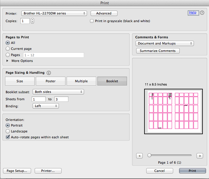
Print everything for Monday as a booklet! Directions below. DO NOT staple them together just fold them and put them in order.
To print
1. SAVE AS your illustrator fils as a pdf. SINGLE PAGES
2. Open your pdf in acrobat reader and print from there using these guidlines.
3. Page Set up should be Portrait
Then use Booklet settings, all pages, both sides, binding on the left orientation Portrait Auto Rotate
:::::::::::::::::::::::::::::::::::::::::::::::::::::::::::::::::::::::::::::::::::::::::::::::::::::::::::::::::
Mon. Oct 5
_ crit booklets
_
fonts
_ create animated gif
- - - - - - - - - - - - - - - - - - - - - - - - - - - - - - - - - - - - - - - - - - - - - - - - - - - - - - - - - - - - - - -
HOMEWORK
DESIGN: refine 1 booklet in 2 different ways. Print both in full color. Fold into a booklet. Do not staple together.
Create an animated gif and put it on behance before class starts.
:::::::::::::::::::::::::::::::::::::::::::::::::::::::::::::::::::::::::::::::::::::::::::::::::::::::::::::::::
Wed. Oct 7
_ crit booklets
_ crit animated gif
_ _ _ _ _ _ _ _ _ _ _ _ _ _ _ _ _ _ _ _ _ _ _ _ _ _ _ _ _ _ _ _ _ _ _ _ _ _ _ _ _
Creating an animated gif in photoshop is very easy. (examples)
1) open Photoshop file size 600 x 400px or 600x600, 72 dpi
2) change you background to a color (you can change it easily again later)
3) copy and paste each letter (at least 6 letters) on a different layer in the size and color you want the letter to be (photoshop will animate based on what is turned on in a layer)
4) under window: find animation
5) use frames not timeline
6) in frame one turn on what you want the viewer to see (change time to .1 sec)
7) duplicate frame and turn next letter on. (repeat 6 and 7 until you are done)
8) add transitions
9) add more time IF you want a pause
10) set it to repeat at least 3 times or forever
11) file save for web devices (will create a .gif)
12) test in a browser then upload to behance.
completely lost? google it how to create an animated gif in photoshop: link
- - - - - - - - - - - - - - - - - - - - - - - - - - - - - - - - - - - - - - - - - - - - - - - - - - - - - - - - - - - - - - -
HOMEWORK
Refine and produce Final Booklet, Upload to behance, Process Book...
FOLLOW THESE DIRECTIONS FOR WHAT YOU NEED DONE BY OCT 14:
_
(1) 12 page booklet
_ 8.5 x 11 sheet with your entire font, numbers and characters. Black and White
_ Process Book
_ Post project to Behance with project description + gif + spreads of your book
_ Process book
Produce 1 final 12 page booklet. Saddle stitched (which means stapled in the middle)
Process Book. Put all your process together. Spiral bind it all OR put it in a 3 ring booklet. Remember process is 50% of your grade so I need to see everything and you need to figure out a professional way to show it all to me. 3 ring binder is fine -- it should be organized, straight, professional. Include a cover sheet with your name, class and year.
Behance. You made one animated gif now make it better!
_ Project Description
_ Animated gif (concept, visually compelling, craft)
_ Spreads. Upload each spread from your booklet. Save each spread as a jpg and upload it. If your pages are white make sure you change the background color in Behance so your pages are defined.
*images that you are posting on behance should be 72 dpi, RGB (not cmyk) and
1200px wide and length is not as important as width. READ: TIPS... IMAGES ON BEHANCE
* Questions. Need help. Need one more crit. Send me a pdf or even 2 different pdfs. I am happy to give you feedback 1 time over the weekend.
:::::::::::::::::::::::::::::::::::::::::::::::::::::::::::::::::::::::::::::::::::::::::::::::::::::::::::::::::
MONDAY OCT 12
NO CLASS IT IS FALL BREAK!
Jayhawk ink will be open MONDAY AND TUESDAY 8:30 - 5:30 so email your files them. No excuses. If you want to print on Different papers then you need to be back by at least Tuesday to give the papers to Jayhawk Ink. Do not wait until Wednesday morning to print. It will not be done and your grade will suffer. You may print at a Kinkos or anywhere else that can print a booklet. That is up to you to research if you don't want to use Jayhawk Ink.
:::::::::::::::::::::::::::::::::::::::::::::::::::::::::::::::::::::::::::::::::::::::::::::::::::::::::::::::::
Wed. Oct 14
PROJECT DUE (instructions are outlined under Oct 7 homework. FOLLOW the directions carefully.
_ (1) 12 page booklet
_ 8.5 x 11 sheet with your entire font, numbers and characters. Black and White
_ Process Book (organize it in a professional manner)
_ Post project to Behance
_ Process book
GRADE
you will be graded on the following
50% process all of the steps leading up to the final, blog entries, process book, behance.
20% font design (original, modular, consistent, well drawn (craft)...
25% booklet design (concept, visual narrative (scale, pacing, surprise), clear hierarchy, use of the grid, craft)
5% animated gif. (concept, visually compelling, craft (elements are aligned)