:::::::::::::::::::::::::::::::::::::::::::::
::::::
associate professor Andrea Herstowski
University of Kansas | School of Architecture, Design and Planning | Visual Communication Design | Graphic Design
______________________________
:- Homepage:
______________________________
:- Teaching Statement
______________________________
Selected Class Projects
:- Bookcovers: Developing a Series
:- Famous Speech: Motion vs. Print
:- Creating Interaction
:- Workbook: Type Rules Illustrated
:- Senior Portfolio Class
______________________________
Sample...
:- Syllabus
:- Rubric
:- Student Observations/Reflections
:- Class Portal
:- Class Project Outline
______________________________
Recognition
:- Teaching/Student Awards
______________________________
Contact Info
e: herstow@ku.edu
c: 795 393 9382
:::::::::::::::::::::::::::::::::::::::::::::::::::::::::::::::::::::::::::::::::::::::::::::::::::::::::::::::::::::::::::::::
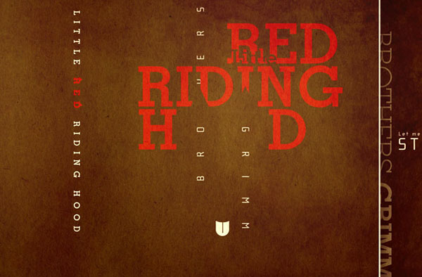
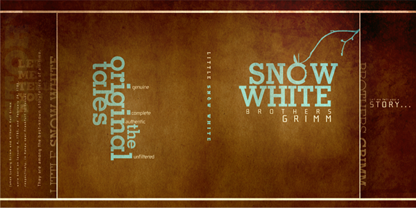
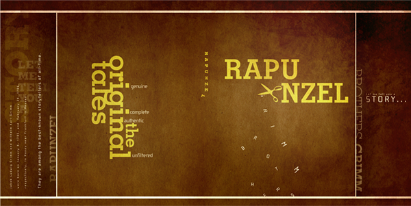
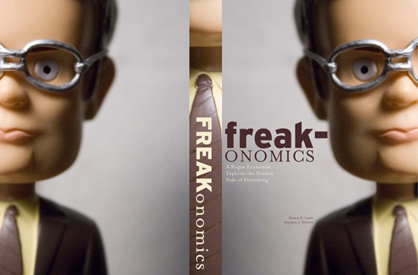
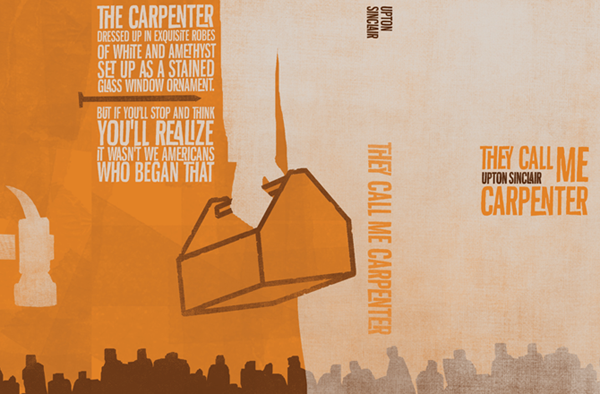
Developing a Series: Can you judge a book by it’s cover?
A really good book cover has to work regardless of what it’s about, on a visceral and emotional level.
— Chip Kidd
For this project students are asked to identify three bookcovers and redesign them into a cohesive, dynamic, emotional series. Designing a successful bookcover is very similar to designing a successful poster: strong concept, telling a story using very few elements, impact, establish a mood/ tone or feeling, and it needs to work from a distance and up close. The key difference between a book and a poster is a book is an object that can be picked up, turned around, held and opened. With each project or challenge the design process is employed: research, exploring image and meaning, idea generation, design studies, refinement, final design presentation and reflection.
:::::::::::::::::::::::::::::::::::::::::::::::::::::::::::::::::::::::::::::::::::::::::::::::::::::::::::::::::::::::::::::::
Michael Selby, part of sophomore portfolio which won him a summer internship in Washington D.C., 2009
Jay Vaglio, bookcovers series awarded in regional AIGA A5 awards, 2008
Brian Rio, series was part of his sophomore portfolio which won best portfolio in national competition, 2009
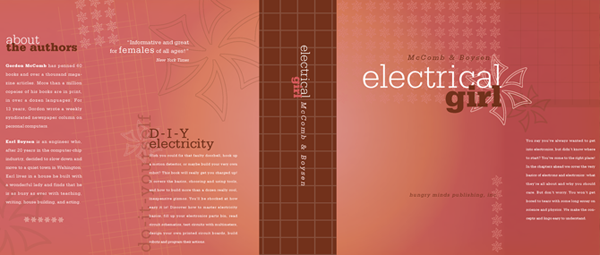
Amy Rottinghaus, bookcover series won "best in show" in national competition, 2006
:::::::::::::::::::::::::::::::::::::::::::::::::::::::::::::::::::::::::::::::::::::::::::::::::::::::::::::::::::::::::::::::
Evolution of the project
I have given this project for the last four years, each year revising how I present the project and how we – the students and I – go through the design process. The project, in its first year, began as a typographic only solution. When looking at the final results the projects were good and even won awards but seemed to be missing something. When professionals reviewed the project, they often asked the students to go back and add an image. Based on what I saw, student feedback and professional comments I knew the next time I gave the project that the covers need not be type only but needed to focus on how type and image can work together, and how image meaning could be explored.
In its fourth year, the project has evolved. From a typographic series to a form based series to one that now has connections to semiotics and studying meaning in messages. I have found many readings (This Means That, Sean Hall ) and online resources (archives, blogs, articles) that I can use to set a context for the project. I spend a number of classes working in small groups on concept, tone, mood, image choice before moving onto making.
The initial phase – research – of this project includes going to a bookstore, walking around, observing and reflecting. The web is also an instrumental tool for phase one. There are numerous websites dedicated to bookcover design archives where students can see multitudes of designs. Many bookcover designers have their own blogs where they show designs and discuss what worked what didn't and the client's reactions. The student's are asked to describe 10 bookcovers they feel are successful and tell us why.
Instead of the student handing in stacks of papers of research to me, I have the students post their findings on their personal blog. *During classroom discussions we can access the blogs. (Students start a personal blog first semester, sophomore year and they keep the same blog of throughout all Visual Communication classes.) The blog is also a place where they capture examples, observations, reflections, and comments. All the students have access to each of their classmates blogs.
Collecting process work and observations: at the completion of this project each student completes a process book containing in their words the objectives, research, concept development, target audience, mood/tone, design studies and final outcomes. Process is 50% of the student's project grade. The process book is an artifact that shows if they completed and understood each part of the project. I use the process books to make adjustments to the project. The student can use the process book when they are interviewing for an internship or job. Professionals like to see student's thinking and process, how they got from one point to another. | process book: michael selby | brian rio |
:::::::::::::::::::::::::::::::::::::::::::::::::::::::::::::::::::::::::::::::::::::::::::::::::::::::::::::::::::::::::::::::
Student Project Overview:
Every project ends with a product and a process book. The process book contains all the process, research, readings, explorations, iterations, final designs and reflections of the project, organized and in a chronological order. As part of the process book students are asked to write 2 different summaries. 1) project brief: tell me in your own words what the project objectives were and 2) write a project overview: reflect about the project. The project overview is an opportunity for students to tell me where was the project too long, short, unclear, confusing, what they thought about it. I refer to the comments when self-evaluating the project.
Student 1: This project was an outstanding lesson in what makes a successful design. With so much attention focused on concept development, the art of communicating an idea to the viewer gets put into real use. The notion that we as designers are not just computer geeks, but essentially architects of thought, language, and communication is an amazingly empowering feeling. We seek to twist, turn, and bend the rules in hopes of viewing existing ideas and images in a completely new way.
Student 2: I am very happy with my final book jackets, but there were many things I did not like about the way we got to the end. I felt that too much time was spent on the development stages. Specifically, the image searches were not extremely helpful for me because I did not have my idea defined at that point in the process. It is more beneficial for me to do some experimentation with the bookcovers, for it helps me narrow down my ideas. I could then go back and find images that I knew would relate to my bookcovers. Furthermore, because of the length of the beginning process, I felt rushed on the actual design process. Finally, though it is costly, I felt that printing the bookcovers was very helpful and this step should not be overlooked.
Student 3: Judging a book by its cover is fun.
There isn’t anything I don’t like about design, but if I had to pick one medium for my designs to last throughout my career it would undoubtedly be bookcovers. Since completing the assignment, I still feel I could design book covers and only book covers and be very, very happy. There are so many ways to interpret the written word and the visual accompaniment is an interesting problem to deal with. Book covers are the inside joke of the literary world, they’re a tease for what’s inside, they’re the hushed words of a secret and you want to know the rest. That said, I don’t often look back with regrets but I feel like I could design these three covers again, differently and perhaps with a better solution. But maybe that’s the fun of bookcover, there’s no concrete solution, it’s truly about interpretation and capturing that interpretation for a specific moment and audience. Whereas there’s usually a range for getting it right, here there is no right. Also, there’s no substitute for printing it out full size.
:::::::::::::::::::::::::::::::::::::::::::::::::::::::::::::::::::::::::::::::::::::::::::::::::::::::::::::::::::::::::::::::
GRADE RUBRIC
1 = unacceptable, 3 = average/good, 5 = exceptional
Bookcover Series
50% process
Process: prepared for every class, followed directions, participated in class discussions. Process is a major part of your grade. The process work is not only checked that you did it but it is also evaluated on how well you did it – was it thoughtful, well done or was it just completed?
| 1 | 2 | 3 | 4 | 5 | prepared for class and participated in class discussions
| 1 | 2 | 3 | 4 | 5 | process: image research and exploration
| 1 | 2 | 3 | 4 | 5 | process: explored different ideas
| 1 | 2 | 3 | 4 | 5 | process: design exploration of variations
| 1 | 2 | 3 | 4 | 5 | prepared process book as directed
40% product
| 1 | 2 | 3 | 4 | 5 | series is kinetic, not static, not cut and paste
| 1 | 2 | 3 | 4 | 5 | bookcovers reflect concept, to suggest
| 1 | 2 | 3 | 4 | 5 | covers match defined mood/tone
| 1 | 2 | 3 | 4 | 5 | images are meaningful, twist meaning
| 1 | 2 | 3 | 4 | 5 | viewer can easily navigate: read the title, find the author
| 1 | 2 | 3 | 4 | 5 | horizontal alignments / negative space /white space
| 1 | 2 | 3 | 4 | 5 | typographic details: hyphenation, dashes, quotes, type size, type color, line length, leading
| 1 | 2 | 3 | 4 | 5 | integration of type and image
10% craft
| 1 | 2 | 3 | 4 | 5 | printed and produced as directed
| 1 | 2 | 3 | 4 | 5 | clean, straight edges
:::::::::::::::::::::::::::::::::::::::::::::::::::::::::::::::::::::::::::::::::::::::::::::::::::::::::::::::::::::::::::::::
To read the full outlined project – project brief, homework assignements, resources click here: bookcover project outline | visit how the class blog was used | student blog entry about research